


π Day 2026 Art Posters - Art for the 5%
On March 14th celebrate `\pi` Day. Hug `\pi`—find a way to do it.
For those who favour `\tau=2\pi` will have to postpone celebrations until July 26th. That's what you get for thinking that `\pi` is wrong. I sympathize with this position and have `\tau` day art too!
If you're not into details, you may opt to party on July 22nd, which is `\pi` approximation day (`\pi` ≈ 22/7). It's 20% more accurate that the official `\pi` day!
Finally, if you believe that `\pi = 3`, you should read why `\pi` is not equal to 3.

Nature’s first green is gold,
Her hardest hue to hold.
— Robert Frost (Nothing Gold Can Stay)
Welcome to this year's celebration of `\pi` and mathematics.
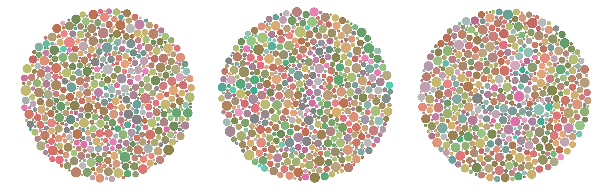
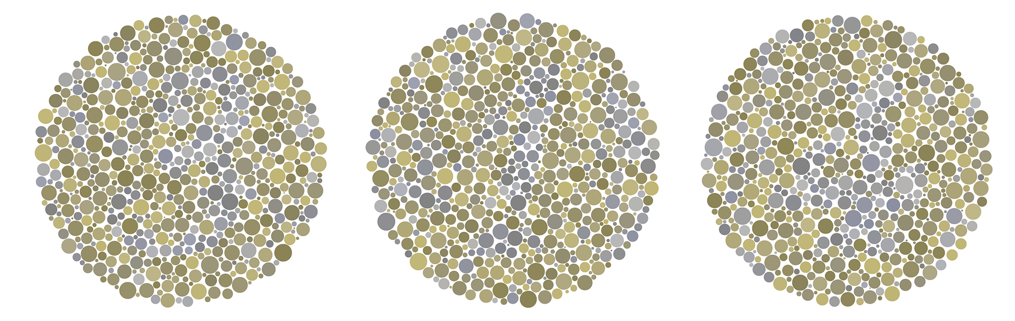
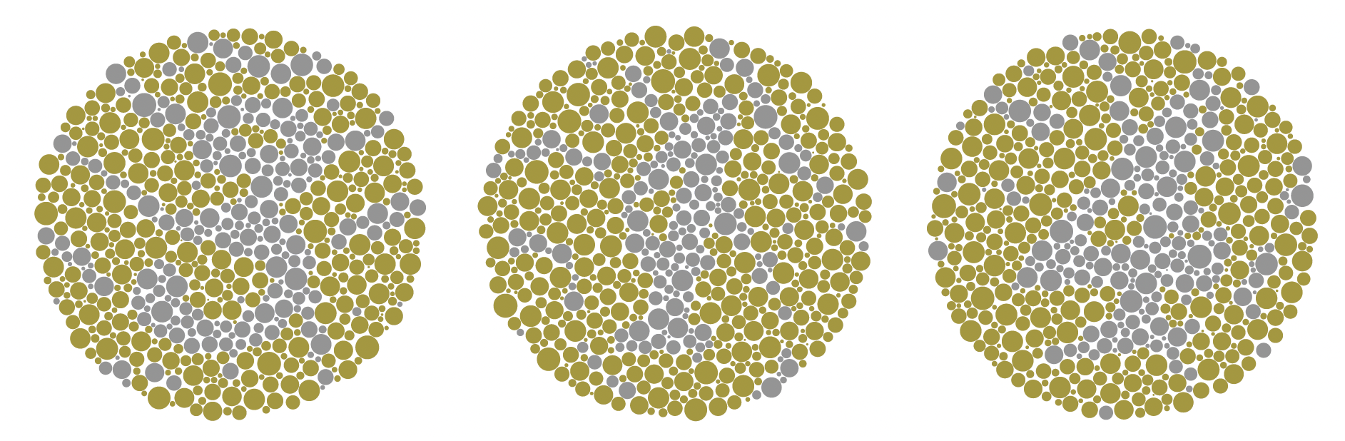
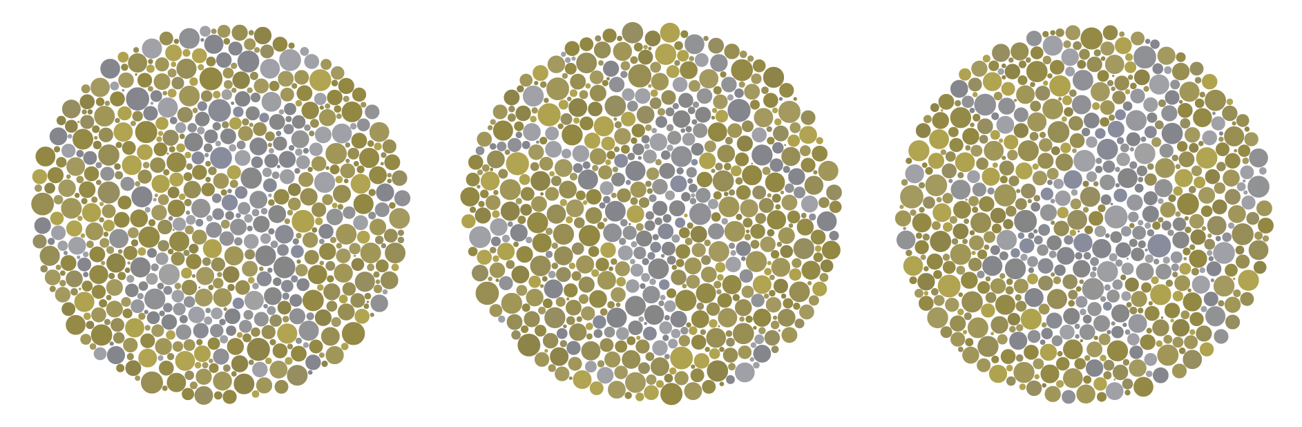
The theme this year is a homage to Shinobu Ishihara (1879–1963) and embodies the Japanese saying "To show something, hide something.".
This year, the digits of `\pi` are discernable only by people with colorblindness. It's the only test where a negative is a positive!
This year's `\pi` poem is Nothing Gold Can Stay by Robert Frost.
This year's `\pi` day song is Colors by Laleh.
contents
- 1 · Colour blindness
- 2 · Towards a hidden test plate
- 2.1 · Reference
- 2.2 · Using confusion colours
- 2.3 · Randomly sampling confusion colours
- 2.4 · Adding confusion with patterns
- 2.5 · Adding a common colour
- 2.6 · Varying luminance and chroma
- 2.7 · Global filter
- 2.8 · Randomizing dot classification
- 3 · First final take
- 4 · Tweaks and tunings
- 5 · What about other colour blindness types?
Here I walk you through my method of creating patterns that are only visible to people with colour blindness. The approach is based on so-called “hidden” plates from Ishihara's Tests for Colour Deficiency.
About 5% of the male population have fewer-than-normal number of M-cones (deuteranomaly) and about 1.5% are missing them altogether (deuteranopia).
Putting it another way, in a group of 8 men, chances are 50% that at least one has some degree of colour blindness.
Other forms of colour deficiency are much rarer. About 2% of males have fewer (or missing) L-cones (protanomaly or protanopia) and only a tiny fraction (<0.01%) have fewer (or missing) S-cones (tritanomaly or tritanopia).
Females are very rarely affected because colour blindess is recessive and linked to the X chromosome and females have two X chromosomes and, therefore, very likely a working copy of the neceesary gene.
In colour blindness, one or more types of colour photoreceptors in the retina are reduced in number or missing entirely.
There are three types of cones in the retina. They're labeled with letters S, M, or L to mean that their sensitivity to light is highest for short (blue), medium (green), or long (red) wavelengths.
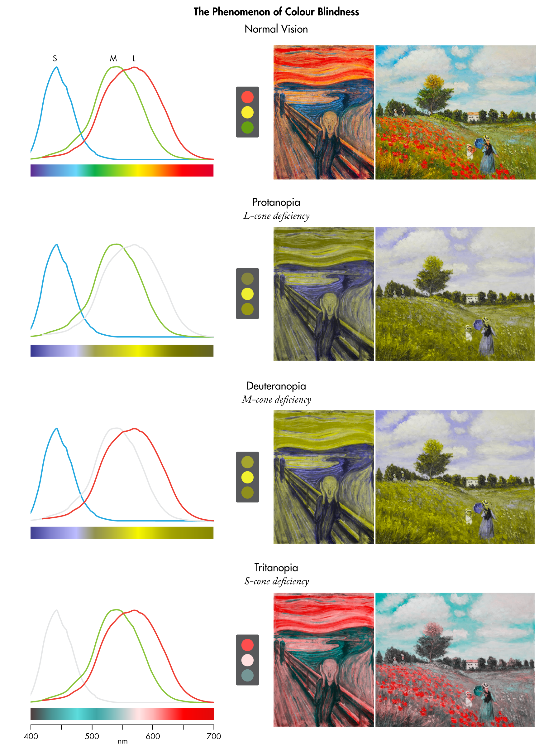
People with colour blindness see fewer colours. They also cannot (or only with difficulty) distinguish certain colour pairs.
It's useful to think of normal colour vision as 3-dimensional and colour blindness as 2-dimensional. In other words, normal vision requires three colour primaries whereas colour blindness requires only two.
In colour blindness, one of the primaries will be “invisible” invisible. The nature of the primary depends on the type of colour blindness.
The consequence of an invisible primary is that we can add as much of it as we want to any colour and this will not change how the colour is perceived by someone with colour blindness.
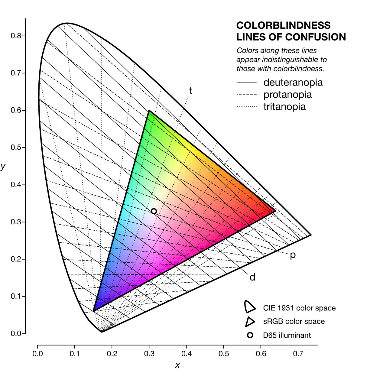
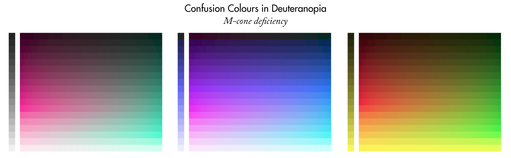
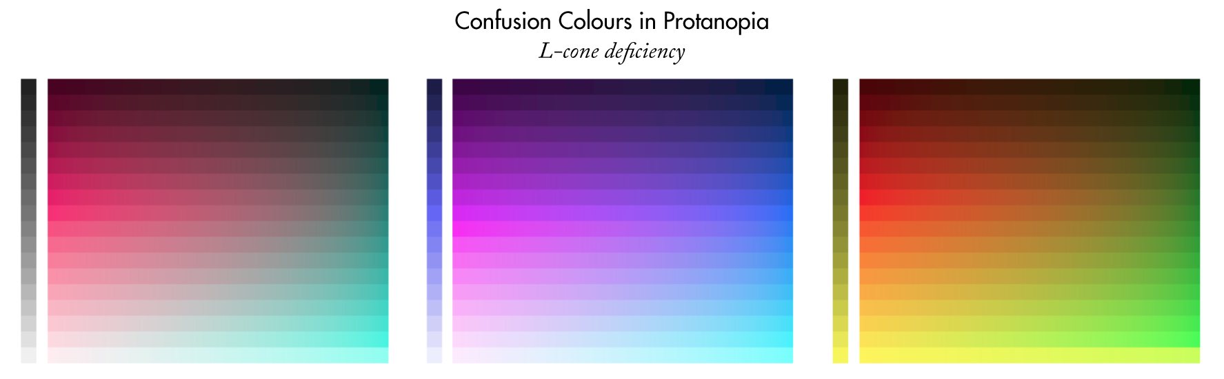
Mixing a visible with an invisible primary creates indistinguishable colours that are called (for obvious reasons) “confusion colours” In color space, they line along “lines of confusion”.
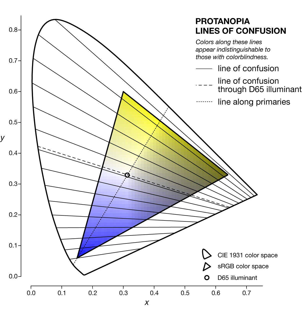
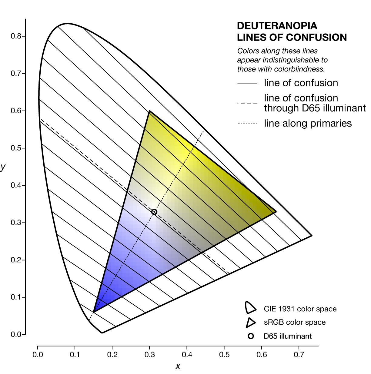
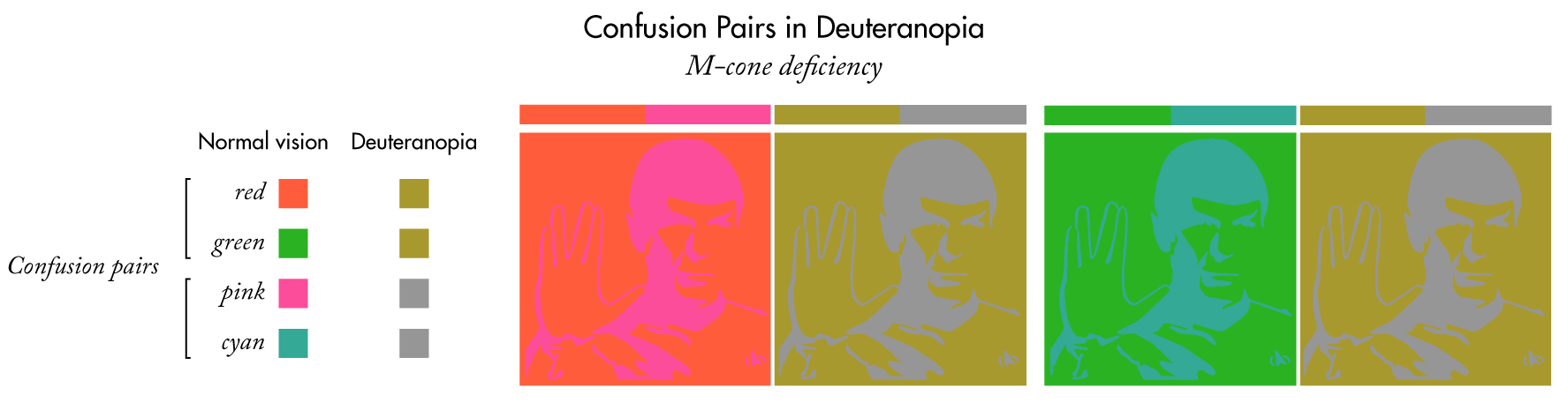
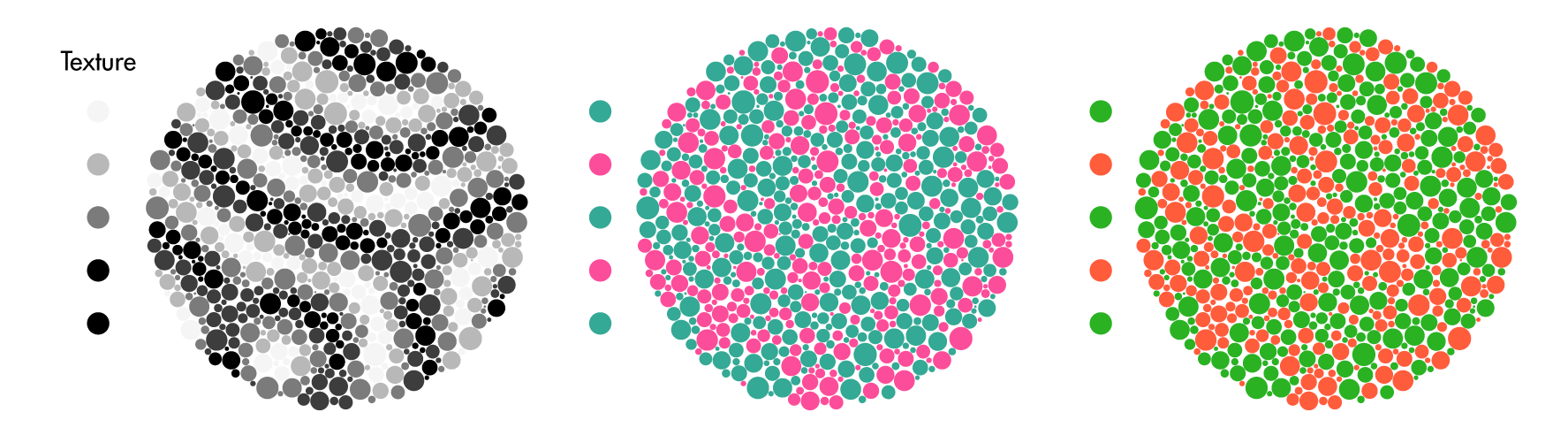
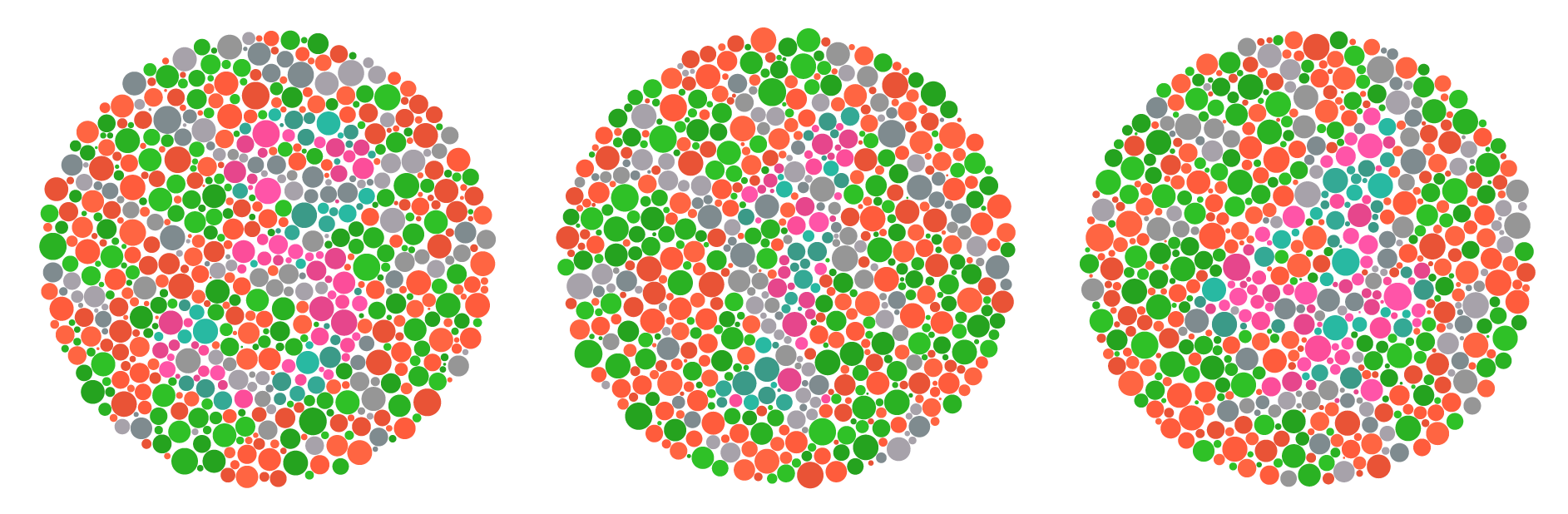
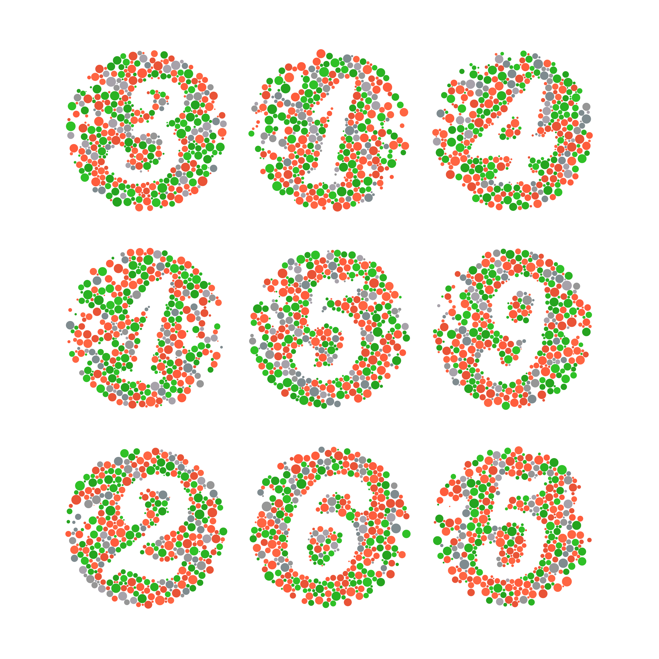
Let's pick three confusion colour pairs for deuteranopia.
Pink/cyan colours map onto grey, rose/blue map onto blue, and red/green colours map onto yellow,
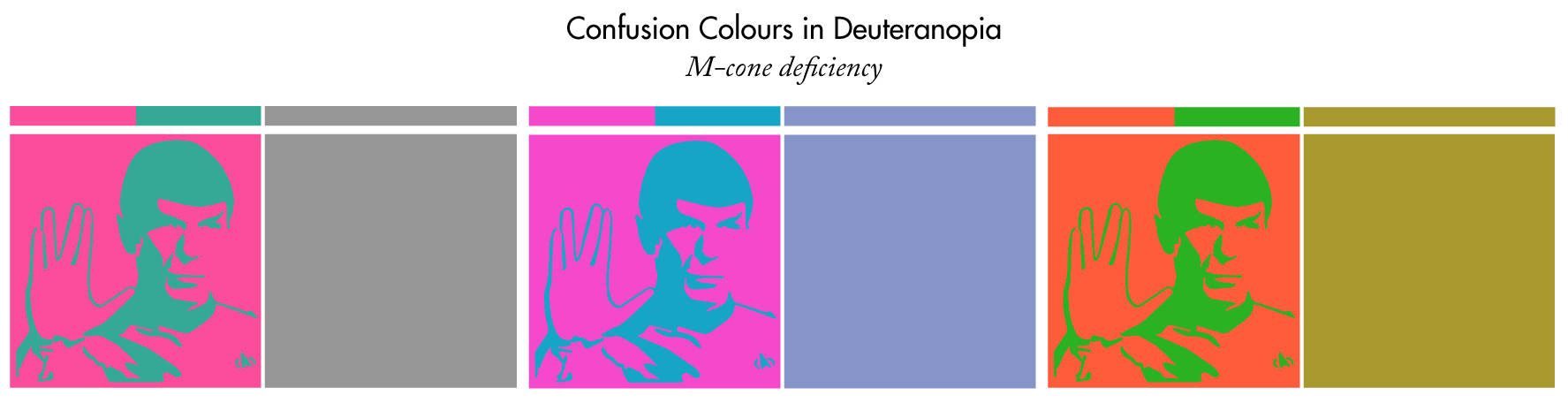
At this point we can make an observation that will be the basis of how this year's `\pi` Day art was created: yellow and grey are quite different but the red/pink and green/cyan pairs are relatively similar to someone with normal vision.
By using one colour from each pair we can create an image that's discernable to someone with deuteranopia but vexing to look at for someone with normal colour vision.
For the rest of this page, when I mention colour blindness assume deuteranopia, unless otherwise specified.
Now that we've seen what confusion color pairs look like next to each other, we can now start creating patterns that will be hidden to people with normal vision but discernable by those with colour blindness.
The effect is subtle. I've spent a lot of time figuring out how to tune this process to create as much confusion for the normal eye and as little confusion to the colour blind eye.
I'm not colour blind, but I can use colour blindness simulations to show me what the art will look like to someone with colour blindness.
YMMV, depending on your committment to seeing a pattern or the severity of your colour deficiency.
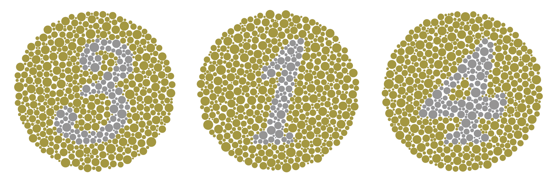
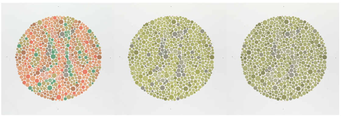
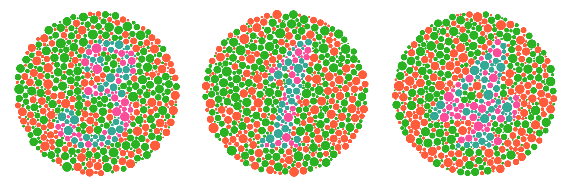
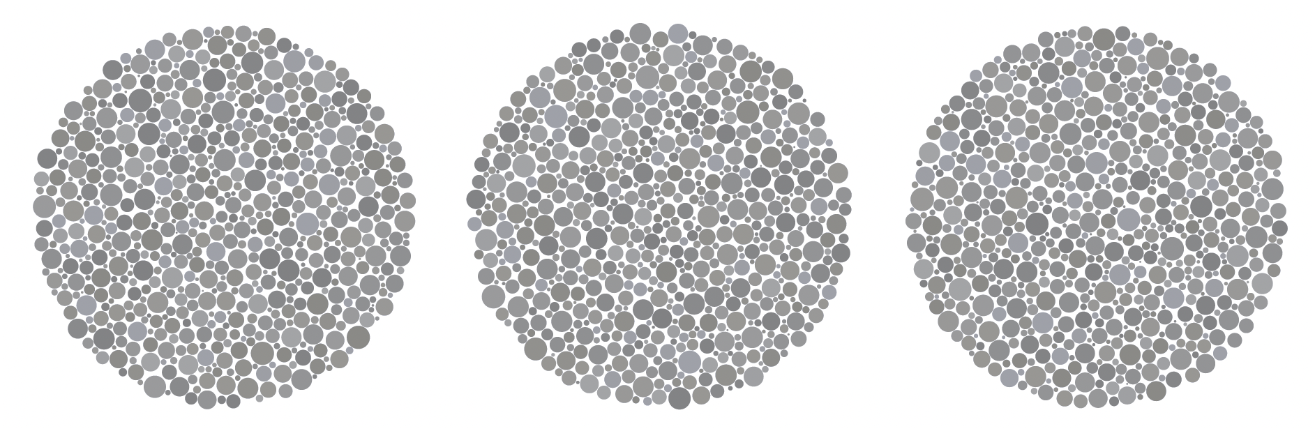
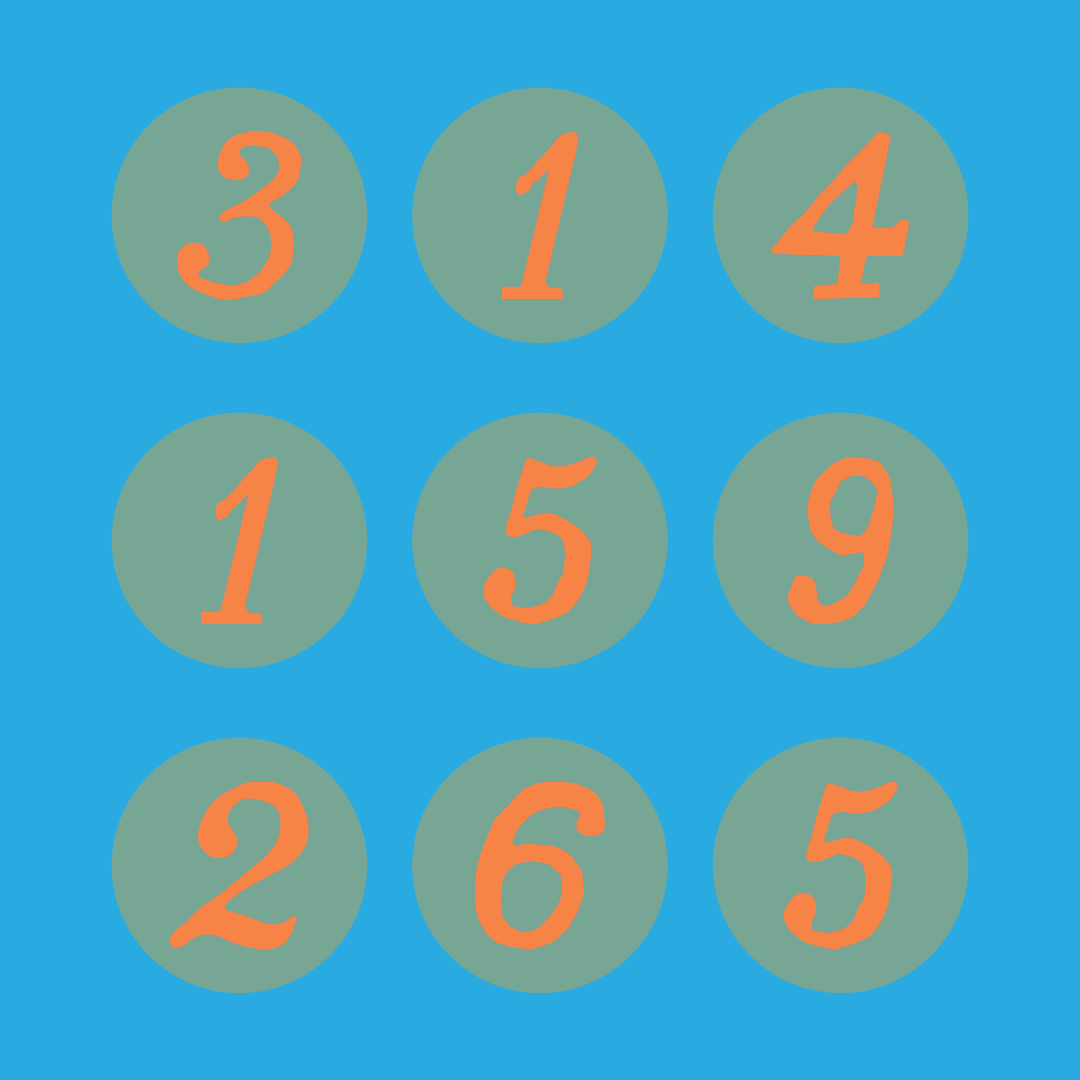
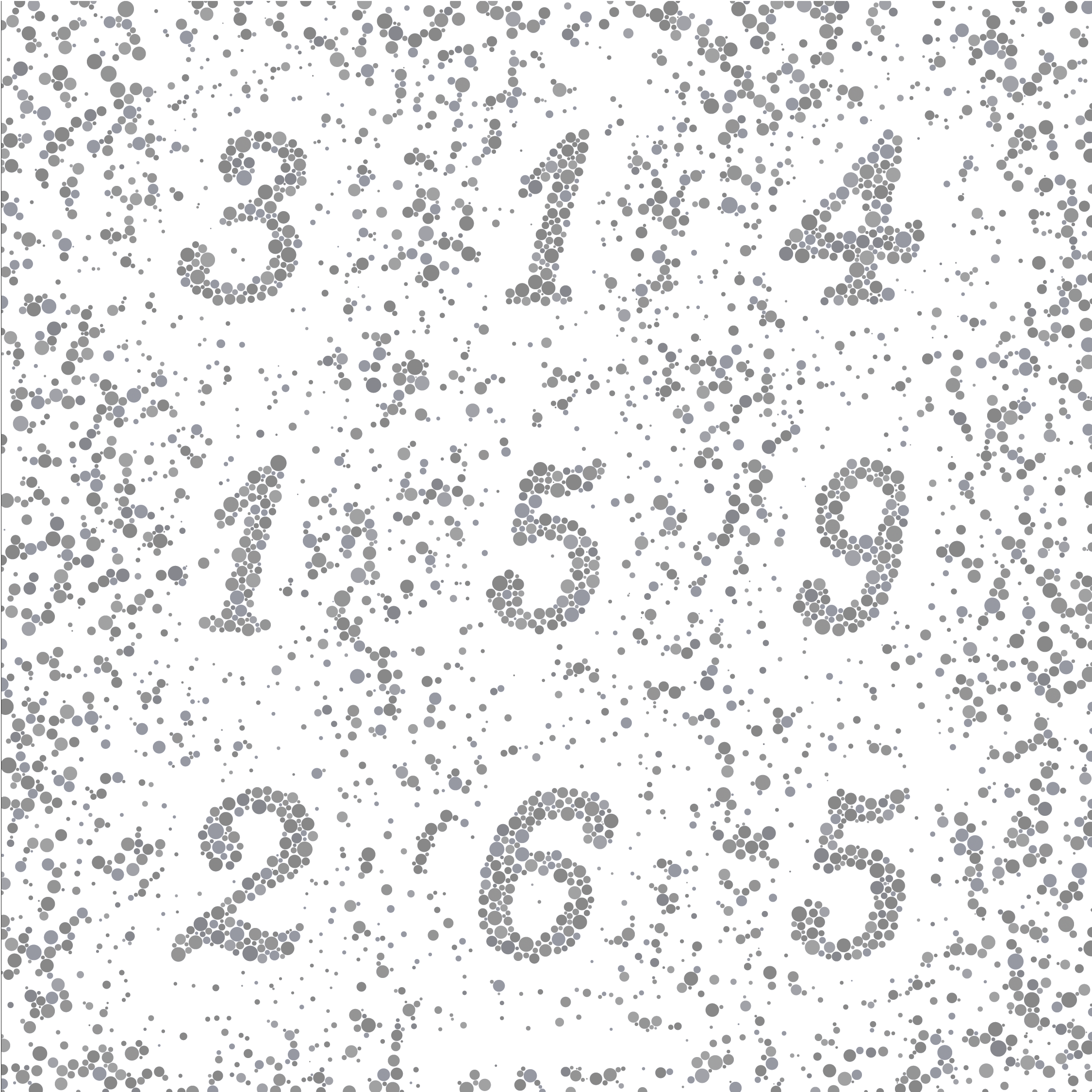
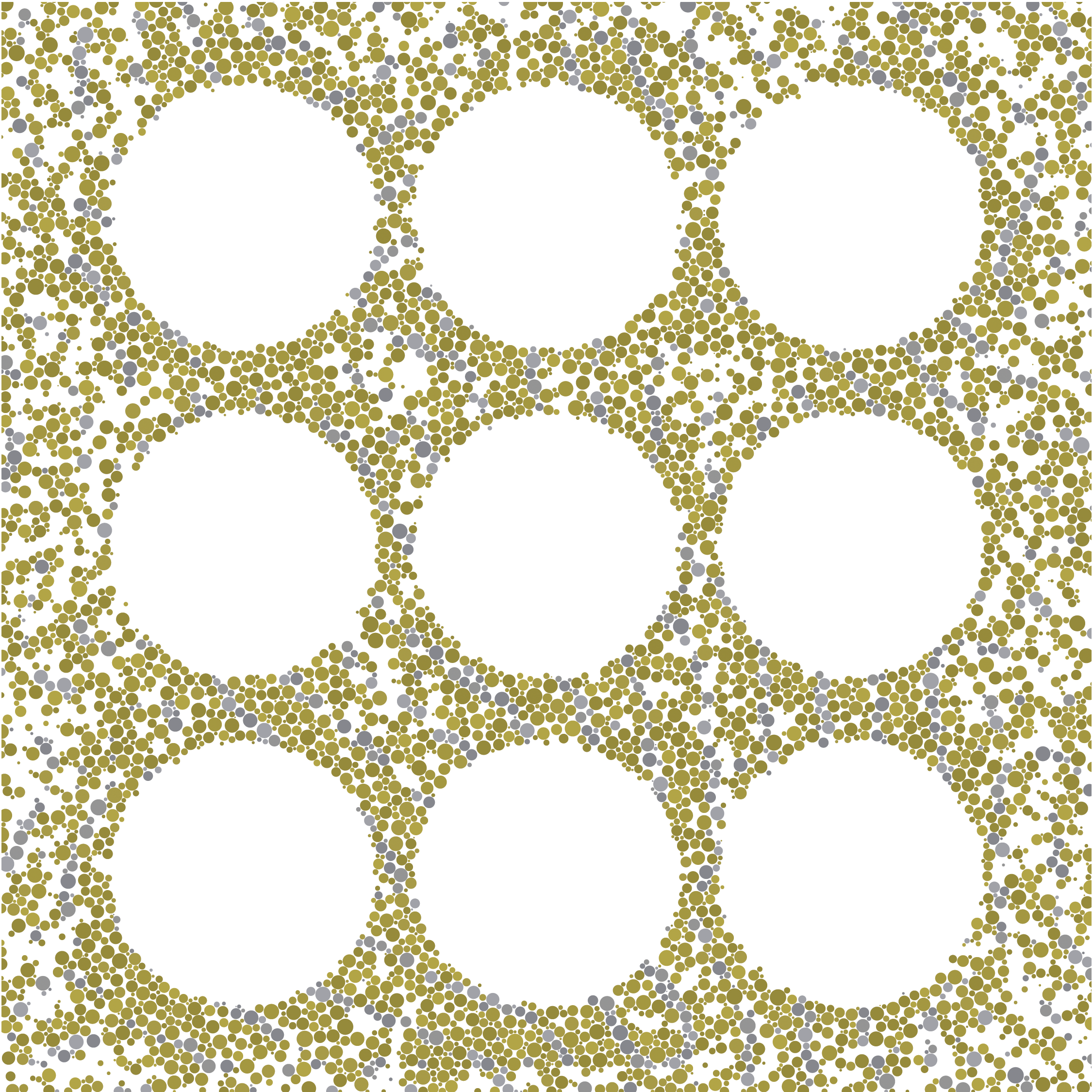
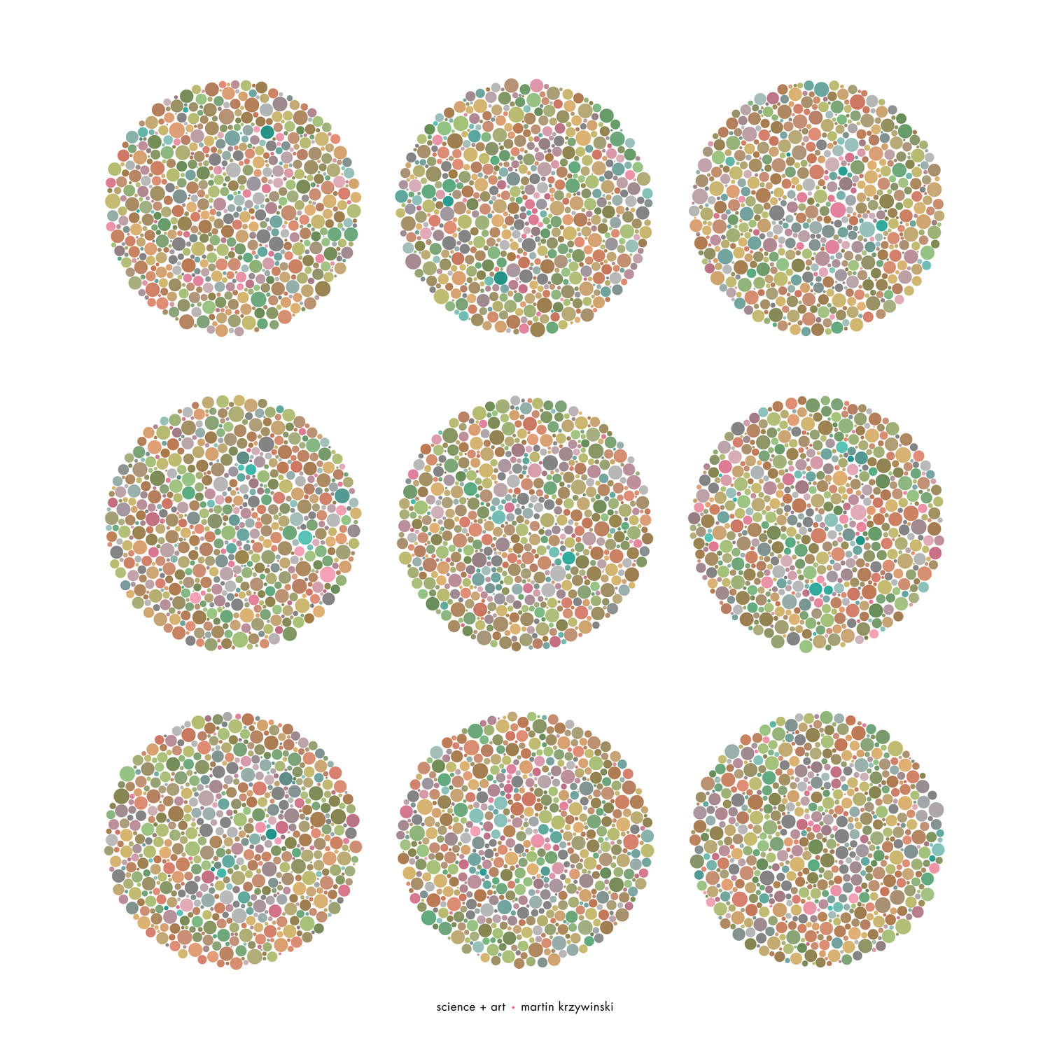
Let's start with a reference image in which the digits are visible to everyone.
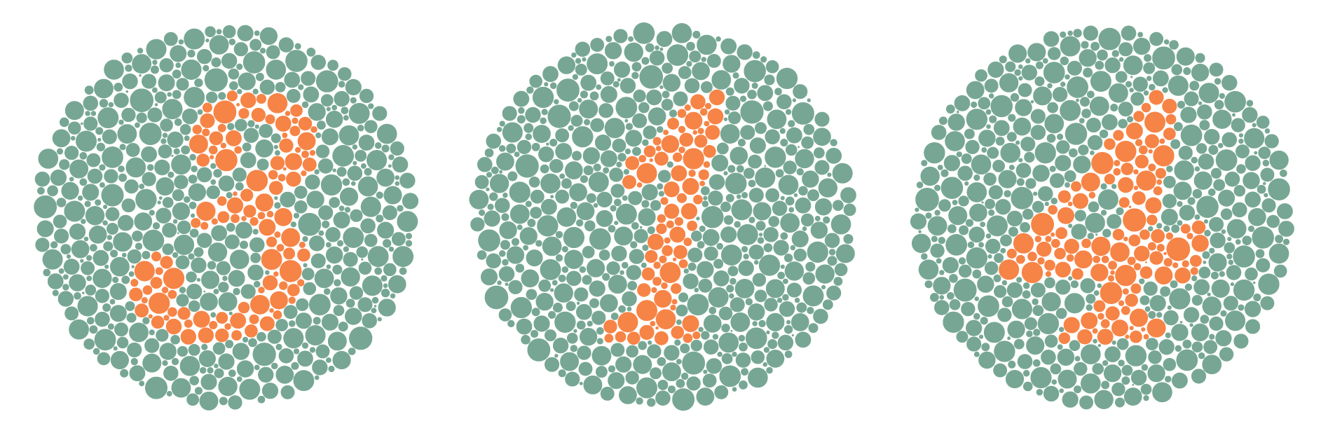
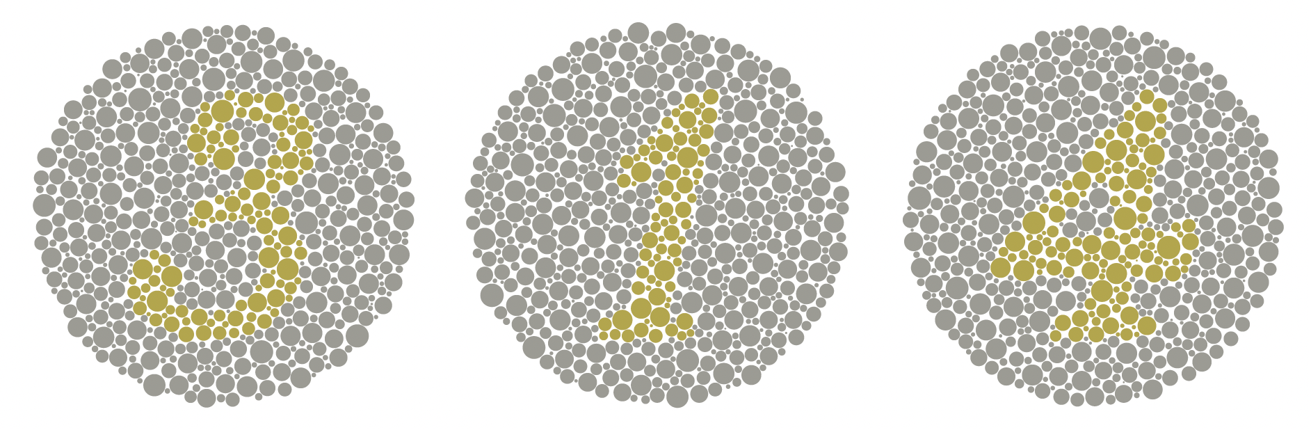
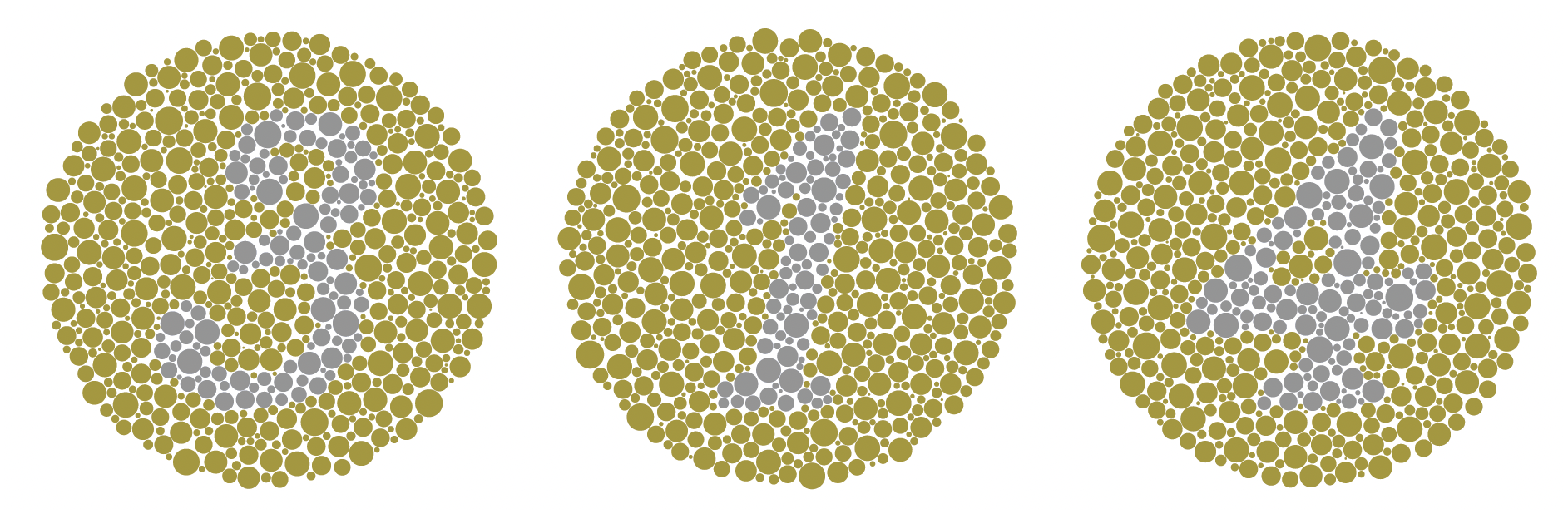
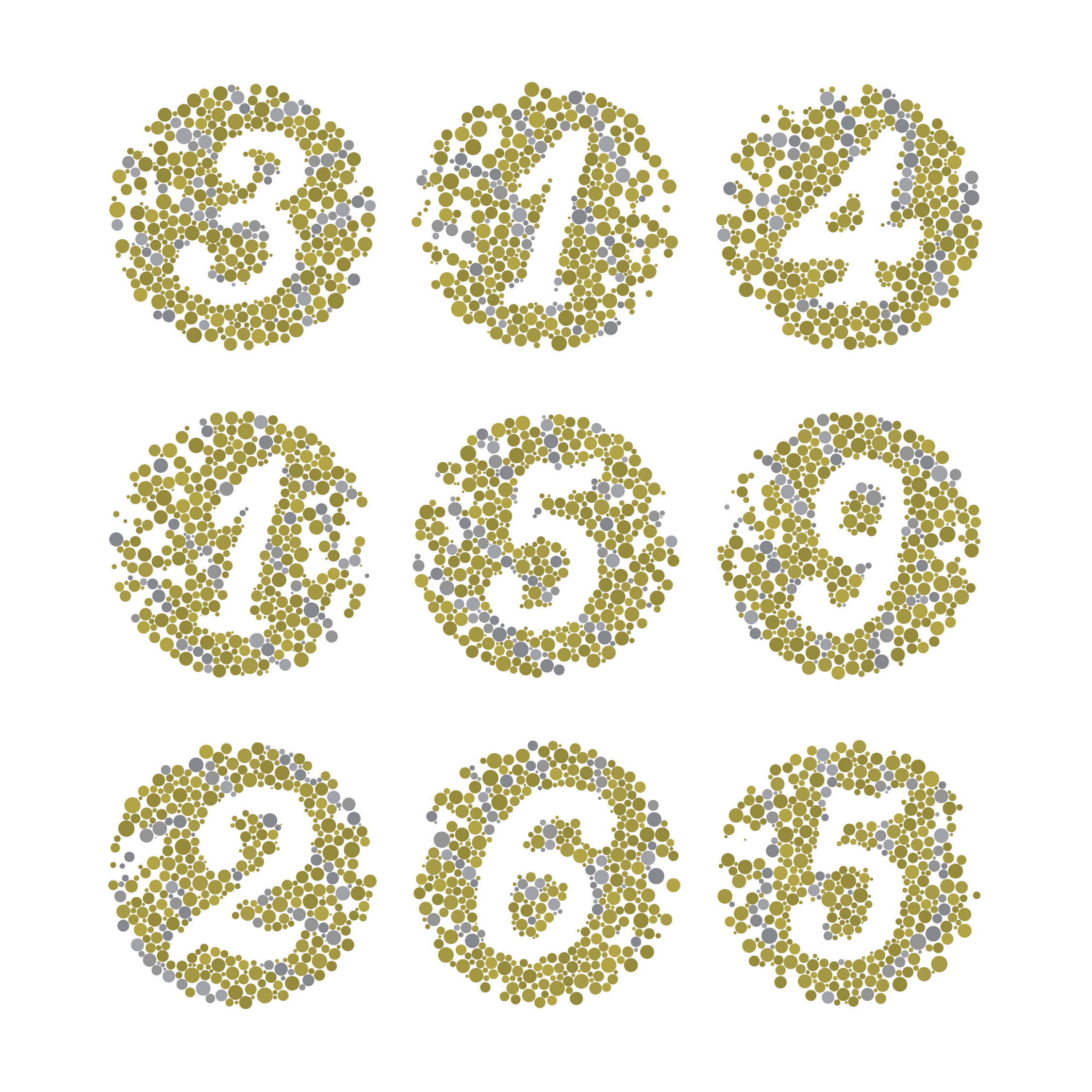
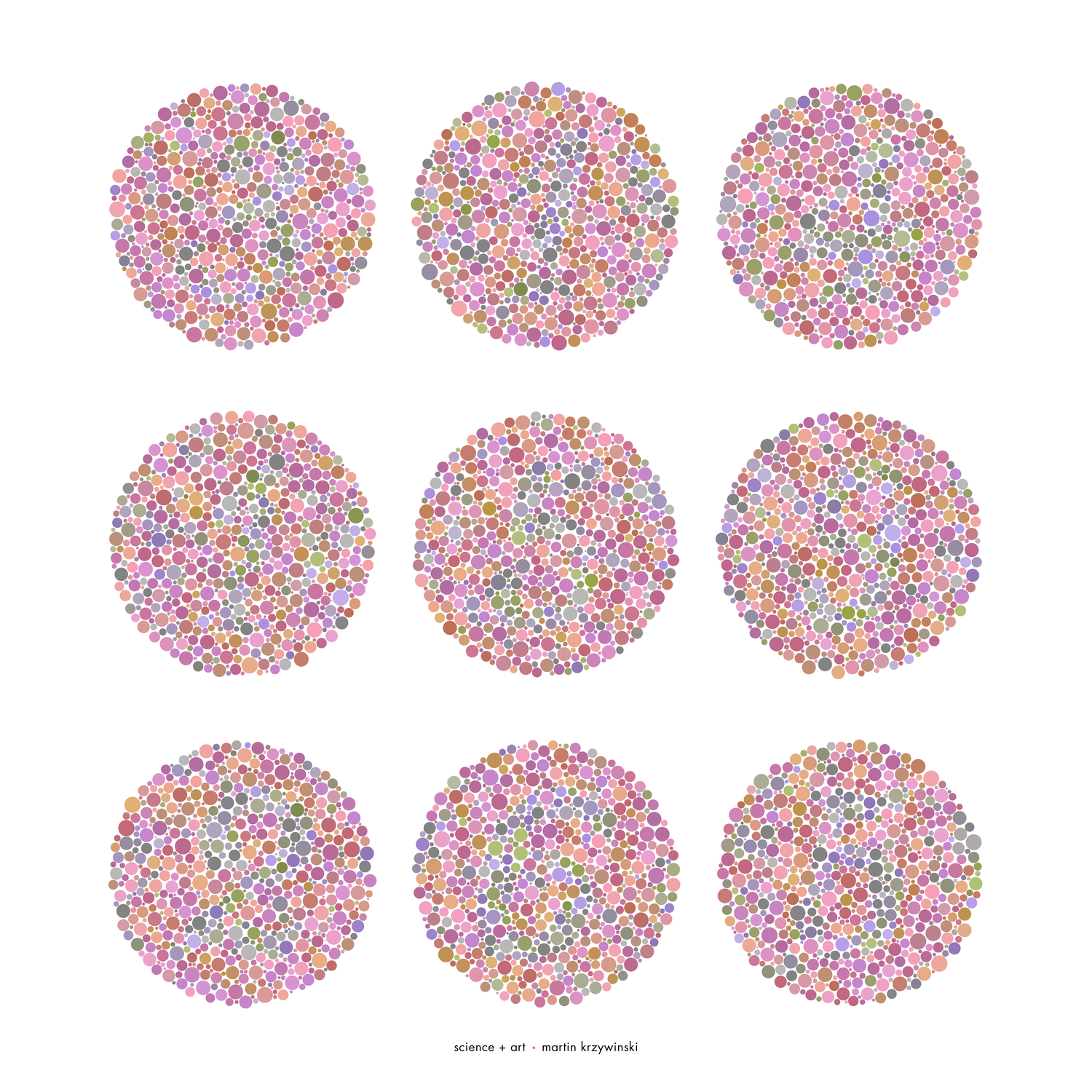
The first row of plates is how they look to someone with normal colour vision. The second row simulates deuteranopia.
If you can't see a digit, then you have achromatopsia, a very rare condition in which the eye has no colour perception whatsoever.
I've previously photographed and analyzed the size distribution of circles on Ishihara test plates.
All the art reflects this distribution and plates are sized to reflect Ishihara test plates, which are 9 cm in diameter.
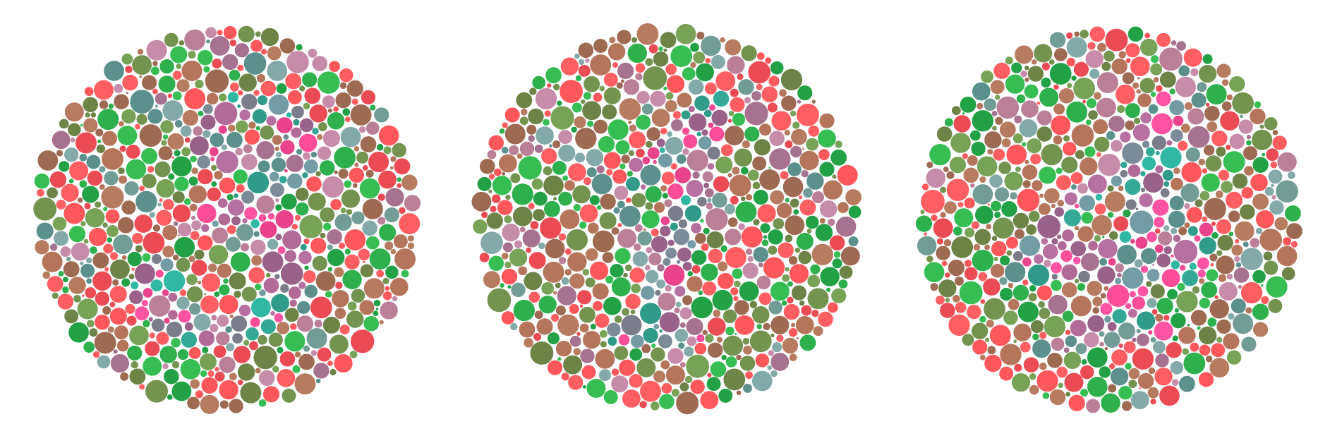
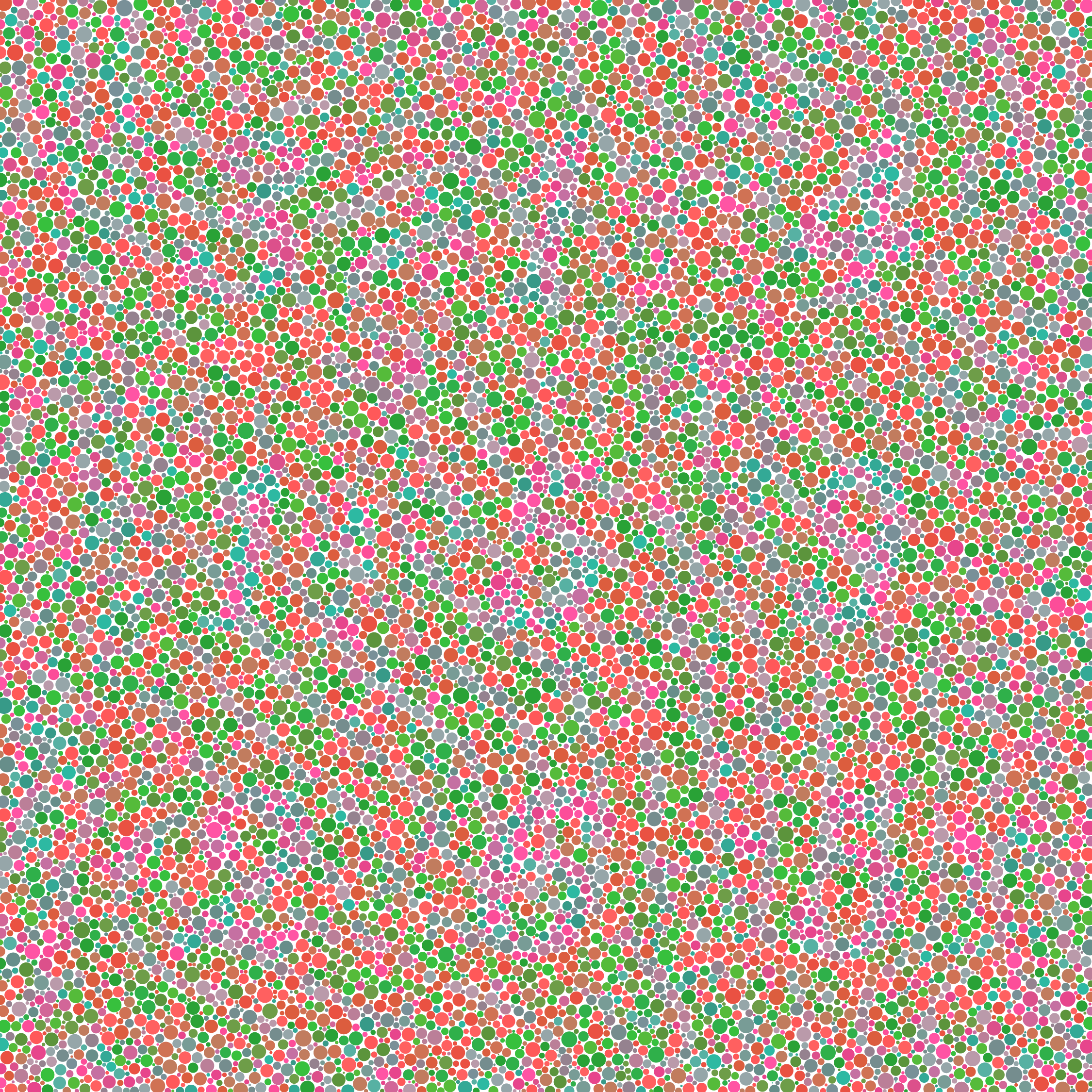
If we use the green and green-cyan pair for our test plates, the digits take their first steps towards disappearing for someone with normal colour vision.
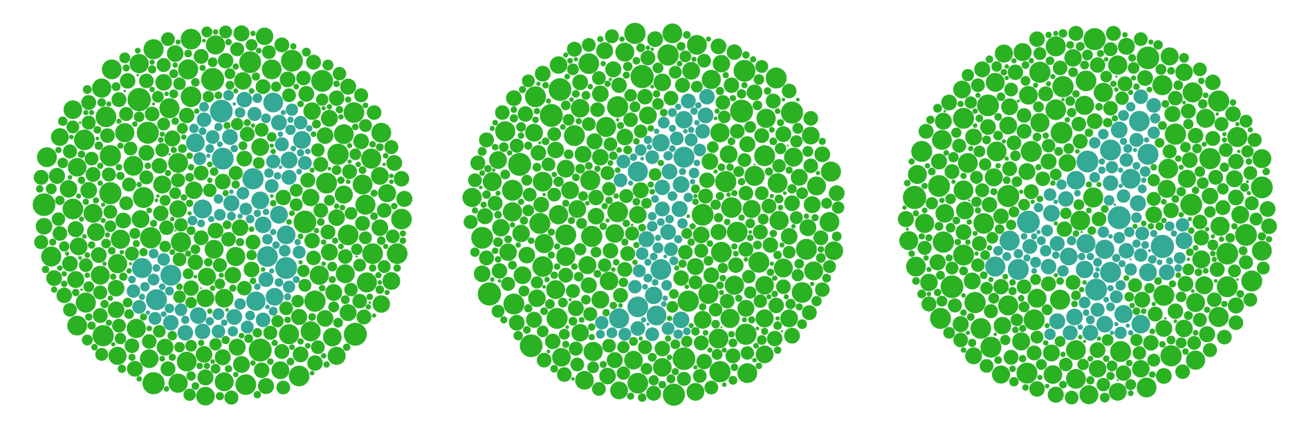

The same thing happens when we use the red and pink pair.
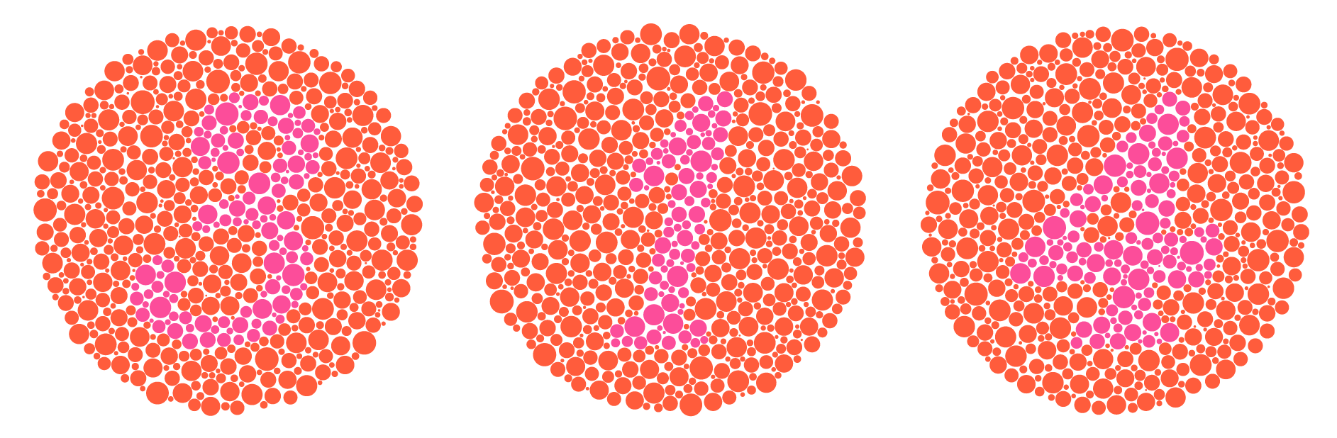
Since (red,green) and (pink,cyan) are confusion colour pairs, we can use one pair for the background of the plate and another for the digit of the plate and the deuteranope will not know the difference.
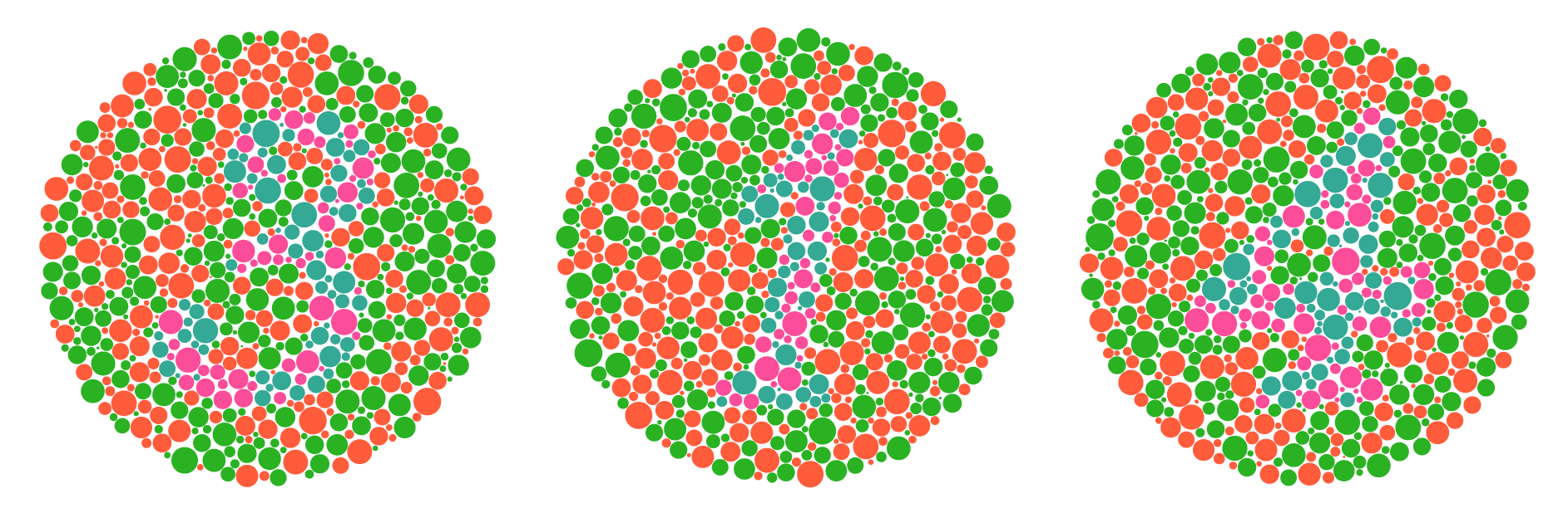
We're taking our first real steps towards hiding the digits from normal eyes.
In the above example, the colours were sampled randomly within each pair. In other words, a given dot in the background (or digit) had the same chance to be red or green (pink or cyan).
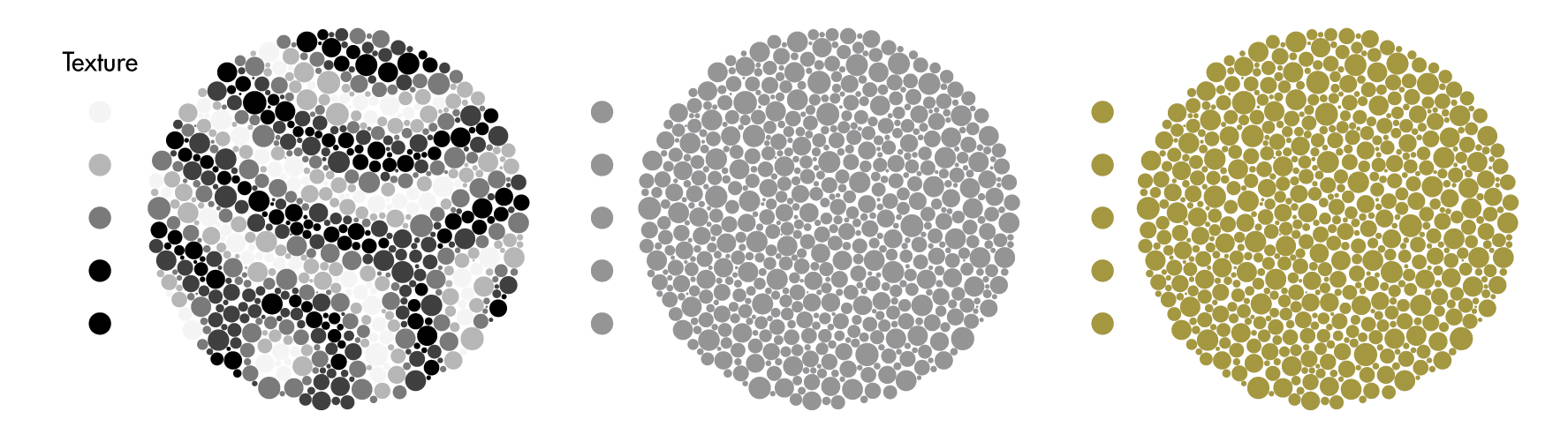
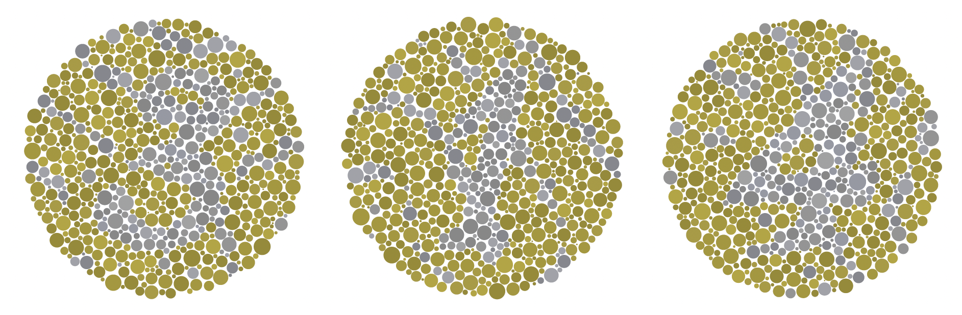
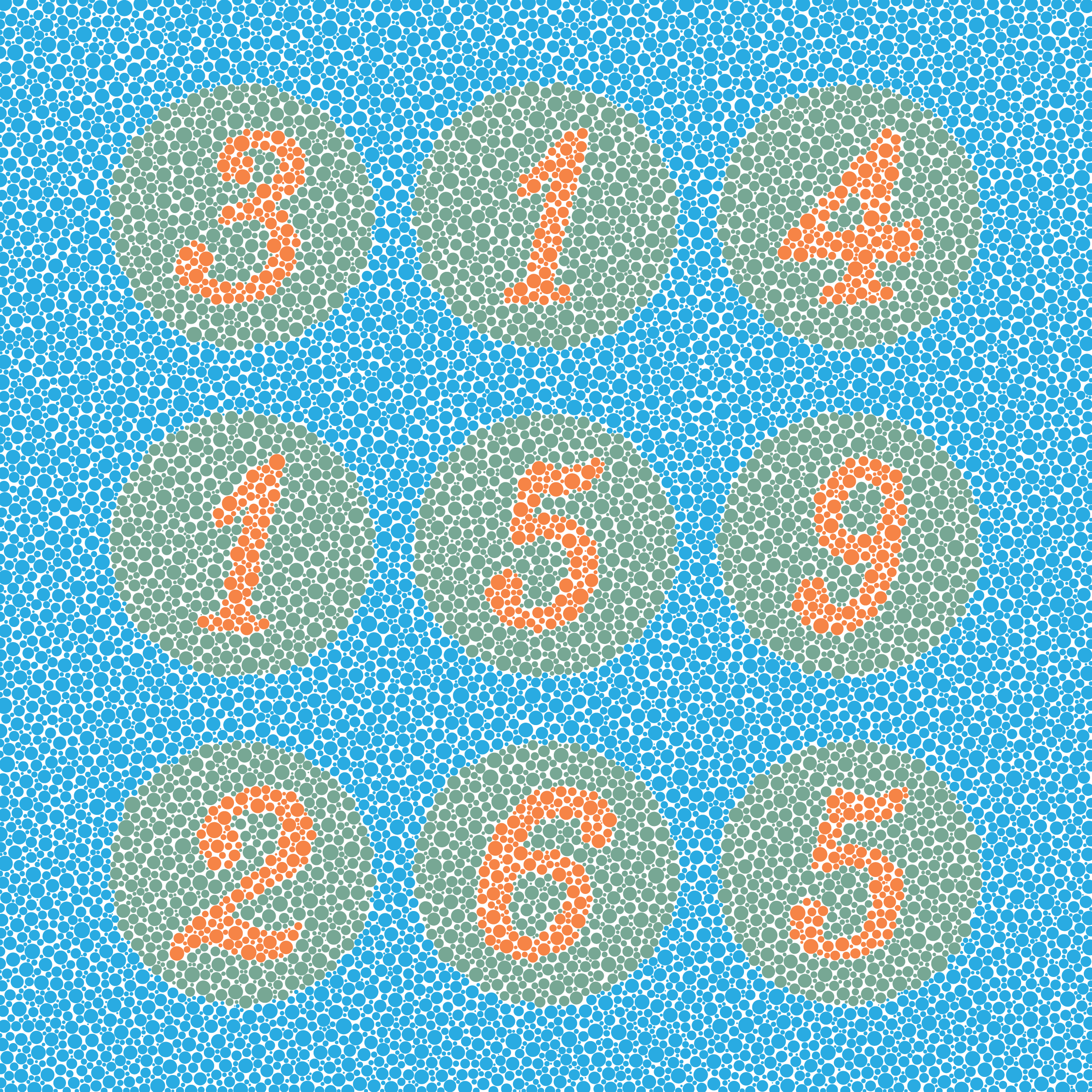
For his hidden plates, Ishihara grouped colours into stripes — this helped confuse the normal eye.
I've taken this idea and implemented it by using a 5-tone texture generated from a reaction-diffusion pattern. to assign each dot one of 5 tones.
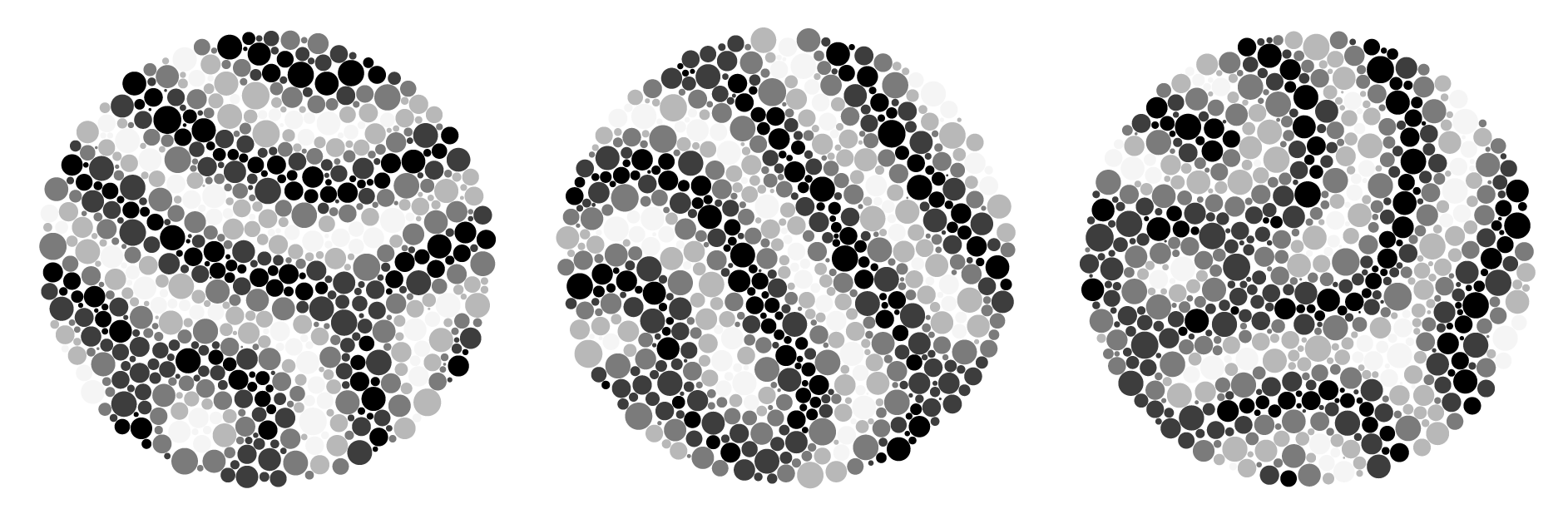
Each dot now has two properties: group (digit, background) and texture level (0–4).
Let's make a very simple mapping between texture and color that alternates the colors between adjacent levels of texture tone.
Here's what our digit test plates look like once we've gone from random colour selection to selection based on the texture tone.

The texture pattern does not repeat across the artwork — each panel will have a different arrangement of colours.
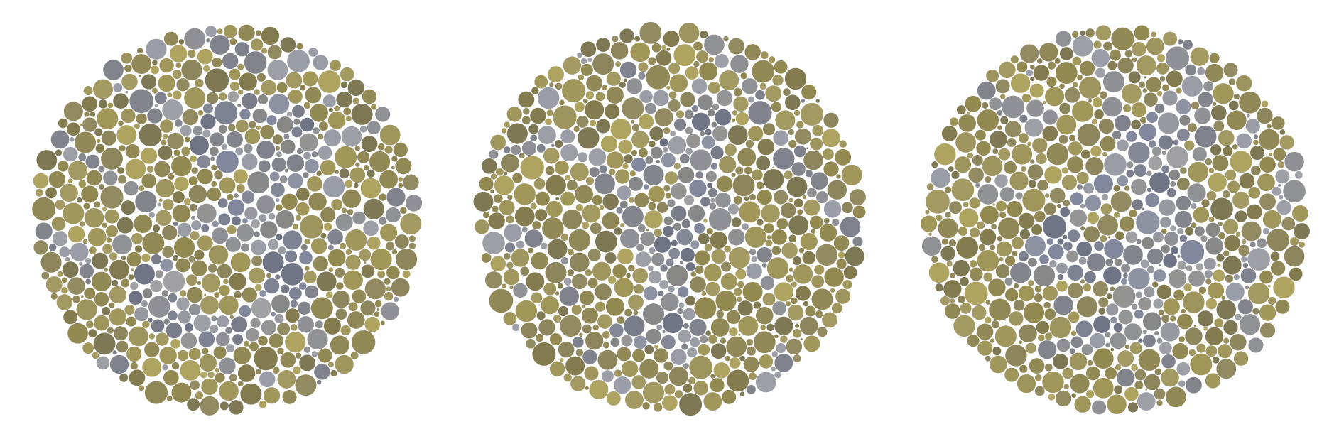
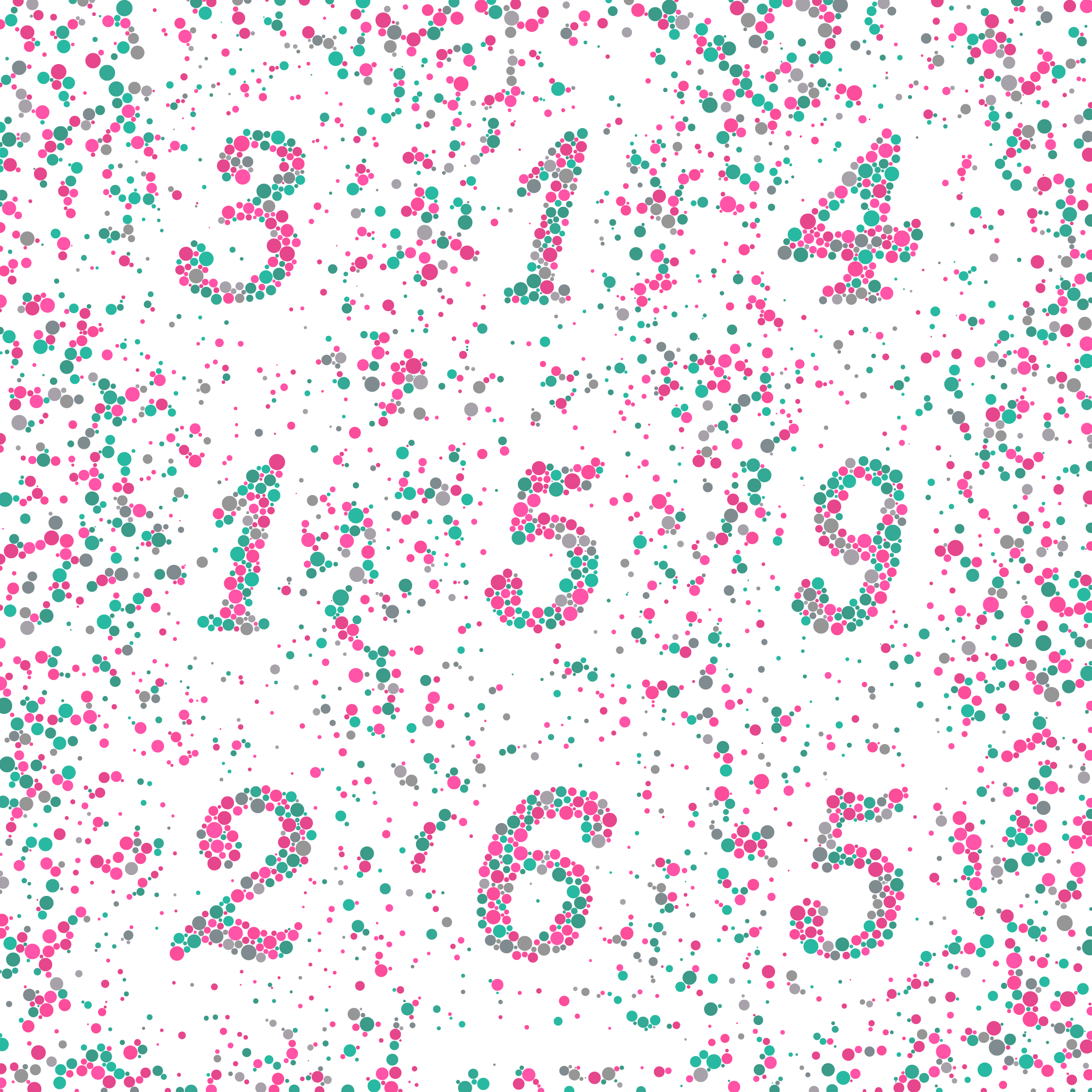
To confuse the normal eye even more, let's map one of the texture tones onto its colourblind equivalent.
We'll use the grey mapped to by pink/cyan. This will take the colors that previously appeared only within the digit and spill them onto the rest of the plate.
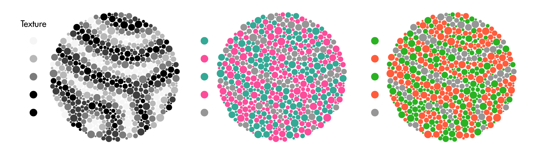
The grey now does a good job in breaking up the shape of the digit. The normal eye is going to be more confused by this than the deuteranope, who will see a grey digit on a background of yellow and with grey stripes.
In this example, there's quite a lot of grey dots outside of the digit. In the final art I apply a probability to this effect. For example, dots outside the digit that correspond to texture level 4 have a 33% of being grey.
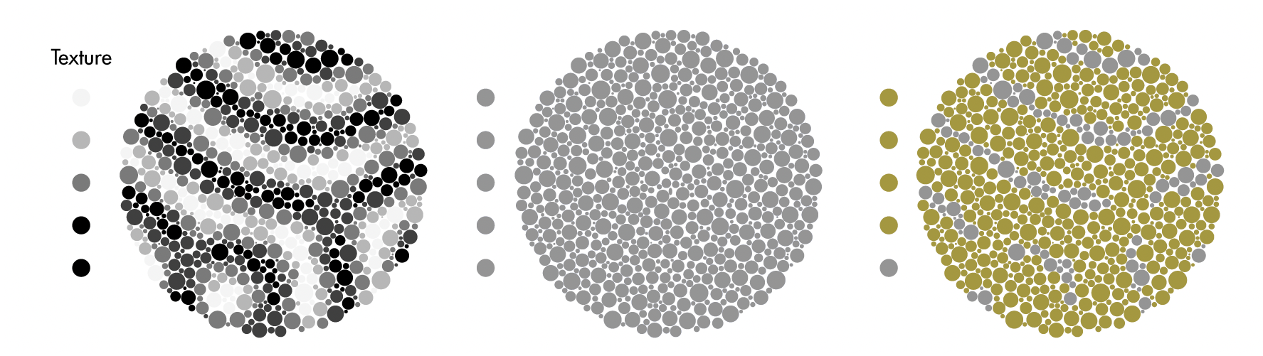
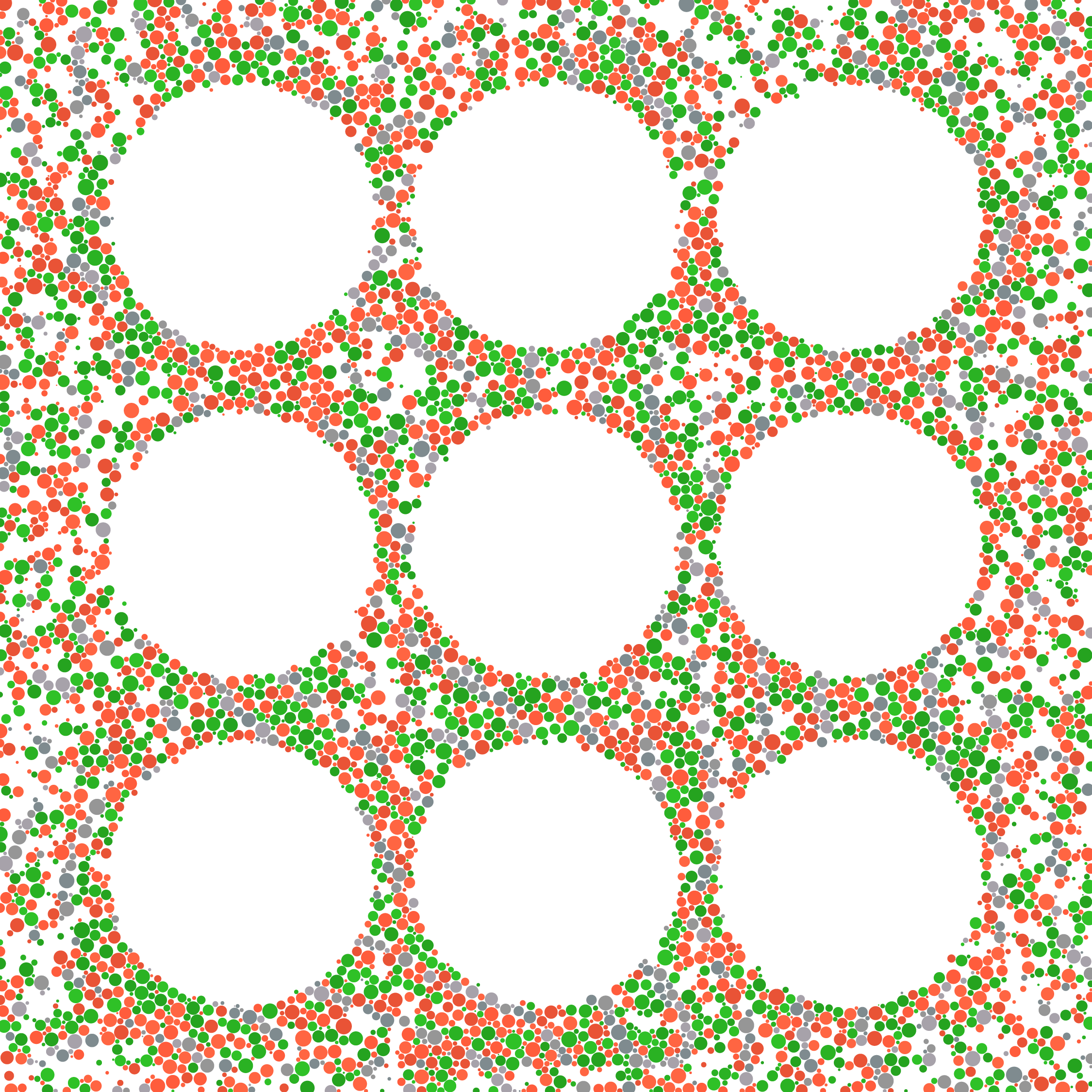
We can work even harder to confuse the normal eye by continuing to add colours (and patterns) seen (only) by the normal eye.
One way to do this is to vary the luminance (perceived brightness) and chroma (saturation) for each dot. This breaks up the lines of the digit even more.
Finally, it would be very useful to have is a single tuning parameter that hides the digits from everyone, but more so from the normal eye.
To do this, I've generated another set of dots that use the digit confusion pair (pink/cyan), with mild luminance and chroma differences.
These dots act like a filter. If they are placed on top of the test plate with 100% opacity, the digits completely disappear.
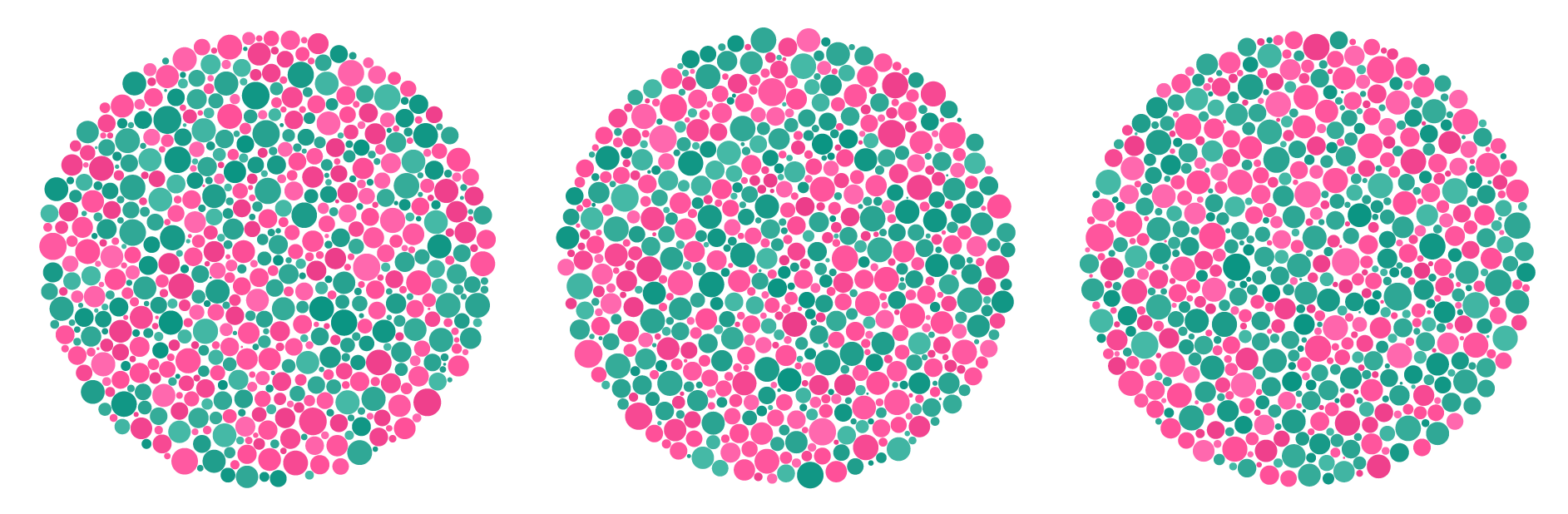
If the filter is applied at (for example) 35% opacity, we will be able to see the underlying pattern, though with more difficulty. This has the effect of adding in some browns and purples for the normal eye.
In the above example the filter was combined with the dot colour in a simple way. Regardless what the dot colour underneath was, the filter's dot was placed on top with 35% opacity.
Below, I adjust this scheme so that the resulting colour depends on the luminance of the dot. The filter strength is maximum for dots with `L = 60` and the strength linearly decreases to 0 outside the interval `L = [50,70]`.
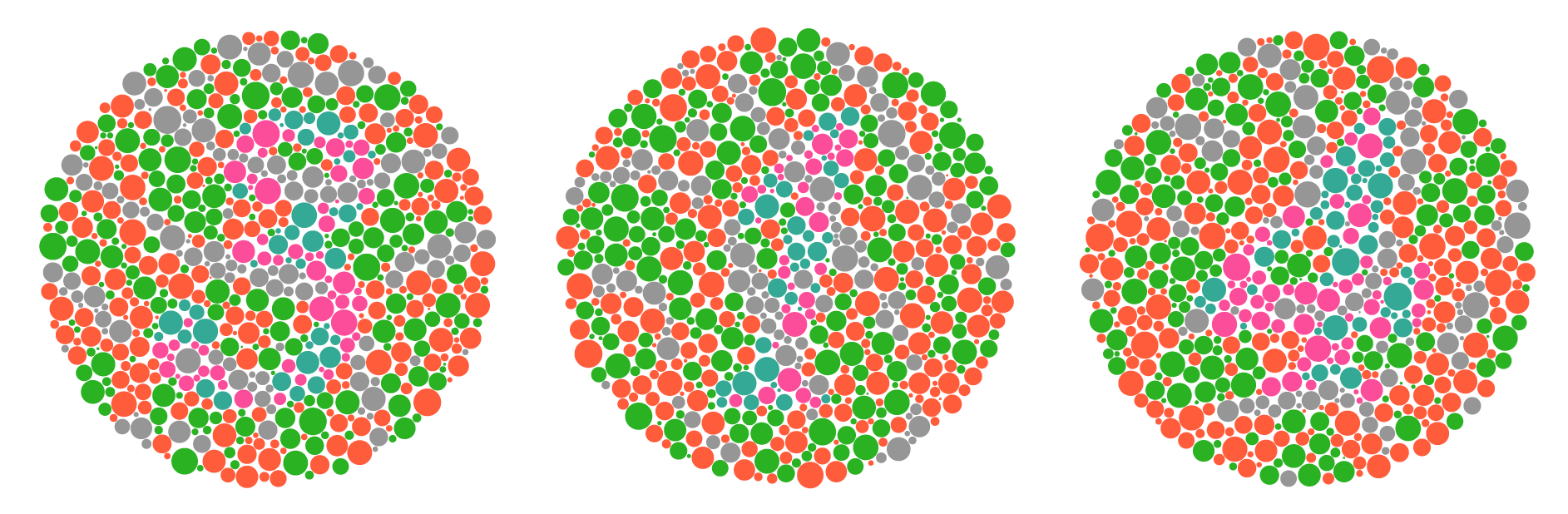
The art starts as a bitmap with three regions: digit, plate, and background. The output is designed to be printed at a specific size so that the panels and dot size distribution mimicks actual Ishihara test plates.
Let's color some of the panel and background dots with the colors used for the digit. This is done by randomly changing the classification of a dot from panel to digit (or background to digit) based on a probability that increases up to some maximum (e.g., 50%) with distance to the nearest digit dot.
With this scheme, plate dots that are near digit dots will not have their color flipped, which would make the digit shape hard to discern. I played around with various probabilities and distance cutoffs.
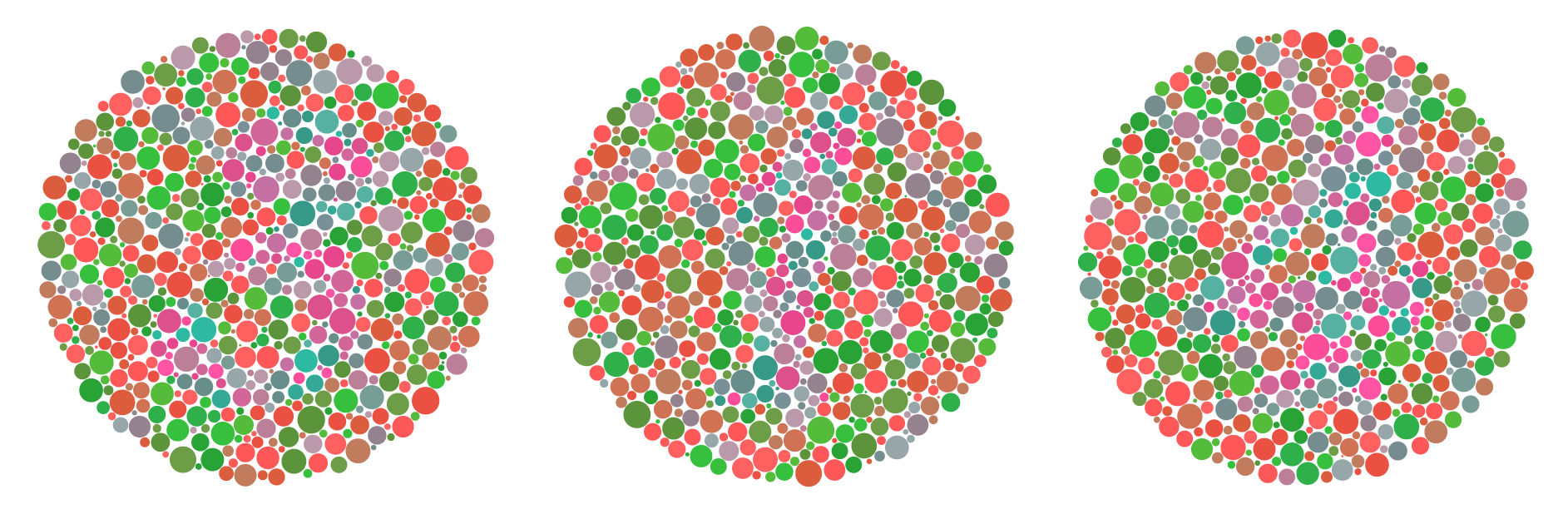
Here's the first take of the full piece that makes use of all the steps described above.
Now that I've walked you through the essentials of the method, I'll briefly go into some of the additional adjustments that are included in the creation of the final art pieces.
In the example above, I used color confusion pairs: pink/cyan and red/green. But, as I mentioned, confusion colors exist on lines of confusion and we are not limited to choosing a pair of confusion colors. We can pick as many as we want (with diminishing returns).
Below I show the equivalent colors for deuteranopia. All colors in a given row will be perceived in the same way by a deuteranope. You can think of the row as a kind of line of confusion, though real lines of confusion are defined in a specific color space.
These equivalent colors were generated useing the method by Viénot, Brettel & Mollon, 1999, which I describe in detail on my math of colour blindness pages.
In general, colour blindness simulations vary slightly, particularly in the luminance of the output.
The actual color selection for the art is a little more complicated than what I show above, though it follows the same principle.
Let `r_i` be the reference color (as seen by the colour blind person) and `e_i` be the set of corresponding confusion colors, where `i=0` for pink/cyan and `i=1` for red/green.
Next, divide up the line of confusion into `j=1..5` equal-sized bands. For example, the color set `e_{ij} = e_{01}` is all the equivalent colors from the first band (`j=1`) of the pink/cyan line of confusion (`i=0`).
Using this scheme, I select 3 colors from each `e_ij` set at luminance `L= 55,60,65,70,75`.
For each region on the canvas (digit or panel/background), I create a large set of colors composed of the smaller sets `e_ij` of equivalent (or reference) colors according to this scheme for each texture tone:
0 `r_0,r_0,r_0,r_0,e_{12}`
1 `r_0`
2 `e_{02},e_{02},e_{02},e_{02},e_{13}`
3 `e_{04}`
4 `e_{01},e_{01},e_{01},e_{05},e_{05},e_{05},e_{14}`
0 `e_{11},e_{11},r_0`
1 `e_{12},e_{12},r_0`
2 `e_{13}`
3 `e_{14}`
4 `e_{15}`
For example, digit dots for texture tone `0` are drawn from `r_0` (grey reference) and `e_12` (band 2 of red/green line of confusion) with a `4:1` probability ratio (this is why `r_0` appears 4 times in the list).
You can see that I sometimes use colors from the red/green confusion lines in the digit (`e_{1j}`) to subtly disturb the pattern of the digit.
Finally, I normalize all the colors to be within luminance `L \in [50,75]` and chroma `C \in [30,40]`.
There's nothing magical or specific about these particular settings. I tweaked the values until I found something that was hard to see.
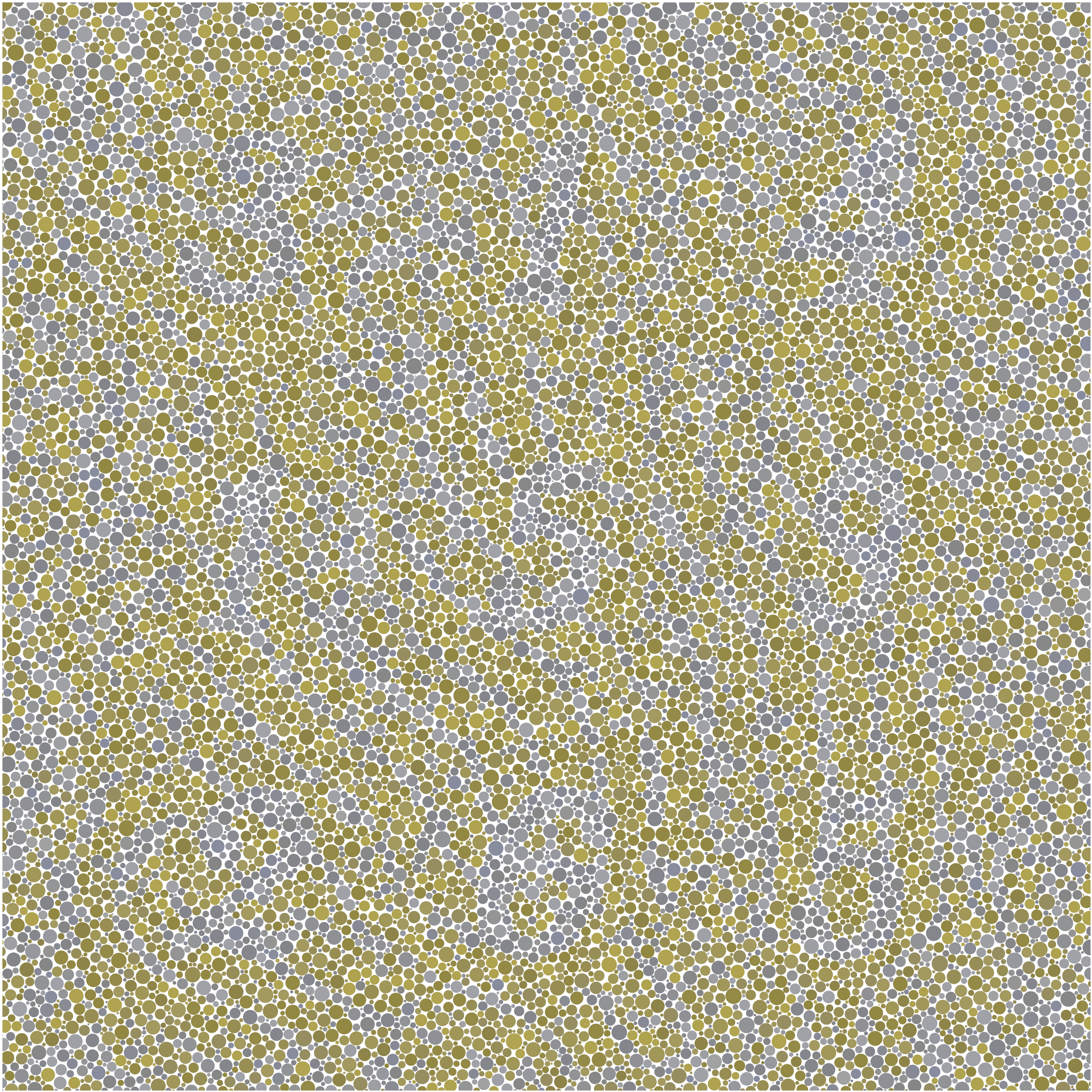
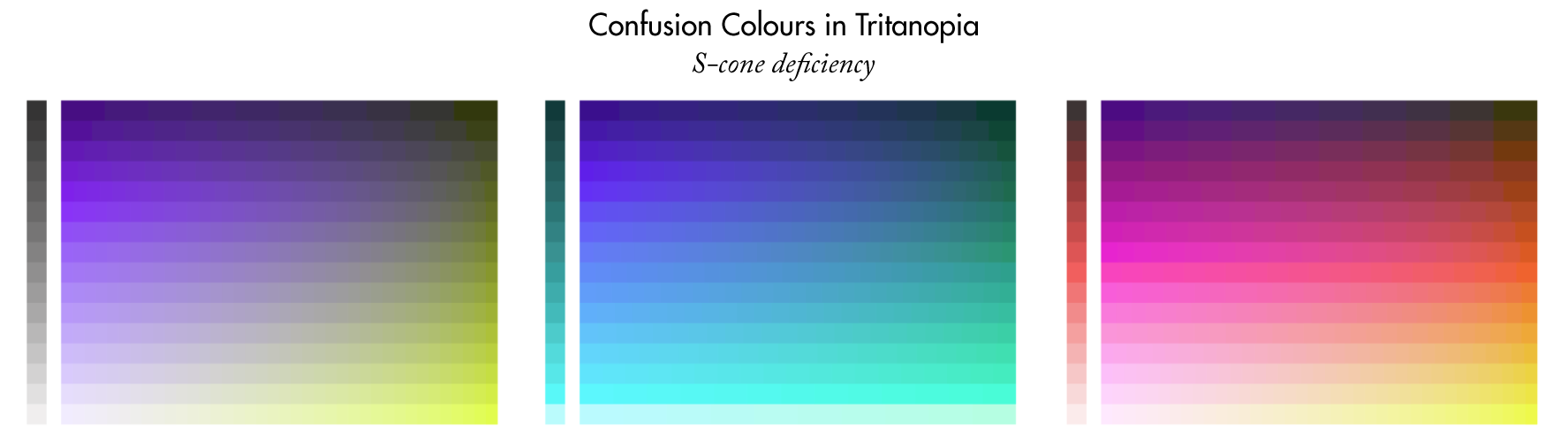
So far, I talked about creating art based on deuteranopia. But what about protanopia or tritanopia?
Protanopia is fairly similar to deuteranopia since the absorption spectra of M-cones and L-cones largely overlap.
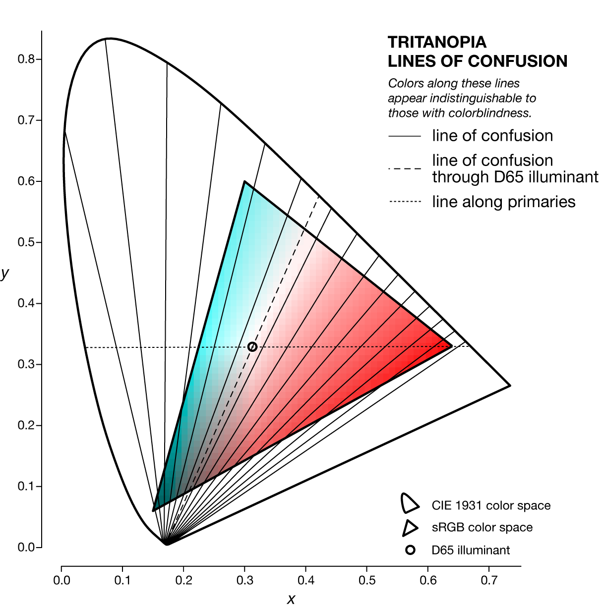
Tritanopia is interesting because the the lines of confusion are quite different than for deuteranopia and protanopia. Recall that protanopia and deuteranopia lines of confusion are similar because the L-cones and M-cones absorption spectra largely overlap.
The S-cones, affected in tritanopia, on the other hand,
Recall that in deuteranopia the pink/cyan and red/green lines had similar colors, and that's why we were able to confuse the normal eye.
The tritanopia lines are purple/yellow, blue/cyan, and pink/red/yellow.
Nature Biotechnology cover
My cover design on the 7 April 2026 Nature Biotechnology issue shows the dendrogram that represents a cluster of uniquely expressed (or downregulated) genes in human naive stem cells induced from such cells. Within each dendrogram block, the genomic barcode sequence (sampled from Supplementary Table 1) is depicted with a Code 39 barcode. The highlighted barcode is one of those used for cell isolation.
Ishiguro S. et al. A multi-kingdom genetic barcoding system for precise clone isolation (2026) Nature Biotechnology 44:616–629.

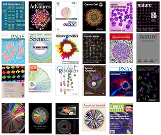
Browse my gallery of cover designs.
Happy 2026 π Day—
Art for the 5%
Celebrate π Day (March 14th) and enjoy the art — but only if you're part of the 5%.
Go ahead, see what you can't see.

Ishihara's Tests for Colour Deficiency
Authentic and accurate images of Ishihara's test plates photographed (and lovingly color-corrected) from the 38-plate Ishihara's Tests for Colour Deficiency.
I also provide the position, size, and color of each circle on each test plate.


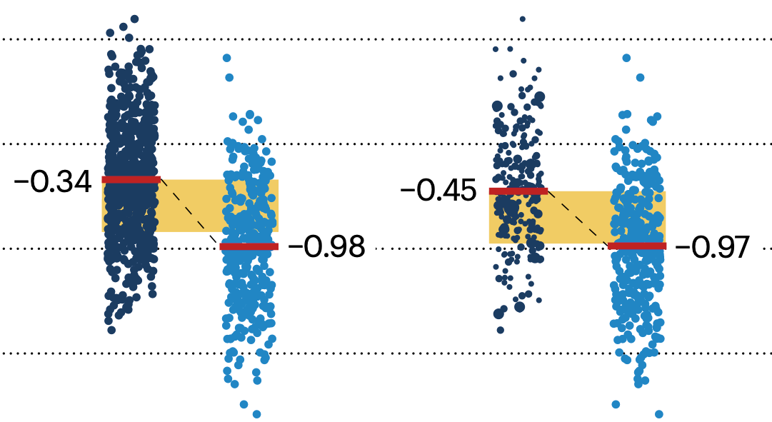
Symmetric alternatives to the ordinary least squares regression
What immortal hand or eye, could frame thy fearful symmetry? — William Blake, "The Tyger"
This month, we look at symmetric regression, which, unlike simple linear regression, it is reversible — remaining unaltered when the variables are swapped.
Simple linear regression can summarize the linear relationship between two variables `X` and `Y` — for example, when `Y` is considered the response (dependent) and `X` the predictor (independent) variable.
However, there are times when we are not interested (or able) to distinguish between dependent and independent variables — either because they have the same importance or the same role. This is where symmetric regression can help.

Luca Greco, George Luta, Martin Krzywinski & Naomi Altman (2025) Points of significance: Symmetric alternatives to the ordinary least squares regression. Nat. Methods 22:1610–1612.
Beyond Belief Campaign BRCA Art
Fuelled by philanthropy, findings into the workings of BRCA1 and BRCA2 genes have led to groundbreaking research and lifesaving innovations to care for families facing cancer.
This set of 100 one-of-a-kind prints explore the structure of these genes. Each artwork is unique — if you put them all together, you get the full sequence of the BRCA1 and BRCA2 proteins.

Propensity score weighting
The needs of the many outweigh the needs of the few. —Mr. Spock (Star Trek II)
This month, we explore a related and powerful technique to address bias: propensity score weighting (PSW), which applies weights to each subject instead of matching (or discarding) them.
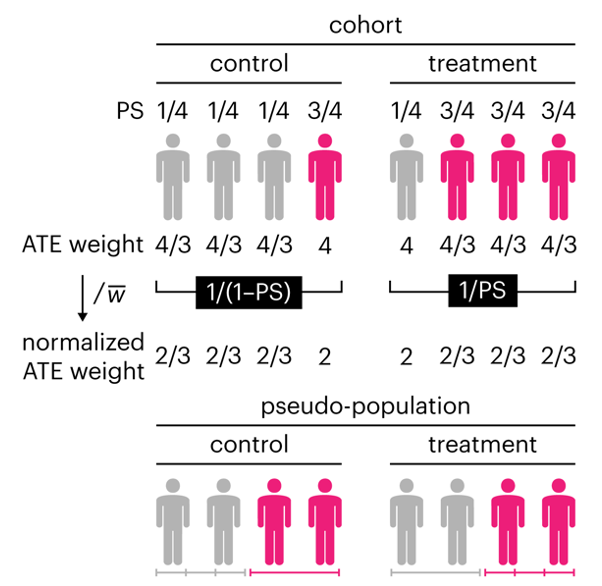
Kurz, C.F., Krzywinski, M. & Altman, N. (2025) Points of significance: Propensity score weighting. Nat. Methods 22:638–640.
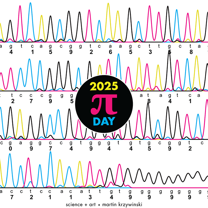
Happy 2025 π Day—
TTCAGT: a sequence of digits
Celebrate π Day (March 14th) and sequence digits like its 1999. Let's call some peaks.
Crafting 10 Years of Statistics Explanations: Points of Significance
I don’t have good luck in the match points. —Rafael Nadal, Spanish tennis player
Points of Significance is an ongoing series of short articles about statistics in Nature Methods that started in 2013. Its aim is to provide clear explanations of essential concepts in statistics for a nonspecialist audience. The articles favor heuristic explanations and make extensive use of simulated examples and graphical explanations, while maintaining mathematical rigor.
Topics range from basic, but often misunderstood, such as uncertainty and P-values, to relatively advanced, but often neglected, such as the error-in-variables problem and the curse of dimensionality. More recent articles have focused on timely topics such as modeling of epidemics, machine learning, and neural networks.
In this article, we discuss the evolution of topics and details behind some of the story arcs, our approach to crafting statistical explanations and narratives, and our use of figures and numerical simulations as props for building understanding.
Altman, N. & Krzywinski, M. (2025) Crafting 10 Years of Statistics Explanations: Points of Significance. Annual Review of Statistics and Its Application 12:69–87.
Propensity score matching
I don’t have good luck in the match points. —Rafael Nadal, Spanish tennis player
In many experimental designs, we need to keep in mind the possibility of confounding variables, which may give rise to bias in the estimate of the treatment effect.
If the control and experimental groups aren't matched (or, roughly, similar enough), this bias can arise.
Sometimes this can be dealt with by randomizing, which on average can balance this effect out. When randomization is not possible, propensity score matching is an excellent strategy to match control and experimental groups.
Kurz, C.F., Krzywinski, M. & Altman, N. (2024) Points of significance: Propensity score matching. Nat. Methods 21:1770–1772.
Understanding p-values and significance
P-values combined with estimates of effect size are used to assess the importance of experimental results. However, their interpretation can be invalidated by selection bias when testing multiple hypotheses, fitting multiple models or even informally selecting results that seem interesting after observing the data.
We offer an introduction to principled uses of p-values (targeted at the non-specialist) and identify questionable practices to be avoided.
Altman, N. & Krzywinski, M. (2024) Understanding p-values and significance. Laboratory Animals 58:443–446.