
 buy artwork
 buy artwork
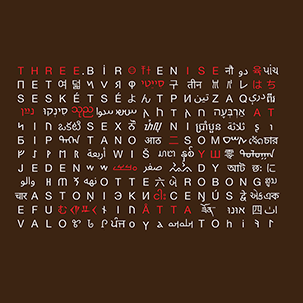
`\pi` Day 2018 Art Posters - Stitched city road maps from around the world


On March 14th celebrate `\pi` Day. Hug `\pi`—find a way to do it.
For those who favour `\tau=2\pi` will have to postpone celebrations until July 26th. That's what you get for thinking that `\pi` is wrong. I sympathize with this position and have `\tau` day art too!
If you're not into details, you may opt to party on July 22nd, which is `\pi` approximation day (`\pi` ≈ 22/7). It's 20% more accurate that the official `\pi` day!
Finally, if you believe that `\pi = 3`, you should read why `\pi` is not equal to 3.

And if you've got to sleep a moment on the road
I will steer for you
And if you want to work the street alone
I'll disappear for you
—Leonard Cohen (I'm Your Man)
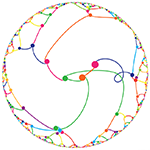
This year's is the 30th anniversary of `\pi` day. The theme of the art is bridging the world and making friends. So myself I again team up with my long-time friend and collaborator Jake Lever. I worled with Jake on the snowflake catalogue, where we build a world of flakes.
And so, this year we also build a world. We start with all the roads in the world and stitch them together in brand new ways. And if you walk more than 1 km in this world, you'll likely to be transported somewhere completely different.
This year's `\pi` day song is Trance Groove: Paris. Why? Because it's worth to go to new places—real or imagined.
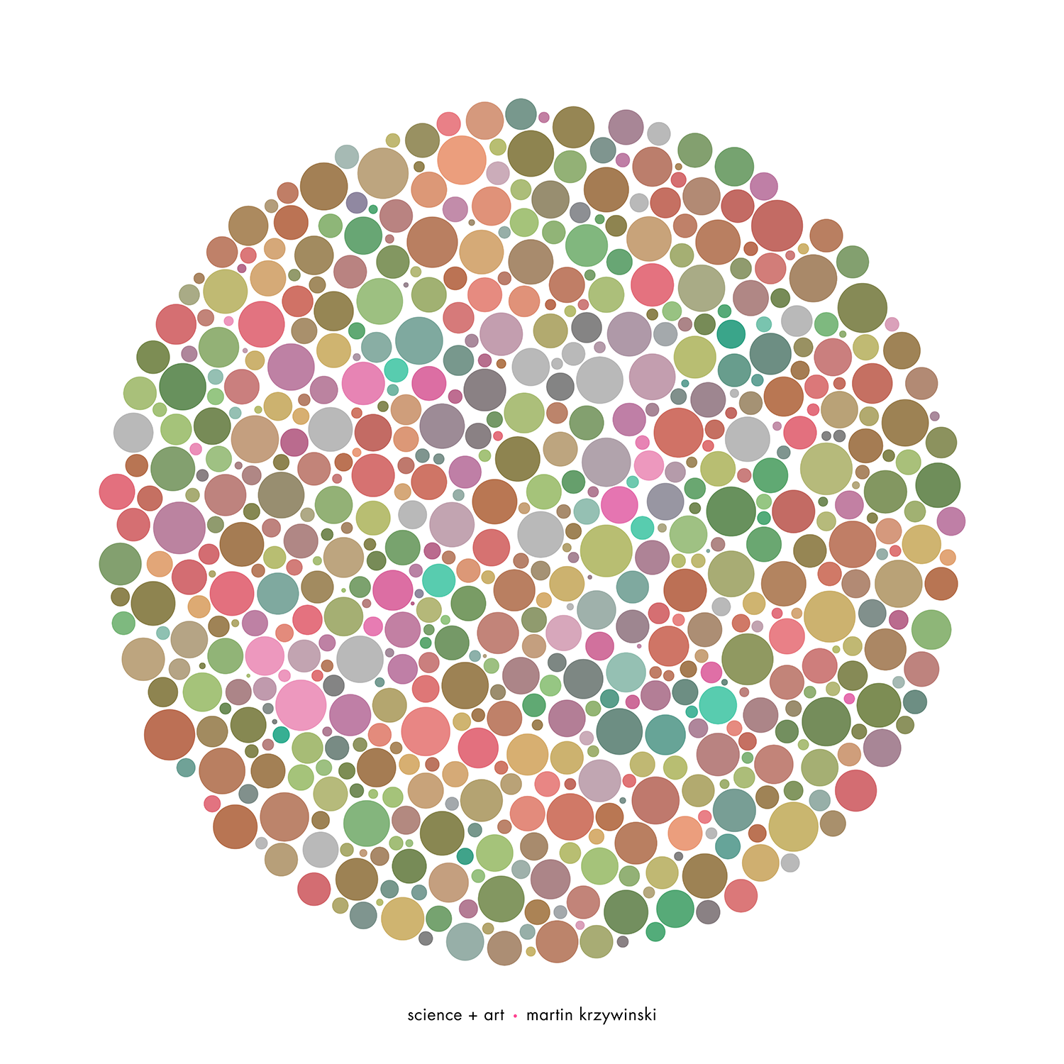
Last year, I made a new world in the sky with my 2017 `\pi` day sky charts. This year, it's time for something a little closer to the ground. Using street maps of various cities, we rearrange the streets and join neighbourhoods from around the world using the digits of `\pi` as a recipe.
A walk from to Istanbul to San Francisco is only 5 minutes? Well, no. But what if it could be.

Read how it was done or simply enjoy the art.
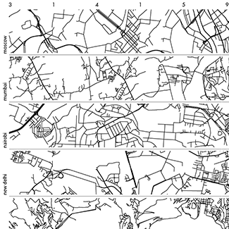
City strips
City strips are horizontal arrangements of patches of roads sampled from a city. The order of the patches is determined by the digits of `\pi`, which are used to select regions of specific density of roads.
 buy artwork
These strips chart 10 patches—the patch for the digit "1" has a few roads and the patch for "9" is the most dense.
Boonies, burbs and boutiques

This series of patches is extracted from the city strips above. Three patches for the consecutive digits 159 are shown and demonstrate how very quickly we can progress from nowhere to somewhere.
 buy artwork
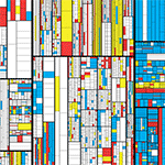
World patches
This arrangement of roads builds on city strips. Here, 36 digits of `\pi` are arranged on a 6 × 6 grid. Roads patches are sampled from 10 different cities—each digit is assigned a different city.
In the map below the digit-to-city assignments are: 0:Amsterdam, 1:Doha, 2:Marrakesh, 3:Mumbai, 4:Nairobi, 5:Rome, 6:San Francisco, 7:Seoul, 8:Shanghai and 9:Vancouver.
 buy artwork
City mix
City mixes are world patches that only use two cities. Below we assign the even digits to Melbourne and the odd digits to Nice.
 buy artwork
 buy artwork
Propensity score weighting
It is not certain that everything is uncertain. —Blaise Pascal
We have already explored how we can mitigate bias caused by confounding variables in observational studies using propensity score (PS) matching (PSM) and propensity score weighting (PSW). However, any statistical model is only as good as its assumptions and, if it is specified incorrectly, it can itself produce biased estimates of the treatment effect.
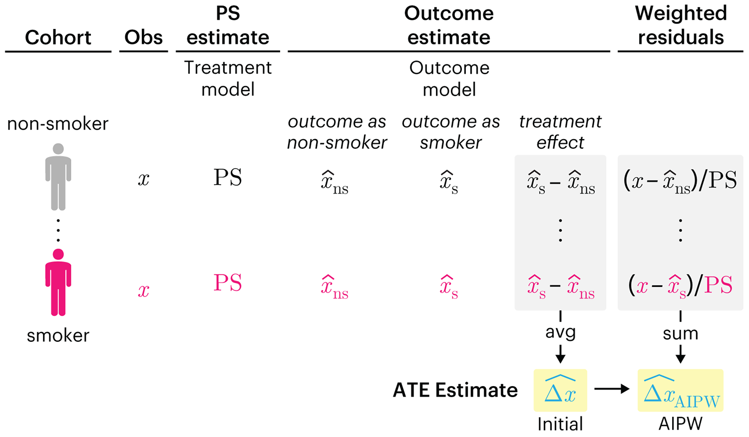
This month, we explore double robustness, a powerful statistical concept that provides a valuable “safety net” against the risk of an incorrect model. It offers two opportunities, instead of just one, to obtain a valid estimate of the treatment effect — making it possible to draw credible causal inferences from observational data without having to depend on a single set of modeling assumptions.
Kurz, C.F., Krzywinski, M. & Altman, N. (2026) Points of significance: Double Robustness. Nat. Methods 23:868–869.
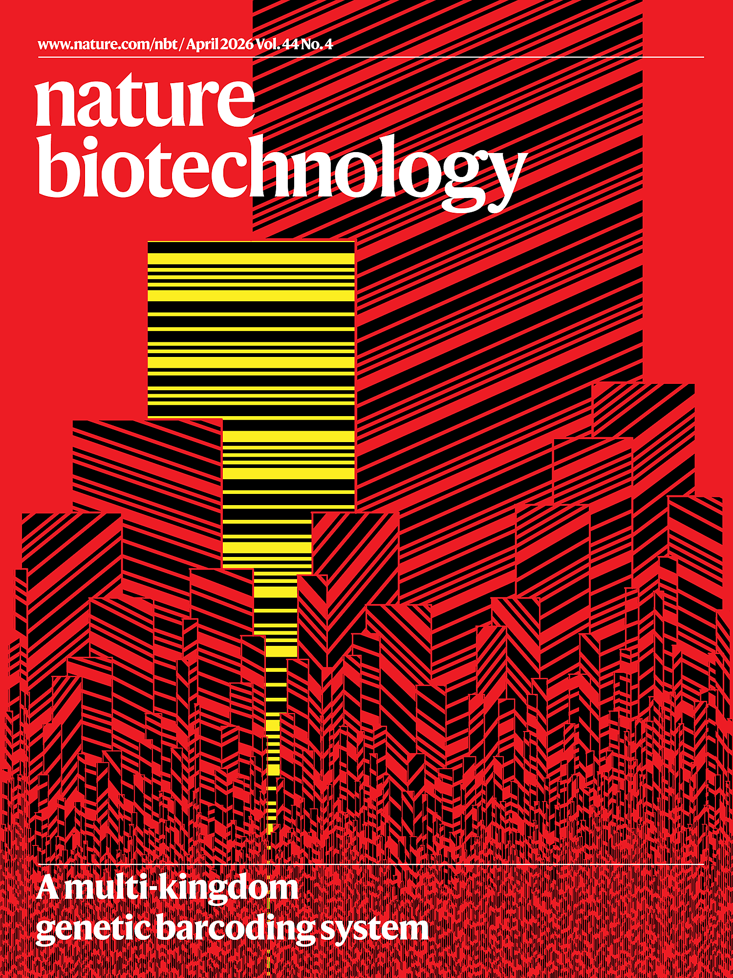
Nature Biotechnology cover
My cover design on the 7 April 2026 Nature Biotechnology issue shows the dendrogram that represents a cluster of uniquely expressed (or downregulated) genes in human naive stem cells induced from such cells. Within each dendrogram block, the genomic barcode sequence (sampled from Supplementary Table 1) is depicted with a Code 39 barcode. The highlighted barcode is one of those used for cell isolation.
Ishiguro S. et al. A multi-kingdom genetic barcoding system for precise clone isolation (2026) Nature Biotechnology 44:616–629.
Browse my gallery of cover designs.
Happy 2026 π Day—
Art for the 5%
Celebrate π Day (March 14th) and enjoy the art — but only if you're part of the 5%.
Go ahead, see what you can't see.
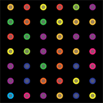
Ishihara's Tests for Colour Deficiency
Authentic and accurate images of Ishihara's test plates photographed (and lovingly color-corrected) from the 38-plate Ishihara's Tests for Colour Deficiency.
I also provide the position, size, and color of each circle on each test plate.


Symmetric alternatives to the ordinary least squares regression
What immortal hand or eye, could frame thy fearful symmetry? — William Blake, "The Tyger"
This month, we look at symmetric regression, which, unlike simple linear regression, it is reversible — remaining unaltered when the variables are swapped.
Simple linear regression can summarize the linear relationship between two variables `X` and `Y` — for example, when `Y` is considered the response (dependent) and `X` the predictor (independent) variable.
However, there are times when we are not interested (or able) to distinguish between dependent and independent variables — either because they have the same importance or the same role. This is where symmetric regression can help.

Luca Greco, George Luta, Martin Krzywinski & Naomi Altman (2025) Points of significance: Symmetric alternatives to the ordinary least squares regression. Nat. Methods 22:1610–1612.
Beyond Belief Campaign BRCA Art
Fuelled by philanthropy, findings into the workings of BRCA1 and BRCA2 genes have led to groundbreaking research and lifesaving innovations to care for families facing cancer.
This set of 100 one-of-a-kind prints explore the structure of these genes. Each artwork is unique — if you put them all together, you get the full sequence of the BRCA1 and BRCA2 proteins.
