

#hitchens
Christopher Hitchens—Out of Letters
contents
The images shown here were created as part of my ASCII Art project, which extends ASCII art to include
- proportionally spaced fonts
- a variety of font weights in a single image
- both tone and structure of the image to select characters
- fixed strings to render an image in legible text
Applying the code to images of Hitchens was motivated by my own deep love of Hitchens and a typographic portrait of Christopher Hitchens, created out of Gill Sans letters by Miles Chic at Capilano University.
Also, what's the reason for reason this season? Why, Hitchmas, of course.

All images are generated using Gotham, with up to 8 weights (Extra Light to Ultra). Each image includes size and characters used for the image. I give the absolute type size, though only useful to know in relative terms to the size of the image and other images drawn with the same method. The color of text in each layer is the same—black— but font weight may vary.
Some images are generated using more than one layer of ASCII. In some cases the characters used in each layer are different.
As the font size is reduced, greater detail and contrast can be achieved.


By setting the image with a fixed string, such as a short quote or longer body of text, detail is lost but the ASCII representation takes on more meaning.


Images take on detail when several rotated layers of text is used. Each of the images below is composed of more than one layer, starting with a 2-layer image which uses the uppercase alphabet at 0 and 90 degrees.

Meaning can be added to the image by using different text in each layer. In the examples below, I set the same image using the pair "Godisnotgreat" (at 0 degrees) and "religionpoisonseverything" (at 90 degrees). In the second example, I use the unlikely combination of "Jesus" and "Mohammad"—inspired by Jesus and Mo.


When rotated layers contain punctuation, very high level of detail can be achieved.

The image below is made out of layers that contain only forward (/) and back (\) slashes.

The image below is made using only the period character in three layers rotated at –45, 0 and 45 degrees. Although the image looks like a pixelated version of the original—it is more than that. It is a typeset representation that uses 8 weights of Gotham. Character spacing between periods is informed by font metrics.


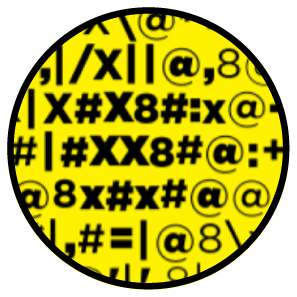
The three images below show the difference between using a variety of punctuation characters and setting an image using a block of text. The first image uses "8 X x" and common punctuation.

I use Hitchslap 9 for the first image below, and all the Hitchslaps for the second image. When setting an image in using a block of text, the choice of character at any position is fixed and only the font weight is allowed to vary. When the text is relatively short (e.g. Hitchslap 9 is 544 characters and is repeated 50 times in the image), rivers of space appear in the image.


In both cases, the image is very recognizable.
When an image of text is set with the text itself, you have recursive ASCII art. Below is Hitchslap 2, set with itself. In the image, the font is Gotham and the text used to asciify the image is also Gotham.
It makes ordinary moral people, compels them, forces them, in some cases orders them do disgusting wicked unforgivable things. There's no expiation for the generations of misery and suffering that religion has inflicted in this way and continues to inflict. And I still haven't heard enough apology for it. — Christopher Hitchens
The quote is 307 characters long and is repeated 391 times in the image.

In principle, the process of asciifying text with text can be repeated, by using the asciified image as input for asciification with progressively smaller text.
Propensity score weighting
It is not certain that everything is uncertain. —Blaise Pascal
We have already explored how we can mitigate bias caused by confounding variables in observational studies using propensity score (PS) matching (PSM) and propensity score weighting (PSW). However, any statistical model is only as good as its assumptions and, if it is specified incorrectly, it can itself produce biased estimates of the treatment effect.
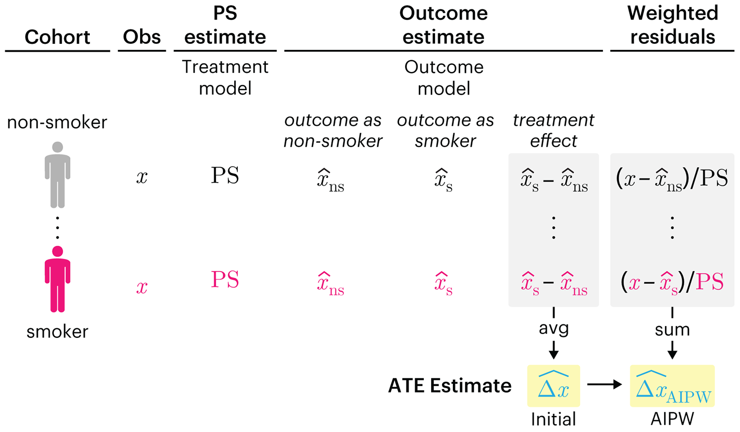
This month, we explore double robustness, a powerful statistical concept that provides a valuable “safety net” against the risk of an incorrect model. It offers two opportunities, instead of just one, to obtain a valid estimate of the treatment effect — making it possible to draw credible causal inferences from observational data without having to depend on a single set of modeling assumptions.
Kurz, C.F., Krzywinski, M. & Altman, N. (2026) Points of significance: Double Robustness. Nat. Methods 23:868–869.
Nature Biotechnology cover
My cover design on the 7 April 2026 Nature Biotechnology issue shows the dendrogram that represents a cluster of uniquely expressed (or downregulated) genes in human naive stem cells induced from such cells. Within each dendrogram block, the genomic barcode sequence (sampled from Supplementary Table 1) is depicted with a Code 39 barcode. The highlighted barcode is one of those used for cell isolation.
Ishiguro S. et al. A multi-kingdom genetic barcoding system for precise clone isolation (2026) Nature Biotechnology 44:616–629.

Browse my gallery of cover designs.
Happy 2026 π Day—
Art for the 5%
Celebrate π Day (March 14th) and enjoy the art — but only if you're part of the 5%.
Go ahead, see what you can't see.

Ishihara's Tests for Colour Deficiency
Authentic and accurate images of Ishihara's test plates photographed (and lovingly color-corrected) from the 38-plate Ishihara's Tests for Colour Deficiency.
I also provide the position, size, and color of each circle on each test plate.


Symmetric alternatives to the ordinary least squares regression
What immortal hand or eye, could frame thy fearful symmetry? — William Blake, "The Tyger"
This month, we look at symmetric regression, which, unlike simple linear regression, it is reversible — remaining unaltered when the variables are swapped.
Simple linear regression can summarize the linear relationship between two variables `X` and `Y` — for example, when `Y` is considered the response (dependent) and `X` the predictor (independent) variable.
However, there are times when we are not interested (or able) to distinguish between dependent and independent variables — either because they have the same importance or the same role. This is where symmetric regression can help.

Luca Greco, George Luta, Martin Krzywinski & Naomi Altman (2025) Points of significance: Symmetric alternatives to the ordinary least squares regression. Nat. Methods 22:1610–1612.
Beyond Belief Campaign BRCA Art
Fuelled by philanthropy, findings into the workings of BRCA1 and BRCA2 genes have led to groundbreaking research and lifesaving innovations to care for families facing cancer.
This set of 100 one-of-a-kind prints explore the structure of these genes. Each artwork is unique — if you put them all together, you get the full sequence of the BRCA1 and BRCA2 proteins.
