

#asciiart
ASCII Art—Proportional Spacing, Tone/Structure Mapping and Fixed Strings
contents
After finding a typographic portrait of Christopher Hitchens, created out of Gill Sans letters by Miles Chic at Capilano University, I thought to resurrect software I wrote a long time ago that converts images into letters and expanding traditional ASCII art by using
- proportionally spaced fonts
- a variety of font weights in a single image
- both tone and structure of the image to select characters
- fixed strings to render an image in legible text
This is a Perl script and requires Imager. See README in the archive for instructions. I cannot provide installation support, but welcome questions and ideas about the method.


The representation of images by characters—ASCII art—has a long history. ASCII art extends the emoticon (or smiley) to represent a larger piece of work. Typically, the works use a fixed-space font (e.g. Courier), originally designed for display on a terminal. Despite the sophistication of computer graphics today, ASCII art continues to have a strong following with new work continually added to public online galleries.

Photos and paintings can be ASCIIfied using a tone-based approach and automated methods exist to do this (Paul D. O’Grady and Scott T. Rickard (2008) Automatic ASCII Art Conversion of Binary Images Using Non-Negative Constraints).
Many artists generate new creations, exclusive to the medium. Typically this kind of ASCII art is based on the interpretation of structure rather than tone—this method has also been automated (Xuemiao Xu, Linling Zhang, Tien-Tsin Wong (2010) Structure-based ASCII Art).
I have written code to generate ASCII art from images by using proportional spaced fonts.

Below is an example of how Pragmata and Gotham can be used to different effect to render an image. When a proportional spaced font is used, the ASCII shape can more fully fill the image.

Let's see how these methods work on a real image. Many ASCII art Mona Lisa versions exist. Below, I render the Mona Lisa with Pragmata, Gotham Book and 8 weights of Gotham.
Two-tone shapes like the S in the figure above require selecting characters that match the structure of the image. (e.g. "|" matches vertical lines). For a given character and image position there are four distinct match possibilities—a combination of whether the character and image have a signal at a position. I show this in the figure below.

By maximizing scores derived from matches (s1, s3) and minimizing any penalties (s2, s4), a character is identified based on maximal coverage of the image region and minimum coverage of areas that are blank.

When proportional text is used, edges are better approximated, such as in the Homer Simpson example below which uses Gotham Book.

Images that are not two-tone require that we match both structure and tone. Structure is approximated by the choice of character, while tone by choice of font weight. To select the best character based on tone, the character's average tone is compared to the average tone of the section of the image to which it is being compared.

It is possible to combine both structure and tone metrics in character selection. Below is an example of how an image with both tone and structure is interpreted as the tone and structure score weights are varied. The balance between these two metrics can be very hard to find—it greatly depends on the image. Tone-based mapping works well when font size is small and the image is viewed from larger distance—in this case, characters play the role of individual pixels with varying brightness. Structure-based mapping works with larger type and closer viewing distance.

Continuous tone bitmaps are an idea application of multi-font ASCII art—images no longer need to be thresholded or dithered.

ASCII art is generated by dividing the image into a grid and finding the letter (the choice of characters is often expanded to include punctuation) that best matches the grid section. Typically, for each grid the entire set of allowable characters is sampled. Instead, we can limit the choice of character by successively sampling from a fixed string.

Here is the Mona Lisa rendered with the fixed string "monalisa" using 8 weights of Gotham.

Things get even more interesting when the text is angled.

The image can be textured with multiple layers of ASCII art. In the example below, four layers of text are used, each with a different font size.

Instead of varying size, the angle of the text can be changed among layers. This results in a pattern reminiscent of a halftone.

An image can be asciified several times, with each iteration the asciified output of the previous step used as input for the next. At each step, the font size should be reduced to s → √s.


Propensity score weighting
It is not certain that everything is uncertain. —Blaise Pascal
We have already explored how we can mitigate bias caused by confounding variables in observational studies using propensity score (PS) matching (PSM) and propensity score weighting (PSW). However, any statistical model is only as good as its assumptions and, if it is specified incorrectly, it can itself produce biased estimates of the treatment effect.
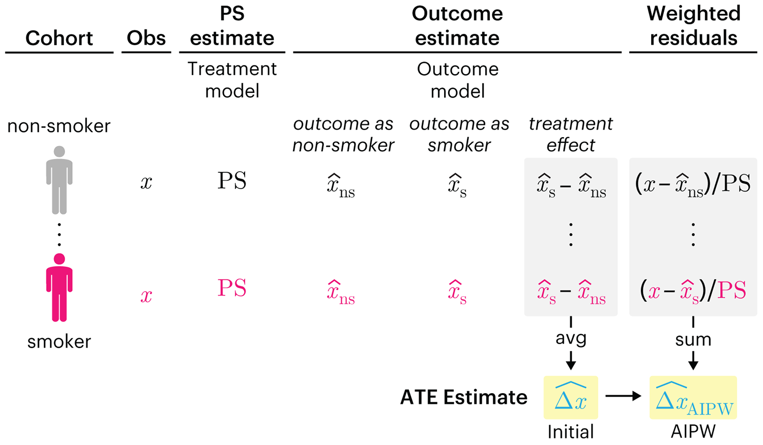
This month, we explore double robustness, a powerful statistical concept that provides a valuable “safety net” against the risk of an incorrect model. It offers two opportunities, instead of just one, to obtain a valid estimate of the treatment effect — making it possible to draw credible causal inferences from observational data without having to depend on a single set of modeling assumptions.
Kurz, C.F., Krzywinski, M. & Altman, N. (2026) Points of significance: Double Robustness. Nat. Methods 23:868–869.
Nature Biotechnology cover
My cover design on the 7 April 2026 Nature Biotechnology issue shows the dendrogram that represents a cluster of uniquely expressed (or downregulated) genes in human naive stem cells induced from such cells. Within each dendrogram block, the genomic barcode sequence (sampled from Supplementary Table 1) is depicted with a Code 39 barcode. The highlighted barcode is one of those used for cell isolation.
Ishiguro S. et al. A multi-kingdom genetic barcoding system for precise clone isolation (2026) Nature Biotechnology 44:616–629.

Browse my gallery of cover designs.
Happy 2026 π Day—
Art for the 5%
Celebrate π Day (March 14th) and enjoy the art — but only if you're part of the 5%.
Go ahead, see what you can't see.

Ishihara's Tests for Colour Deficiency
Authentic and accurate images of Ishihara's test plates photographed (and lovingly color-corrected) from the 38-plate Ishihara's Tests for Colour Deficiency.
I also provide the position, size, and color of each circle on each test plate.

