 buy artwork
`\pi` Day 2015 Art Posters

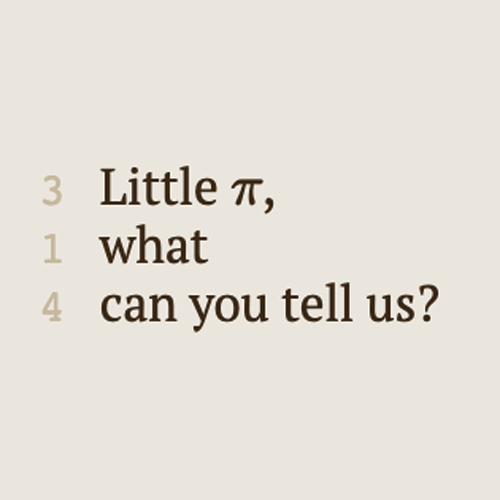
On March 14th celebrate `\pi` Day. Hug `\pi`—find a way to do it.
For those who favour `\tau=2\pi` will have to postpone celebrations until July 26th. That's what you get for thinking that `\pi` is wrong. I sympathize with this position and have `\tau` day art too!
If you're not into details, you may opt to party on July 22nd, which is `\pi` approximation day (`\pi` ≈ 22/7). It's 20% more accurate that the official `\pi` day!
Finally, if you believe that `\pi = 3`, you should read why `\pi` is not equal to 3.
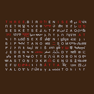
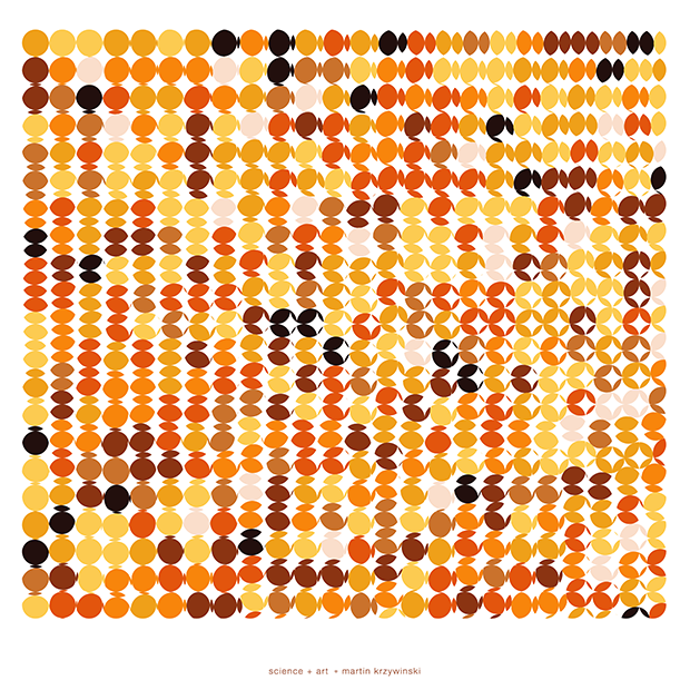
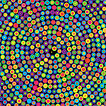
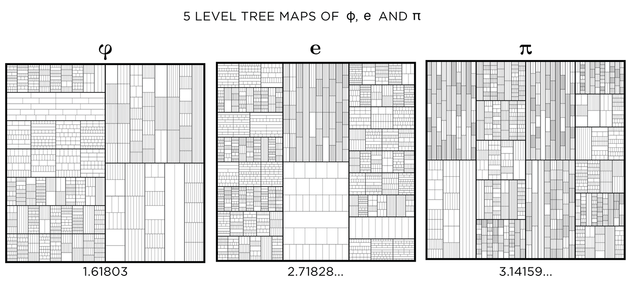
Not a circle in sight in the 2015 `\pi` day art. Try to figure out how up to 612,330 digits are encoded before reading about the method. `\pi`'s transcendental friends `\phi` and `e` are there too—golden and natural. Get it?
This year's `\pi` day is particularly special. The digits of time specify a precise time if the date is encoded in North American day-month-year convention: 3-14-15 9:26:53.
The art has been featured in Ana Swanson's Wonkblog article at the Washington Post—10 Stunning Images Show The Beauty Hidden in `\pi`.
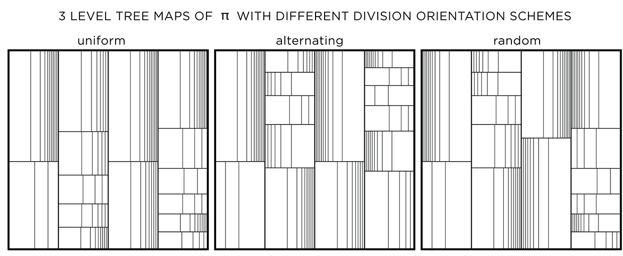
We begin with a square and progressively divide it. At each stage, the digit in `pi` is used to determine how many lines are used in the division. The thickness of the lines used for the divisions can be attenuated for higher levels to give the treemap some texture.

This method of encoding data is known as treemapping. Typically, it is used to encode hierarchical information, such as hard disk spac usage, where the divisions correspond to the total size of files within directories.
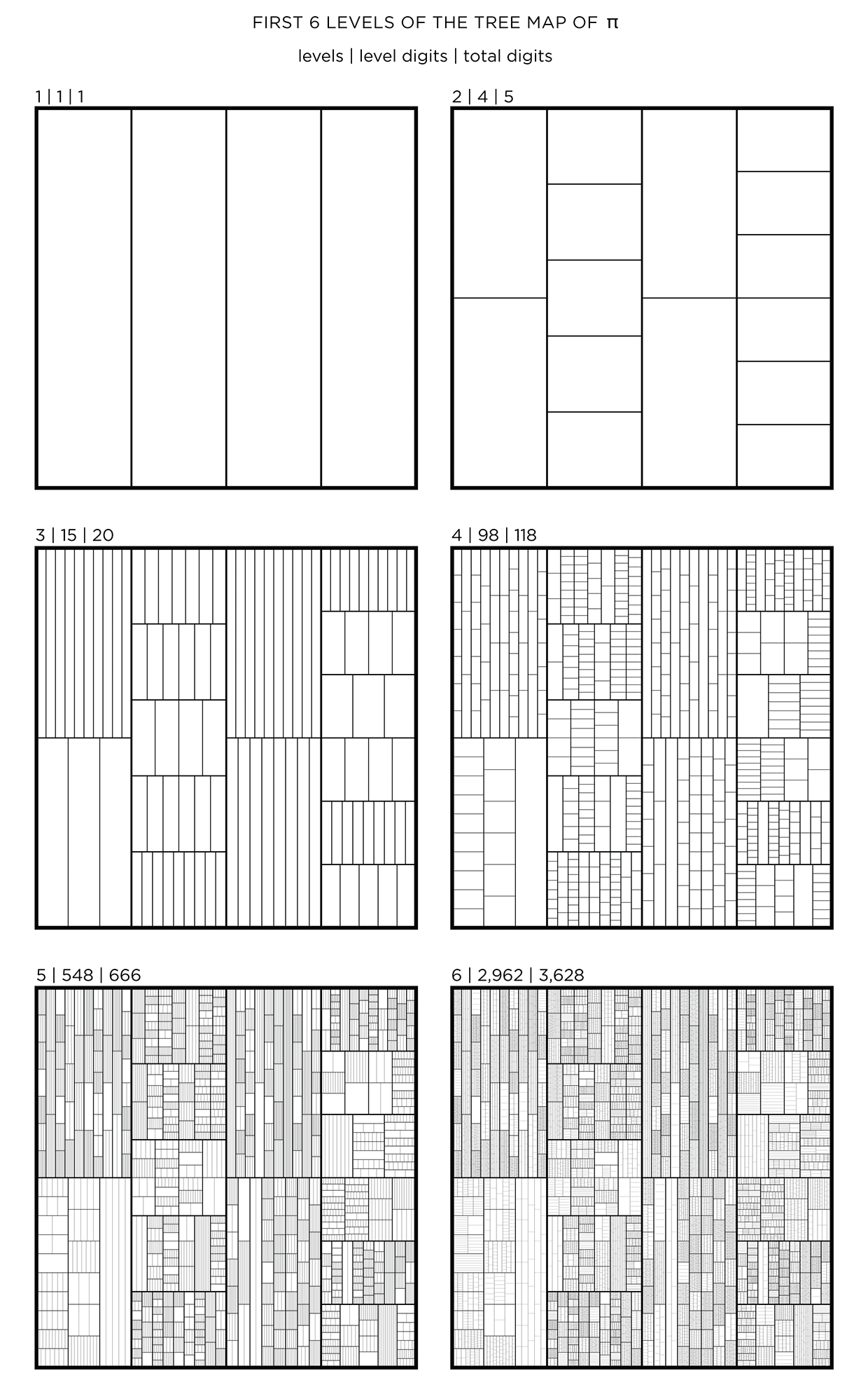
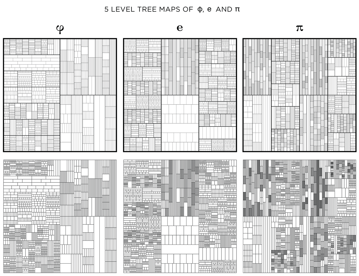
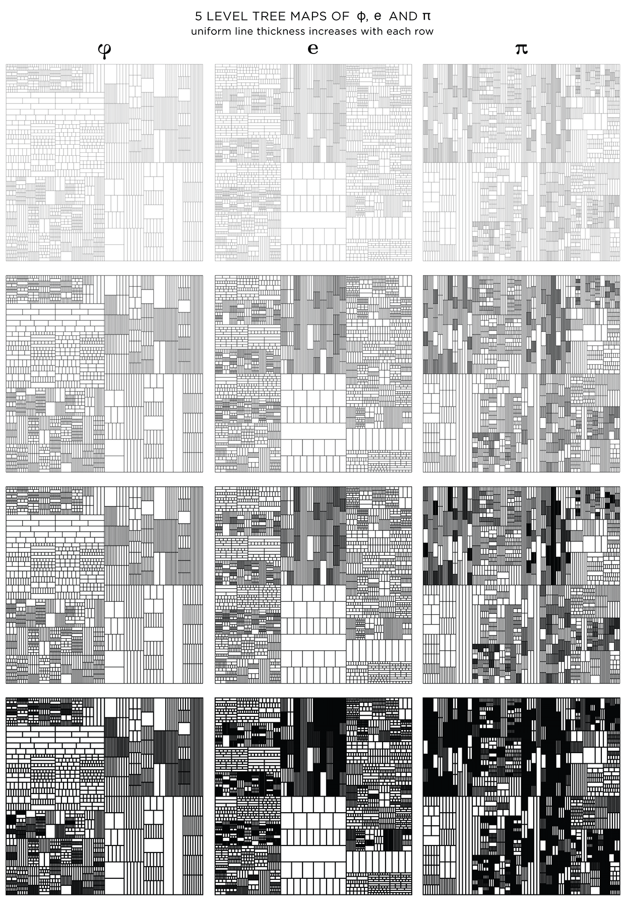
This kind of treemap can be made from any number. Below I show 6 level maps for `pi`, `phi` (Golden ratio) and `e` (base of natural logarithm).
The number of digits per level, `n_i` and total digits, `N_i` in the tree map for `pi`, `phi` and `e` is shown below for levels `i = 1 .. 6`.
           PI             PHI              e
i     n_i    N_i      n_i    N_i      n_i    N_i
1       1      1        1      1        1      1
2       4      5        2      3        3      4
3      15     20        9     12       19     23
4      98    118       59     71       96    119
5     548    666      330    401      574    693
6    2962   3628     1857   2258     3162   3855
7   16616  20244    10041  12299    17541  21396
8   91225 111469
9  500861 612330
Dividing the map
In all the treemaps above, the divisions were made uniformly for each rectangle. With uniform division, the lines that divide a shape are evenly spaced. With randomized division, the placement of lines is randomized, while still ensuring that lines do not coincide.
A multiplier, such as `phi` (Golden Ratio), can be used to control the division. In this case, the first division is made at 1/`phi` (0.62/0.38 split) and the remaining rectangle (0.38) is further divided at `/`phi` (0.24/0.14 split).
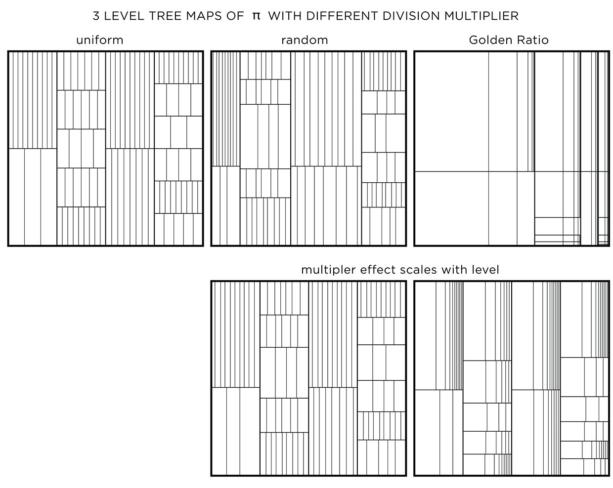
Using a non-uniform multipler is one way to embed another number in the art.
When a multiplier like `phi` is used, divisions at the top levels create very large rectangles. To attenuate this, the effect of the multiplier can be weighted by the level. Regardless of what multiplier is used, the first level is always uniformly divided. Division at subsequent levels incorporates more of the multiplier effect.
The orientation of the division can be uniform (same for a layer and alternating across layers), alternating (alternating across and within a layer) or random. This modification has an effect only if the divisions are not uniform.
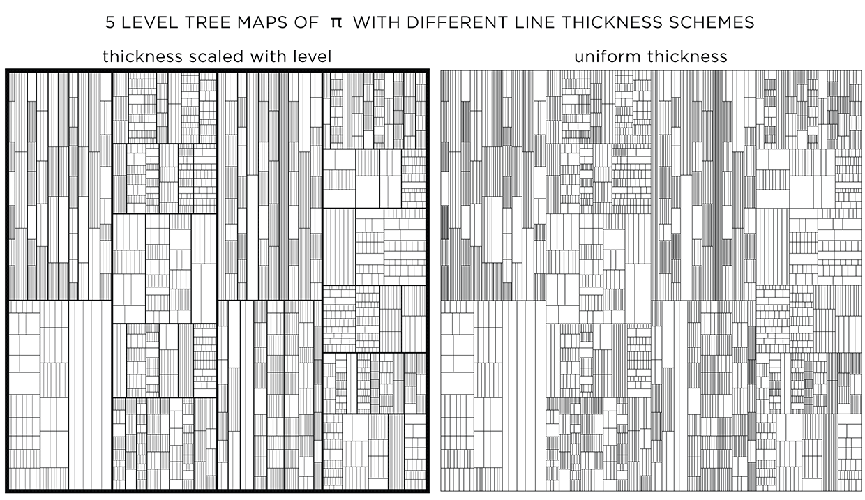
Adjusting line thickness
To emphasize the layers, a different line thickness can be used. When lines are drawn progressively thinner with each layer, detail is controlled and the map has more texture.
When all lines have the same thickness, it is harder to distinguish levels.
You could see this as a challenge! Below I show the treemaps for `pi`, `phi` and `e` with and without stroke modulation.
When displayed at a low resolution (the image below is 620 pixels across), shapes at higher levels appear darker because the distance between the lines within is close to (or smaller) than a pixel. By matching the line thickness to the image resolution, you can control how dark the smallest divisions appear.
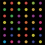
Adding color
Adding color can make things better, or worse. Dropping color randomly, without respect for the level structure of the treemap, creates a mess.
We can rescue things by increasing the probability that a given rectangle will be made transparent—this will allow the color of the rectangle below to show through. Additionally, by drawing the layers in increasing order, smaller rectangles are drawn on top of bigger ones, giving a sense of recursive subdivision.
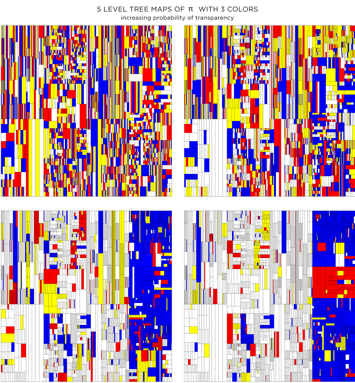
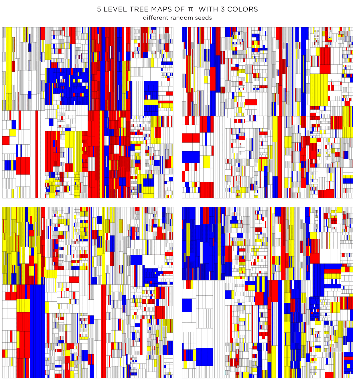
Because the color is assigned randomly, various instances of the treemap can be made. The maps below have the same proportion of colors and transparency (same as the first image in second row in the figure above) and vary only by the random seed to pick colors.
Coloring using adjacency graph
The color assignments above were random. For each shape the probability of choosing a given color (transparent, white, yellow, red, blue) was the same.
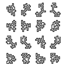
Color choice for a shape can also be influenced by the color of neighbouring shapes. To do this, we need to create a graph that captures the adjacency relationship between all the shapes at each level. Below I show the first 4 levels of the `pi` treemap and their adjacency graphs. In each graph, the node corresponds to a shape and an edge between nodes indicates that the shapes share a part of their edge. Shapes that touch only at a corner are not considered adjacent.
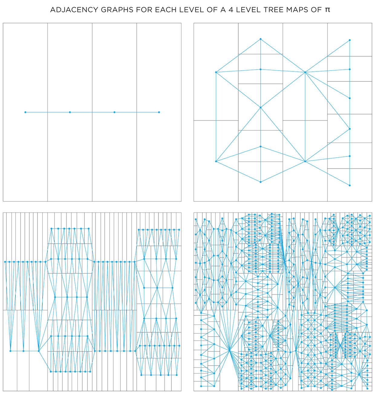
One way in which the graphs can be used is to attempt to color each layer using at most 4 colors. The 4 color theorem tells us that only 4 unique colors are required to color maps such as these in a way that no two neighbouring shapes have the same color.
It turns out that the full algorithm of coloring a map with only 4 colors is complicated, but reasonably simple options exist.. For the maps here, I used the DSATUR (maximum degree of saturation) approach.

The DSATUR algorithm works well, but does not guarantee a 4-color solution. It performs no backtracking. If you look carefully, one of the rectangles in the 4th layer (top right quadrant in the graph) required a 5th color (shown black).
Beyond Belief Campaign BRCA Art
Fuelled by philanthropy, findings into the workings of BRCA1 and BRCA2 genes have led to groundbreaking research and lifesaving innovations to care for families facing cancer.
This set of 100 one-of-a-kind prints explore the structure of these genes. Each artwork is unique — if you put them all together, you get the full sequence of the BRCA1 and BRCA2 proteins.

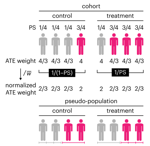
Propensity score weighting
The needs of the many outweigh the needs of the few. —Mr. Spock (Star Trek II)
This month, we explore a related and powerful technique to address bias: propensity score weighting (PSW), which applies weights to each subject instead of matching (or discarding) them.
Kurz, C.F., Krzywinski, M. & Altman, N. (2025) Points of significance: Propensity score weighting. Nat. Methods 22:1–3.
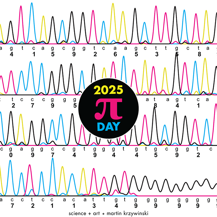
Happy 2025 π Day—
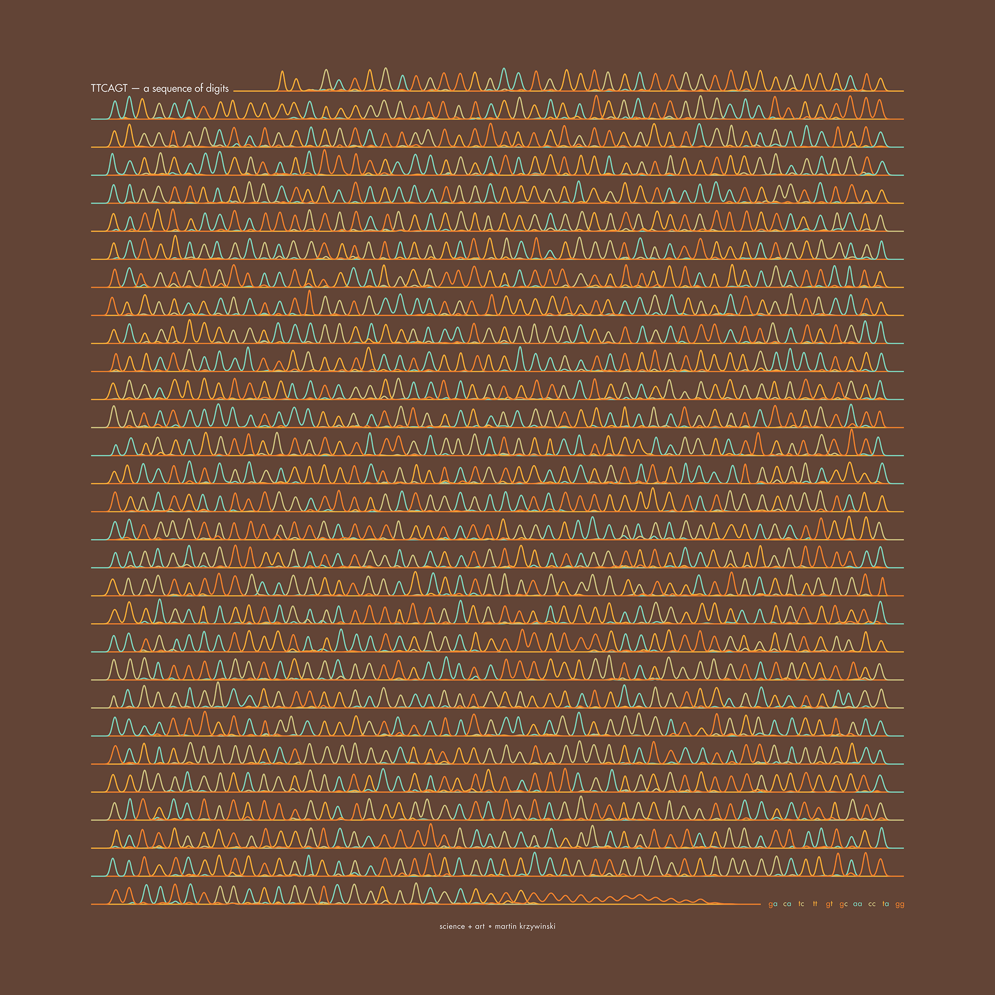
TTCAGT: a sequence of digits
Celebrate π Day (March 14th) and sequence digits like its 1999. Let's call some peaks.
Crafting 10 Years of Statistics Explanations: Points of Significance
I don’t have good luck in the match points. —Rafael Nadal, Spanish tennis player
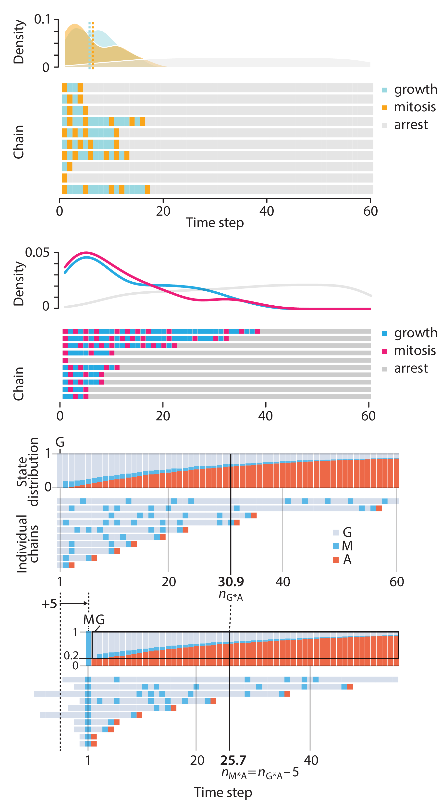
Points of Significance is an ongoing series of short articles about statistics in Nature Methods that started in 2013. Its aim is to provide clear explanations of essential concepts in statistics for a nonspecialist audience. The articles favor heuristic explanations and make extensive use of simulated examples and graphical explanations, while maintaining mathematical rigor.
Topics range from basic, but often misunderstood, such as uncertainty and P-values, to relatively advanced, but often neglected, such as the error-in-variables problem and the curse of dimensionality. More recent articles have focused on timely topics such as modeling of epidemics, machine learning, and neural networks.
In this article, we discuss the evolution of topics and details behind some of the story arcs, our approach to crafting statistical explanations and narratives, and our use of figures and numerical simulations as props for building understanding.
Altman, N. & Krzywinski, M. (2025) Crafting 10 Years of Statistics Explanations: Points of Significance. Annual Review of Statistics and Its Application 12:69–87.
Propensity score matching
I don’t have good luck in the match points. —Rafael Nadal, Spanish tennis player
In many experimental designs, we need to keep in mind the possibility of confounding variables, which may give rise to bias in the estimate of the treatment effect.
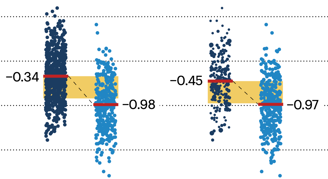
If the control and experimental groups aren't matched (or, roughly, similar enough), this bias can arise.
Sometimes this can be dealt with by randomizing, which on average can balance this effect out. When randomization is not possible, propensity score matching is an excellent strategy to match control and experimental groups.
Kurz, C.F., Krzywinski, M. & Altman, N. (2024) Points of significance: Propensity score matching. Nat. Methods 21:1770–1772.
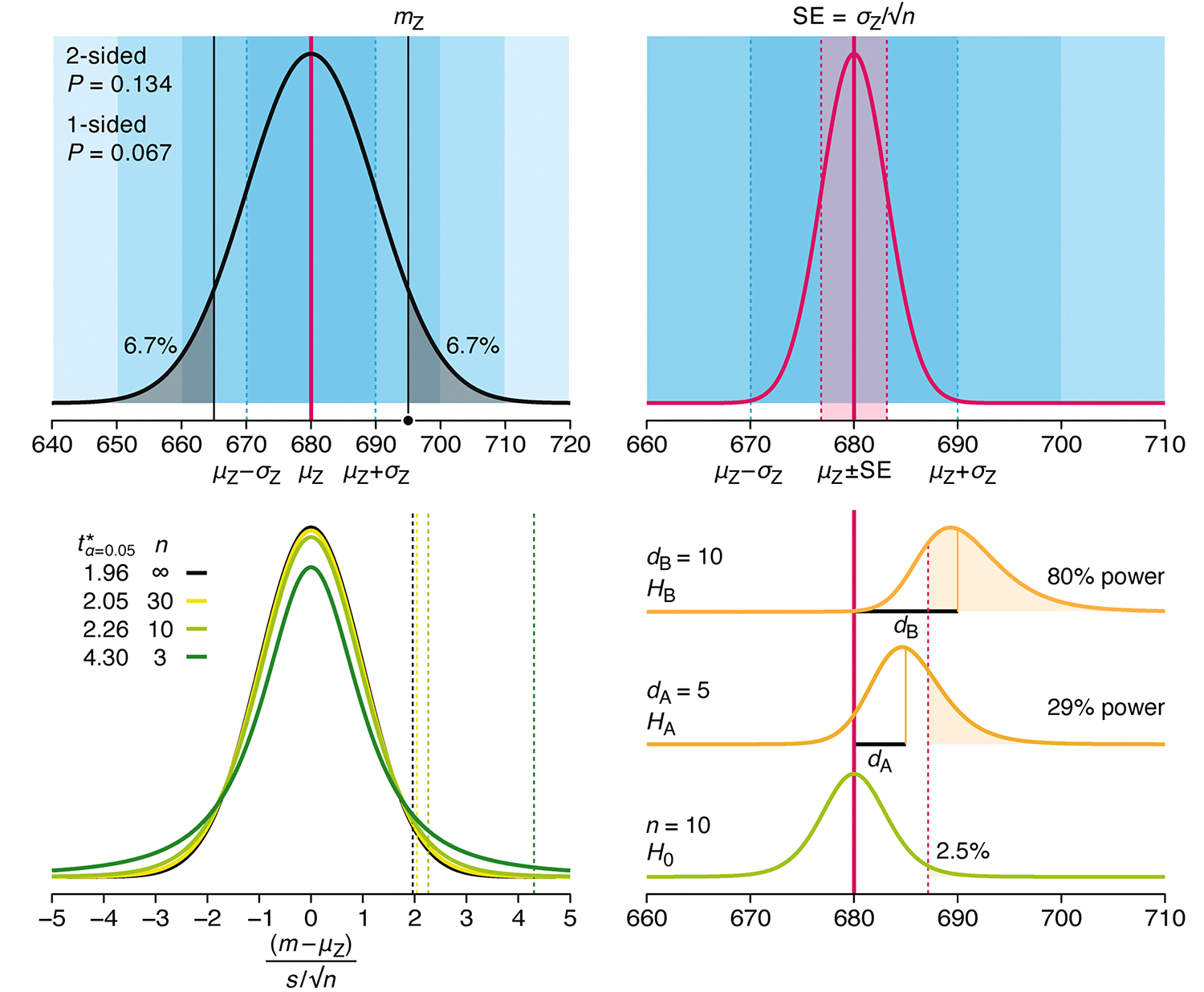
Understanding p-values and significance
P-values combined with estimates of effect size are used to assess the importance of experimental results. However, their interpretation can be invalidated by selection bias when testing multiple hypotheses, fitting multiple models or even informally selecting results that seem interesting after observing the data.
We offer an introduction to principled uses of p-values (targeted at the non-specialist) and identify questionable practices to be avoided.
Altman, N. & Krzywinski, M. (2024) Understanding p-values and significance. Laboratory Animals 58:443–446.