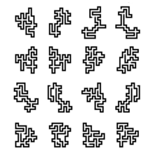
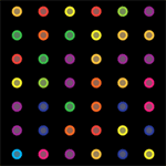
 buy artwork
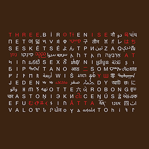
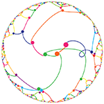
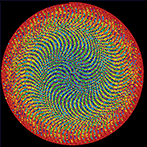
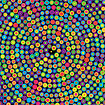
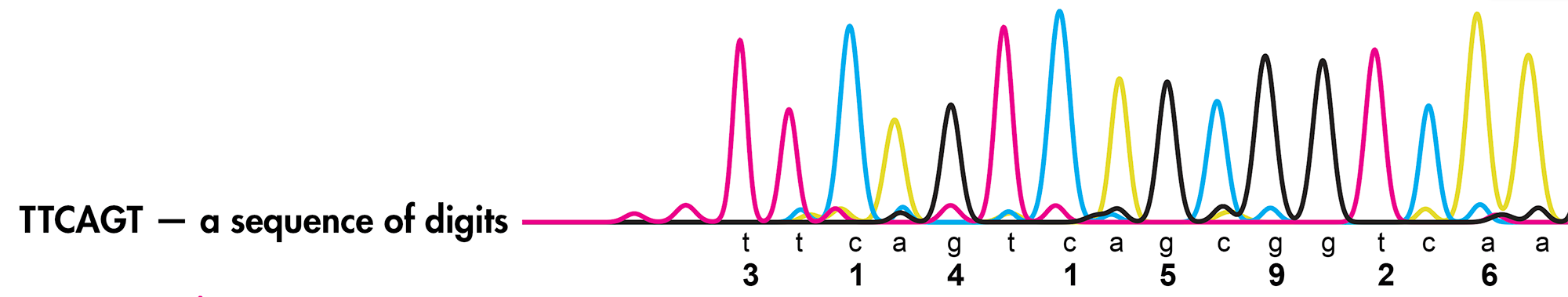
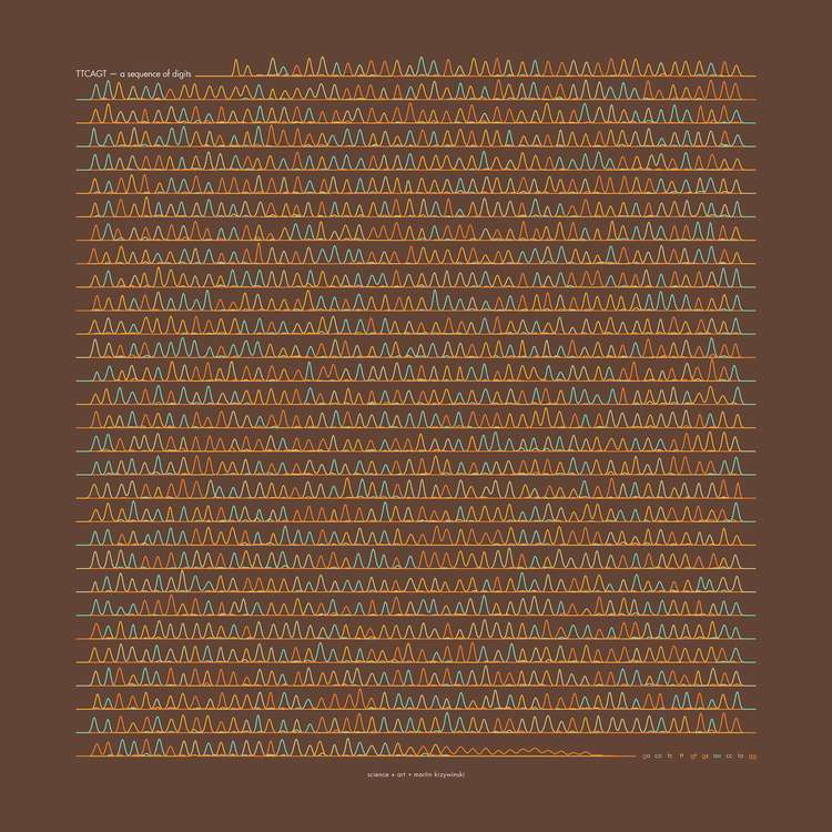
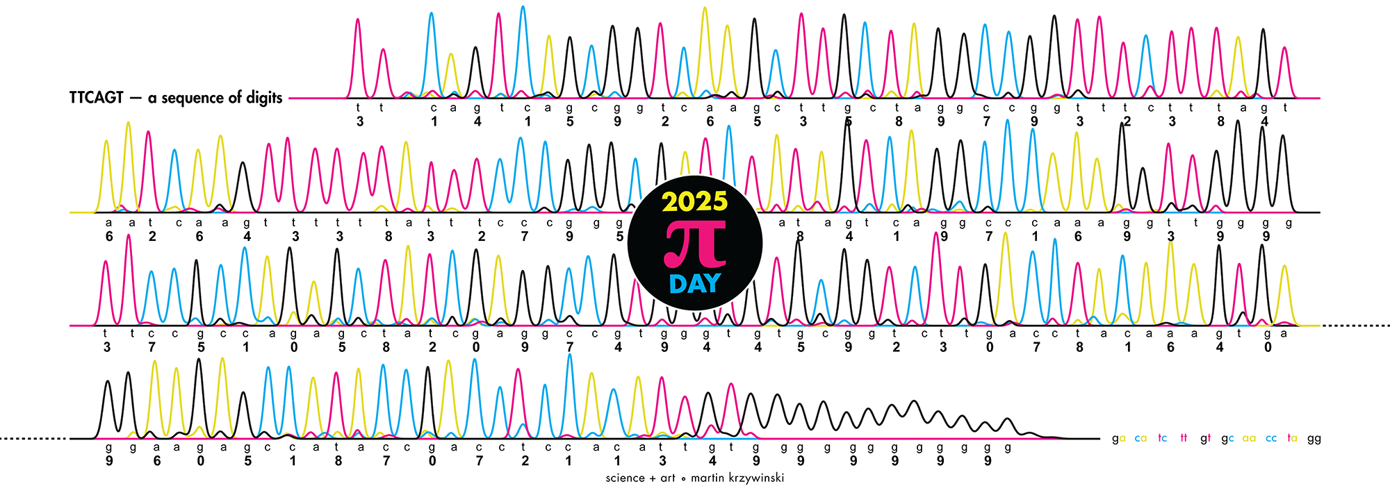
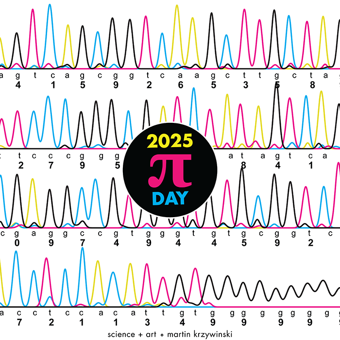
π Day 2025 Art Posters - TTCAGT: a sequence of digits


On March 14th celebrate `\pi` Day. Hug `\pi`—find a way to do it.
For those who favour `\tau=2\pi` will have to postpone celebrations until July 26th. That's what you get for thinking that `\pi` is wrong. I sympathize with this position and have `\tau` day art too!
If you're not into details, you may opt to party on July 22nd, which is `\pi` approximation day (`\pi` ≈ 22/7). It's 20% more accurate that the official `\pi` day!
Finally, if you believe that `\pi = 3`, you should read why `\pi` is not equal to 3.

Well—well; the sad minutes are moving,
Though loaded with trouble and pain;
And some time the loved and the loving
Shall meet on the mountains again!
—Emily Bronte
Welcome to this year's celebration of `\pi` and mathematics.
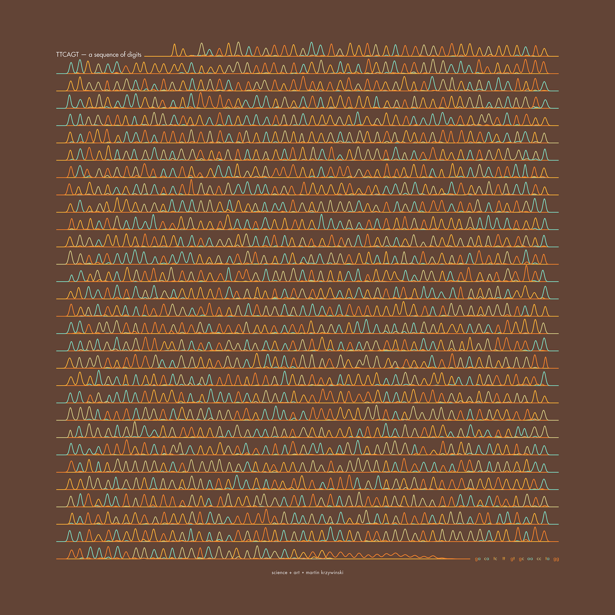
The theme this year is Sanger sequencing — old-school, one base at a time.
This year's `\pi` poem is Loud Without The Wind Was Roaring by Emily Bronte.
This year's `\pi` day song is Movements by Luca Musto.
Also, the tabbed menu above is full. Gasp.

contents
Here's a simplified explanation of how Sanger sequencing works.
I'm skipping any detail about primers, reaction conditions and the fact that some sequences will be complementary (e.g. A→T, C→G, G→C, T→A).
Let's suppose we want to determine the sequence in TTCAGT.
To do this, we make use of a DNA copying process called polymerase chain reaction (PCR). But the name here isn't important.
PCR will take our DNA and make millions of copies of it. This kind of PCR is good for one-to-many amplification but, in its basic form, is not that useful for us.
Normally, PCR works by using a template strand of DNA (that which is to be copied) and a protein called DNA polymerase (among others), which synthesizes a new strand on top of the template by stitching together a complementary sequence using free-floating nucleotides in the solution buffer.
However, we can change how the PCR copying process happens by throwing in a few extra molecular ingredients into the reaction buffer.
We add a small amount of "special" nucleotides (A*, C*, G* and T*) which will terminate the PCR copy reaction. These special nucleotides are available to the PCR machinery in the same way that the regular nucleotides A, C, G, T are. Except, because the special bases are available at much lower concentration (e.g. 1/100), they will be incorporated into the new string at a low probability.
In this new copy reaction, we will get all the possible subsequences that start at the first base
T*
TT*
TTC*
TTCA*
TTCAG*
TTCAGT*
For example, in the copied sequence TTC*, PCR has incorporated two regular T's followed by the terminating C*.
We now take these fragments (which are all floating around in a solution buffer) and order them by size using gel electrophoresis.
Briefly, this process takes advantage of the fact that (a) DNA molecules are negative charged and (b) smaller molecules diffuse faster through a gel matrix than larger ones.
We diffuse the DNA molecules through a polyacrylamide gel. But waiting for diffusion would take forever. To speed things up, we apply voltage across the gel. This pulls the negatively charged DNA molecules to the positive terminal. Shorter fragments pass through the gel with minimal hinderance but larger ones get occasionally caught up and temporarily stuck in the gel matrix and thus take longer to pass through
If all this happens in a capillary, we get a procession of size-ordered fragments coming out the other end.
Finally, remember how I said that these terminating nucleotides were "special"? They fluoresce under a laser. We use this light to detect the fragment — which shows up as a fluorescence peak.
Ideally, if the signal is clean, we will see a uniformly (more or less) series of smudges on the gel. The relative positions of the peaks tell us which DNA fragment comes next (e.g. TT* and TTCAGT* are separated by 3 peaks that correspond to TTC* TTCA* and TTCAG*).
We are able to tell the bases apart because we run four parallel and independent copy processes, each having access to only one of the terminating nucleotides. For example, the T*, TT* and TTCAGT* peaks would all show up in the T* reaction but not in the other reactions.
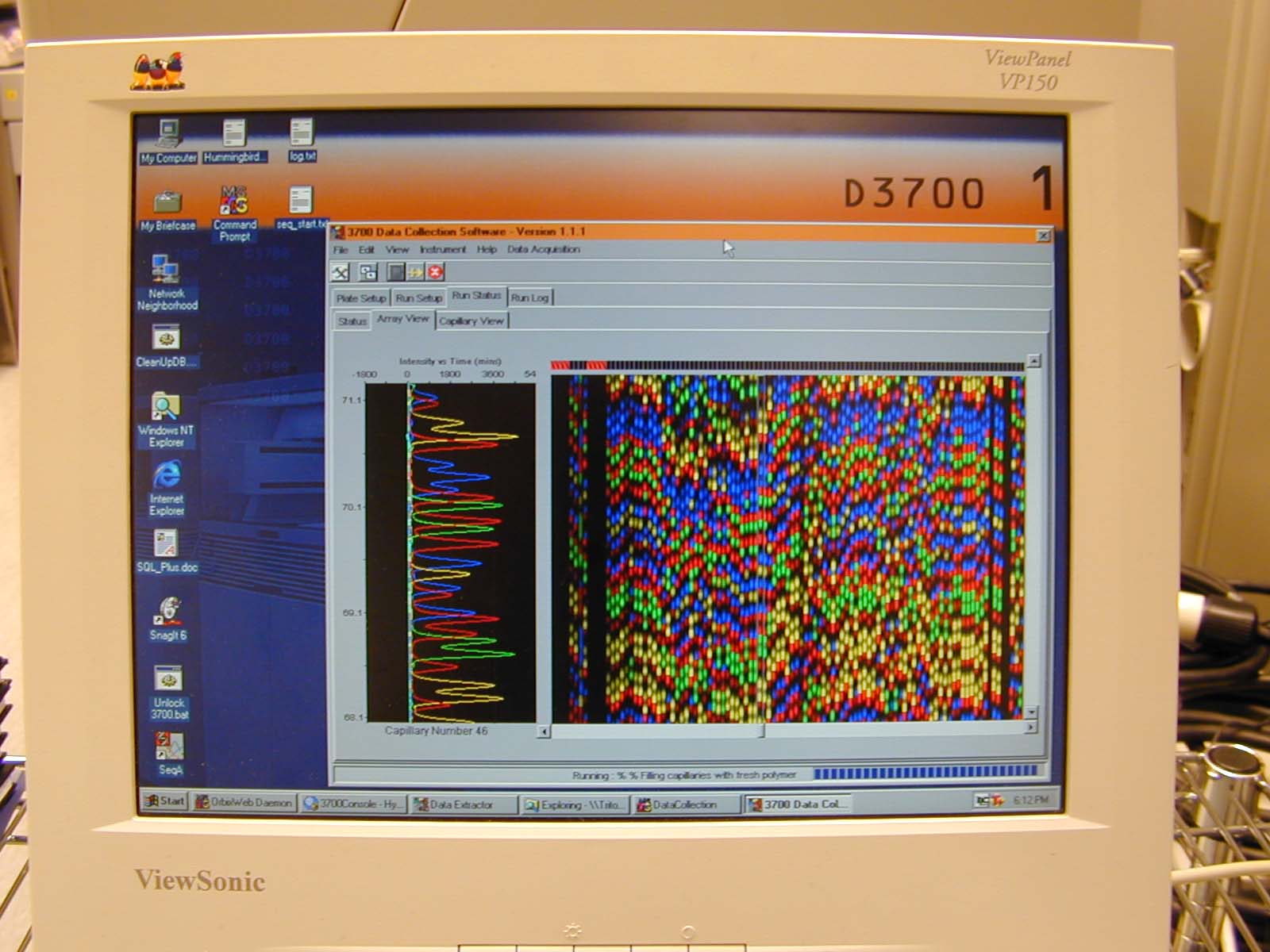
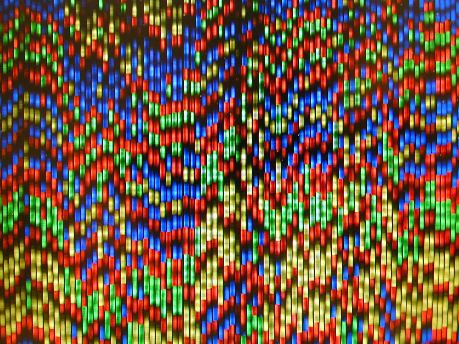
This used to all be done manually but in the late 90's and early 2000's this all happened inside automated sequencers.
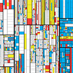
One of these sequencers was an ABI 3700. Below I show what the screen interface looked like during a run. Traditionally, the color assignments to the bases were A (green), C (blue), G (black/yellow) and T (red). Pure RGB for intensity.
The posters show `\pi` up to the Feynman Point, which are six 9's at decimal places 762–767. This position in `\pi` is a great place to stop because of the unexpected pattern of 9's at the end.
Each digit is encoded by two bases:
0 GA
1 CA
2 TC
3 TT
4 GT
5 GC
6 AA
7 CC
8 TA
9 GG
With this scheme, 3.14 reads as TTCAGT. Hence, the title of the art "TTCAGT: a sequence of digits".
This encoding was chosen so that the number of bases in the sequence was balanced, to the extent possible. The number of peaks per base on the trace is
A 381
C 381
G 390
T 384
I fixed 9 to be GG because G is traditionally shown as black in Sanger traces and I wanted to end on this color.
I also fixed 3 to be TT (traditionally red) so that the trace starts with two red (or magenta) peaks.
There are many other encodings possible.
One kind of encoding is Huffman, which creates a tree of unique representations formed from an alphabet of symbols to encode information. Check out the paper Toward a Better Compression for DNA Sequences Using Huffman Encoding. Try the online Huffman encoder
Here's one of the optimal Huffman encodings of the first 768 digits of `\pi` into nucleotides.
1 symbol  1  C count 88/768 11.5%
9 symbol  0  A count 85/768 11.1%
2 symbol 33 TT count 81/768 10.5%
4 symbol 32 TG count 79/768 10.3%
3 symbol 31 TC count 76/768  9.9%
6 symbol 30 TA count 75/768  9.8%
8 symbol 23 GT count 72/768  9.4%
7 symbol 22 GG count 71/768  9.2%
0 symbol 21 GC count 71/768  9.2%
5 symbol 20 GA count 70/768  9.1%
The most common digits are 1 and 9, so these can be encoded by a single base (C and A, respectively). The remaining digits need two bases.
If we encoded each digit with two bases, then we'd need a string of 1,536 bases. But with the Huffman encoding, we only need 1,363 bases because we now realize a savings of 88 bases for 1 (which is now encoded by one base instead of two) and 85 bases for 9.
For simplicity, the posters use two bases per digit.
The peaks were generated from a simple model that drew each peak as a Normal distribution.
The peaks that corresponded to a digit each had a mean height, width, and position, which was perturbed on a peak-by-peak basis using random values drawn from a Normal distribution.
For example, the peak height mean was `\bar{h} = 0.6` times row height with a standard deviation of `\sigma_h = 0.1\bar{h}`. The width of each peak was `\bar{w} = 0.15S`, where `S` is the spacing between peaks, with a standard deviation of `\sigma_w = 0.1\bar{w}`. The position standard deviation was `sigma_x = 0.075S`.
Towards the last 20 peaks (10 digits), the peak height is reduced and width is increased to taper off the signal.
For each signal peak, up to four noise peaks were added to the signal. The peaks were positioned at horizontal offsets of `-2, -1, +1, 2` peak spacings. Neighbour error peaks (offset by `-1` and `1`) had a 50% probability of being drawn and the next-nearest neighbour error peaks (offset by `-2` and `2`) had a 25% probability.
The error peaks were on average 10% (neighbours) or 5% (next-nearest neighbours) of the height of the signal peaks.
These background peaks arise during the Sanger reaction for a variety of reasons. Typically the start of the trace is messy, but I don't account for this.
The posters are designed for 50 cm × 50 cm (19.7" × 19.7"). At this size the title font (Futura Medium) is 16 pt and the legend font (Futura Book) is 12 pt.
You can easily display the poster at half this size and still have the legend font readable.
There are 30 rows with up to 52 peaks per row. The first and last rows have fewer peaks.
Propensity score weighting
The needs of the many outweigh the needs of the few. —Mr. Spock (Star Trek II)
This month, we explore a related and powerful technique to address bias: propensity score weighting (PSW), which applies weights to each subject instead of matching (or discarding) them.
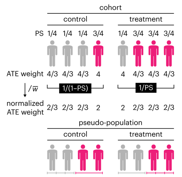
Kurz, C.F., Krzywinski, M. & Altman, N. (2025) Points of significance: Propensity score weighting. Nat. Methods 22:1–3.
Happy 2025 π Day—
TTCAGT: a sequence of digits
Celebrate π Day (March 14th) and sequence digits like its 1999. Let's call some peaks.
Crafting 10 Years of Statistics Explanations: Points of Significance
I don’t have good luck in the match points. —Rafael Nadal, Spanish tennis player
Points of Significance is an ongoing series of short articles about statistics in Nature Methods that started in 2013. Its aim is to provide clear explanations of essential concepts in statistics for a nonspecialist audience. The articles favor heuristic explanations and make extensive use of simulated examples and graphical explanations, while maintaining mathematical rigor.
Topics range from basic, but often misunderstood, such as uncertainty and P-values, to relatively advanced, but often neglected, such as the error-in-variables problem and the curse of dimensionality. More recent articles have focused on timely topics such as modeling of epidemics, machine learning, and neural networks.
In this article, we discuss the evolution of topics and details behind some of the story arcs, our approach to crafting statistical explanations and narratives, and our use of figures and numerical simulations as props for building understanding.
Altman, N. & Krzywinski, M. (2025) Crafting 10 Years of Statistics Explanations: Points of Significance. Annual Review of Statistics and Its Application 12:69–87.
Propensity score matching
I don’t have good luck in the match points. —Rafael Nadal, Spanish tennis player
In many experimental designs, we need to keep in mind the possibility of confounding variables, which may give rise to bias in the estimate of the treatment effect.
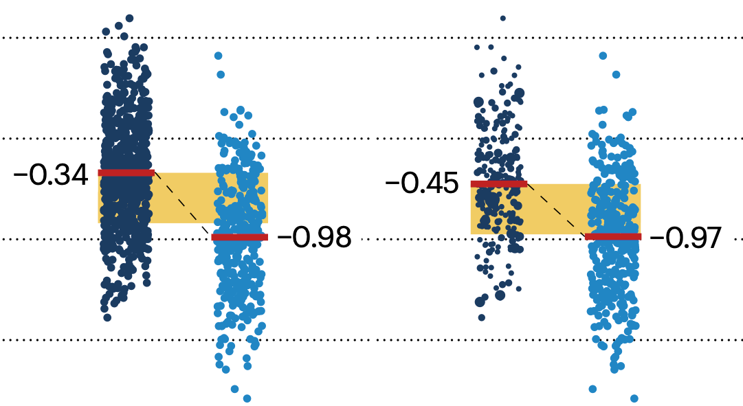
If the control and experimental groups aren't matched (or, roughly, similar enough), this bias can arise.
Sometimes this can be dealt with by randomizing, which on average can balance this effect out. When randomization is not possible, propensity score matching is an excellent strategy to match control and experimental groups.
Kurz, C.F., Krzywinski, M. & Altman, N. (2024) Points of significance: Propensity score matching. Nat. Methods 21:1770–1772.
Understanding p-values and significance
P-values combined with estimates of effect size are used to assess the importance of experimental results. However, their interpretation can be invalidated by selection bias when testing multiple hypotheses, fitting multiple models or even informally selecting results that seem interesting after observing the data.
We offer an introduction to principled uses of p-values (targeted at the non-specialist) and identify questionable practices to be avoided.
Altman, N. & Krzywinski, M. (2024) Understanding p-values and significance. Laboratory Animals 58:443–446.
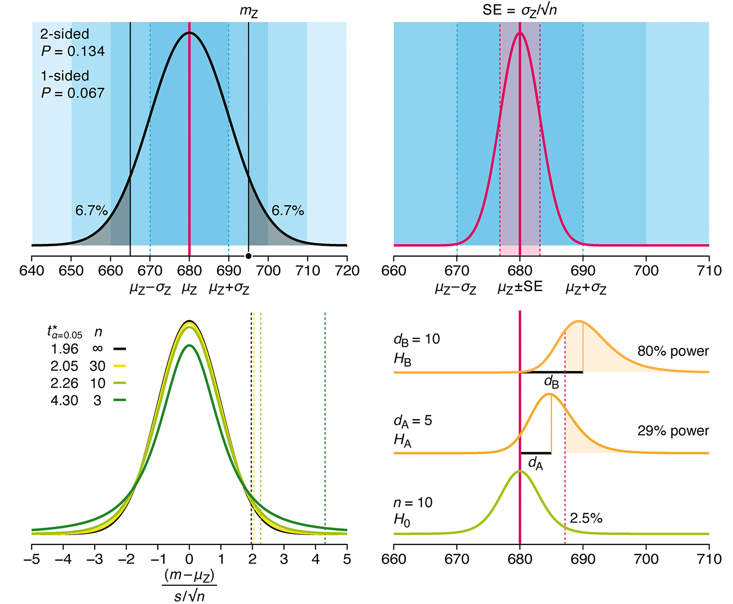
Depicting variability and uncertainty using intervals and error bars
Variability is inherent in most biological systems due to differences among members of the population. Two types of variation are commonly observed in studies: differences among samples and the “error” in estimating a population parameter (e.g. mean) from a sample. While these concepts are fundamentally very different, the associated variation is often expressed using similar notation—an interval that represents a range of values with a lower and upper bound.
In this article we discuss how common intervals are used (and misused).
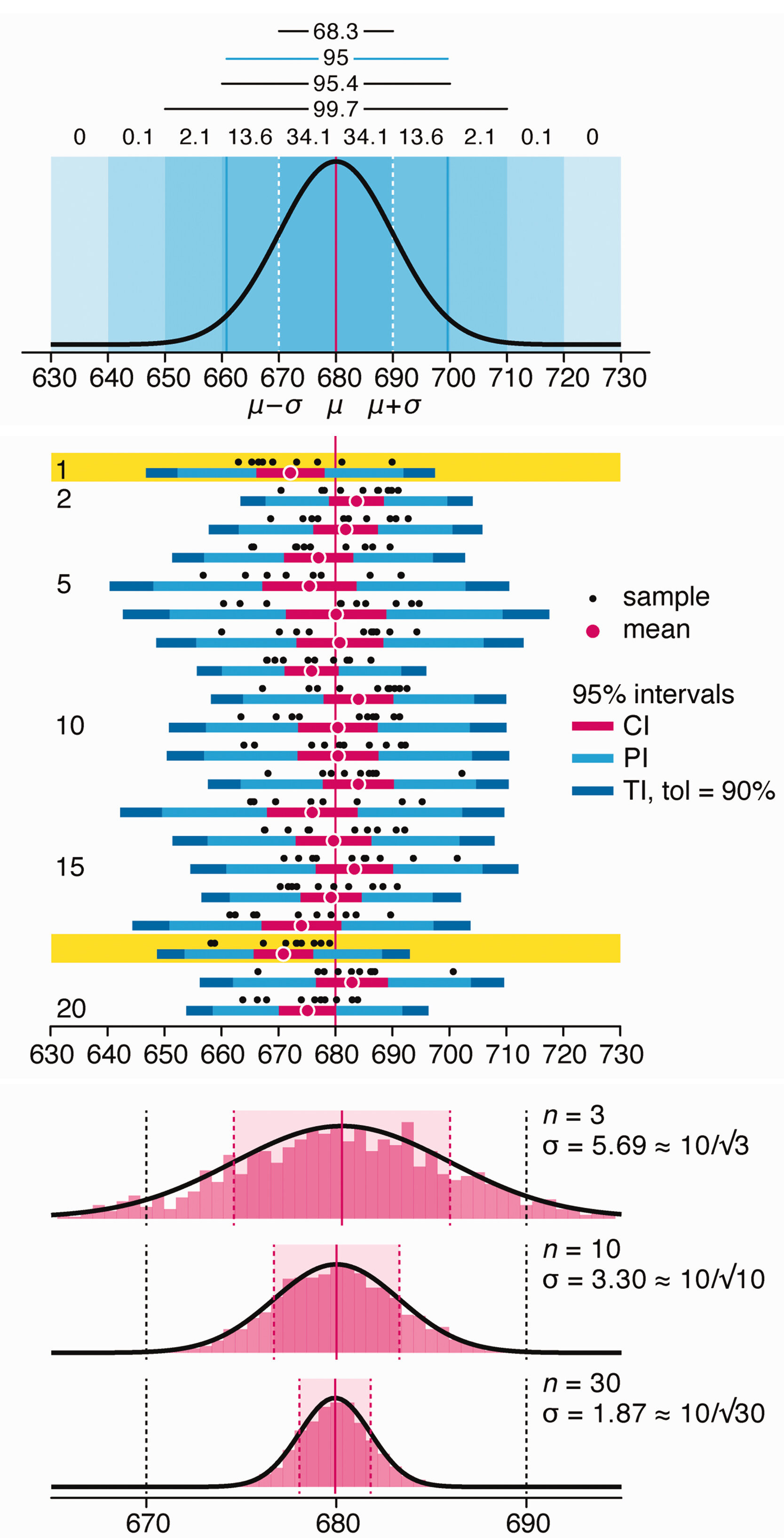
Altman, N. & Krzywinski, M. (2024) Depicting variability and uncertainty using intervals and error bars. Laboratory Animals 58:453–456.