


Essentials of Data Visualization — 8-part miniseries
Thinking about drawing data and communicating science
This video series focuses on relevant and practical concepts in scientific data visualization. My aim is to make you think more clearly about visual presentation and to make you a better communicator. Each video is about 15 minutes long and comes with a slide deck of the images used in the video, exercise and suggested solutions.
Each video in the series presents fundamental ideas and is designed to provide constraints and guidance to your thoughts about communicating your data. The purpose of scientific data visualization is not merely to inform but also to answer and generate hypotheses.
Whatever your communication medium, you should always have consistency (good!), redundancy (bad!) and an appropriate mapping between relevant and salience in mind (tricky!). Once these are satisfied, look to flow and density of material to achieve clarity (elusive!).
I present these essential topics using biological data as examples. But if you're not a biologist, don't worry. Instead, think about the data structure rather than meaning and you'll be fine.
Download all course materials.
1. Data Encoding

Make it easy to answer relevant questions.
When you think of data visualization, the first ideas that come to mind are a scatter plot, or a bar char, a box plot or a network diagram. These are all data encodings—methods that relate data values to the positions, sizes and shapes of the lines or symbols that appear on the screen or in a figure. There are many data encodings—which do you choose?
watch | PDF slides
2. Shapes and Symbols

Intuitively encode role and relevance.
Shapes and glyphs are really important. They make up the heart of a lot of data plots. Your default should be the circle. If you need different shapes, try to map the classes as intuitively as possible onto the shapes. Use less prominent symbols for data that are less relevant (such as reference data included for context).
watch | PDF slides
3. Color

Use it for emphasis and visual separation.
Color is one of the most exciting ways in which you can completely screw over your visualization. What can start off as a great diagram can be absolutely ruined by a lack of color judgment. When using color, ask yourself—do I need it? Try to work around it using grey tones from Brewer palettes. If you succeed, you’re in a perfect place to use spot color, sparingly, for emphasis.
watch | PDF slides
4. Uncertainty

Don't make errors in error bars.
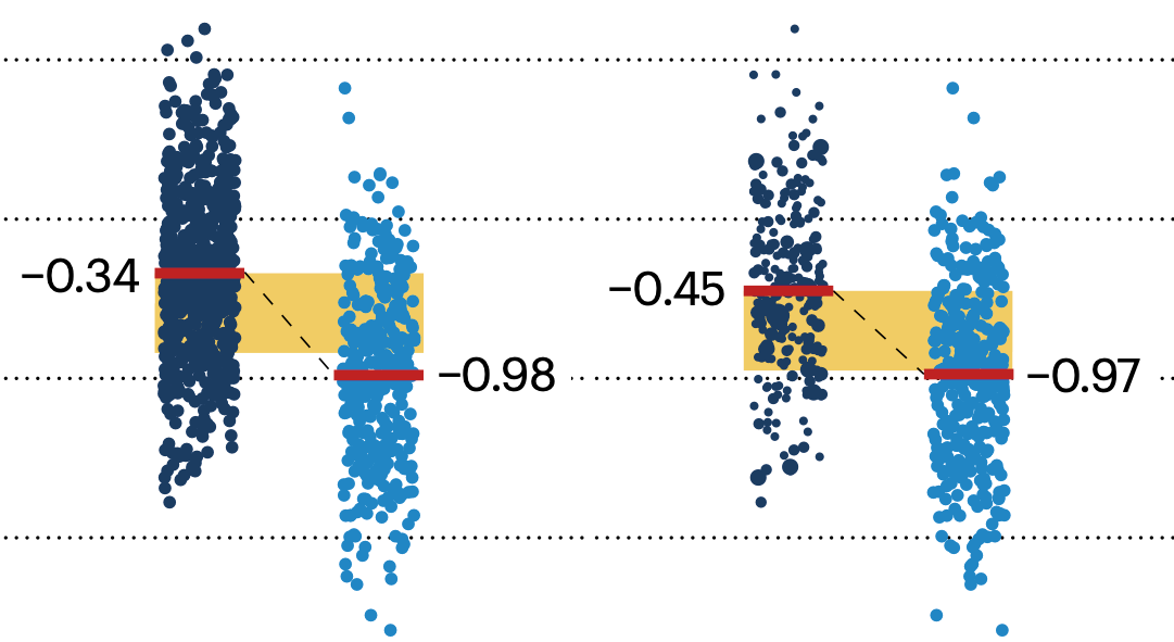
Knowing the limits of your knowledge is very important. In biology, it’s important to be able to sample the extent of biological variation. And so being able to show this and other forms of variation in measurements or any computed values in visualizations is very important—it addresses reproducibility and your capacity to make statistical inference. Often this is done with error bars. Ironically, there’s a lot of error associated with the use of and interpretation of error bars.
watch | PDF slides
5. Design

Organize and clarify.
Design plays a large role in data visualization. Think of design as choreography for the page. In our context it’s not merely driven by aesthetic, but function. Although there’s always room for aesthetic—gently applied—and I really encourage you to find your own and continue to refine it. But always remember, be understood before being articulate. Be legible before being attractive! Your goal here isn’t to make inroads on the global stage of aesthetic studies. Become a good visual explainer. It’s harder … and more worth doing.
watch | PDF slides
6. Nothing

No data, no ink.
Data-to-ink ratio, taken to the extreme: if there is no data to show, no ink should be used. The idea of “no data to show” may correspond to a variety of scenarios. There may be sincerely no data to show—no values were collected. Or, there are no significant changes to see. Where possible, you should use empty space to indicate lack of data or lack of change in data. You should never be distracted by something that isn’t relevant and empty space is not distracting—it really just provides contrast to adjacent elements, which presumably correspond to actual data or actionable data.
watch | PDF slides
7. Labels

Respect type and use it to establish hierarchy.
Open up a journal or your favourite text book. Find a figure. There’s probably some labels in there. Maybe it’s a multi-panel figure and the labels are the titles. Maybe there are some callouts that tell you what the parts are. If it’s a plot there are probably axis labels and tick labels and maybe a legend with some labels. There’s usually several informational layers in the image, each with their own labels. These labels should reflect that these layers are different. They should also reflect the relative importance of these layers.
watch | PDF slides
8. Process

Creating a visualization for Scientific American Graphic Science: from start to finish.
Let’s now look at the process of designing a visualization from scratch—from the encoding all the way to design. This was a graphic I did for the June 2015 issue of Scientific American. It appeared on the Graphic Science page.
watch | PDF slides
Beyond Belief Campaign BRCA Art
Fuelled by philanthropy, findings into the workings of BRCA1 and BRCA2 genes have led to groundbreaking research and lifesaving innovations to care for families facing cancer.
This set of 100 one-of-a-kind prints explore the structure of these genes. Each artwork is unique — if you put them all together, you get the full sequence of the BRCA1 and BRCA2 proteins.

Propensity score weighting
The needs of the many outweigh the needs of the few. —Mr. Spock (Star Trek II)
This month, we explore a related and powerful technique to address bias: propensity score weighting (PSW), which applies weights to each subject instead of matching (or discarding) them.
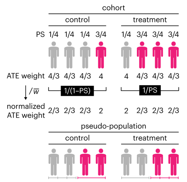
Kurz, C.F., Krzywinski, M. & Altman, N. (2025) Points of significance: Propensity score weighting. Nat. Methods 22:1–3.
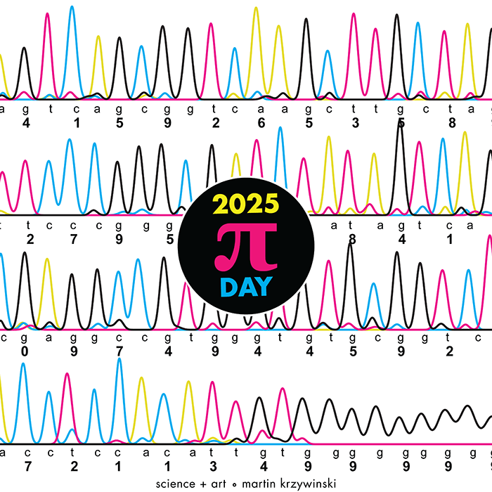
Happy 2025 π Day—
TTCAGT: a sequence of digits
Celebrate π Day (March 14th) and sequence digits like its 1999. Let's call some peaks.
Crafting 10 Years of Statistics Explanations: Points of Significance
I don’t have good luck in the match points. —Rafael Nadal, Spanish tennis player
Points of Significance is an ongoing series of short articles about statistics in Nature Methods that started in 2013. Its aim is to provide clear explanations of essential concepts in statistics for a nonspecialist audience. The articles favor heuristic explanations and make extensive use of simulated examples and graphical explanations, while maintaining mathematical rigor.
Topics range from basic, but often misunderstood, such as uncertainty and P-values, to relatively advanced, but often neglected, such as the error-in-variables problem and the curse of dimensionality. More recent articles have focused on timely topics such as modeling of epidemics, machine learning, and neural networks.
In this article, we discuss the evolution of topics and details behind some of the story arcs, our approach to crafting statistical explanations and narratives, and our use of figures and numerical simulations as props for building understanding.
Altman, N. & Krzywinski, M. (2025) Crafting 10 Years of Statistics Explanations: Points of Significance. Annual Review of Statistics and Its Application 12:69–87.
Propensity score matching
I don’t have good luck in the match points. —Rafael Nadal, Spanish tennis player
In many experimental designs, we need to keep in mind the possibility of confounding variables, which may give rise to bias in the estimate of the treatment effect.
If the control and experimental groups aren't matched (or, roughly, similar enough), this bias can arise.
Sometimes this can be dealt with by randomizing, which on average can balance this effect out. When randomization is not possible, propensity score matching is an excellent strategy to match control and experimental groups.
Kurz, C.F., Krzywinski, M. & Altman, N. (2024) Points of significance: Propensity score matching. Nat. Methods 21:1770–1772.