
Working with Senior Graphics Editor Jen Christiansen, Senior Editors Mark Fischetti and Clara Moskowitz, I have designed these Graphic Science visualizations for Scientific American.


Learn how nothing can teach us about the universe
Huge empty patches of the universe could help solve some of the greatest mysteries in the cosmos.
Scientific American January 2024, volume 330 issue 1
text by Clara Moskowitz | graphic by Martin Krzywinski

source
Sloan Digital Sky Survey (SDSS) Data Release 12
Hamaus, Pisani et al. Precision cosmology with voids in the final BOSS data. JCAP12(2020)023.
Constellation figures: Alan MacRobert (Sky & Telescope), Paulina Rowicka/Martin Krzywinski (revisions & Microscopium)
Stars: Hoffleit & Warren Jr. (1991) The Bright Star Catalog, 5th Revised Edition (Preliminary Version).
Cosmology: Planck collaboration. Planck 2018 results. VI. Cosmological parameters (2018). `H_0 = 67.4` km/(Mpc·s), `\Omega_m = 0.315`, `\Omega_{vac} = 0.685`
See how scientists put together the complete human genome
For the first time, researchers have sequenced all 3,117,275,501 bases of our genetic code.
Scientific American August 2022, volume 327 issue 2
text by Clara Moskowitz | graphic by Martin Krzywinski

source
assembly sequence from UCSC Genome Browser (assembly history), Nurk et al. The complete sequence of a human genome (2022) Science 376:44–53.
News
Filling in the Gaps by Laura Zahn, Most complete human genome yet reveals previously indecipherable DNA by Elizabeth Pennisi
How COVID-19 spread like wildfire
Mutations in the SARS-Cov-2 virus reveal the story.
Scientific American June 2020, volume 322 issue 6
text by Mark Fischetti | graphic by Martin Krzywinski
Source
Interested in more COVID-19 and SARS-Cov-2 graphics? Check out my projects below.


Take your medicine... now
Drugs could be more effective if taken when proteins they target are more active.
Scientific American January 2019, volume 320 issue 1

text by Mark Fischetti | graphic by Martin Krzywinski
A compelling overview figure of periodicity in a quantity. Before you even think about it, you already know what you're looking it.
Source
Ruben et al. A database of tissue-specific rhythmically expressed human genes has potential applications in circadian medicine Science Translational Medicine 10 Issue 458, eaat8806.
The same genes may underlie different psychiatric disorders
A distinct set of genes may underlie several psychiatric conditions.
Scientific American July 2018, volume 319 issue 1
text by Mark Fischetti | graphic by Martin Krzywinsk
The dataset is challenging: expression, correlation and network module membership of 11,000+ genes. Getting it onto one page was an exercise in restraint and calm.
source
Gandal M.J. et al. Shared Molecular Neuropathology Across Major Psychiatric Disorders Parallels Polygenic Overlap Science 359 693–697 (2018)
Men and women alter a home's bacteria differently
An analysis of dust reveals how the presence of men, women, dogs and cats affects the variety of bacteria in a household.
Scientific American December 2015, volume 313 issue 6
text by Mark Fischetti | graphic by Martin Krzywinski and Barbara Jeanine Hunnicutt
Catalogue of bacteria shapes by Barbara Jeanine Hunnicutt.
We explored differences in household dust bacteria based on the gender and pet status of the occupants.
We have also written about the making of the graphic, for those interested in how these things come together.
source
Barberan A et al. (2015) The ecology of microscopic life in household dust. Proc. R. Soc. B 282: 20151139.
A roadmap to the "volume control" of genes
Genes, traits and disease are linked in complex and surprising ways.
Scientific American June 2015, volume 312 issue 6
text by Dina Fine Maron | graphic by Martin Krzywinski
Because sometimes only a network hairball will do.
source
Integrative analysis of 111 reference human epigenomes. (2015) Nature 518:317.
Tiny genetic differences between humans and other primates pervade the genome
Genome comparisons reveal the DNA that distinguishes Homo sapiens from its kin.
Scientific American September 2014, volume 311 issue 3
text by Kate Wong | illustrations by Portia Sloan Rollings | graphic by Martin Krzywinski
A Scientific American blog entry "A Monkey's Blueprint" accompanies this piece.
This design won a bronze award at Malofiej 23. For more information about Malofiej, see the SA Visual blog entry "There's No Infographic without Info (and other Lessons from Malofiej)".

A: Yes.
source
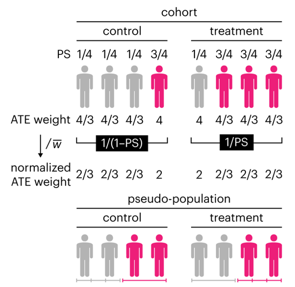
Propensity score weighting
It is not certain that everything is uncertain. —Blaise Pascal
We have already explored how we can mitigate bias caused by confounding variables in observational studies using propensity score (PS) matching (PSM) and propensity score weighting (PSW). However, any statistical model is only as good as its assumptions and, if it is specified incorrectly, it can itself produce biased estimates of the treatment effect.
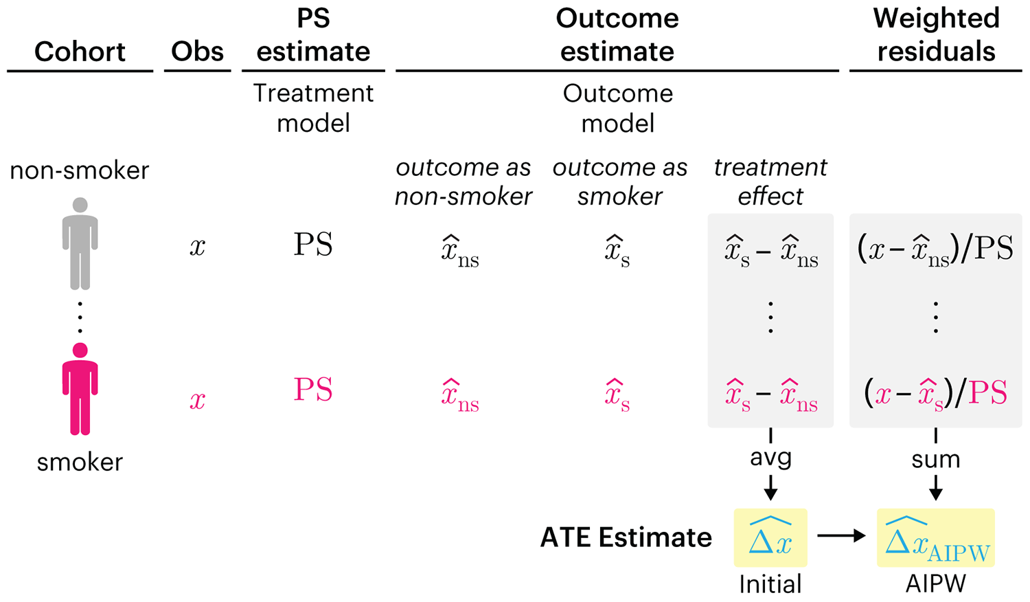
This month, we explore double robustness, a powerful statistical concept that provides a valuable “safety net” against the risk of an incorrect model. It offers two opportunities, instead of just one, to obtain a valid estimate of the treatment effect — making it possible to draw credible causal inferences from observational data without having to depend on a single set of modeling assumptions.
Kurz, C.F., Krzywinski, M. & Altman, N. (2026) Points of significance: Double Robustness. Nat. Methods 23:868–869.
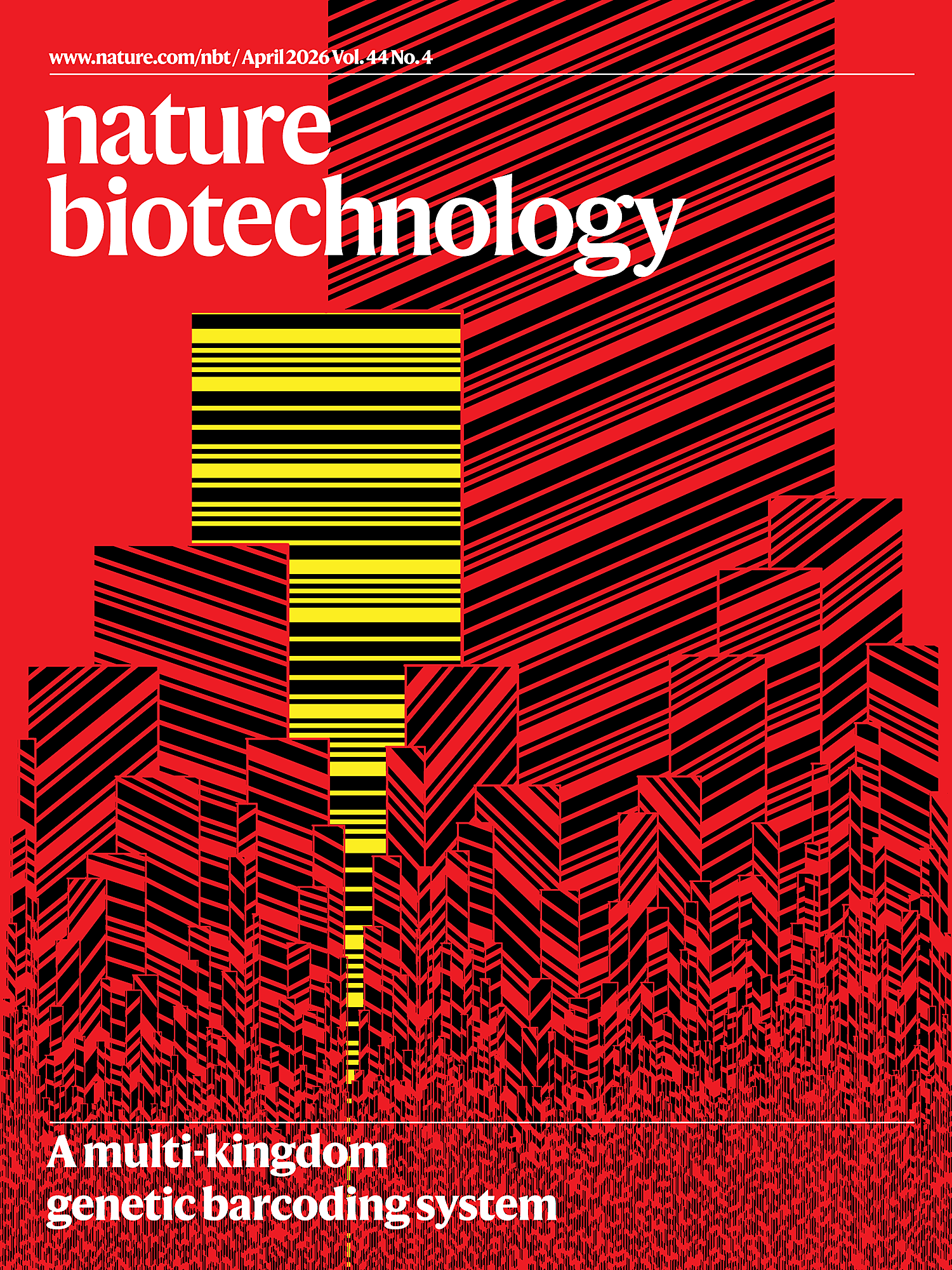
Nature Biotechnology cover
My cover design on the 7 April 2026 Nature Biotechnology issue shows the dendrogram that represents a cluster of uniquely expressed (or downregulated) genes in human naive stem cells induced from such cells. Within each dendrogram block, the genomic barcode sequence (sampled from Supplementary Table 1) is depicted with a Code 39 barcode. The highlighted barcode is one of those used for cell isolation.
Ishiguro S. et al. A multi-kingdom genetic barcoding system for precise clone isolation (2026) Nature Biotechnology 44:616–629.
Browse my gallery of cover designs.
Happy 2026 π Day—
Art for the 5%
Celebrate π Day (March 14th) and enjoy the art — but only if you're part of the 5%.
Go ahead, see what you can't see.

Ishihara's Tests for Colour Deficiency
Authentic and accurate images of Ishihara's test plates photographed (and lovingly color-corrected) from the 38-plate Ishihara's Tests for Colour Deficiency.
I also provide the position, size, and color of each circle on each test plate.


Symmetric alternatives to the ordinary least squares regression
What immortal hand or eye, could frame thy fearful symmetry? — William Blake, "The Tyger"
This month, we look at symmetric regression, which, unlike simple linear regression, it is reversible — remaining unaltered when the variables are swapped.
Simple linear regression can summarize the linear relationship between two variables `X` and `Y` — for example, when `Y` is considered the response (dependent) and `X` the predictor (independent) variable.
However, there are times when we are not interested (or able) to distinguish between dependent and independent variables — either because they have the same importance or the same role. This is where symmetric regression can help.

Luca Greco, George Luta, Martin Krzywinski & Naomi Altman (2025) Points of significance: Symmetric alternatives to the ordinary least squares regression. Nat. Methods 22:1610–1612.
Beyond Belief Campaign BRCA Art
Fuelled by philanthropy, findings into the workings of BRCA1 and BRCA2 genes have led to groundbreaking research and lifesaving innovations to care for families facing cancer.
This set of 100 one-of-a-kind prints explore the structure of these genes. Each artwork is unique — if you put them all together, you get the full sequence of the BRCA1 and BRCA2 proteins.

Propensity score weighting
The needs of the many outweigh the needs of the few. —Mr. Spock (Star Trek II)
This month, we explore a related and powerful technique to address bias: propensity score weighting (PSW), which applies weights to each subject instead of matching (or discarding) them.
Kurz, C.F., Krzywinski, M. & Altman, N. (2025) Points of significance: Propensity score weighting. Nat. Methods 22:638–640.
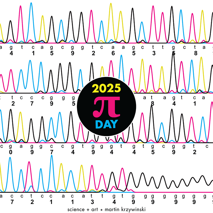
Happy 2025 π Day—
TTCAGT: a sequence of digits
Celebrate π Day (March 14th) and sequence digits like its 1999. Let's call some peaks.