
The COVID Charts
Observations on data visualizations of the coronavirus outbreak
The COVID Charts are brief critiques of data visualization and science communication of the coronavirus outbreak. They are not statements about the underlying science or public health policy.
If you would like me to critique a specific chart, get in touch.
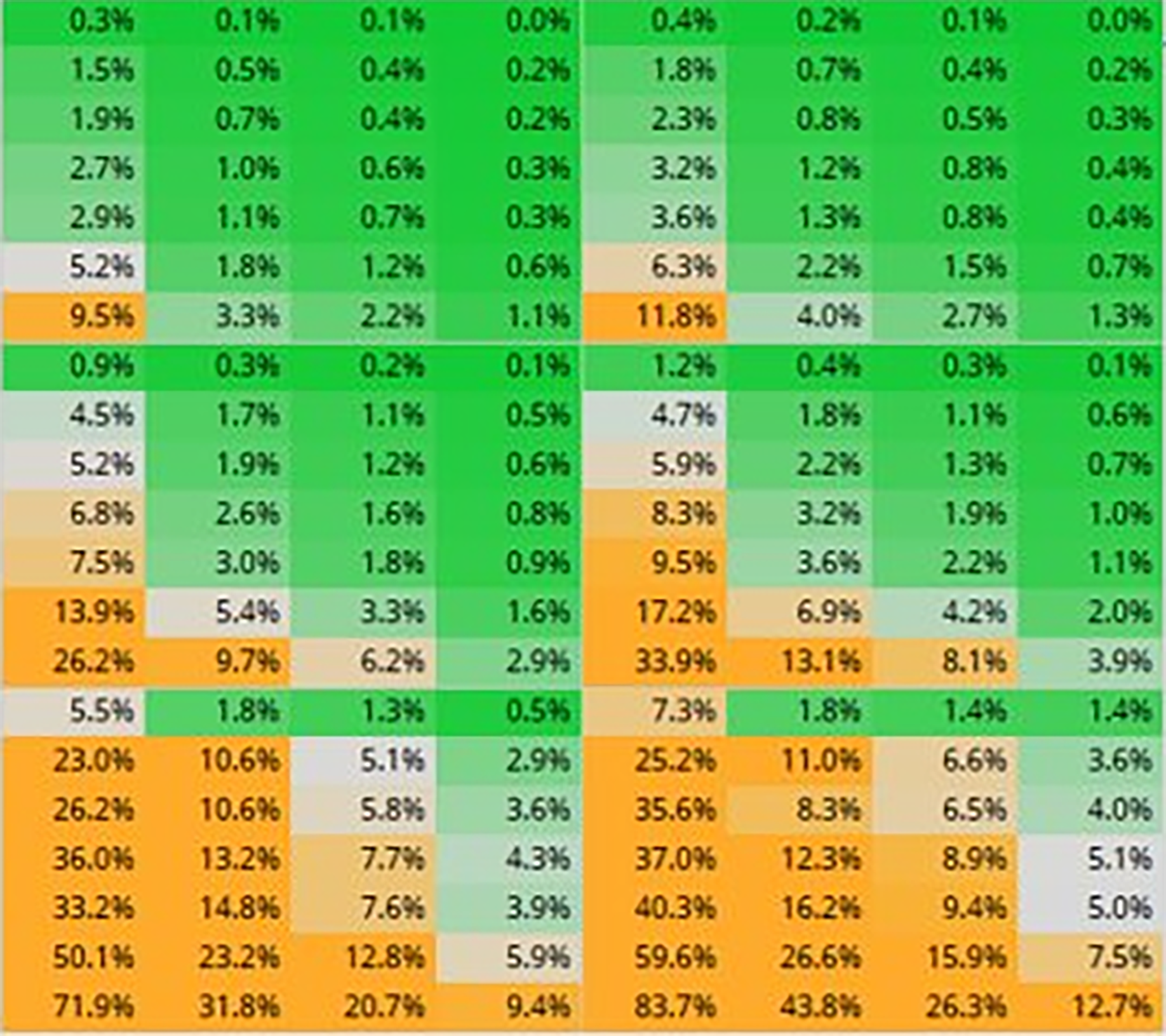
▲ Inaccessible, sloppy and rambling — a poor message . COVID-19 hospitalization risk as function of age, sex, comorbidities and vaccination status (Adrian Dix, 21 January 2022).
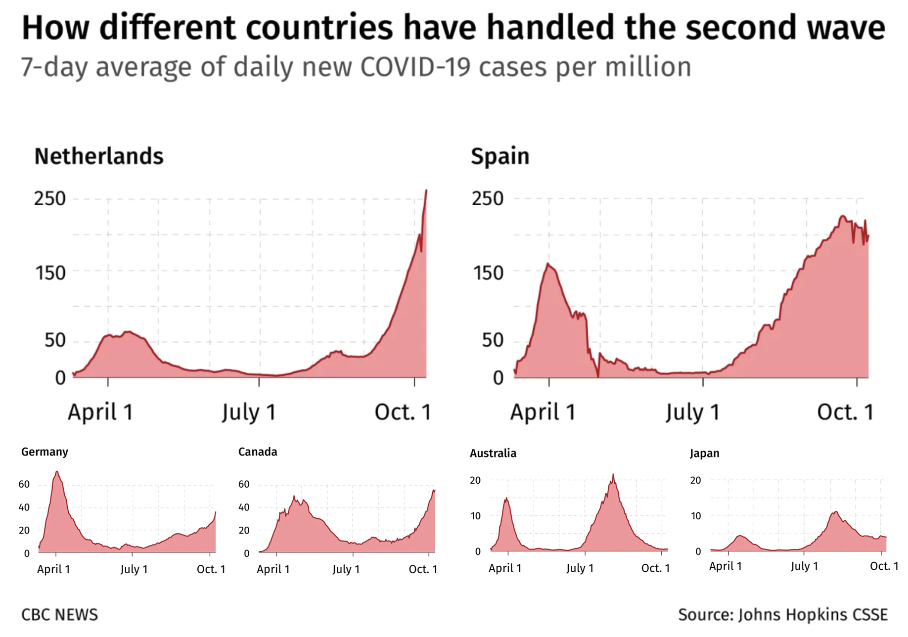
▲ It's not a comparison until you make it a comparison. . Profiles of 7-day average daily cases in eight countries during the second wave of COVID-19. (CBC News, 24 October 2020).
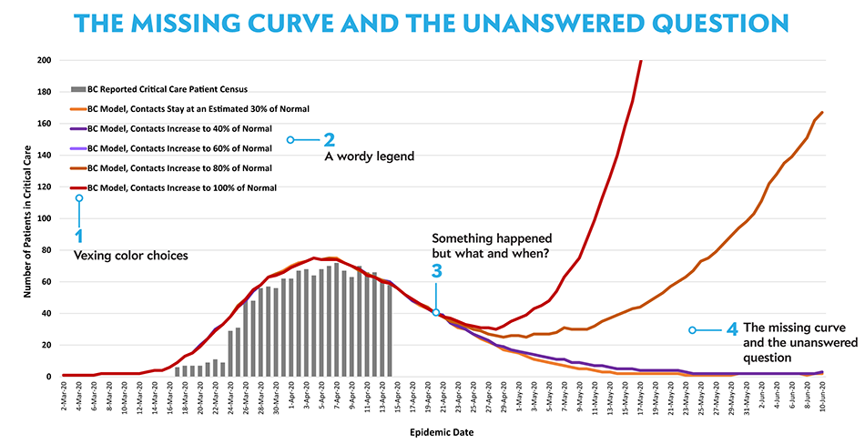
▲ The missing curve and the unanswered question . A model released by the B.C. government of how critical care cases for COVID-19 could develop over the coming months based on the level of restrictions in place. (BC Centre for Disease Control, 17 April 2020).
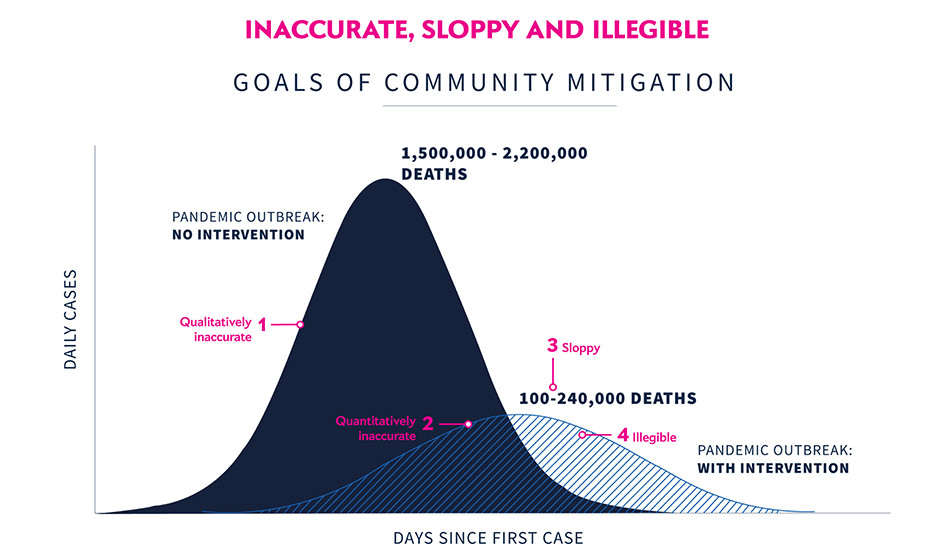
▲ Inaccurate, sloppy and illegible . A slide from the presentation that explains the goals of community mitigation by comparing the time progress of daily cases with and without intervention. The chart projects that by “flattening the curve” deaths can be reduced from 1.5–2.2 million to 100,000–240,000. (White House Coronavirus Task Force, 31 March 2020).