visualization + design
Hilbert Curve Art, Hilbertonians and Monkeys
I collaborated with Scientific American to create a data graphic for the September 2014 issue. The graphic compared the genomes of the Denisovan, bonobo, chimp and gorilla, showing how our own genomes are almost identical to the Denisovan and closer to that of the bonobo and chimp than the gorilla.

Here you'll find Hilbert curve art, a introduction to Hilbertonians, the creatures that live on the curve, an explanation of the Scientific American graphic and downloadable SVG/EPS Hilbert curve files.
Hilbert curve
There are wheels within wheels in this village and fires within fires!
— Arthur Miller (The Crucible)
The Hilbert curve is one of many space-filling curves. It is a mapping between one dimension (e.g. a line) and multiple dimensions (e.g. a square, a cube, etc). It's useful because it preserves locality—points that are nearby on the line are usually mapped onto nearby points on the curve.
It's a pretty strange mapping, to be sure. Although a point on a line maps uniquely onto the curve this is not the case in reverse. At infinite order the curve intersects itself infinitely many times! This shouldn't be a surprise if you consider that the unit square has the same number of points as the unit line. Now that's the real surprise! So surprising in fact that it apparently destabilized Cantor's mind, who made the initial discovery.
Bryan Hayes has a great introduction (Crinkly Curves) to the Hilbert curve at American Scientist.
If manipulated so that its ends are adjacent, the Hilbert curve becomes the Moore curve.
constructing the hilbert curve
The order 1 curve is generated by dividing a square into quadrants and connecting the centers of the quadrants with three lines. Which three connections are made is arbitrary—different choices result in rotations of the curve.
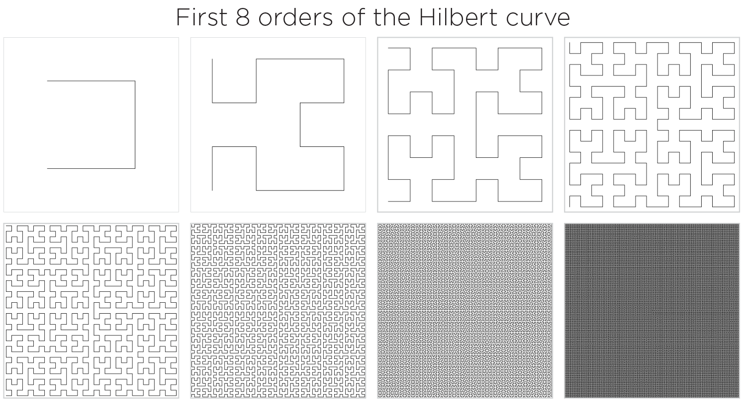
The order 6 curve is the highest order whose structure can be discerned at this figure resolution. Though just barely. The length of this curve is about 64 times the width of the square, so about 9,216 pixels! That's tight packing.
By order 7 the structure in the 620 pixel wide image (each square is 144 px wide) cannot be discerned. By order 8 the curve has 65,536 points, which exceeds the number of pixels its square in the figure. A square of 256 x 256 would be required to show all the points without downsampling.
Two order 10 curves have 1,048,576 points each and would approximately map onto all the pixels on an average monitor (1920 x 1200 pixels).
A curve of order 33 has `7.38 * 10^19` points and if drawn as a square of average body height would have points that are an atom's distance from one another (`10^{-10}` m).
mapping the line onto the square
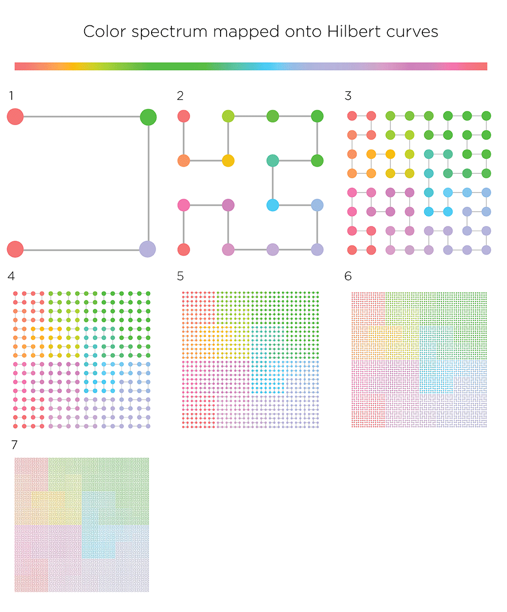
By mapping the familiar rainbow onto the curve you can see how higher order curves "crinkle" (to borrow Bryan's term) around the square.
properties of the first 23 orders of the Hilbert curve
| order | points | segments | length |
| `n` | `4^n` | `4^{n-1}` | `2^n-2^{-n}` |
| 1 | 4 | 3 | 1.5 |
| 2 | 16 | 15 | 3.75 |
| 3 | 64 | 63 | 7.875 |
| 4 | 256 | 255 | 15.9375 |
| 5 | 1,024 | 1,023 | 31.96875 |
| 6 | 4,096 | 4,095 | 63.984375 |
| 7 | 16,384 | 16,383 | 127.9921875 |
| 8 | 65,536 | 65,535 | 255.99609375 |
| 9 | 262,144 | 262,143 | 511.998046875 |
| 10 | 1,048,576 | 1,048,575 | 1023.9990234375 |
| 11 | 4,194,304 | 4,194,303 | 2047.99951171875 |
| 12 | 16,777,216 | 16,777,215 | 4095.99975585938 |
| 13 | 67,108,864 | 67,108,863 | 8191.99987792969 |
| 14 | 268,435,456 | 268,435,455 | 16383.9999389648 |
| 15 | 1,073,741,824 | 1,073,741,823 | 32767.9999694824 |
| 16 | 4,294,967,296 | 4,294,967,295 | 65535.9999847412 |
| 17 | 17,179,869,184 | 17,179,869,183 | 131071.999992371 |
| 18 | 68,719,476,736 | 68,719,476,735 | 262143.999996185 |
| 19 | 274,877,906,944 | 274,877,906,943 | 524287.999998093 |
| 20 | 1,099,511,627,776 | 1,099,511,627,775 | 1048575.99999905 |
| 21 | 4,398,046,511,104 | 4,398,046,511,103 | 2097151.99999952 |
| 22 | 17,592,186,044,416 | 17,592,186,044,415 | 4194303.99999976 |
| 23 | 70,368,744,177,664 | 70,368,744,177,663 | 8388607.99999988 |
You can download the basic curve shapes for orders 1 to 10 and experiment yourself. Both square and circular forms are available.
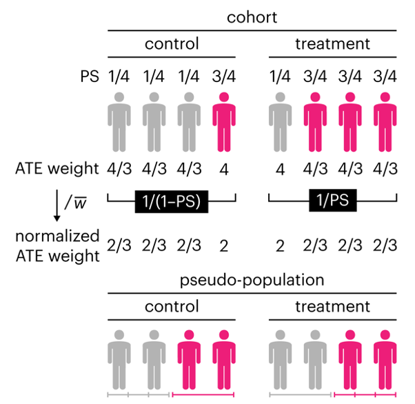
Propensity score weighting
The needs of the many outweigh the needs of the few. —Mr. Spock (Star Trek II)
This month, we explore a related and powerful technique to address bias: propensity score weighting (PSW), which applies weights to each subject instead of matching (or discarding) them.
Kurz, C.F., Krzywinski, M. & Altman, N. (2025) Points of significance: Propensity score weighting. Nat. Methods 22:1–3.
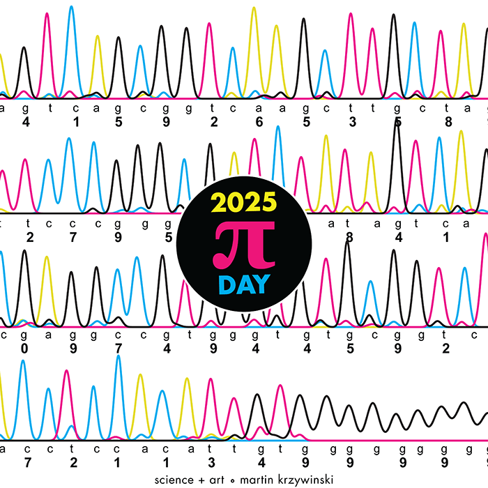
Happy 2025 π Day—
TTCAGT: a sequence of digits
Celebrate π Day (March 14th) and sequence digits like its 1999. Let's call some peaks.
Crafting 10 Years of Statistics Explanations: Points of Significance
I don’t have good luck in the match points. —Rafael Nadal, Spanish tennis player
Points of Significance is an ongoing series of short articles about statistics in Nature Methods that started in 2013. Its aim is to provide clear explanations of essential concepts in statistics for a nonspecialist audience. The articles favor heuristic explanations and make extensive use of simulated examples and graphical explanations, while maintaining mathematical rigor.
Topics range from basic, but often misunderstood, such as uncertainty and P-values, to relatively advanced, but often neglected, such as the error-in-variables problem and the curse of dimensionality. More recent articles have focused on timely topics such as modeling of epidemics, machine learning, and neural networks.
In this article, we discuss the evolution of topics and details behind some of the story arcs, our approach to crafting statistical explanations and narratives, and our use of figures and numerical simulations as props for building understanding.
Altman, N. & Krzywinski, M. (2025) Crafting 10 Years of Statistics Explanations: Points of Significance. Annual Review of Statistics and Its Application 12:69–87.
Propensity score matching
I don’t have good luck in the match points. —Rafael Nadal, Spanish tennis player
In many experimental designs, we need to keep in mind the possibility of confounding variables, which may give rise to bias in the estimate of the treatment effect.
If the control and experimental groups aren't matched (or, roughly, similar enough), this bias can arise.
Sometimes this can be dealt with by randomizing, which on average can balance this effect out. When randomization is not possible, propensity score matching is an excellent strategy to match control and experimental groups.
Kurz, C.F., Krzywinski, M. & Altman, N. (2024) Points of significance: Propensity score matching. Nat. Methods 21:1770–1772.
Understanding p-values and significance
P-values combined with estimates of effect size are used to assess the importance of experimental results. However, their interpretation can be invalidated by selection bias when testing multiple hypotheses, fitting multiple models or even informally selecting results that seem interesting after observing the data.
We offer an introduction to principled uses of p-values (targeted at the non-specialist) and identify questionable practices to be avoided.
Altman, N. & Krzywinski, M. (2024) Understanding p-values and significance. Laboratory Animals 58:443–446.
Depicting variability and uncertainty using intervals and error bars
Variability is inherent in most biological systems due to differences among members of the population. Two types of variation are commonly observed in studies: differences among samples and the “error” in estimating a population parameter (e.g. mean) from a sample. While these concepts are fundamentally very different, the associated variation is often expressed using similar notation—an interval that represents a range of values with a lower and upper bound.
In this article we discuss how common intervals are used (and misused).
Altman, N. & Krzywinski, M. (2024) Depicting variability and uncertainty using intervals and error bars. Laboratory Animals 58:453–456.