
Designing for Color blindness
Color choices and transformations for deuteranopia and other afflictions
Here, I help you understand color blindness and describe a process by which you can make good color choices when designing for accessibility.
The opposite of color blindness is seeing all the colors and I can help you find 1,000 (or more) maximally distinct colors.
You can also delve into the mathematics behind the color blindness simulations and learn about copunctal points (the invisible color!) and lines of confusion.
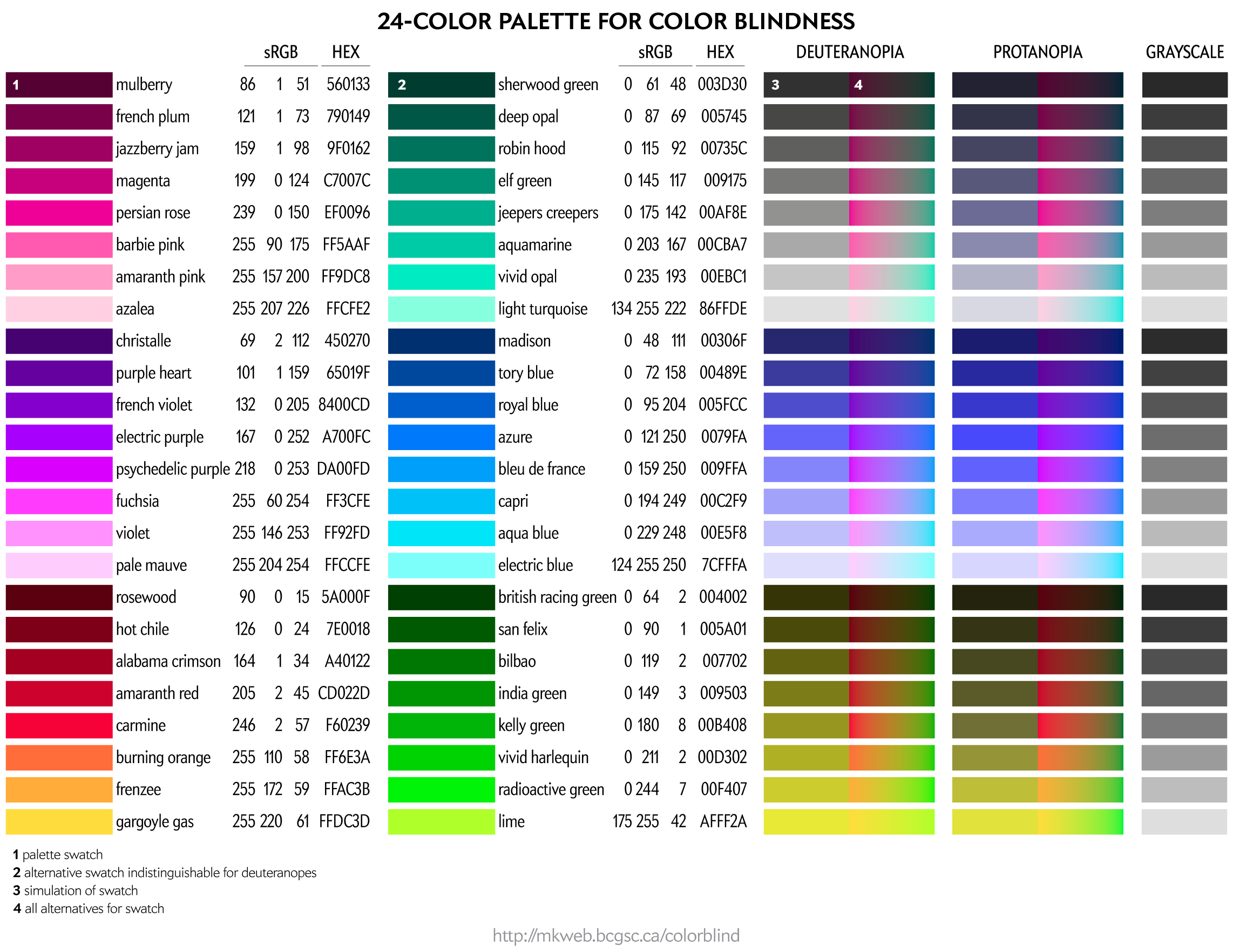
Color palettes for color blindness
contents
In this section, I cover how to make good color choices when considering audiences with color blindness.
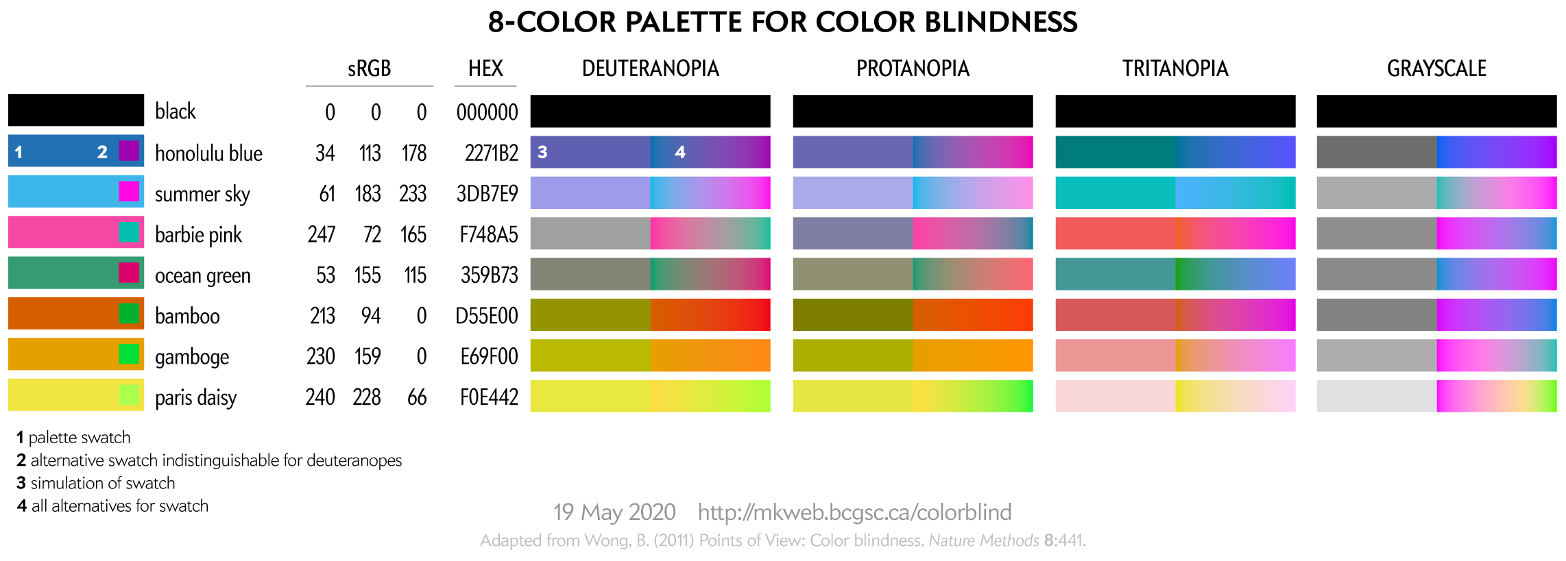
With the exception of the 8-color palette, all palettes have been created using a process (read below) that tries to maintain perceptual luminance uniformity in color-blind space.
This 8-color palette is adapted from Nature Method's Points of View: Color blindness by Bang Wong. Note that in that original source the RGB values listed in the table did not exactly correspond to the RGB swatches—probably an RGB vs CMYK conversion mixup.
This palette is suitable for categorical color encoding—the colors do not, as a whole, have a natural order and none is substantially more salient than another.
You can download these colors as plain text list of HEX and RGB values.
For more tips about designing with color blindness in mind, see Color Universal Design (CUD) — How to make figures and presentations that are friendly to people with color blindess.
To people with color blindness, some colors appear the same. This equivalence can be used to identify colors that are distinct to those with normal as well as to those with color blindness.
For a given RGB color we can simulate how it would appear to someone with color blindess and identify groups of RGB colors that appear indistinguishable in color blindness.
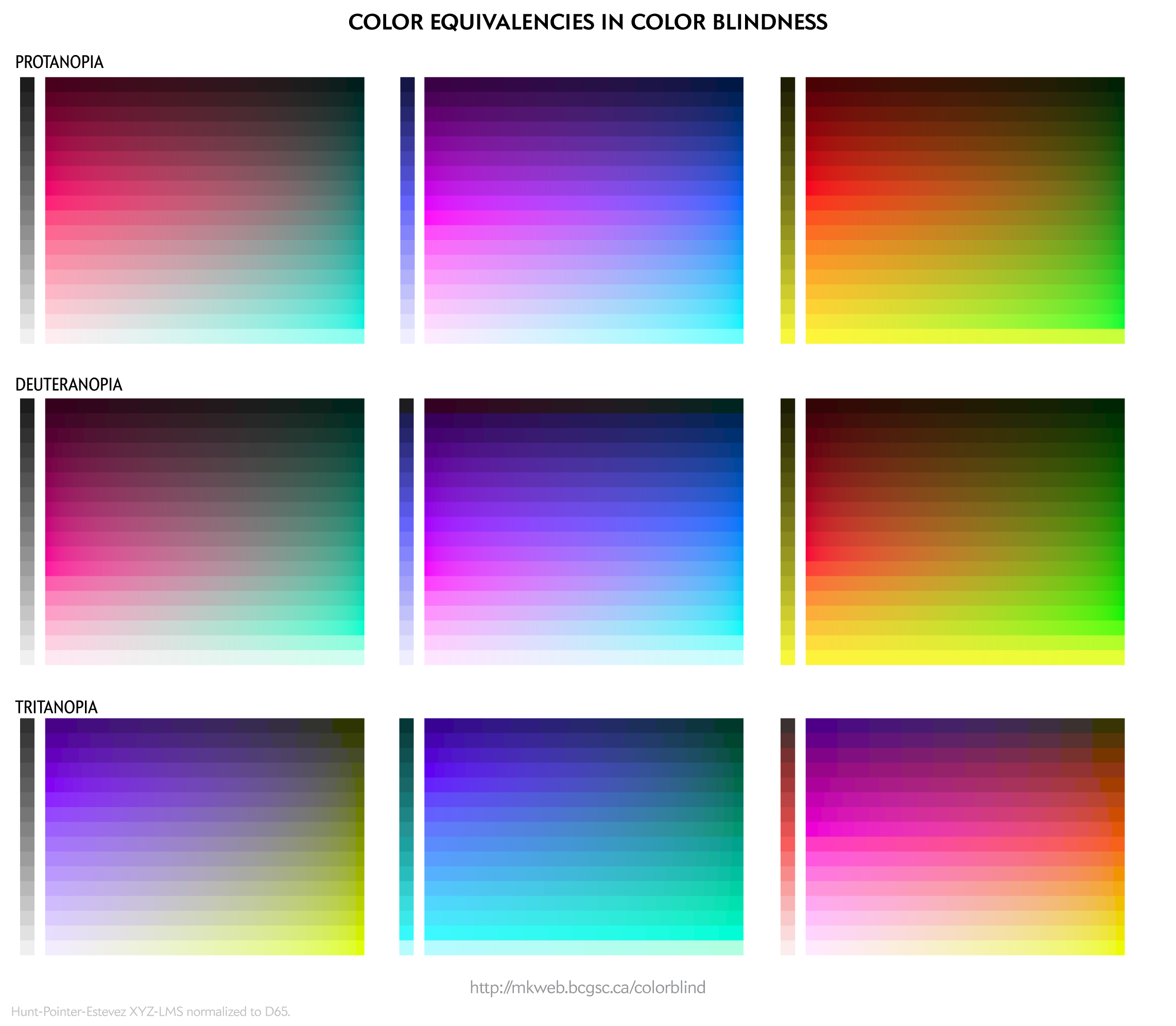
These equivalencies can be used to construct color palettes—lists of colors that are distinguishable to deuteranopes and those with normal vision.
Since deuteranopia is the most common, this is the condition that I use for color selection.
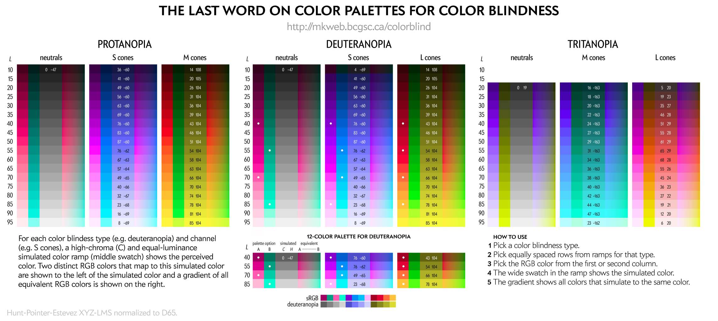
The exact luminance (perceived brightness) of the simulated color varies depending on the color blindness algorithm. Each row in the squares above should look identical using any color blindness simulation (e.g. Color Oracle, Photoshop, etc) but brightness of the rows may be slightly different than shown here.
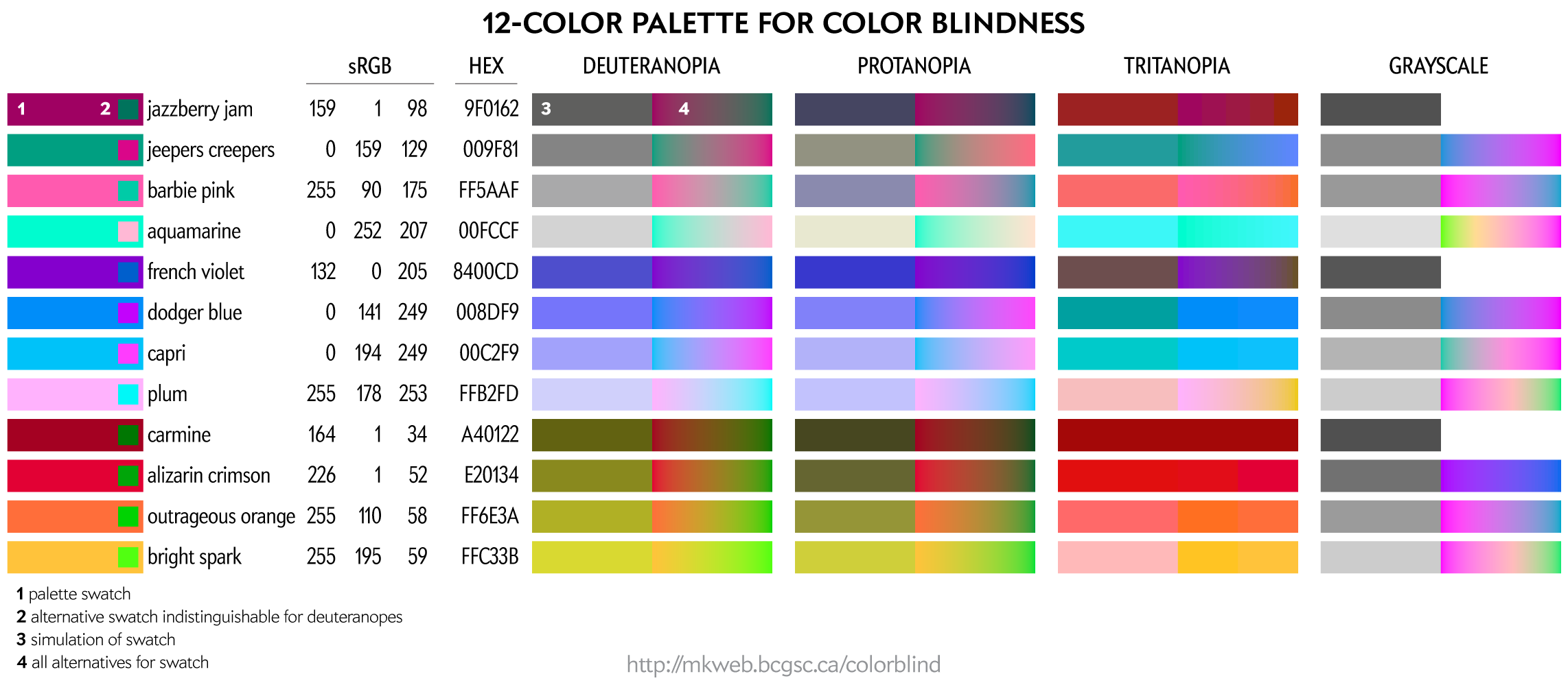
This palette maps four colors onto each of the two color dimensions in deuteranopes and four onto greyscale. This palette is very useful for designing transit and subway maps.
Color names are playful selections from my list of 10,000 color names.
You can download these colors as plain text list of HEX and RGB values.
You can download these colors as plain text list of HEX and RGB values.
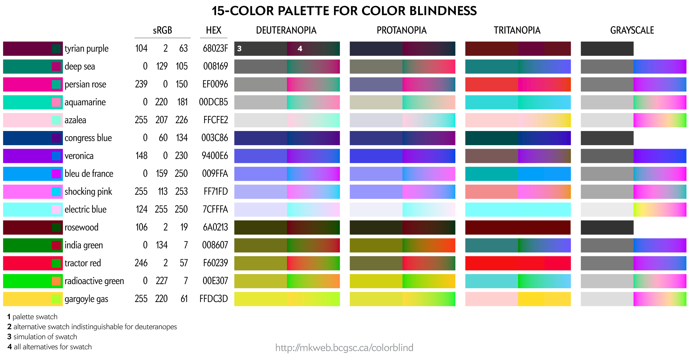
Even more color choices for color blindess, including colors that map onto greys. For these, I don't have RGB/HEX values handy.
You can download these colors as plain text list of HEX and RGB values.
You can create your own color palettes using the figure below.
For a given color blindness type (e.g. deuteranopia) and channel (e.g. blue), the rows represent reasonably uniform steps in LCH luminance of the simulated color and a rich (high chroma) simulation at that luminance.
Beyond Belief Campaign BRCA Art
Fuelled by philanthropy, findings into the workings of BRCA1 and BRCA2 genes have led to groundbreaking research and lifesaving innovations to care for families facing cancer.
This set of 100 one-of-a-kind prints explore the structure of these genes. Each artwork is unique — if you put them all together, you get the full sequence of the BRCA1 and BRCA2 proteins.

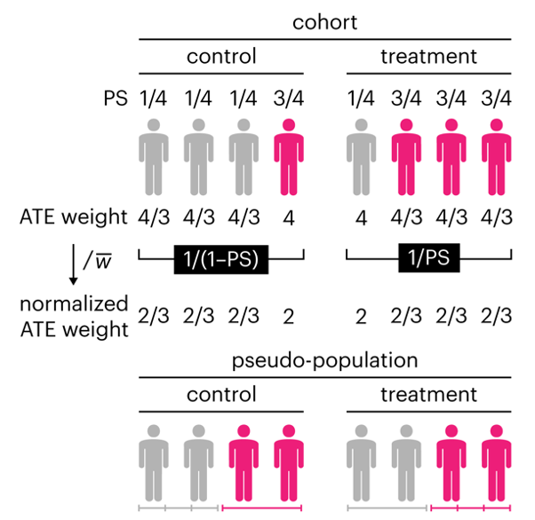
Propensity score weighting
The needs of the many outweigh the needs of the few. —Mr. Spock (Star Trek II)
This month, we explore a related and powerful technique to address bias: propensity score weighting (PSW), which applies weights to each subject instead of matching (or discarding) them.
Kurz, C.F., Krzywinski, M. & Altman, N. (2025) Points of significance: Propensity score weighting. Nat. Methods 22:1–3.
Happy 2025 π Day—
TTCAGT: a sequence of digits
Celebrate π Day (March 14th) and sequence digits like its 1999. Let's call some peaks.
Crafting 10 Years of Statistics Explanations: Points of Significance
I don’t have good luck in the match points. —Rafael Nadal, Spanish tennis player
Points of Significance is an ongoing series of short articles about statistics in Nature Methods that started in 2013. Its aim is to provide clear explanations of essential concepts in statistics for a nonspecialist audience. The articles favor heuristic explanations and make extensive use of simulated examples and graphical explanations, while maintaining mathematical rigor.
Topics range from basic, but often misunderstood, such as uncertainty and P-values, to relatively advanced, but often neglected, such as the error-in-variables problem and the curse of dimensionality. More recent articles have focused on timely topics such as modeling of epidemics, machine learning, and neural networks.
In this article, we discuss the evolution of topics and details behind some of the story arcs, our approach to crafting statistical explanations and narratives, and our use of figures and numerical simulations as props for building understanding.
Altman, N. & Krzywinski, M. (2025) Crafting 10 Years of Statistics Explanations: Points of Significance. Annual Review of Statistics and Its Application 12:69–87.
Propensity score matching
I don’t have good luck in the match points. —Rafael Nadal, Spanish tennis player
In many experimental designs, we need to keep in mind the possibility of confounding variables, which may give rise to bias in the estimate of the treatment effect.
If the control and experimental groups aren't matched (or, roughly, similar enough), this bias can arise.
Sometimes this can be dealt with by randomizing, which on average can balance this effect out. When randomization is not possible, propensity score matching is an excellent strategy to match control and experimental groups.
Kurz, C.F., Krzywinski, M. & Altman, N. (2024) Points of significance: Propensity score matching. Nat. Methods 21:1770–1772.