


null
from an undefined
place,
undefined
create (a place)
an account
of us
— Viorica Hrincu
Sometimes when you stare at the void, the void sends you a poem.
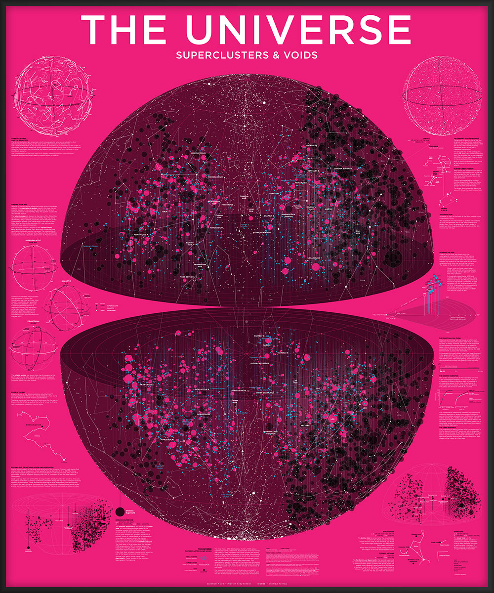
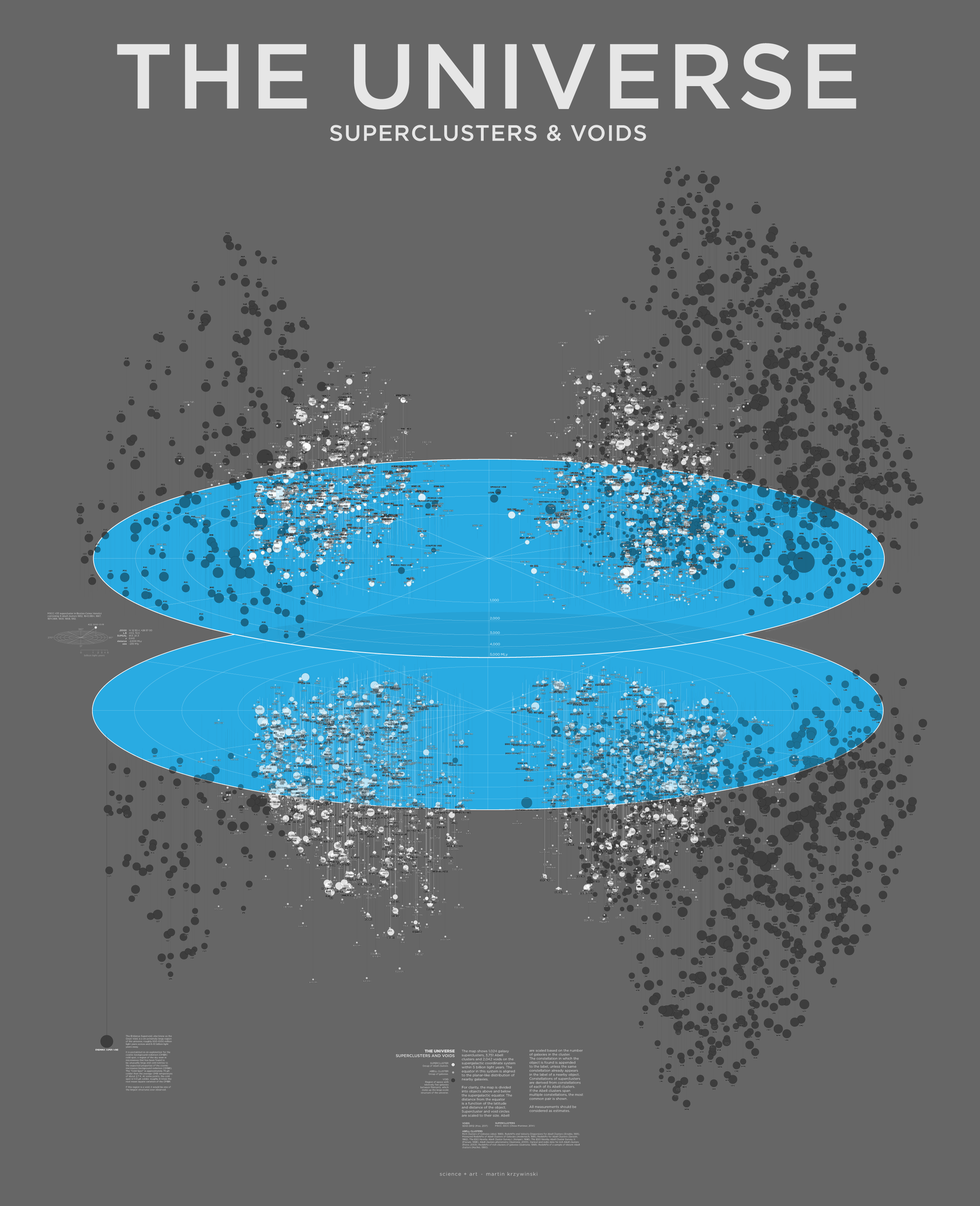
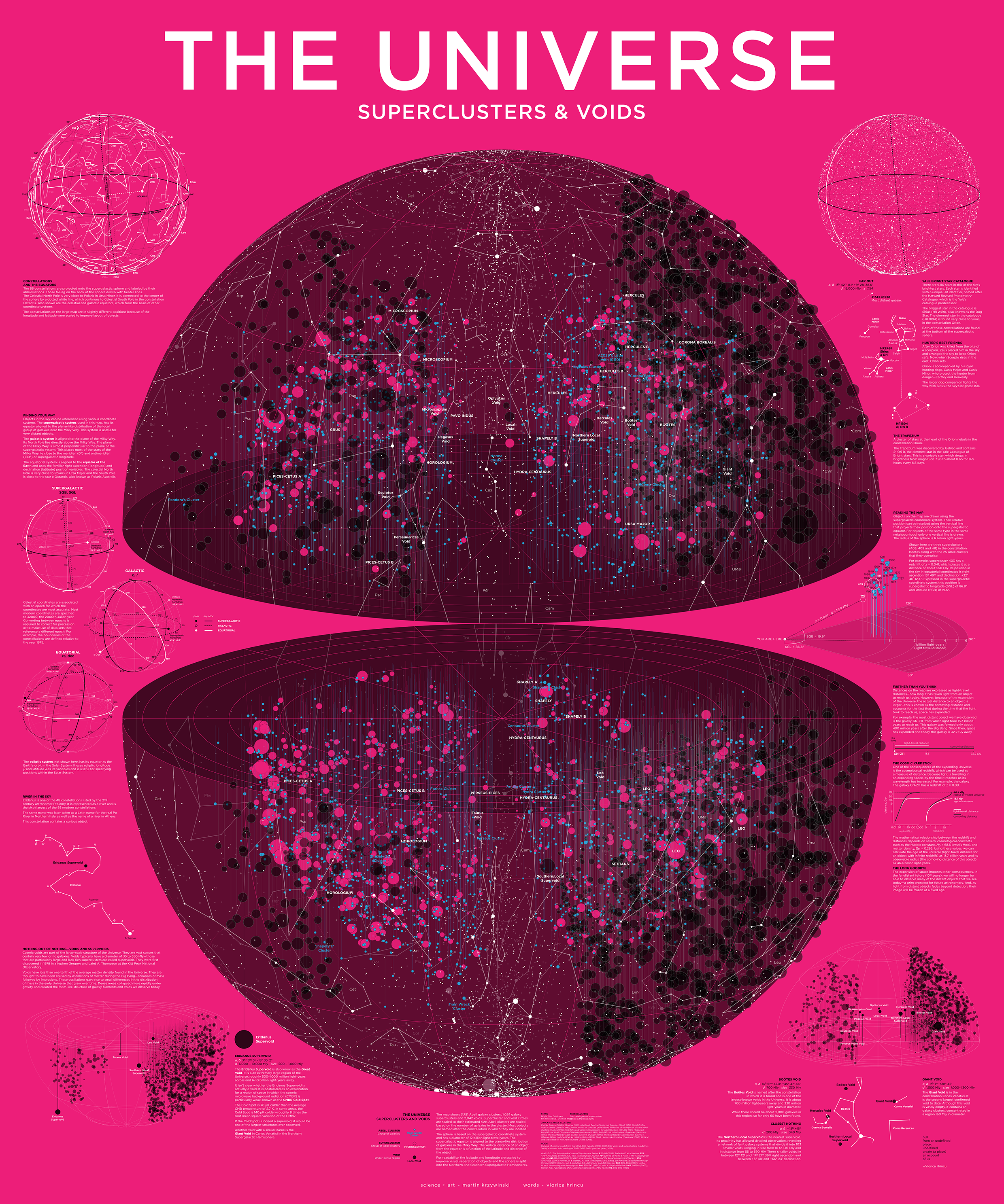
Universe—Superclusters and Voids
The average density of the universe is about `10 \times 10^{-30} \text{ g/cm}^3` or about 6 protons per cubic meter. This should put some perspective in what we mean when we speak about voids as "underdense regions".
listen: there's a hell
of a good universe next door; let's go
—e.e. cummings (pity this monster, manunkind)
designing the poster
contents
- 1 · Evolution of the Superclusters and Voids poster
- 2 · Inspiration
- 3 · VizieR astronomical catalogues
- 4 · Applying an orthographic projection
- 5 · Building the poster
- 6 · Adding stars and constellations
- 7 · Colors, fonts and design choices
- 8 · A poetic collaboration
- 9 · Interpretive panels and stories
Below I describe the design process of the poster, which is available in various color schemes.
The distances on the poster are all light-travel distances. To learn more about how distances are measured in the Universe, I've put together a short tutorial and calculator on space expansion, light-travel and comoving distances.
The reference section links to reading material about the details of individual elements, such as the coordinate system.
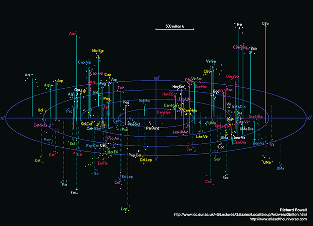
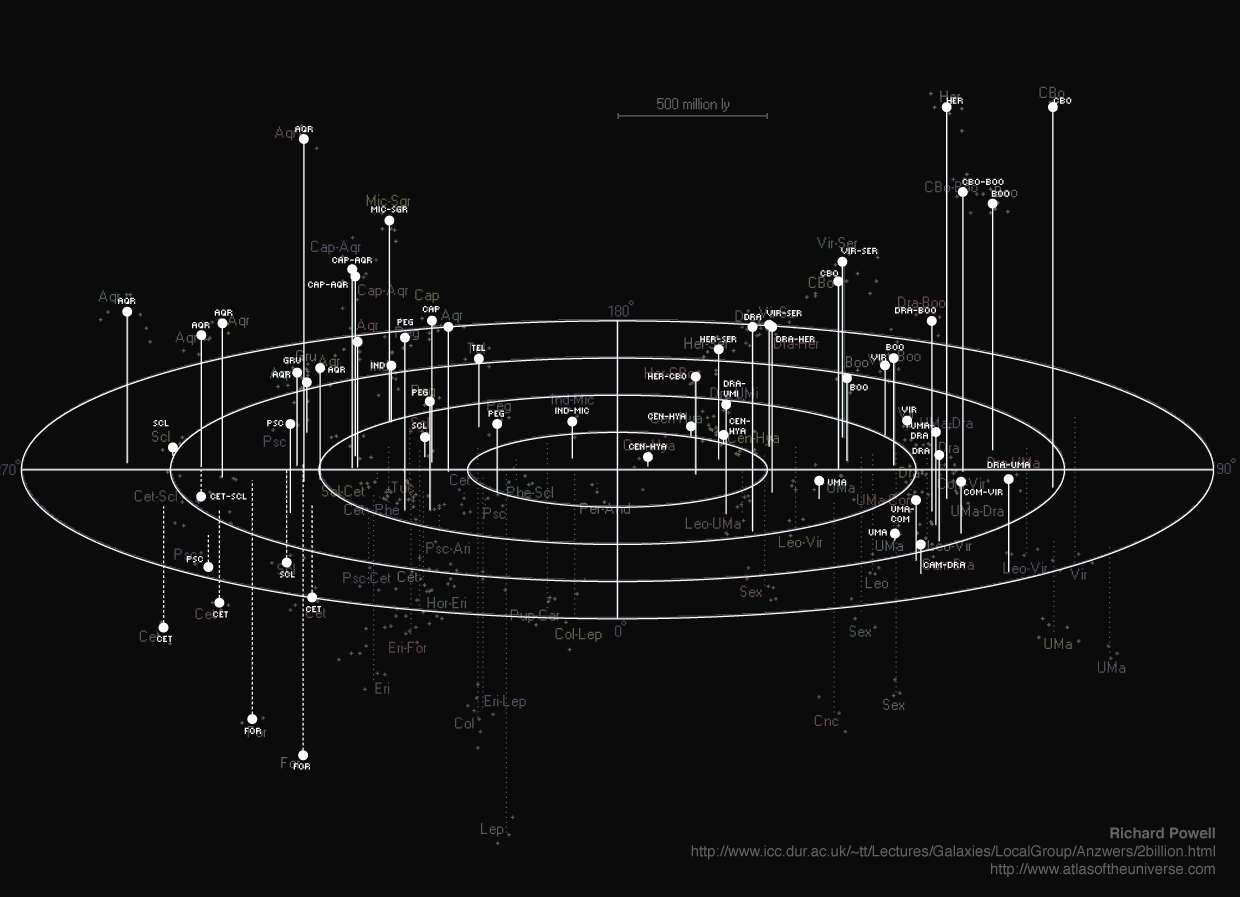
I was motivated by this map by Richard Powell of the Universe within 2 billion light years.
I started dutifully tracing the map and I got as far as the image below...
...before I decided that I should just parse Richard's list of superclusters and programmatically generate the map.
#Common Name   Equatorial   Supergal Redsh Dis  Size Con     Abell clusters in the
#              Coordinates  Coords   z     Mly  Mly          in the supercluster
#              RA    Dec    L°  B°
Centaurus      13 00 -32.0  148  -7  0.014 194  150  Cen-Hya 1060,3526,3565,3574,3581
Perseus-Pisces 02 32 +39.8  341  -8  0.016 222  100  Per-And 262,347,426
Pavo-Indus     20 34 -37.0  230 +32  0.017 235  100  Ind-Mic 3656,3698,3742
...
You can download a plain-text and tidied version of this file, in which the Abell list for a supercluster is now on a single line.
Below is my first attempt. This is a top-down view of the supergalactic equator. Clusters in the Southern Supergalactic Hemisphere are joined to the equator plane by dotted lines.
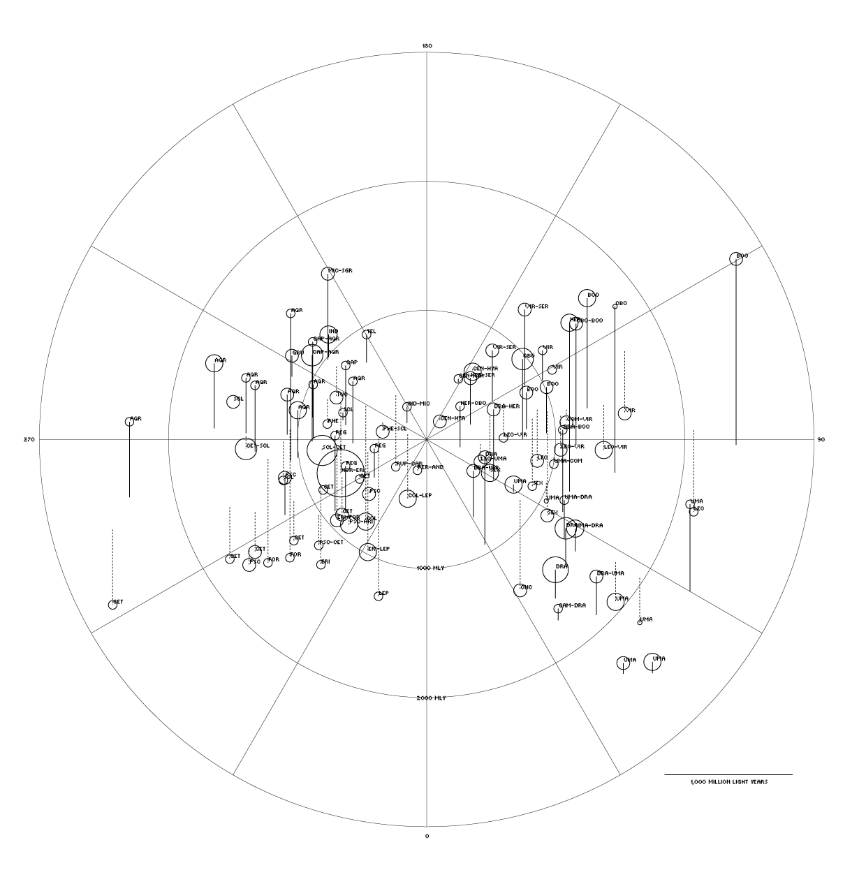
I liked the angled view of Richard's map, so I adjusted the code to achieve this.
I knew I wanted to draw the voids on the map, so I scraped some coordinates from Wikipedia's List of Voids and added them to the map.
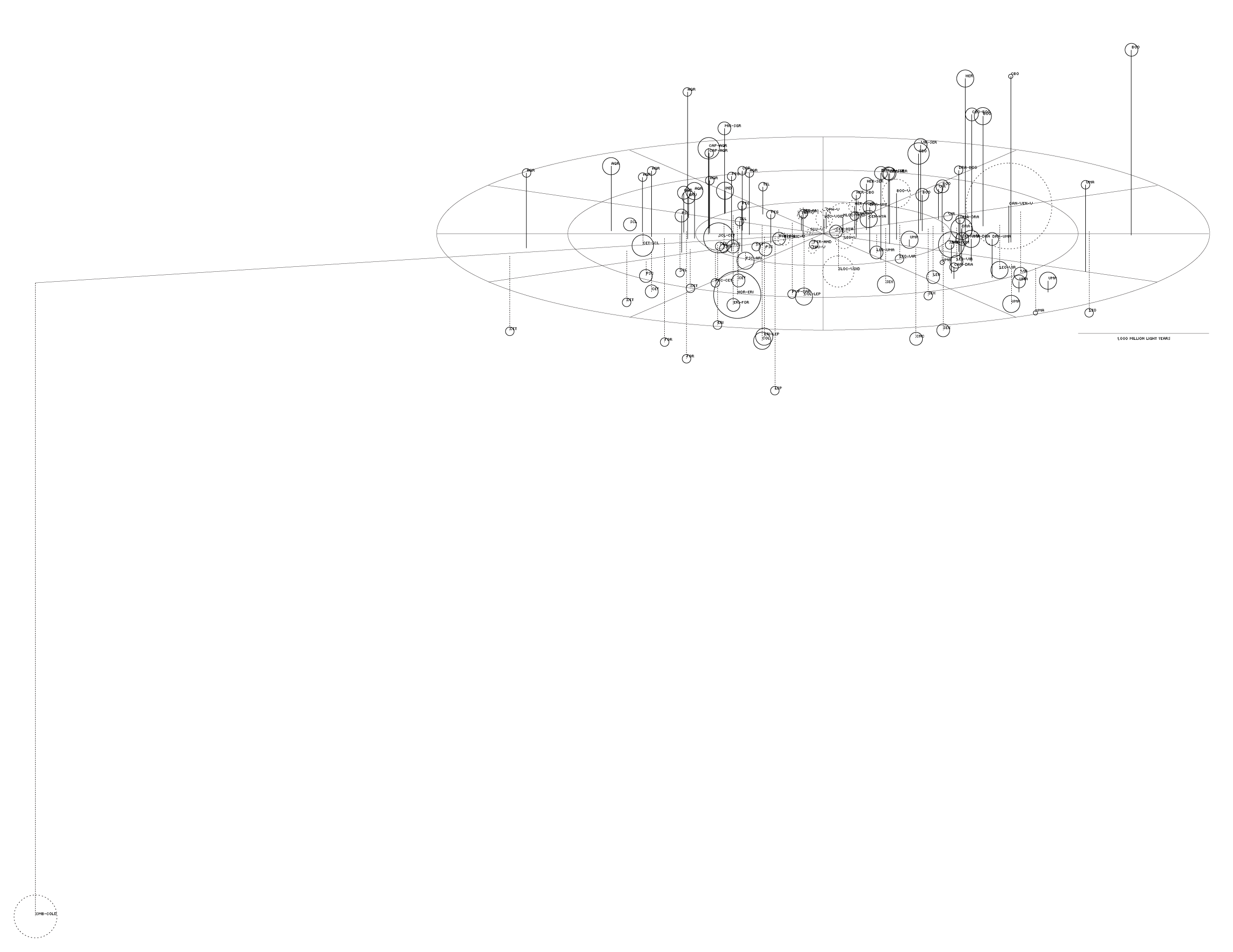
The object on the far left is the Eridanus Void, which is a hypothesized void to explain the CMBR Cold Spot. I wanted this in the map, but the scale made it difficult—Richard's list of clusters only went out as far as about 2.7 billion light-years but The Eridanus Void is between 6 and 10 billion light years away.
To accomodate this void on the map I needed either (a) more superclusters to fill out the map and/or (b) scale the distance with a log (e.g. `log(d)`) or power transformation (e.g. `d^k`).
There was also another issue: my code implemented an erzats 2-dimensional projection, not an actual orthographic or perspective 2d projection.
For more data, I went to the VizieR database of astronomical catalogues. It's a little clunky but offers a portal to an absolutely immense amount of data. Once you gain familiarity with the interface, it can feel like the Universe is within reach.
I made use of the Abell catalogue and the supercluster catalogue that groups the Abell clusters into superclusters.
VII/110A Rich Clusters of Galaxies, Abell+, 1989
J/MNRAS/445/4073 Two catalogues of superclusters, Chow-Martinez+, 2014
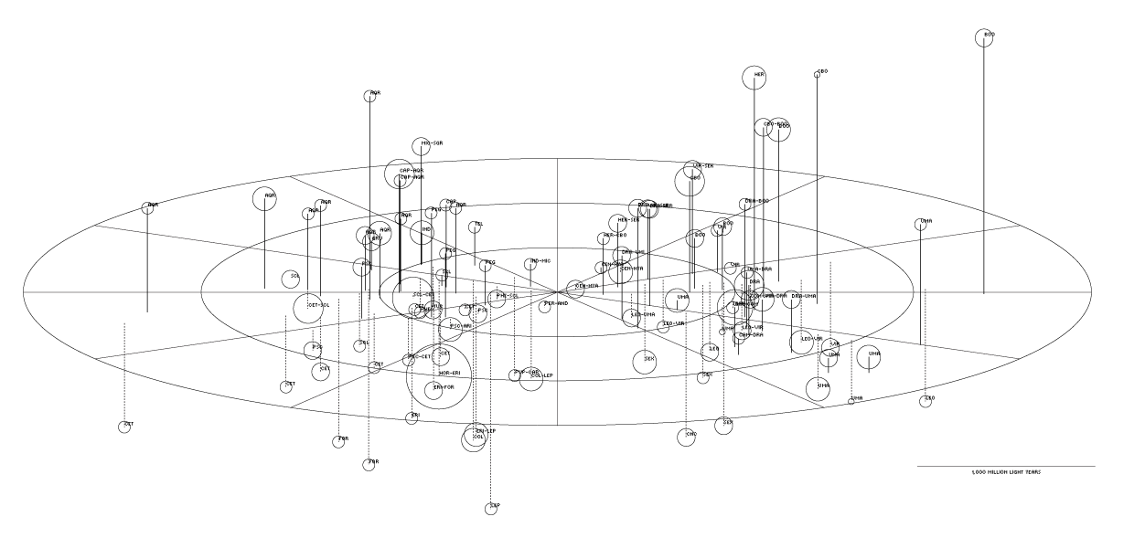
When these catalogues are plotted using an authentic projection, the result is the map below.
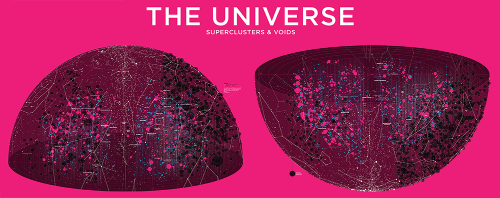
When both hemispheres are shown together, there's a lot of overlap between objects close to the equator. To mitigate this, below is my first attempt at separating the hemispheres and building a poster of the map.
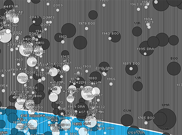
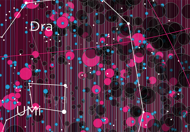
Below is a close crop of a region of the poster. At this point, I'm still using the bitmap Mini 7 Condensed font and including labels for all Abell and superclusters.
Each supercluster also has its constellation designation. This tiny detail took a while to work out. The coordinates had to be precessed to 1875 to apply the IAU constellation boundary criteria.
VI/42 Identification of a Constellation From Position, Roman, 1987
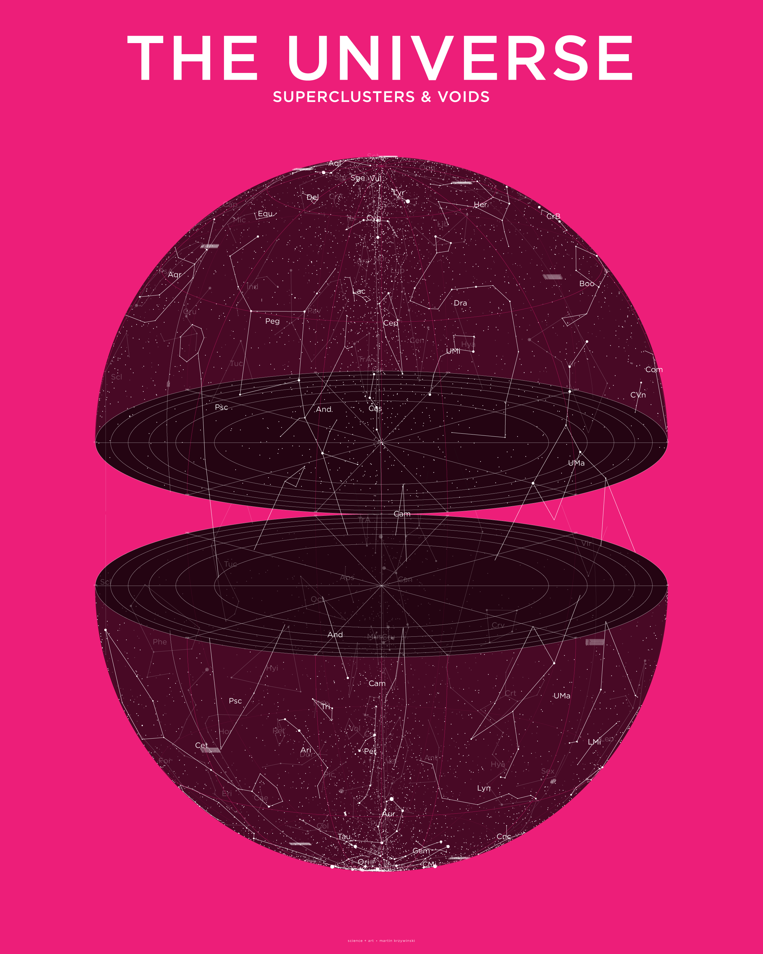
To manage the density of the labels—especially the constellation labels—I thought it would be better to simply show the constellations. I thought that the natural place to put the constellations would be the surface of the supergalactic sphere at a sufficient distance from the origin to accommodate all the objects within the sphere.
I threw in the sky's brightest 9,110 stars from the Yale Catalogue of Bright Stars.
V/50 Bright Star Catalogue, 5th Revised Ed., Hoffleit+, 1991
I obtained the list of constellation shapes from Marc van der Sluys' list. For each constellation, this list gives the pairs of stars in the Yale Catalogue of Bright Stars that are connected by the constellation lines.
BSC (Yale Catalogue of Bright Stars) constellation edges. by Marc van der Sluys
However, many of Marc's constellations shapes were not the asterisms sanctioned by the IAU. I therefore corrected all the constellation shapes by manually examining the IAU map and cross-referencing the stars to the Yale Catalogue of Bright Stars. Ugh.
My list of IAU constellation shapes conveniently includes the J2000 right ascension and declination for each stars in the pair, along with their HR index, magnitude and name.
IAU Constellation shapes as edges between BSC stars (Yale Catalogue of Bright Stars) by Martin Krzywinski
For example, Cassiopeia's familiar "W" appears as 4 lines that indicate the connections between HR stars 21-168-264-403-542.
Cas  21  2.294583 59.149722 2.27 bet Caph|bet Cas|11 Cas
    168 10.127083 56.537222 2.23 alf Schedar|alf Cas|18 Cas
Cas 168 10.127083 56.537222 2.23 alf Schedar|alf Cas|18 Cas
    264 14.177083 60.716667 2.47 gam BU 499A|BU 1028|gam Cas|27 Cas
Cas 264 14.177083 60.716667 2.47 gam BU 499A|BU 1028|gam Cas|27 Cas
    403 21.454167 60.235278 2.68 del Ruchbah|BUP 19A|del Cas|37 Cas
Cas 403 21.454167 60.235278 2.68 del Ruchbah|BUP 19A|del Cas|37 Cas
    542 28.598750 63.670000 3.38 eps Segin|eps Cas|45 Cas
For more details about the constellations see my IAU Constellation Shape Resources.
At this point, I went with a vibrant magenta background and switch to the Gotham typeface for the text. I also separeated the hemispheres completely, which makes the map look a little like the hemispheres of the brain. And that's ok.
Once I dropped the Abell clusters, superclusters and voids into the sphere, it was beginning to look crowded.
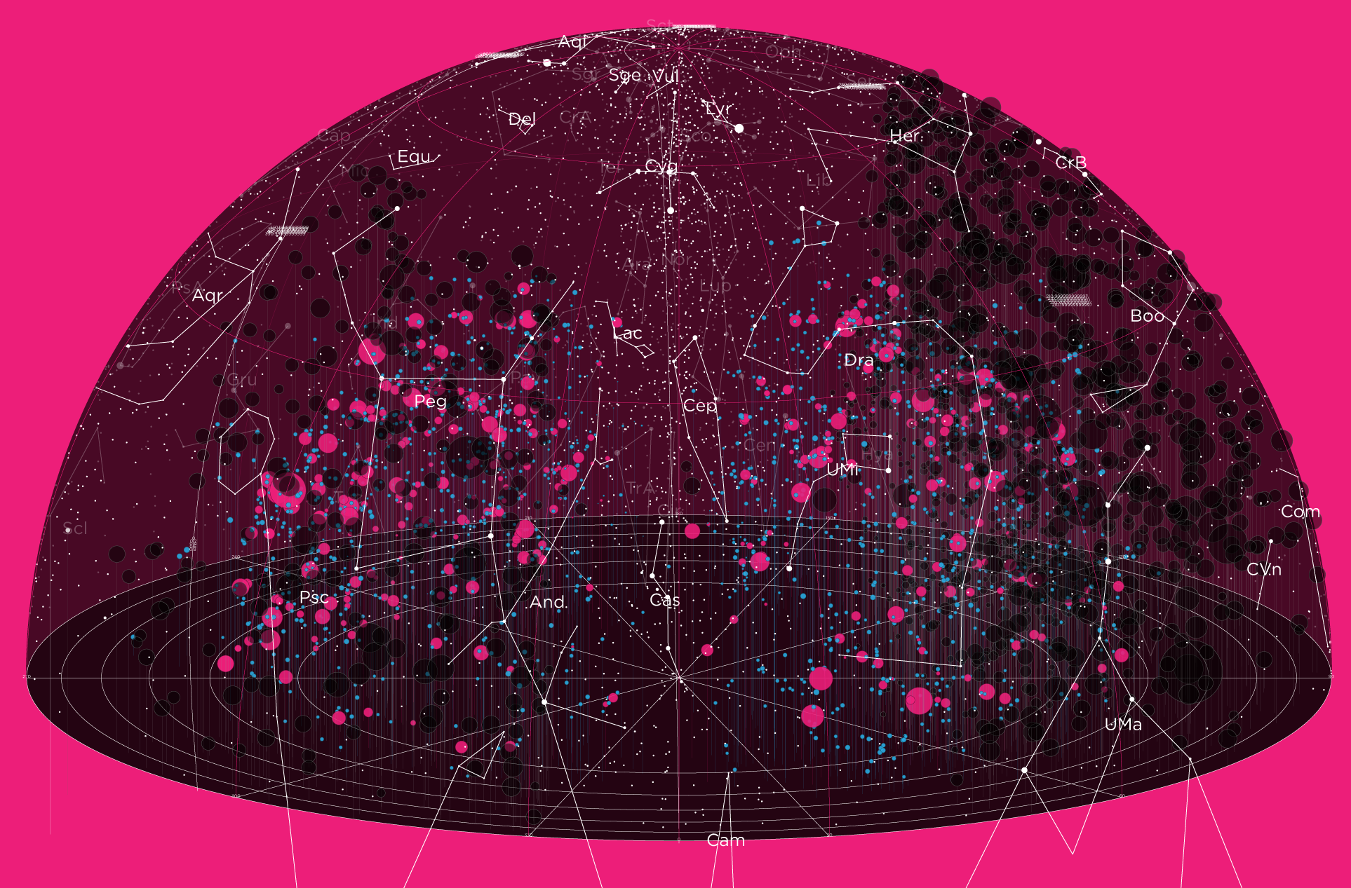
From the close crop below, you can see that the drop lines for each object are clusttering the space.
I struggled with these drop lines. On one hand, I thought they were very important because they anchored the objects to the equator and thus provided a better sense of the object's position. On the other hand, they added to the busyness of the map. Ultimately I settled on a compromise. An object's drop line would only be drawn if it didn't have a neighbouring object of the same type.
I'm very eager to find ways to combine my work with poetry.
This poster features a poem by Viorica Hrincu. It's about nothingness and the somethingness that can arise from it, if we find it. It appears on the bottom right of the poster. Tucked, but not away.
null
from an undefined
place,
undefined
create (a place)
an account
of us
— Viorica Hrincu
Previously, I've collaborated with Paolo Marcazzan for my 2017 `\pi` Day `\pi` in the Sky poster. There, Paolo contributed "Of Black Body", a poem about thermodynamics, constellations and the truth we might find there. For Paolo, the poem hints at our plight (and flight): "For the earthbound, the questions and concerns remain those of identity, passage, escape from transiency, and slow tempering of hope."
It's likely that neither the coordinate system nor the elements in this map are familiar to most people. Supergalactic what? And what do you mean comoving isn't the first step in cohabitation?
To make the poster accessible, I started adding panels around the map that explained what is drawn, how to read the map, the coordinate system, what superclusters and voids are. I also threw in a few mythological stories, such as the one about Orion and his dogs and about Eridanus.
Also explained are the difference between light-travel and comoving distance along with small graphs that illustrate these concepts.
Read all the stories on the poster.
Beyond Belief Campaign BRCA Art
Fuelled by philanthropy, findings into the workings of BRCA1 and BRCA2 genes have led to groundbreaking research and lifesaving innovations to care for families facing cancer.
This set of 100 one-of-a-kind prints explore the structure of these genes. Each artwork is unique — if you put them all together, you get the full sequence of the BRCA1 and BRCA2 proteins.

Propensity score weighting
The needs of the many outweigh the needs of the few. —Mr. Spock (Star Trek II)
This month, we explore a related and powerful technique to address bias: propensity score weighting (PSW), which applies weights to each subject instead of matching (or discarding) them.
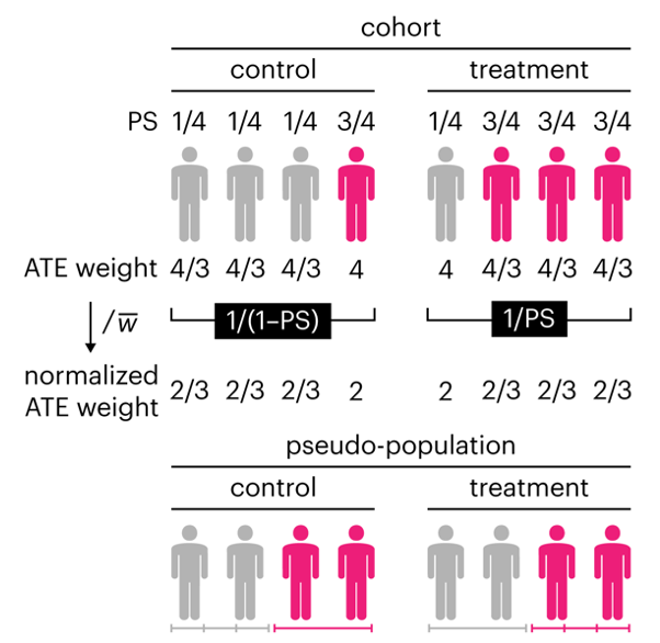
Kurz, C.F., Krzywinski, M. & Altman, N. (2025) Points of significance: Propensity score weighting. Nat. Methods 22:1–3.
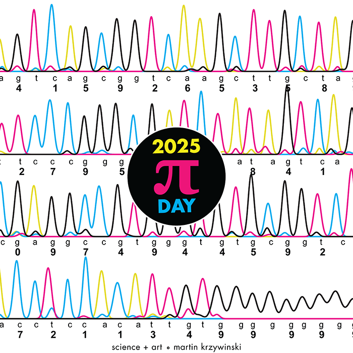
Happy 2025 π Day—
TTCAGT: a sequence of digits
Celebrate π Day (March 14th) and sequence digits like its 1999. Let's call some peaks.
Crafting 10 Years of Statistics Explanations: Points of Significance
I don’t have good luck in the match points. —Rafael Nadal, Spanish tennis player
Points of Significance is an ongoing series of short articles about statistics in Nature Methods that started in 2013. Its aim is to provide clear explanations of essential concepts in statistics for a nonspecialist audience. The articles favor heuristic explanations and make extensive use of simulated examples and graphical explanations, while maintaining mathematical rigor.
Topics range from basic, but often misunderstood, such as uncertainty and P-values, to relatively advanced, but often neglected, such as the error-in-variables problem and the curse of dimensionality. More recent articles have focused on timely topics such as modeling of epidemics, machine learning, and neural networks.
In this article, we discuss the evolution of topics and details behind some of the story arcs, our approach to crafting statistical explanations and narratives, and our use of figures and numerical simulations as props for building understanding.
Altman, N. & Krzywinski, M. (2025) Crafting 10 Years of Statistics Explanations: Points of Significance. Annual Review of Statistics and Its Application 12:69–87.
Propensity score matching
I don’t have good luck in the match points. —Rafael Nadal, Spanish tennis player
In many experimental designs, we need to keep in mind the possibility of confounding variables, which may give rise to bias in the estimate of the treatment effect.
If the control and experimental groups aren't matched (or, roughly, similar enough), this bias can arise.
Sometimes this can be dealt with by randomizing, which on average can balance this effect out. When randomization is not possible, propensity score matching is an excellent strategy to match control and experimental groups.
Kurz, C.F., Krzywinski, M. & Altman, N. (2024) Points of significance: Propensity score matching. Nat. Methods 21:1770–1772.
Understanding p-values and significance
P-values combined with estimates of effect size are used to assess the importance of experimental results. However, their interpretation can be invalidated by selection bias when testing multiple hypotheses, fitting multiple models or even informally selecting results that seem interesting after observing the data.
We offer an introduction to principled uses of p-values (targeted at the non-specialist) and identify questionable practices to be avoided.
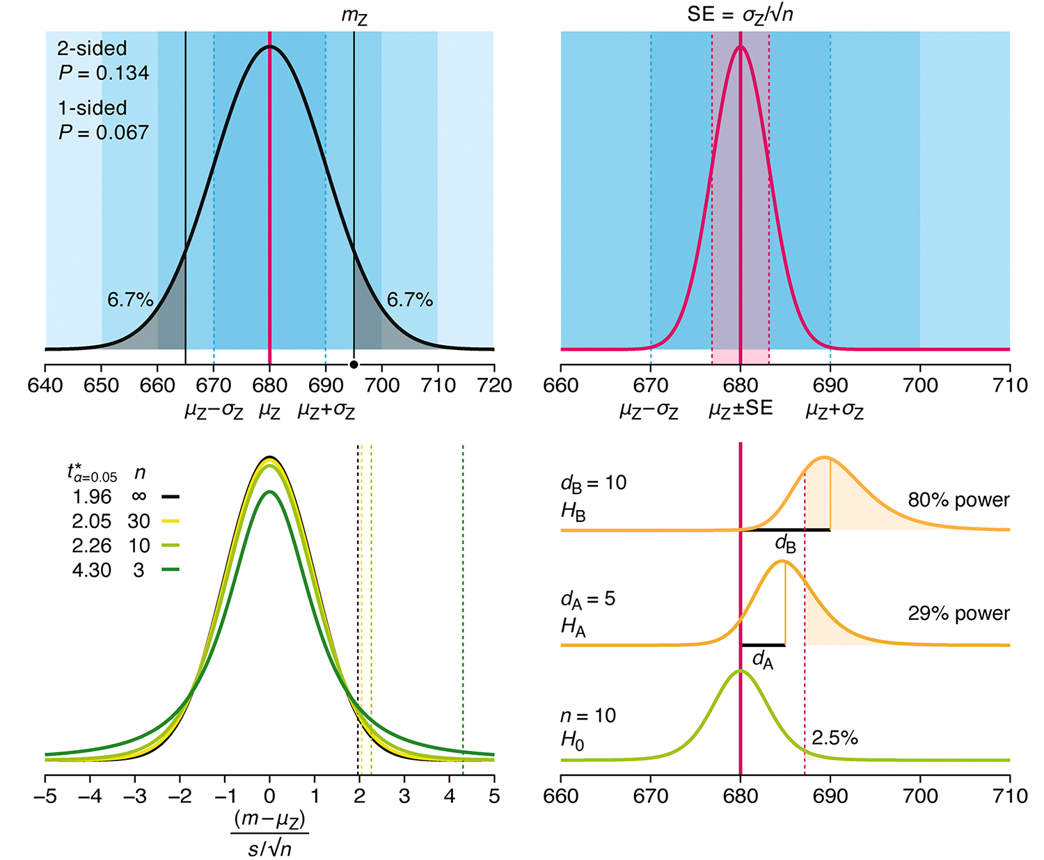
Altman, N. & Krzywinski, M. (2024) Understanding p-values and significance. Laboratory Animals 58:443–446.