
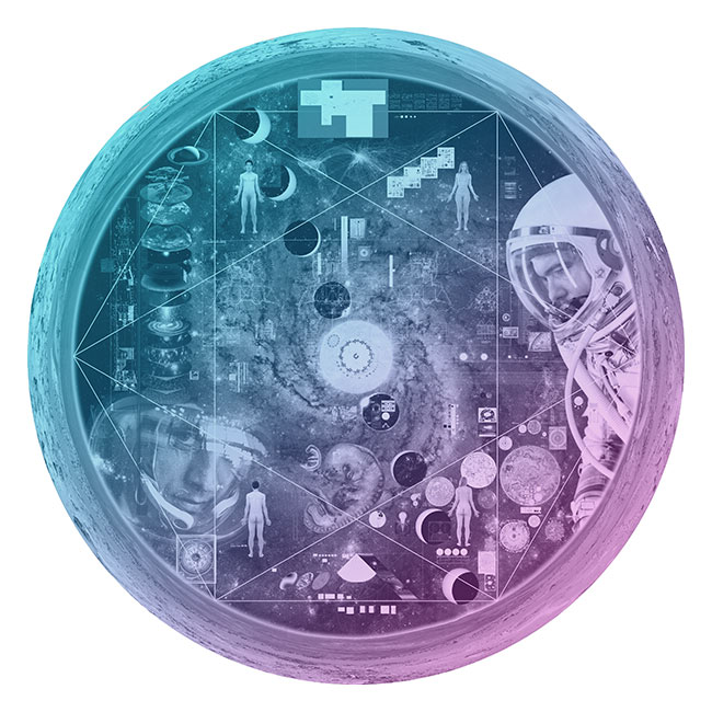
There is no sound in space, but there is music (and genomes)
contents
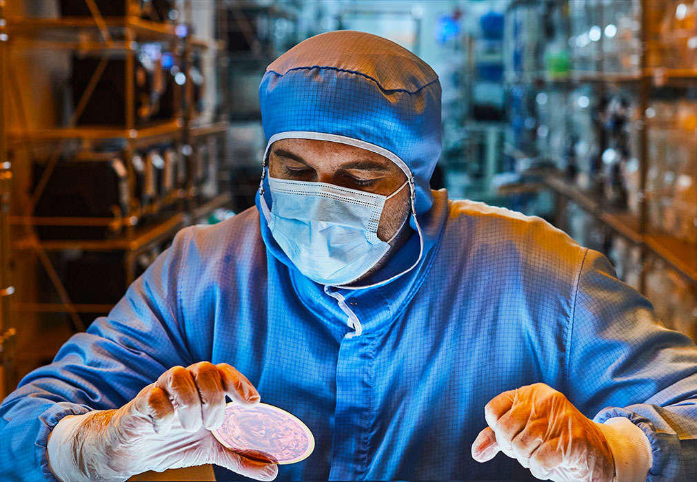
The Sanctuary discs are 10 cm sapphire wafers. Each disc has about 3 billion 1.4 micron pixels that each store 1-bit of information — the pixel is either on or off. Reading the information off the disc is easy — just look at the pixels. Very closely. In other words, each disc is a very high resolution image.
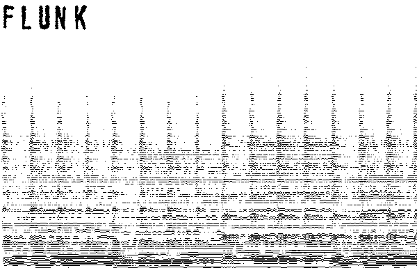
To send music (or any kind of data), we need to convert it to an image. Enter the spectrogram.
A spectrogram is a 2-dimensional representation of sound. The x-axis is time and the y-axis is frequency. At each `(x,y)` position the strength of frequency `f=y` at time `t=x` is encoded by the brigthness of a pixel. This way to "draw the sound", which can be decoded back.
The National Music Centre has an excellent short tutorial on how to interpret spectrograms. And if you're a birder, then spectograms of bird calls won't be new to you.
And while I realize that aliens (almost certainly) and future humans (quite possibly) might not perceive sound in the same way, I see this as a minor point. I'm sure they'll work it out. You know... science.
I am indebted to Tim Sainburg for providing assistance and code. The analysis uses the librosa music and audio analysis Python library.
This song was written for the Moon. It sounds best there.
Flunk's History of Everything Ever album contains two versions of the song. A final vocal mix as well as an instrumental version, which you get with the purchase of the album.
But there is another. In the intermediate version, when the lyrics weren't quite finalized, Anja sang incomplete phrases and loose vocalizations.
We called this the "gibberish" version and even though the final song was ready before the discs were created, we thought gibberish made for the perfect space language.
Pretend you're an alien or human from the future and give it a listen:
If we had all the pixels on the Moon, we would encode the spectrogram with a large number of frequencies (e.g. `n = 1,024`) with very fine sampling of time (e.g. 5 ms). The song is about 4 minutes, so this would require an image of 48,000 × 1,024 × 8. The last factor of 8 is for the 8-bit encoding of each pixel.
Although this represents only about 13% of the capacity of a disc (about 200 Mb of genome sequence using our encoding) it's more than we had to spare. There weren't enough pixels on 4 discs to write 4 genomes and the proteome and instructions and the song.
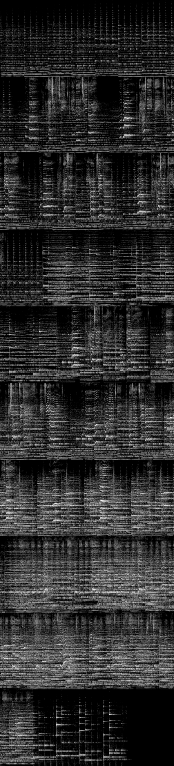
It was clear that I needed a reasonably small spectrogram. There are two ways to achieve this: larger time bins and fewer frequencies. It turns out that a 50 ms time window that stepped along every 20 ms was sufficient — the music didn't have a lot of fast notes. To make the most out of the frequencies I used a psychoacoustic scale.
The mel scale is based on psychoacoustics. It is a logarithmic frequency scale and reflects the fact that we can discriminate low frequencies better than high ones. In other words, to faithfully reproduce sound you need to include more of the low frequencies than high frequencies.
The conversion between `f` in Hertz to `m` in mels is `m = k_0 \textrm{log}(1+f/k_1)`. Because mels are very efficient at spacing frequencies based on perception, I can get away with using very few mels! A-mel-zing!
I started with 512 mels and 1, 2, 3, 4 and 8 bits per mel. In this encoding, each pixel, which encodes how much of each mel is present in the sound, can have one of `2^b` values (e.g. in the 3-bit encoding we can have up to 8 values).
Optimizing the number of bits is really important because I didn't have that much spare space on the discs. Every pixel of music took away from pixel of genome information. Each bit of each mel requires 11,688 pixels. Thus, going from 3 bits to 4 bits in a 512 mel encoding required an additional 5,984,256 pixels. Two pixels encoded a base, so this corresponded to about 3 Mb of sequence.
Here is what the decoding of the each spectrogram sounds like — this verifies whether the music is reasonably preserved during the encoding-decoding process.
You can hear that the 8-bit and 4-bit encodings are very good. Remember, we're talking about music on the Moon here, so manage your expectations.
The 3-bit encoding is great. This is the bit sweet spot.
The 2-bit encoding isn't awesome but it's not horrible. You can definitely make out the music and lyrics but there's a warble to the sound.
The 1-bit encoding amazingly still sounds like something. It's very ghostly. The 1-bit encoding is binary — it stores whether a frequency exists at a given point in time or not. All frequencies have the same strength. I imagine this is what music in space sounds like.
The 512 mel 3-bit encoding took the 17,852,768 pixels, which was about 9 Mb of sequence. Could we do better?
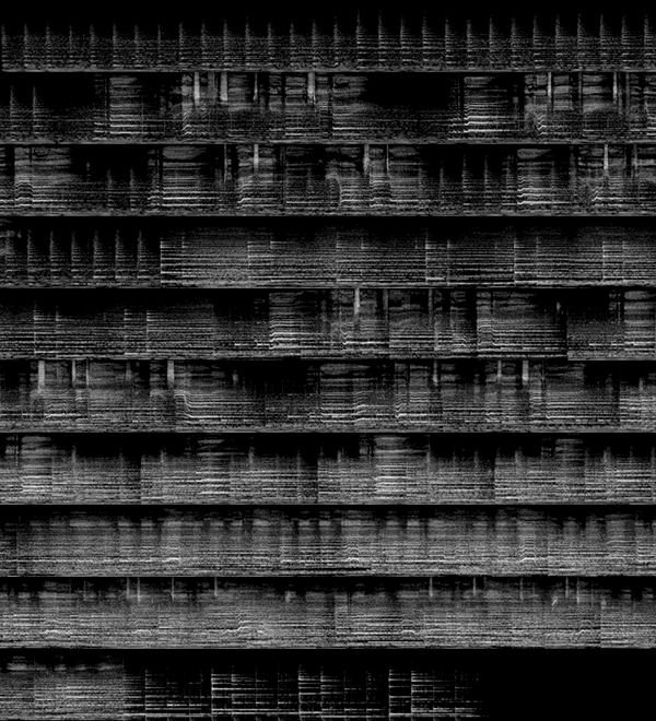
It turns out that 128 mels is all we need. Well, maybe not all we need but all we can get! And while the 128 mel 1-bit and 2-bit encodings are sketchy, the 3-bit is amazingly good.
Just think about how little information is being stored here. For each 20 ms of music, we have 128 frequencies, each of which is specified by one of 8 discrete volume levels (because we have only 3 bits).
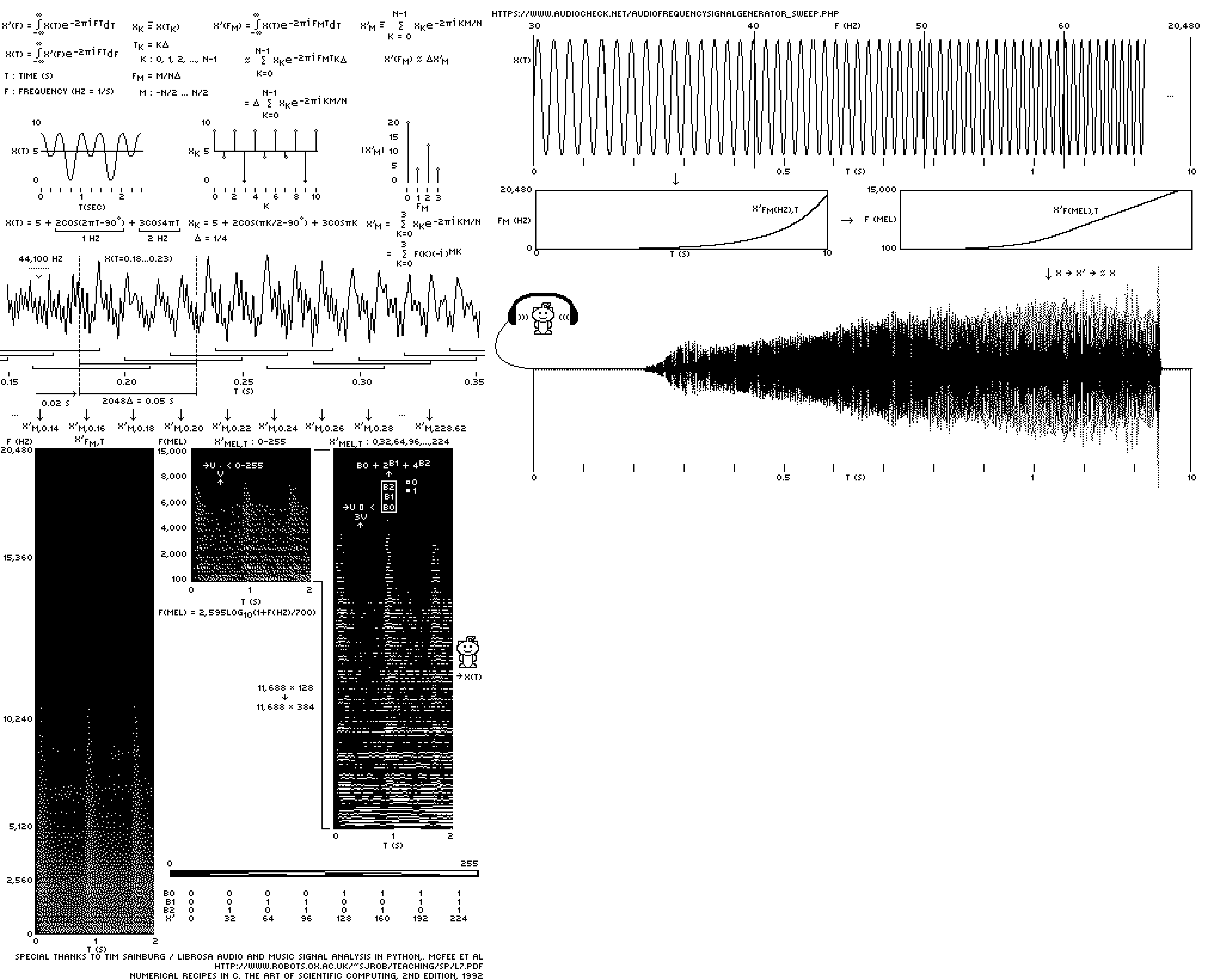
Because the discs are a 1-bit medium, to store each pixel of the 128 mel 3-bit spectrogram, I needed 3 pixels. This was done by taking the 3-bit pixel and representing it as a column of 3 1-bit pixels. Don't worry, everything is explained in the very clear instructions on the discs.
Below is the final spectrogram as it appears on the disc, shown here wrapped into 19 rows of 600 pixels, each of which correspond to 12 seconds of music.

Nasa to send our human genome discs to the Moon
We'd like to say a ‘cosmic hello’: mathematics, culture, palaeontology, art and science, and ... human genomes.
Comparing classifier performance with baselines
All animals are equal, but some animals are more equal than others. —George Orwell
This month, we will illustrate the importance of establishing a baseline performance level.
Baselines are typically generated independently for each dataset using very simple models. Their role is to set the minimum level of acceptable performance and help with comparing relative improvements in performance of other models.
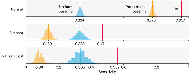
Unfortunately, baselines are often overlooked and, in the presence of a class imbalance5, must be established with care.
Megahed, F.M, Chen, Y-J., Jones-Farmer, A., Rigdon, S.E., Krzywinski, M. & Altman, N. (2024) Points of significance: Comparing classifier performance with baselines. Nat. Methods 20.
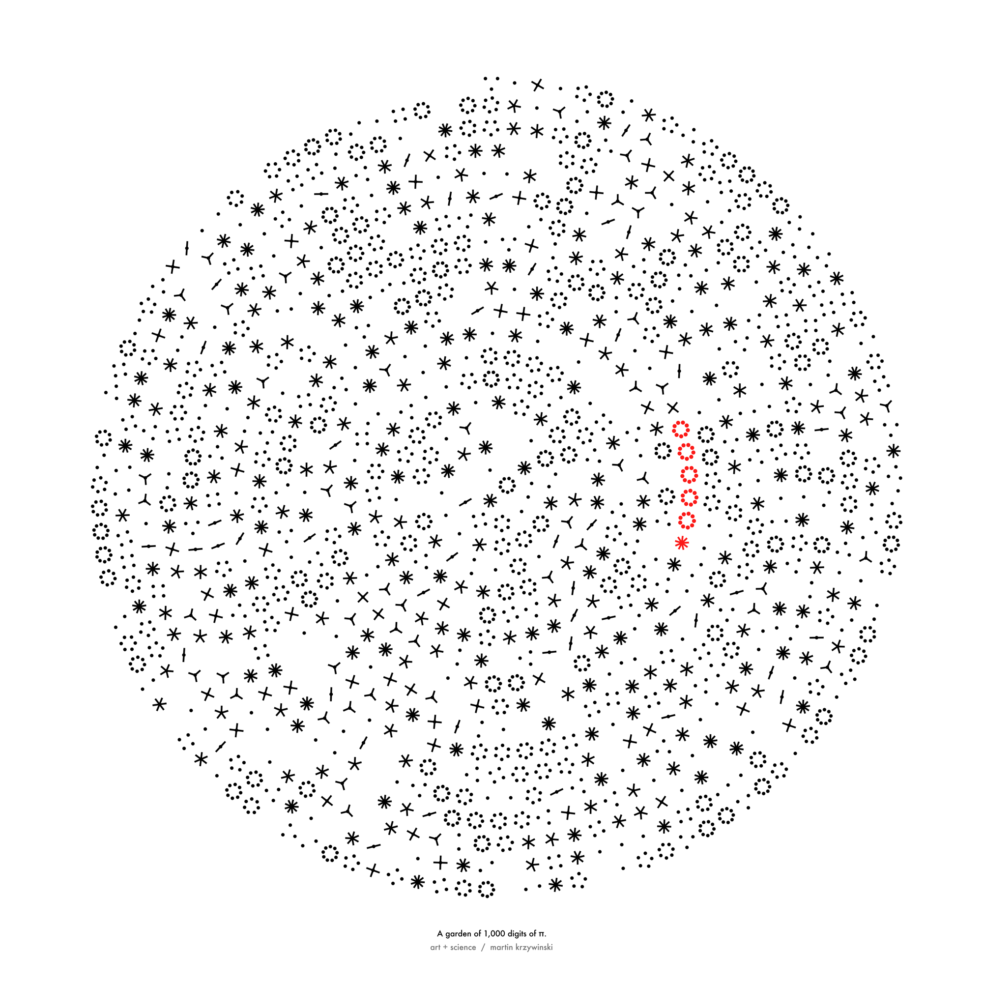
Happy 2024 π Day—
sunflowers ho!
Celebrate π Day (March 14th) and dig into the digit garden. Let's grow something.
How Analyzing Cosmic Nothing Might Explain Everything
Huge empty areas of the universe called voids could help solve the greatest mysteries in the cosmos.
My graphic accompanying How Analyzing Cosmic Nothing Might Explain Everything in the January 2024 issue of Scientific American depicts the entire Universe in a two-page spread — full of nothing.
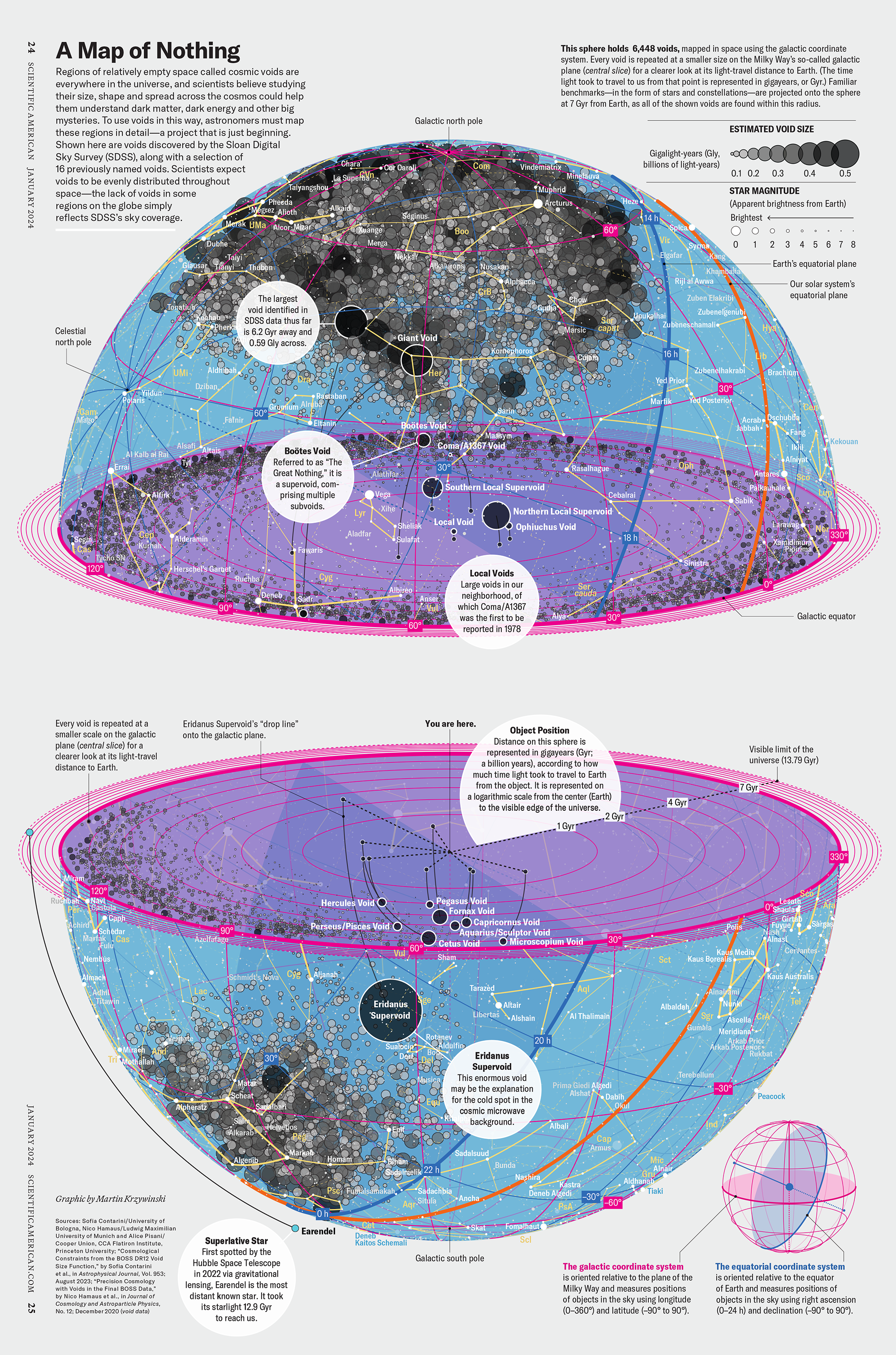
The graphic uses the latest data from SDSS 12 and is an update to my Superclusters and Voids poster.
Michael Lemonick (editor) explains on the graphic:
“Regions of relatively empty space called cosmic voids are everywhere in the universe, and scientists believe studying their size, shape and spread across the cosmos could help them understand dark matter, dark energy and other big mysteries.
To use voids in this way, astronomers must map these regions in detail—a project that is just beginning.
Shown here are voids discovered by the Sloan Digital Sky Survey (SDSS), along with a selection of 16 previously named voids. Scientists expect voids to be evenly distributed throughout space—the lack of voids in some regions on the globe simply reflects SDSS’s sky coverage.”
voids
Sofia Contarini, Alice Pisani, Nico Hamaus, Federico Marulli Lauro Moscardini & Marco Baldi (2023) Cosmological Constraints from the BOSS DR12 Void Size Function Astrophysical Journal 953:46.
Nico Hamaus, Alice Pisani, Jin-Ah Choi, Guilhem Lavaux, Benjamin D. Wandelt & Jochen Weller (2020) Journal of Cosmology and Astroparticle Physics 2020:023.
Sloan Digital Sky Survey Data Release 12
Alan MacRobert (Sky & Telescope), Paulina Rowicka/Martin Krzywinski (revisions & Microscopium)
Hoffleit & Warren Jr. (1991) The Bright Star Catalog, 5th Revised Edition (Preliminary Version).
H0 = 67.4 km/(Mpc·s), Ωm = 0.315, Ωv = 0.685. Planck collaboration Planck 2018 results. VI. Cosmological parameters (2018).
constellation figures
stars
cosmology
Error in predictor variables
It is the mark of an educated mind to rest satisfied with the degree of precision that the nature of the subject admits and not to seek exactness where only an approximation is possible. —Aristotle
In regression, the predictors are (typically) assumed to have known values that are measured without error.
Practically, however, predictors are often measured with error. This has a profound (but predictable) effect on the estimates of relationships among variables – the so-called “error in variables” problem.
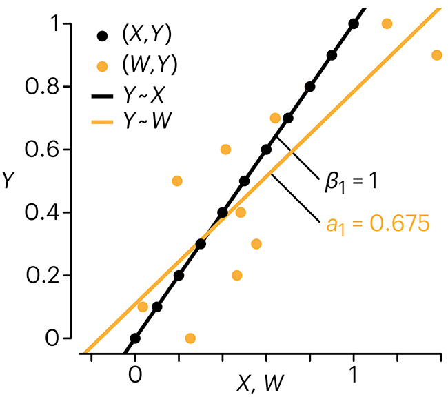
Error in measuring the predictors is often ignored. In this column, we discuss when ignoring this error is harmless and when it can lead to large bias that can leads us to miss important effects.
Altman, N. & Krzywinski, M. (2024) Points of significance: Error in predictor variables. Nat. Methods 20.
Background reading
Altman, N. & Krzywinski, M. (2015) Points of significance: Simple linear regression. Nat. Methods 12:999–1000.
Lever, J., Krzywinski, M. & Altman, N. (2016) Points of significance: Logistic regression. Nat. Methods 13:541–542 (2016).
Das, K., Krzywinski, M. & Altman, N. (2019) Points of significance: Quantile regression. Nat. Methods 16:451–452.
Convolutional neural networks
Nature uses only the longest threads to weave her patterns, so that each small piece of her fabric reveals the organization of the entire tapestry. – Richard Feynman
Following up on our Neural network primer column, this month we explore a different kind of network architecture: a convolutional network.
The convolutional network replaces the hidden layer of a fully connected network (FCN) with one or more filters (a kind of neuron that looks at the input within a narrow window).
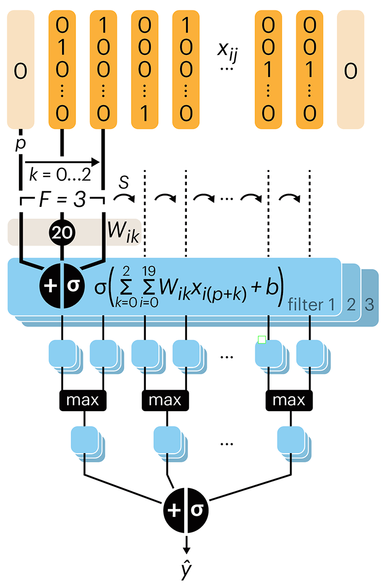
Even through convolutional networks have far fewer neurons that an FCN, they can perform substantially better for certain kinds of problems, such as sequence motif detection.
Derry, A., Krzywinski, M & Altman, N. (2023) Points of significance: Convolutional neural networks. Nature Methods 20:1269–1270.
Background reading
Derry, A., Krzywinski, M. & Altman, N. (2023) Points of significance: Neural network primer. Nature Methods 20:165–167.
Lever, J., Krzywinski, M. & Altman, N. (2016) Points of significance: Logistic regression. Nature Methods 13:541–542.