

There is no sound in space, but there is music (and genomes)
contents
Here I show the decoding instructions that appear on the first disc. These took forever to make, were a lot of fun to make, and might require a full alien civilization to decode.

The instructions begin with an important announcement "Hello people read this!" followed by Huffman-encoded Nuremberg Code and Declaration of Helsinki. I explain how to decode the Huffman encoding.

There's lots of art and graphical notions on the discs. Here you see an amoeba and fairyfly — drawn at physical scale on the discs. Each pixel on the disc is 1.4 microns, so 100 microns is about 70 pixels. The images shown here are magnified for easier reading.
You also see a short space poem created out of an alphabetically ordered triplets of classification terms from the Atlas of Peculiar Galaxies. “To unclassified wind!”
absorption adjacent amorphous
and appearance arm
associated attraction brightness
chains close clumps
companions concentric connected
counter-tail detached diffuse
disturbed double effects
ejected ellipticals emanating
filaments fission fragments
from galaxies groups
heavy high infall
integral interacting interior
irregular irregularities jets
large long loops
low material miscellaneous
multiple narrow nearby
nuclei objects of
one one-armed or
perturbing pōwehi repelling
resolution rings segments
sign small spiral
split surface three-armed
to unclassified wind
Once we have the EULA out of the way, let's get into it.
The first instruction panel begins with a piece of Alan Watts' It Starts Now, dedicated to our last universal common ancestor (LUCA). “You are this universe...”
We see the tree of life (I apologize for the millions of sparks of life that aren't listed) and you're taken along the branching all the way to us, into our cells and into the bases of our DNA that are on the discs. It's quite a trip.

The next panel shows how the data is organized on the discs and how it's encoded. All amidst a story of dinosaur struggle.
The pixel stream on the discs contain metadata codes (it was fun to find the shorted codes that didn't appear in the sequence). For example, SNPs of each class (e.g. A/T) are indicated by unique sequence of bits.

The genome is just a kind of recipe book for proteins. So the next panel explains how these are made up of amino acids. I mention that they fold but leave the details of the folding as an exercise to the audience. We can't be expected to figure out everything ourselves.

Next, to practise what you've learned, there is a little practical example of decoding a baby disc. Also the final panel of the dinosaur story appears here — many things are out of order on the discs and the reader is encouraged to piece them together. Yes, “death is very very long”.

Once you've decoded the discs, you can check your work against this table. The number of bits, bases and SNPs on each disc are shown.

The instruction panels end in a few "making of" scenes and a list of credits.

I took a photo of Steve Chand holding the flowcell before he loaded the sequencer. The map of the solar system answers the question “When did he load the sequencer?”

Our Center was founded by Michael Smith. The discs include a short dedication and a nostalgic photo of his office that I took shortly after he died.


We wouldn't be here without the seminal papers of Franklin and of Watson and Crick. Ok we would be here without them but we wouldn't know ourselves as well.
The Nature mansucripts are lovingly typeset here.

Beyond Belief Campaign BRCA Art
Fuelled by philanthropy, findings into the workings of BRCA1 and BRCA2 genes have led to groundbreaking research and lifesaving innovations to care for families facing cancer.
This set of 100 one-of-a-kind prints explore the structure of these genes. Each artwork is unique — if you put them all together, you get the full sequence of the BRCA1 and BRCA2 proteins.

Propensity score weighting
The needs of the many outweigh the needs of the few. —Mr. Spock (Star Trek II)
This month, we explore a related and powerful technique to address bias: propensity score weighting (PSW), which applies weights to each subject instead of matching (or discarding) them.
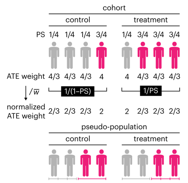
Kurz, C.F., Krzywinski, M. & Altman, N. (2025) Points of significance: Propensity score weighting. Nat. Methods 22:1–3.
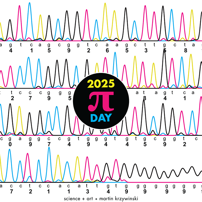
Happy 2025 π Day—
TTCAGT: a sequence of digits
Celebrate π Day (March 14th) and sequence digits like its 1999. Let's call some peaks.
Crafting 10 Years of Statistics Explanations: Points of Significance
I don’t have good luck in the match points. —Rafael Nadal, Spanish tennis player
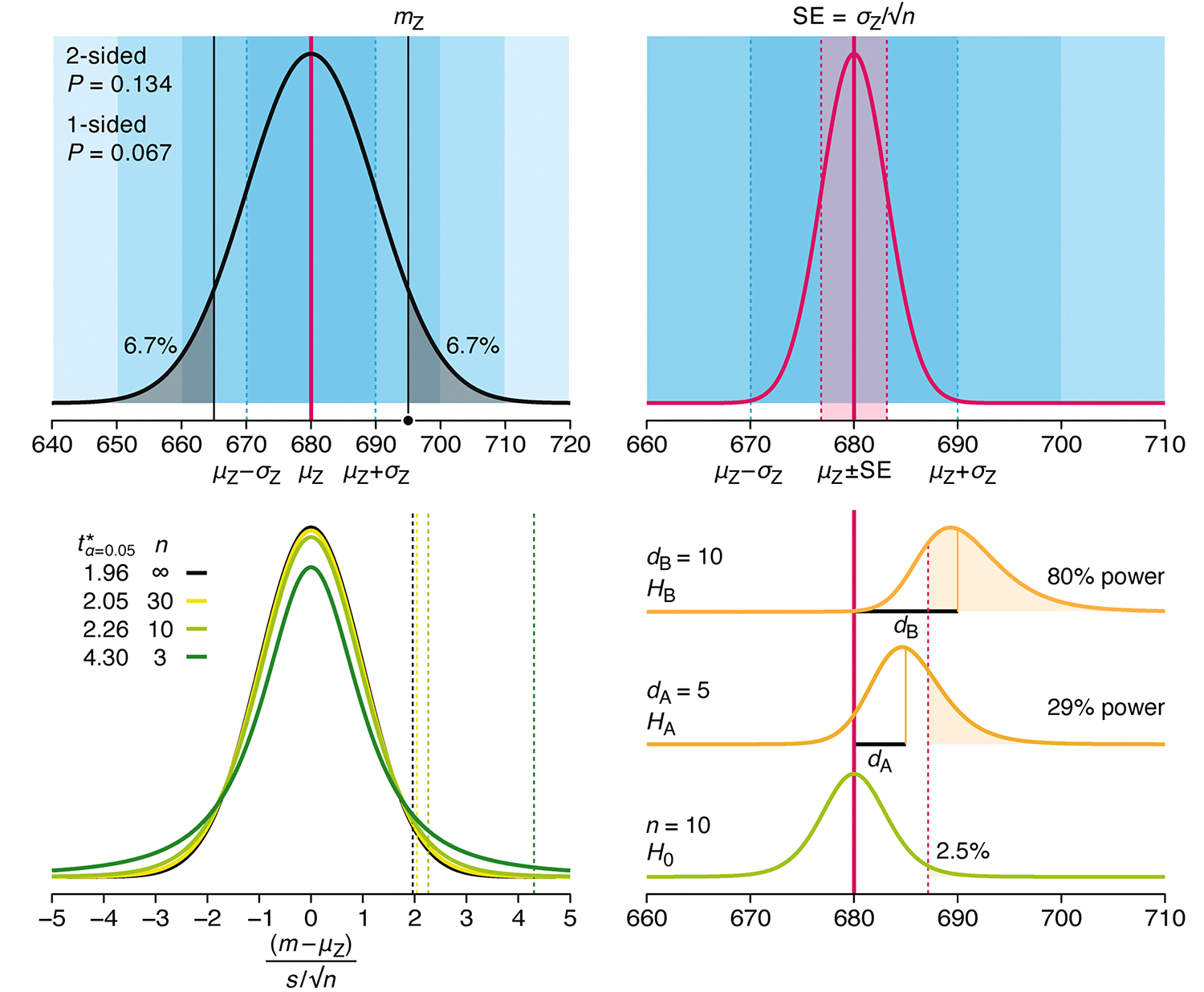
Points of Significance is an ongoing series of short articles about statistics in Nature Methods that started in 2013. Its aim is to provide clear explanations of essential concepts in statistics for a nonspecialist audience. The articles favor heuristic explanations and make extensive use of simulated examples and graphical explanations, while maintaining mathematical rigor.
Topics range from basic, but often misunderstood, such as uncertainty and P-values, to relatively advanced, but often neglected, such as the error-in-variables problem and the curse of dimensionality. More recent articles have focused on timely topics such as modeling of epidemics, machine learning, and neural networks.
In this article, we discuss the evolution of topics and details behind some of the story arcs, our approach to crafting statistical explanations and narratives, and our use of figures and numerical simulations as props for building understanding.
Altman, N. & Krzywinski, M. (2025) Crafting 10 Years of Statistics Explanations: Points of Significance. Annual Review of Statistics and Its Application 12:69–87.
Propensity score matching
I don’t have good luck in the match points. —Rafael Nadal, Spanish tennis player
In many experimental designs, we need to keep in mind the possibility of confounding variables, which may give rise to bias in the estimate of the treatment effect.
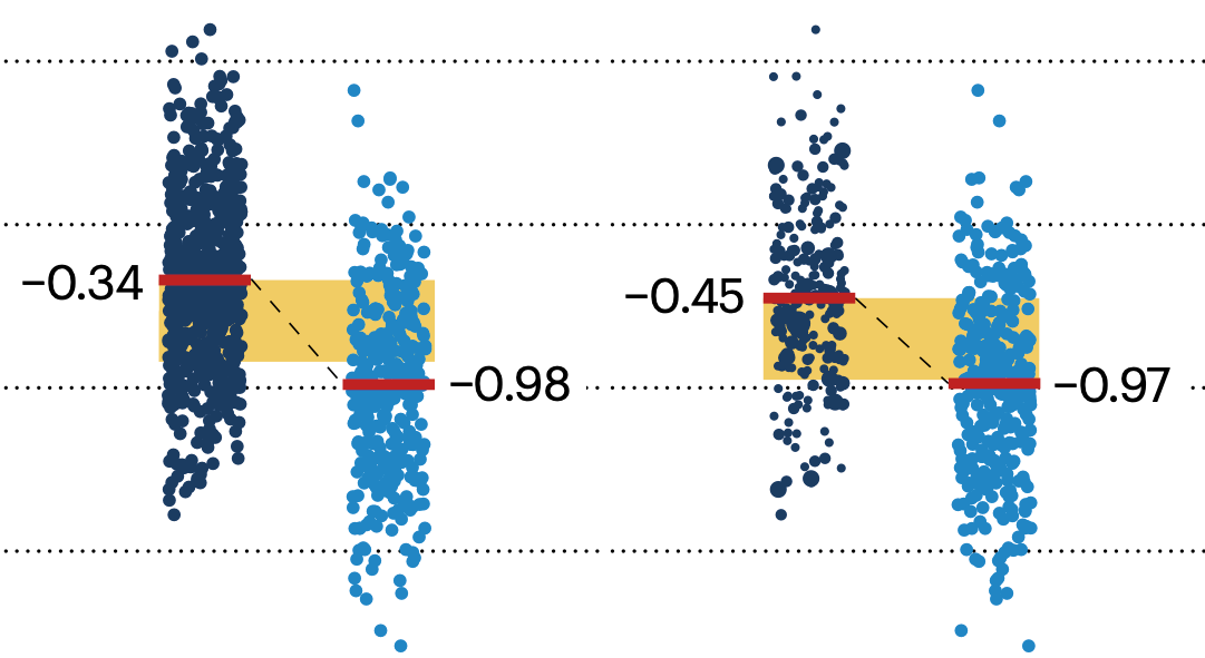
If the control and experimental groups aren't matched (or, roughly, similar enough), this bias can arise.
Sometimes this can be dealt with by randomizing, which on average can balance this effect out. When randomization is not possible, propensity score matching is an excellent strategy to match control and experimental groups.
Kurz, C.F., Krzywinski, M. & Altman, N. (2024) Points of significance: Propensity score matching. Nat. Methods 21:1770–1772.
Understanding p-values and significance
P-values combined with estimates of effect size are used to assess the importance of experimental results. However, their interpretation can be invalidated by selection bias when testing multiple hypotheses, fitting multiple models or even informally selecting results that seem interesting after observing the data.
We offer an introduction to principled uses of p-values (targeted at the non-specialist) and identify questionable practices to be avoided.
Altman, N. & Krzywinski, M. (2024) Understanding p-values and significance. Laboratory Animals 58:443–446.