

BD Genomics stereoscopic art exhibit — AGBT 2017
Art is science in love.
— E.F. Weisslitz
contents


Science cannot move forward without storytelling. While we learn about the world and its patterns through science, it is through stories that we can organize and sort through the observations and conclusions that drive the generation of scientific hypotheses.
With Alberto Cairo, I've written about the importance of storytelling as a tool to explain and narrate in Storytelling (2013) Nat. Methods 10:687. There we suggest that instead of "explain, not merely show," you should seek to "narrate, not merely explain."
Our account received support (Should scientists tell stories. (2013) Nat. Methods 10:1037) but not from all (Against storytelling of scientific results. (2013) Nat. Methods 10:1045).
A good science story must present facts and conclusions within a hierarchy—a bag of unsorted observations isn't likely to engage your readers. But while a story must always inform, it should also delight (as much as possible), and inspire. It should make the complexity of the problem accessible—or, at least, approachable—without simplifications that preclude insight into how concepts connect (they always do).
Just like science, explaining science is a process—one that can be more vexing than the science itself!
In science one tries to tell people, in such a way as to be understood by everyone, something that no one ever knew before. But in poetry, it’s the exact opposite.
—Paul Dirac, Mathematical Circles Adieu by H. Eves [quoted]
I have previously written about the process of taking a scientific statement (Creating Scientific American Graphic Science graphics) and turning it into a data visualization or, more broadly, visual story.
The process of the creation of one of these visual stories is itself a story. A story about how the genome is not a blueprint, a discovery of Hilbertonians, which are creatures that live on the Hilbert curve, how algorithms for protein folding can be used to generate art based on the digits of `\pi`, or how we can make human genome art by humans with genomes. I've also written about my design process in creating the cover for Genome Research and the cover of PNAS. As always, not everything works out all the time—read about the EMBO Journal covers that never made it.


Here, I'd like to walk you through the process and sketches of creating a story based on the idea of differences in data and how the story can be used to understand the function of cells and disease.
The visual story is a creative collaboration with Becton Dickinson and The Linus Group and its creation began with the concept of differences. The art was on display at AGBT 2017 conference and accompanies BD's launch of the Resolve platform and "Difference of One in Genomics".

Starting with the idea of the "difference of one", our goal was to create artistic representations of data sets generated using the BD Resolve platform, which generates single-cell transcriptomes, that captured a variety of differences that are relevant in genomics research.
The data art pieces were installed in a gallery style, with data visualization and artistic expression in equal parts.
The art itself is an old school take on virtual reality. Unlike modern VR, which isolates the participants from one another, we chose a low-tech route that not only brings the audience closer to the data but also to each other.
The data were generated using the BD Resolve single-cell transcriptomics platform. For each of the three art pieces, we identified a data set that captured a variety of differences.
- disease onset—how does gene expression in tumor cells differ from normal cells?
- disease progression—as a tumor grows and spreads, how does expression change?
- background variation—how does gene expression change between normal cells that perform a different function?

The real surprise and insight is in difference that ultimately advance our thinking (Data visualization: amgibuity as a fellow traveller. (2013) Nat. Methods 10:613-615).
Figuring out which differences are of this kind requires that instead of "What's new?" we ask "What's different?"
Propensity score weighting
It is not certain that everything is uncertain. —Blaise Pascal
We have already explored how we can mitigate bias caused by confounding variables in observational studies using propensity score (PS) matching (PSM) and propensity score weighting (PSW). However, any statistical model is only as good as its assumptions and, if it is specified incorrectly, it can itself produce biased estimates of the treatment effect.
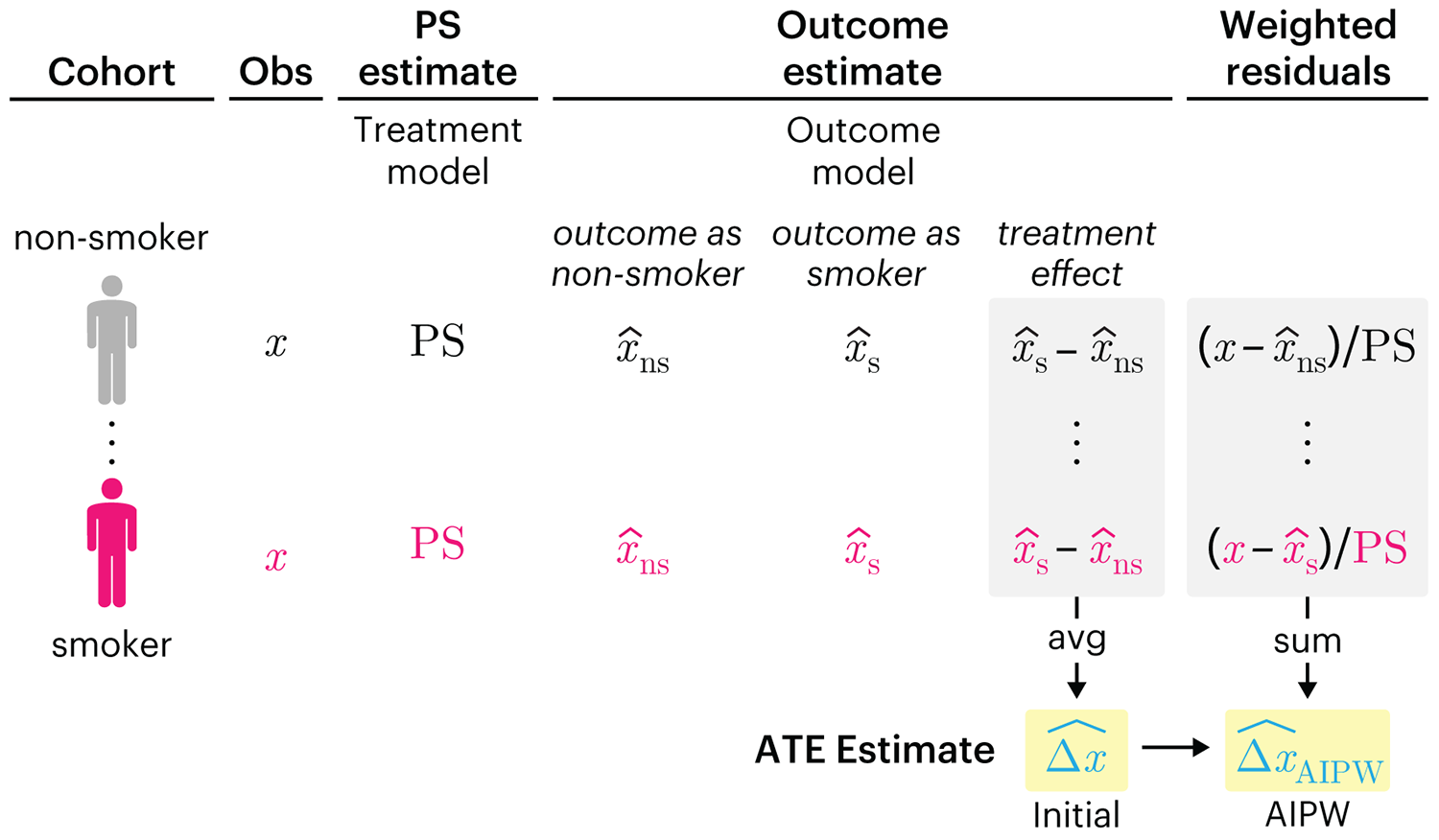
This month, we explore double robustness, a powerful statistical concept that provides a valuable “safety net” against the risk of an incorrect model. It offers two opportunities, instead of just one, to obtain a valid estimate of the treatment effect — making it possible to draw credible causal inferences from observational data without having to depend on a single set of modeling assumptions.
Kurz, C.F., Krzywinski, M. & Altman, N. (2026) Points of significance: Double Robustness. Nat. Methods 23:868–869.
Nature Biotechnology cover
My cover design on the 7 April 2026 Nature Biotechnology issue shows the dendrogram that represents a cluster of uniquely expressed (or downregulated) genes in human naive stem cells induced from such cells. Within each dendrogram block, the genomic barcode sequence (sampled from Supplementary Table 1) is depicted with a Code 39 barcode. The highlighted barcode is one of those used for cell isolation.
Ishiguro S. et al. A multi-kingdom genetic barcoding system for precise clone isolation (2026) Nature Biotechnology 44:616–629.

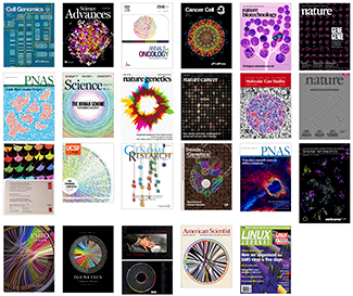
Browse my gallery of cover designs.
Happy 2026 π Day—
Art for the 5%
Celebrate π Day (March 14th) and enjoy the art — but only if you're part of the 5%.
Go ahead, see what you can't see.

Ishihara's Tests for Colour Deficiency
Authentic and accurate images of Ishihara's test plates photographed (and lovingly color-corrected) from the 38-plate Ishihara's Tests for Colour Deficiency.
I also provide the position, size, and color of each circle on each test plate.


Symmetric alternatives to the ordinary least squares regression
What immortal hand or eye, could frame thy fearful symmetry? — William Blake, "The Tyger"
This month, we look at symmetric regression, which, unlike simple linear regression, it is reversible — remaining unaltered when the variables are swapped.
Simple linear regression can summarize the linear relationship between two variables `X` and `Y` — for example, when `Y` is considered the response (dependent) and `X` the predictor (independent) variable.
However, there are times when we are not interested (or able) to distinguish between dependent and independent variables — either because they have the same importance or the same role. This is where symmetric regression can help.

Luca Greco, George Luta, Martin Krzywinski & Naomi Altman (2025) Points of significance: Symmetric alternatives to the ordinary least squares regression. Nat. Methods 22:1610–1612.
Beyond Belief Campaign BRCA Art
Fuelled by philanthropy, findings into the workings of BRCA1 and BRCA2 genes have led to groundbreaking research and lifesaving innovations to care for families facing cancer.
This set of 100 one-of-a-kind prints explore the structure of these genes. Each artwork is unique — if you put them all together, you get the full sequence of the BRCA1 and BRCA2 proteins.
