


Browse my gallery of cover designs.

Creating the PNAS Cover
contents
One of my goals in life, which I can now say has been accomplished, is to make biology look like astrophysics. Call it my love for the Torino Impact Hazard Scale.
I was given an opportunity to achieve this goal when Linda Chang from Aly Karsan's group approached me with some microscopy photos of mouse veins. I was asked to do "something" with these images for a cover submission to accompany the manuscript.
When people see my covers, sometimes they ask "How did you do that?" Ok, actually they never ask this. But being a scientist, I'm trained me to produce answers in anticipation of such questions. So, below, I show you how the image was constructed.
The image was published on the cover of PNAS (PNAS 1 May 2012; 109 (18))
Photoshop CS5, Nik Color Efex Pro 4, Alien Skin Bokeh 2 and a cup of coffee from a Rancilio Silvia.Below are a few of the images I had the option to work with. These are mouse embryonic blood vessels, with a carotid artery shown in the foreground with endothelial cells in green, vascular smooth muscle cells in red and the nuclei in blue.
Of course, as soon as I saw the images, I realized that there was very little that I needed to do to trigger the viewer's imagination. These photos were great!


Immediately I thought of two episodes of Star Trek (original series): Doomsday Machine and the Immunity Syndrome, as well as of images from the Hubble Telescope.


I though it would be pretty easy to make the artery images look all-outer-spacey. They already looked it.
And then I saw the image below.

The background was created from the two images shown here. The second image was sampled three times, at different rotations.


The channel mixer was used to remove the green channel and leave only red and blue.

The next layer was composed of what looked like ribbons of blue gas. This was created by sampling the oval shapes from the source images. Here the red channel was a great source for cloud shapes, and this was the only channel that was kept. The hue was shifted to blue and a curve adjustment was applied to increase the contrast.


When the foreground and middle ground elements were combined, the result was already 40 parsecs away.

The foreground was created from the spectacular comet-like image of a mouse artery. Very little had to be done to make this element look good. It already looked good.
I applied a little blur using Alien Skin's Bokeh 2 to narrow the apparent depth of field, masked out elements at the bottom of the image and removed some of the green channel. The entire blue channel was removed altogether (this gave the tail of the comet a mottled, flame-like appearance).


And here we have the final image.
Propensity score weighting
It is not certain that everything is uncertain. —Blaise Pascal
We have already explored how we can mitigate bias caused by confounding variables in observational studies using propensity score (PS) matching (PSM) and propensity score weighting (PSW). However, any statistical model is only as good as its assumptions and, if it is specified incorrectly, it can itself produce biased estimates of the treatment effect.
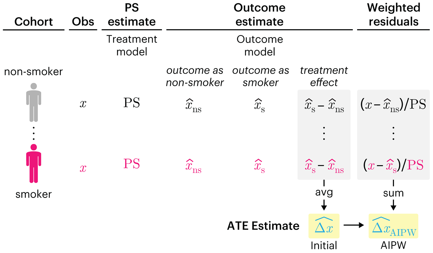
This month, we explore double robustness, a powerful statistical concept that provides a valuable “safety net” against the risk of an incorrect model. It offers two opportunities, instead of just one, to obtain a valid estimate of the treatment effect — making it possible to draw credible causal inferences from observational data without having to depend on a single set of modeling assumptions.
Kurz, C.F., Krzywinski, M. & Altman, N. (2026) Points of significance: Double Robustness. Nat. Methods 23:868–869.
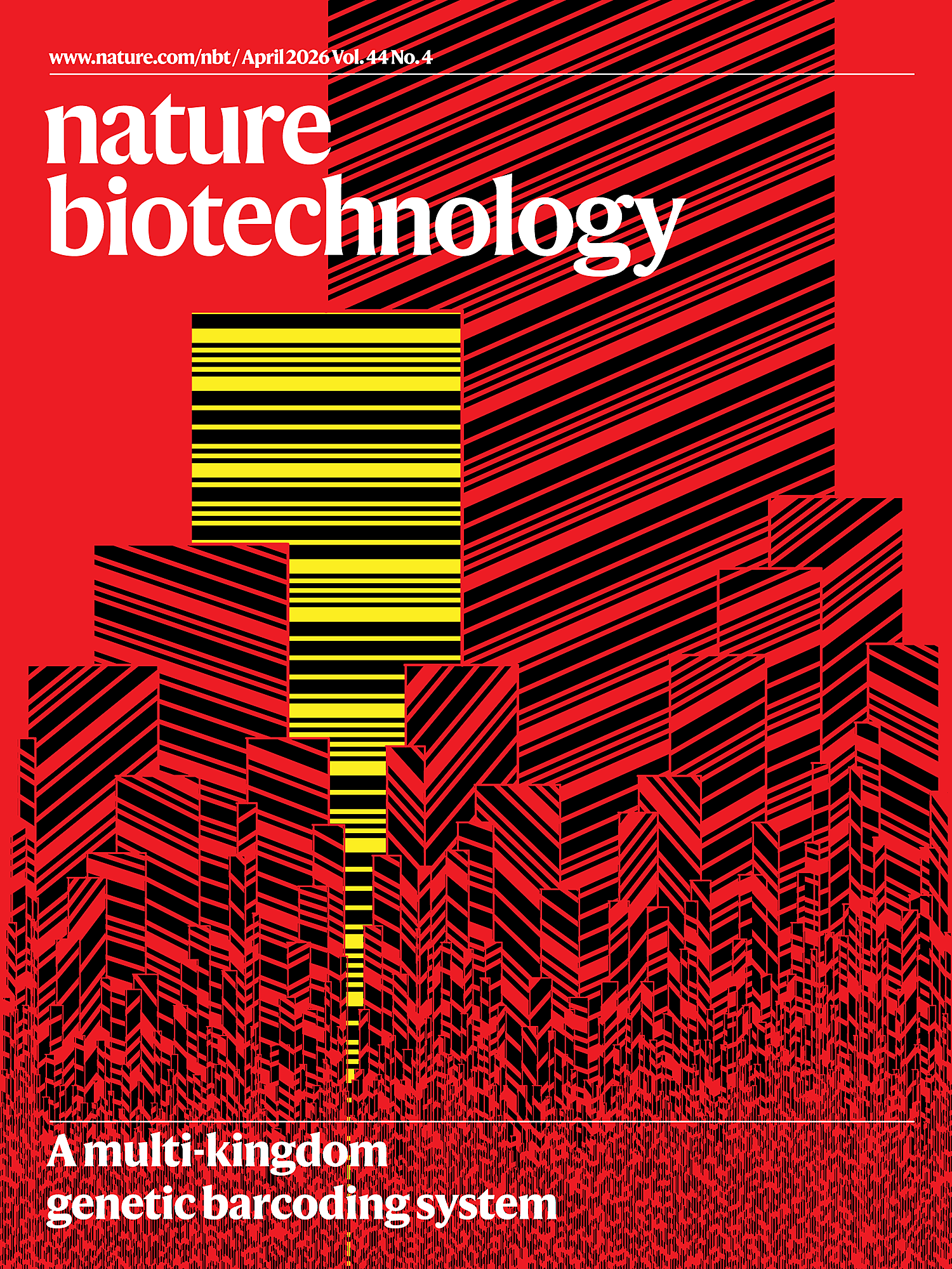
Nature Biotechnology cover
My cover design on the 7 April 2026 Nature Biotechnology issue shows the dendrogram that represents a cluster of uniquely expressed (or downregulated) genes in human naive stem cells induced from such cells. Within each dendrogram block, the genomic barcode sequence (sampled from Supplementary Table 1) is depicted with a Code 39 barcode. The highlighted barcode is one of those used for cell isolation.
Ishiguro S. et al. A multi-kingdom genetic barcoding system for precise clone isolation (2026) Nature Biotechnology 44:616–629.
Browse my gallery of cover designs.
Happy 2026 π Day—
Art for the 5%
Celebrate π Day (March 14th) and enjoy the art — but only if you're part of the 5%.
Go ahead, see what you can't see.

Ishihara's Tests for Colour Deficiency
Authentic and accurate images of Ishihara's test plates photographed (and lovingly color-corrected) from the 38-plate Ishihara's Tests for Colour Deficiency.
I also provide the position, size, and color of each circle on each test plate.


Symmetric alternatives to the ordinary least squares regression
What immortal hand or eye, could frame thy fearful symmetry? — William Blake, "The Tyger"
This month, we look at symmetric regression, which, unlike simple linear regression, it is reversible — remaining unaltered when the variables are swapped.
Simple linear regression can summarize the linear relationship between two variables `X` and `Y` — for example, when `Y` is considered the response (dependent) and `X` the predictor (independent) variable.
However, there are times when we are not interested (or able) to distinguish between dependent and independent variables — either because they have the same importance or the same role. This is where symmetric regression can help.

Luca Greco, George Luta, Martin Krzywinski & Naomi Altman (2025) Points of significance: Symmetric alternatives to the ordinary least squares regression. Nat. Methods 22:1610–1612.