

Creating the Genome Research November 2012 Cover
contents
My November 2012 Genome Research cover design takes a fun and illustrative approach to visualization. It's a mix of art and science.
The cover image accompanies the article by Cydney Nielsen from our visualization group, describing her Spark tool for visualization epigenetics data.
Nielsen CB, Younesy H, O'Geen H, Xu X, Jackson AR, et al. (2012) Spark: A navigational paradigm for genomic data exploration. Genome Res 22: 2262-2269.

Instead of a literal depiction of output from Spark, the final design presents what appears to be necklaces of the kind of tiles that Spark uses for its visual presentation. I took a chance that Genome Research had a sense of humor. Luckily, they did and accepted the design for the cover.
Colored tiles are playfully suspended on vertical strings to illustrate how Spark, presented in this issue, uses clustering to group genomic regions (tiles) with similar data patterns (colored heatmaps) and facilitates genome-wide data exploration. — Genome Research 22 (11)
Browse my gallery of cover designs.

Thinking about design ideas for the cover, I looked to the kind of visual motifs that Spark used for inspiration. Immediately the colorful tiles, which represent clustered data tracks, stood out.

Spark's output is very stylized, colorful and high contrast. It was important to preserve this aesthetic in the design. I also wanted to incorporate the idea of clustering in the design, as well as the concept that the clusters represented data from different parts of the genome.
While it was not important to illustrate how Spark organizes and analyzed data explicitly — in fact, I wanted these aspects to be subtle — it was important that the cover illustration had connections to Spark at several levels.

Spark was created by Cydney Nielsen, who works with me at the Genome Sciences Center. It is designed to mitigate the difficulties arising from the fact that genome-wide data is typically scattered across thousands of points of interest.
Genome browsers integrate diverse data sets by plotting them as vertically stacked tracks across a common genomic x-axis. Genome browsers are designed for viewing local regions of interest (e.g. an individual gene) and are frequently used during the initial data inspection and exploration phases.
Most genome browsers support zooming along the genome coordinate. This type of overview is not always useful because it produces a summary across a continuous genomic range (e.g. chromosome 1) and not across the subset of regions that are of interest (e.g. genes on chromosome 1). Spark addresses this shortcoming and provides a way to help answer questions like: What are the common data patterns across genes start sites in my data set?

Spark's visualization is driven by clustering data tracks (e.g. ChIP-seq coverage) from across equivalent regions (e.g. gene start sites). The clustered tracks are displayed as heatmaps, with each row being a data track and each column a windowed region of the genome.
With fond memories of Monte Carlo simulations from my physics days, I set out to simulate some realistic-looking, but entirely synthetic, Spark cluster tiles.

My first idea was a design which would show these tiles falling, perhaps accumulating on a pile on the ground. Quick prototypes of this idea were disappointing. The tiles appeared flimsy and too complex, while the image was largely empty. I spent several hours messing around with the rotation and pseudo-3D layout, but could not find anything that was satisfying.


I thought to do this right would require a proper simulation within a 3D system.
To address the fact that the tiles felt flimsy and overly complicated and the design lacked depth, I simplified the tile simulation to generate 5x5 tiles. These simpler representations still embodied how Spark displayed data, but did so minimally.

To keep with the idea that the clusters come from different regions of the genome, I thought of arranging them along line segments. Unlike the design in which the tiles were falling, this constrained the layout significantly and allowed me to play with the design to make it look like the clusters were draped over it. By casting a light shadow behind each string of tiles, a subtle 3D effect could be achieved while still keeping the design within a plane.
There are 11 orientations of tiles created by rotating a thin square around the vertical axis with a slight forward tilt. There are 5 rotations to the left and right at angles 10, 26, 46, 66 and 80 degrees. The rotation was achieved using Illustrator's Extrude and Bevel 3D filter.


The layout and rotation of the tiles was inspired by Flight and Fall by Rachel Nottingham, a mobile of paper birds.
I wanted to keep the layout of the spark tiles pleasant, without being too organized. I find this to be a difficult balance to achieve — natural randomness is deceptively difficult to create by hand.
Four different versions of the design were submitted to Genome Research. I was happiest with the treatment in which the tiles maintained their color and the Spark clusters were projected as tones of white. This designed felt more solid and punchy — I feel like you can reach out and touch one of those strings.

Propensity score weighting
It is not certain that everything is uncertain. —Blaise Pascal
We have already explored how we can mitigate bias caused by confounding variables in observational studies using propensity score (PS) matching (PSM) and propensity score weighting (PSW). However, any statistical model is only as good as its assumptions and, if it is specified incorrectly, it can itself produce biased estimates of the treatment effect.
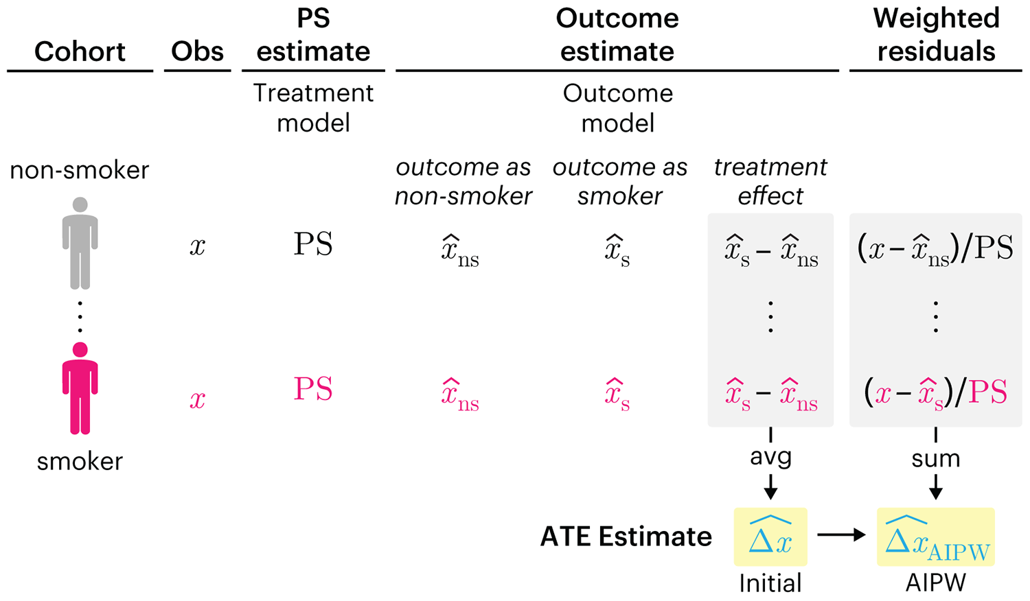
This month, we explore double robustness, a powerful statistical concept that provides a valuable “safety net” against the risk of an incorrect model. It offers two opportunities, instead of just one, to obtain a valid estimate of the treatment effect — making it possible to draw credible causal inferences from observational data without having to depend on a single set of modeling assumptions.
Kurz, C.F., Krzywinski, M. & Altman, N. (2026) Points of significance: Double Robustness. Nat. Methods 23:868–869.
Nature Biotechnology cover
My cover design on the 7 April 2026 Nature Biotechnology issue shows the dendrogram that represents a cluster of uniquely expressed (or downregulated) genes in human naive stem cells induced from such cells. Within each dendrogram block, the genomic barcode sequence (sampled from Supplementary Table 1) is depicted with a Code 39 barcode. The highlighted barcode is one of those used for cell isolation.
Ishiguro S. et al. A multi-kingdom genetic barcoding system for precise clone isolation (2026) Nature Biotechnology 44:616–629.
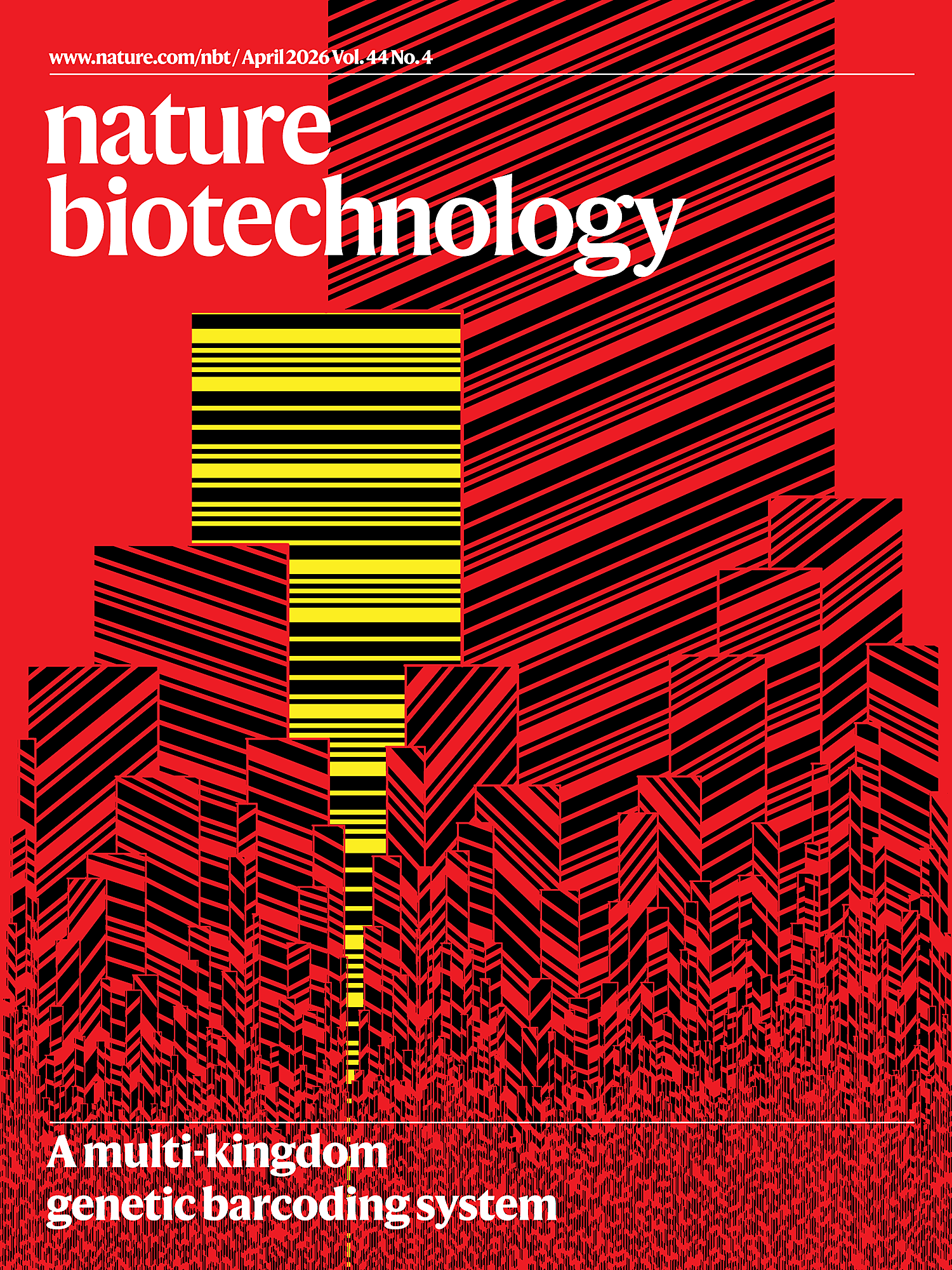
Browse my gallery of cover designs.
Happy 2026 π Day—
Art for the 5%
Celebrate π Day (March 14th) and enjoy the art — but only if you're part of the 5%.
Go ahead, see what you can't see.

Ishihara's Tests for Colour Deficiency
Authentic and accurate images of Ishihara's test plates photographed (and lovingly color-corrected) from the 38-plate Ishihara's Tests for Colour Deficiency.
I also provide the position, size, and color of each circle on each test plate.


Symmetric alternatives to the ordinary least squares regression
What immortal hand or eye, could frame thy fearful symmetry? — William Blake, "The Tyger"
This month, we look at symmetric regression, which, unlike simple linear regression, it is reversible — remaining unaltered when the variables are swapped.
Simple linear regression can summarize the linear relationship between two variables `X` and `Y` — for example, when `Y` is considered the response (dependent) and `X` the predictor (independent) variable.
However, there are times when we are not interested (or able) to distinguish between dependent and independent variables — either because they have the same importance or the same role. This is where symmetric regression can help.

Luca Greco, George Luta, Martin Krzywinski & Naomi Altman (2025) Points of significance: Symmetric alternatives to the ordinary least squares regression. Nat. Methods 22:1610–1612.
Beyond Belief Campaign BRCA Art
Fuelled by philanthropy, findings into the workings of BRCA1 and BRCA2 genes have led to groundbreaking research and lifesaving innovations to care for families facing cancer.
This set of 100 one-of-a-kind prints explore the structure of these genes. Each artwork is unique — if you put them all together, you get the full sequence of the BRCA1 and BRCA2 proteins.
