
Genome Informatics 2010 cover
contents
The program cover shows sequences of some of the genes and viruses that appear in the 2010 Genome Informatics conference's abstracts.


The booklet was published with a black cover background. Below is an inverted and pinkish take on the cover.

Each sequence is represented by a continuous path. The length of the path is proportional to the length of the sequence.
At each point on the path, color is used to show the GC content computed over a window of 20 bases at that position.
Because the GC content doesn't vary greatly, values in the range 0.2–0.6 are mapped onto hues 0–300, with GC values outside that range assigned to the start and end hues. To smooth the color mpaping, a running average is calculated across 10 adjacent samples.
Direction of the curvature of the path is determined by the GC content relative to the average GC content of the human genome.
The magnitude of path curvature is informed by the repeat content near that location, which is calculated by determining the average frequency of 10-mers sampled within a window of 200 bases relative to their frequency in the human exon sequence.
This quantity is expressed relative to the chance of observing these 10-mers randomly and used to inform the angle of the path. Regions that are composed of 10-mers that are relatively rare are straighter than those which contain repetitive regions.

The path is confined within a circular area to keep it compact, at the cost of losing translational and rotational invariance of the representation. This limitation is due to the fact that the segments of the path depend on the angle and position at which the path approaches the circular boundary.
For genes, the transcribed sequence is shown, which includes both introns and exons.

The overall effect of the path encoding is a qualitative, artistic interpretation of local sequence structure. Two paths can be directly compared to interrogate differences in their corresponding sequence.
The Deadly Genomes poster demonstrates how entire genomes appear when encoded as paths. The poster compares the incidence rates and mortality of harmful viruses and bacteria, such as malaria, syphilis, AIDS and SARS.

As on the conference covers, on the poster each genome is drawn as a path. The length of the path is proportional to the size of the genome. Every fifth base is drawn as a circle whose color is based on the GC content (fraction of guanines and cytosines). The path curvature is proportional to the repeat content and the direction of curvature is determined by whether the GC content is lower or higher than average. Genomes are labeled by disease, organism, size (in bases) and GC content. Updated with the genome of SARS-CoV-2 (Wuhan-Hu-1 isolate) and COVID-19 case statistics as of 3 March 2020."
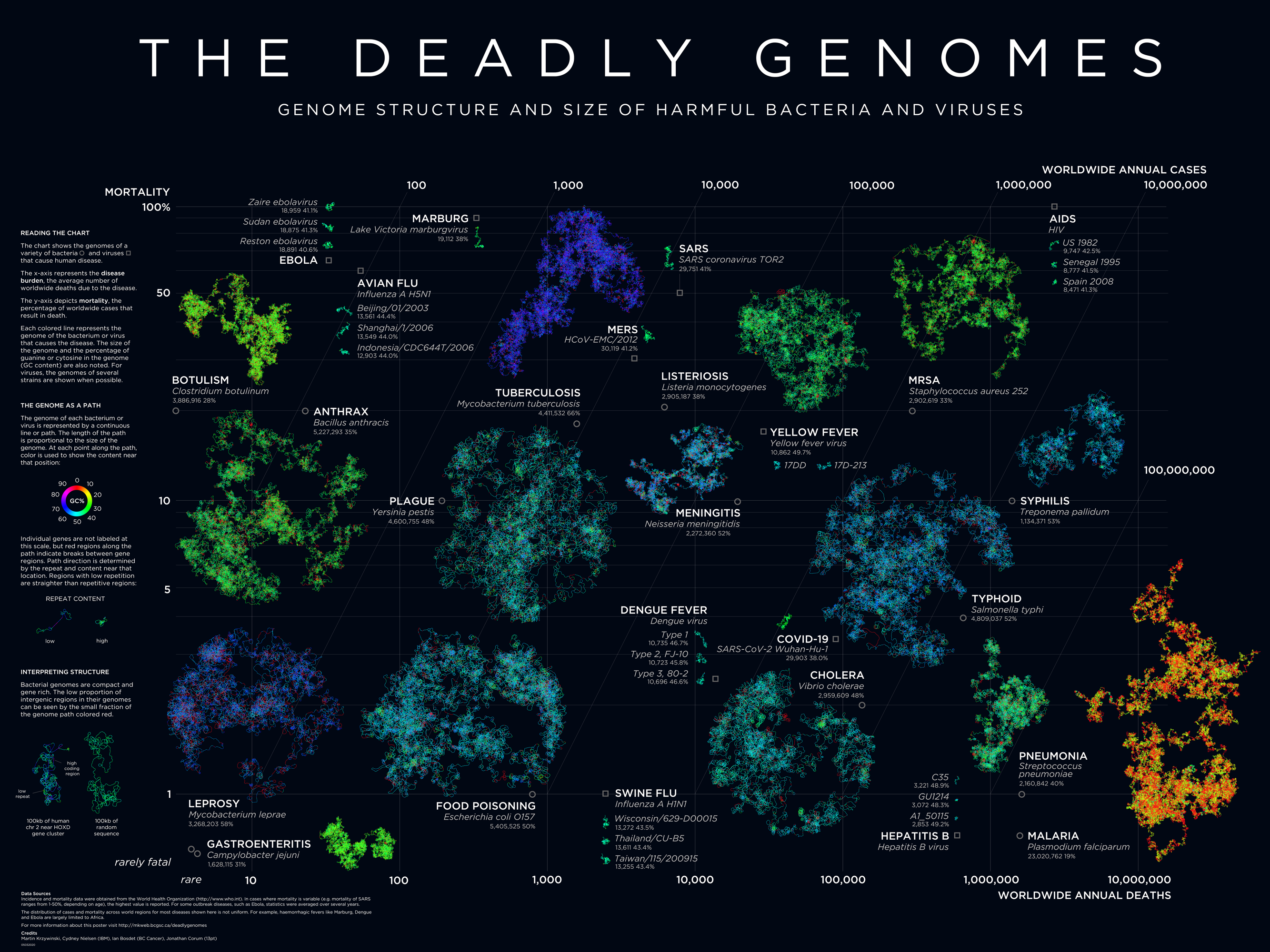
The poster was a finalist in the 2009 National Science Foundation Visualization Challenge.
Propensity score weighting
It is not certain that everything is uncertain. —Blaise Pascal
We have already explored how we can mitigate bias caused by confounding variables in observational studies using propensity score (PS) matching (PSM) and propensity score weighting (PSW). However, any statistical model is only as good as its assumptions and, if it is specified incorrectly, it can itself produce biased estimates of the treatment effect.
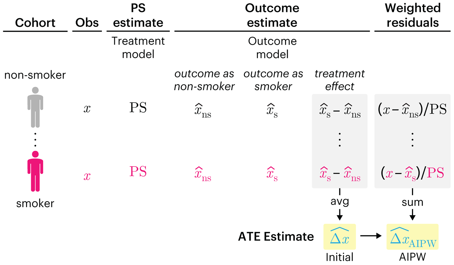
This month, we explore double robustness, a powerful statistical concept that provides a valuable “safety net” against the risk of an incorrect model. It offers two opportunities, instead of just one, to obtain a valid estimate of the treatment effect — making it possible to draw credible causal inferences from observational data without having to depend on a single set of modeling assumptions.
Kurz, C.F., Krzywinski, M. & Altman, N. (2026) Points of significance: Double Robustness. Nat. Methods 23:868–869.
Nature Biotechnology cover
My cover design on the 7 April 2026 Nature Biotechnology issue shows the dendrogram that represents a cluster of uniquely expressed (or downregulated) genes in human naive stem cells induced from such cells. Within each dendrogram block, the genomic barcode sequence (sampled from Supplementary Table 1) is depicted with a Code 39 barcode. The highlighted barcode is one of those used for cell isolation.
Ishiguro S. et al. A multi-kingdom genetic barcoding system for precise clone isolation (2026) Nature Biotechnology 44:616–629.

Browse my gallery of cover designs.
Happy 2026 π Day—
Art for the 5%
Celebrate π Day (March 14th) and enjoy the art — but only if you're part of the 5%.
Go ahead, see what you can't see.

Ishihara's Tests for Colour Deficiency
Authentic and accurate images of Ishihara's test plates photographed (and lovingly color-corrected) from the 38-plate Ishihara's Tests for Colour Deficiency.
I also provide the position, size, and color of each circle on each test plate.


Symmetric alternatives to the ordinary least squares regression
What immortal hand or eye, could frame thy fearful symmetry? — William Blake, "The Tyger"
This month, we look at symmetric regression, which, unlike simple linear regression, it is reversible — remaining unaltered when the variables are swapped.
Simple linear regression can summarize the linear relationship between two variables `X` and `Y` — for example, when `Y` is considered the response (dependent) and `X` the predictor (independent) variable.
However, there are times when we are not interested (or able) to distinguish between dependent and independent variables — either because they have the same importance or the same role. This is where symmetric regression can help.

Luca Greco, George Luta, Martin Krzywinski & Naomi Altman (2025) Points of significance: Symmetric alternatives to the ordinary least squares regression. Nat. Methods 22:1610–1612.
Beyond Belief Campaign BRCA Art
Fuelled by philanthropy, findings into the workings of BRCA1 and BRCA2 genes have led to groundbreaking research and lifesaving innovations to care for families facing cancer.
This set of 100 one-of-a-kind prints explore the structure of these genes. Each artwork is unique — if you put them all together, you get the full sequence of the BRCA1 and BRCA2 proteins.
