
 buy artwork
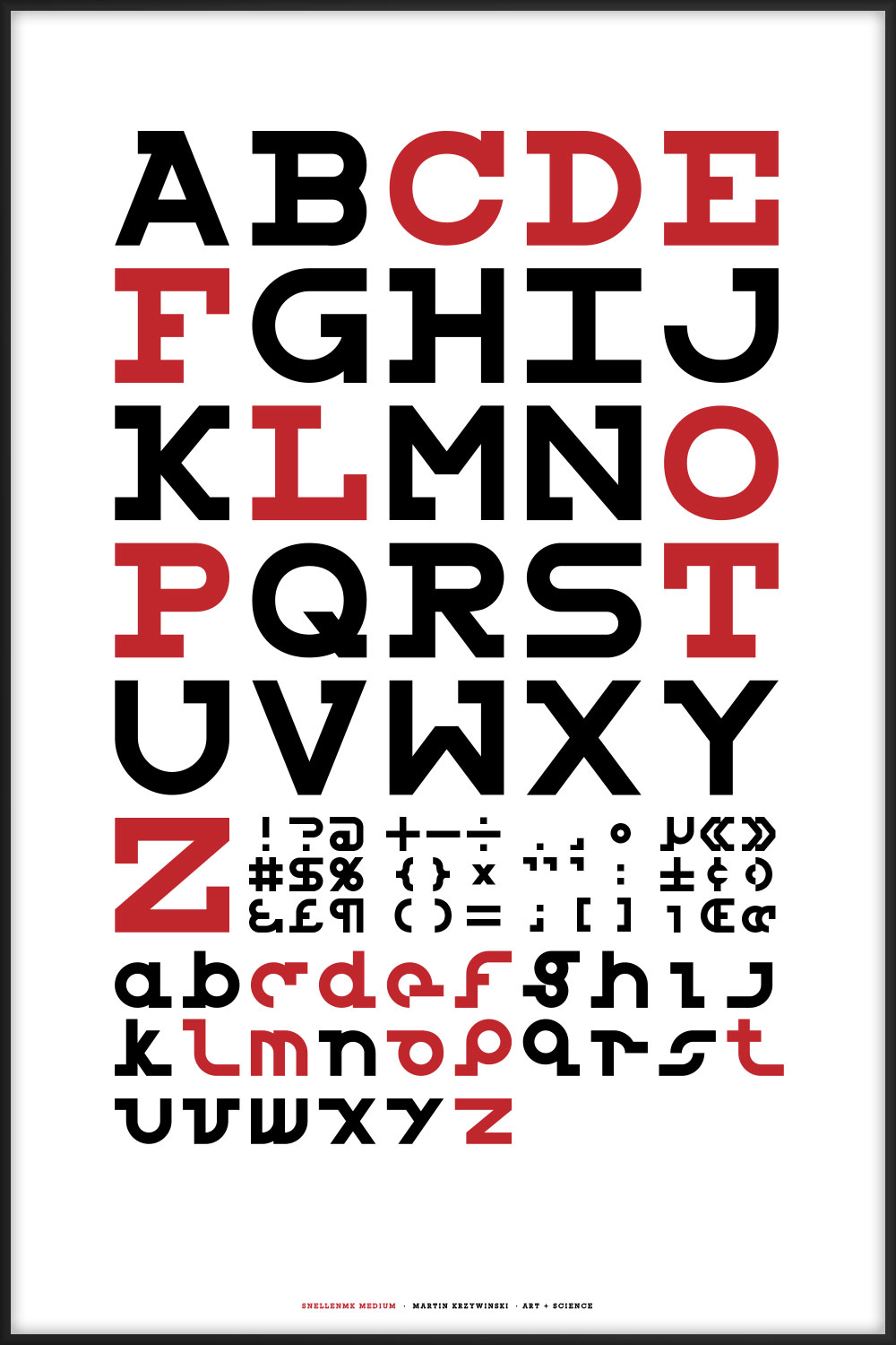
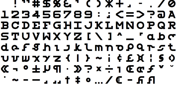
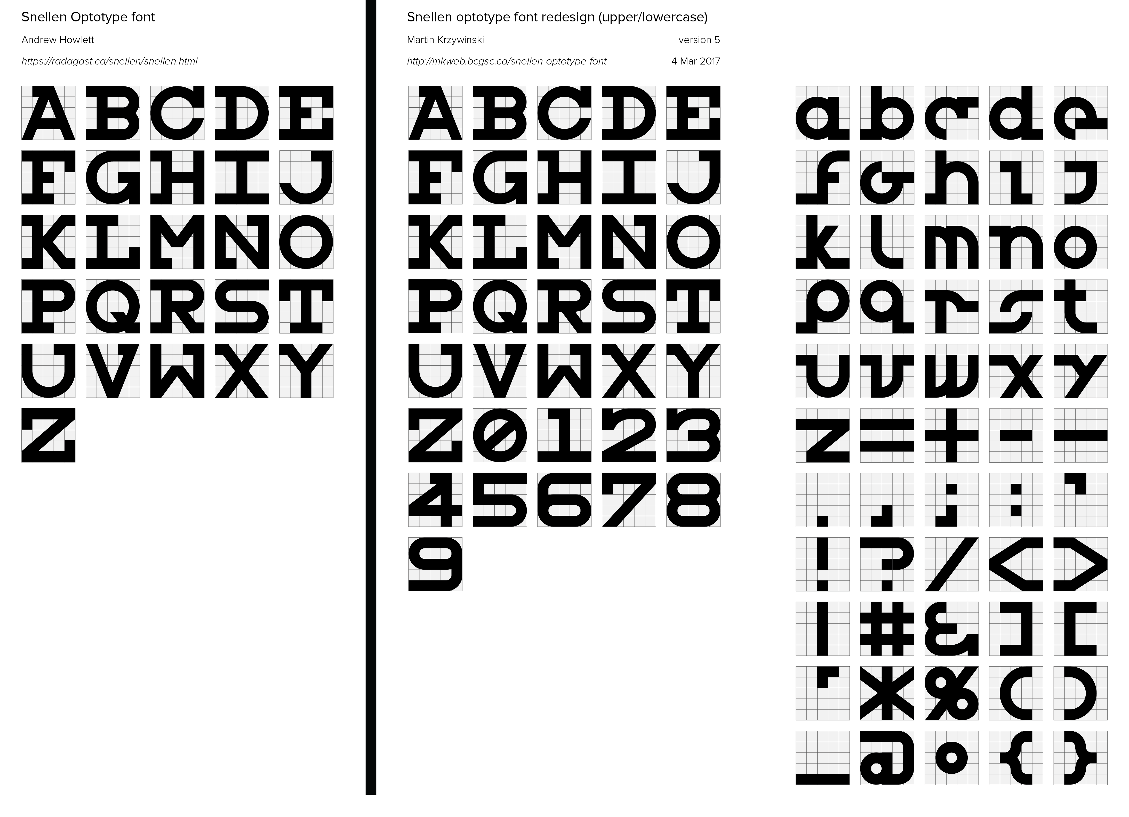
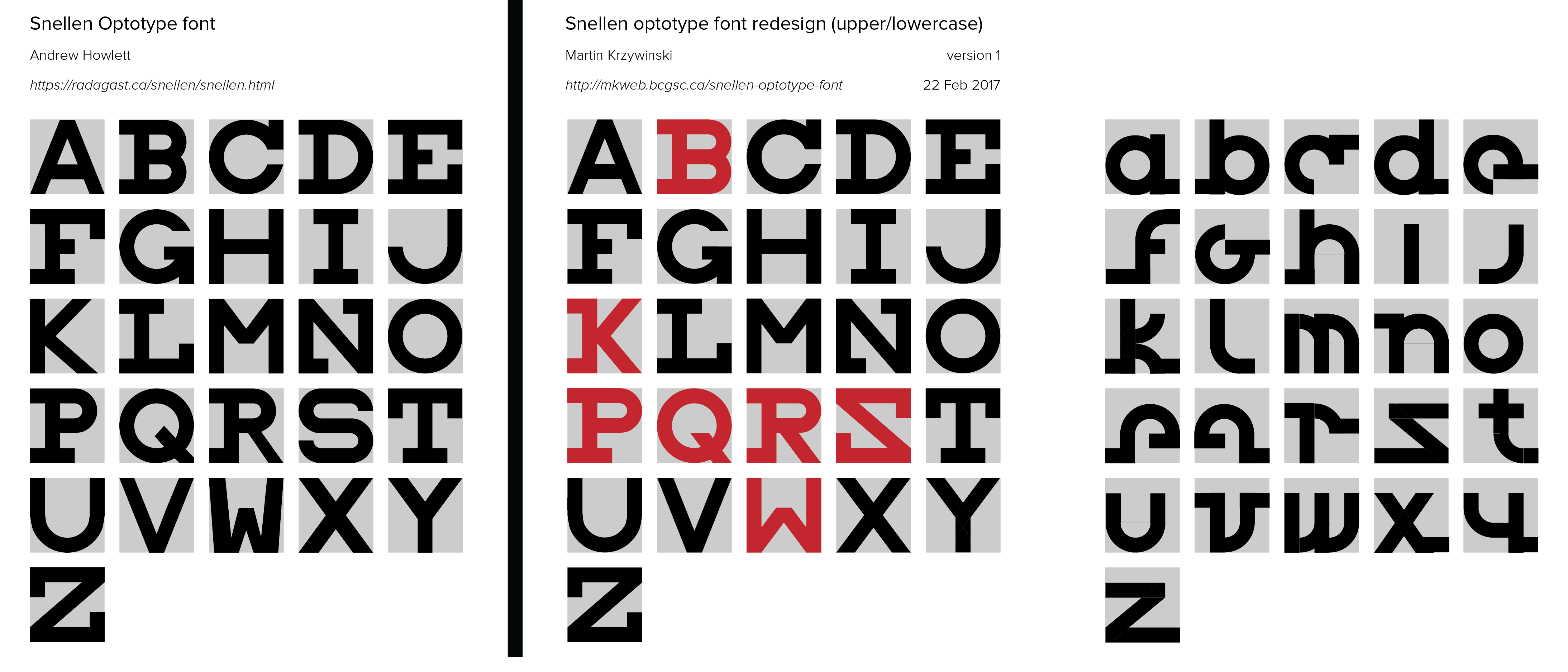
Snellen Optotype Font with Upper and Lowercase characters
contents
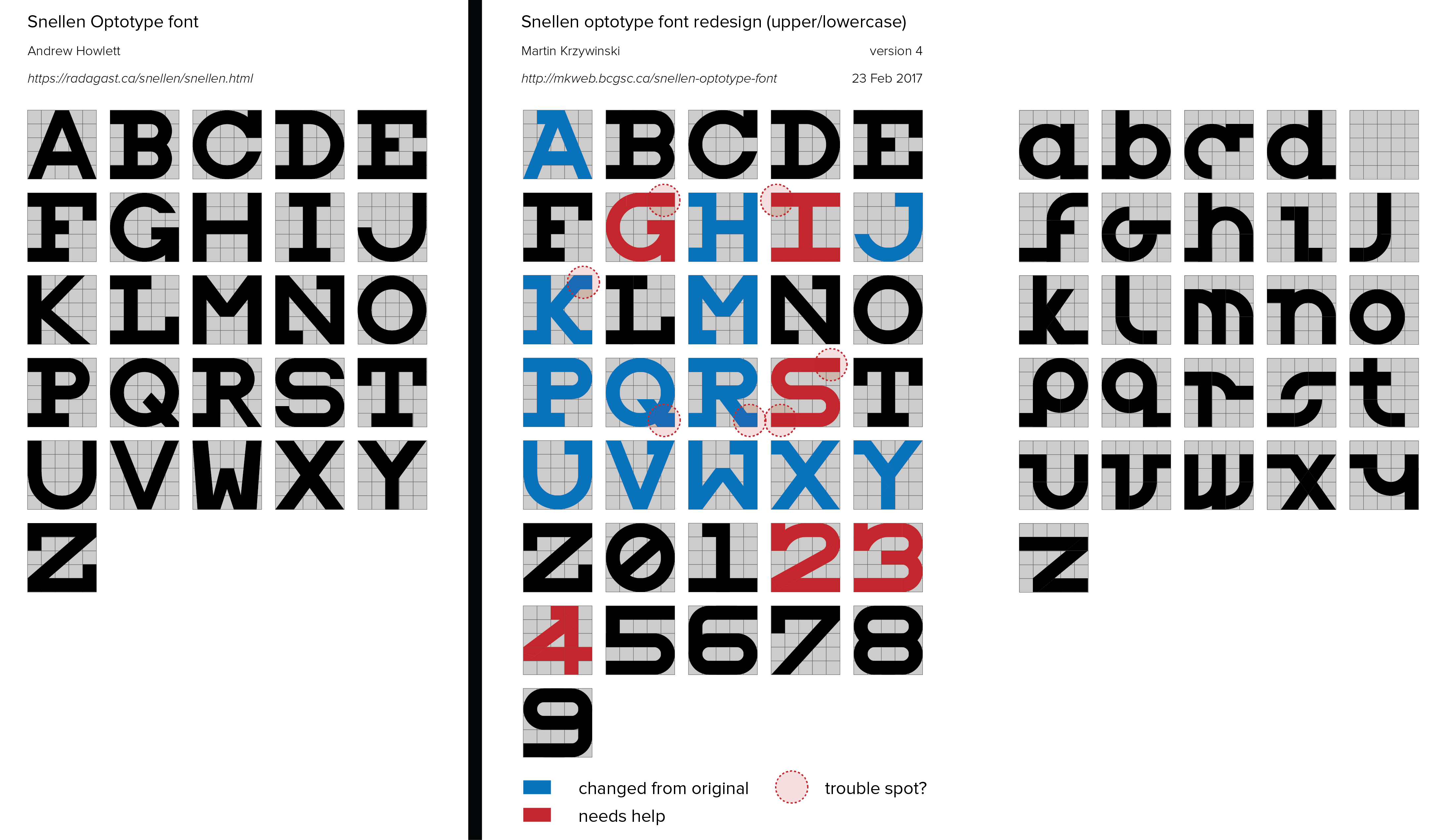
In the process of designing my Snellen Eye Chart typographical posters, I came across the Snellen font by Andrew Howlett. I wasn't happy with all the letters, so I made attempts at giving the font an update. I call this redesign "Snellen MK", to avoid conflict with Howlett's "Snellen".
Not being a font designer, I will likely get myself into trouble.
While making my Snellen chart series, I entered the rabbit hole of optotype fonts ... and I can't get out!
 buy artwork
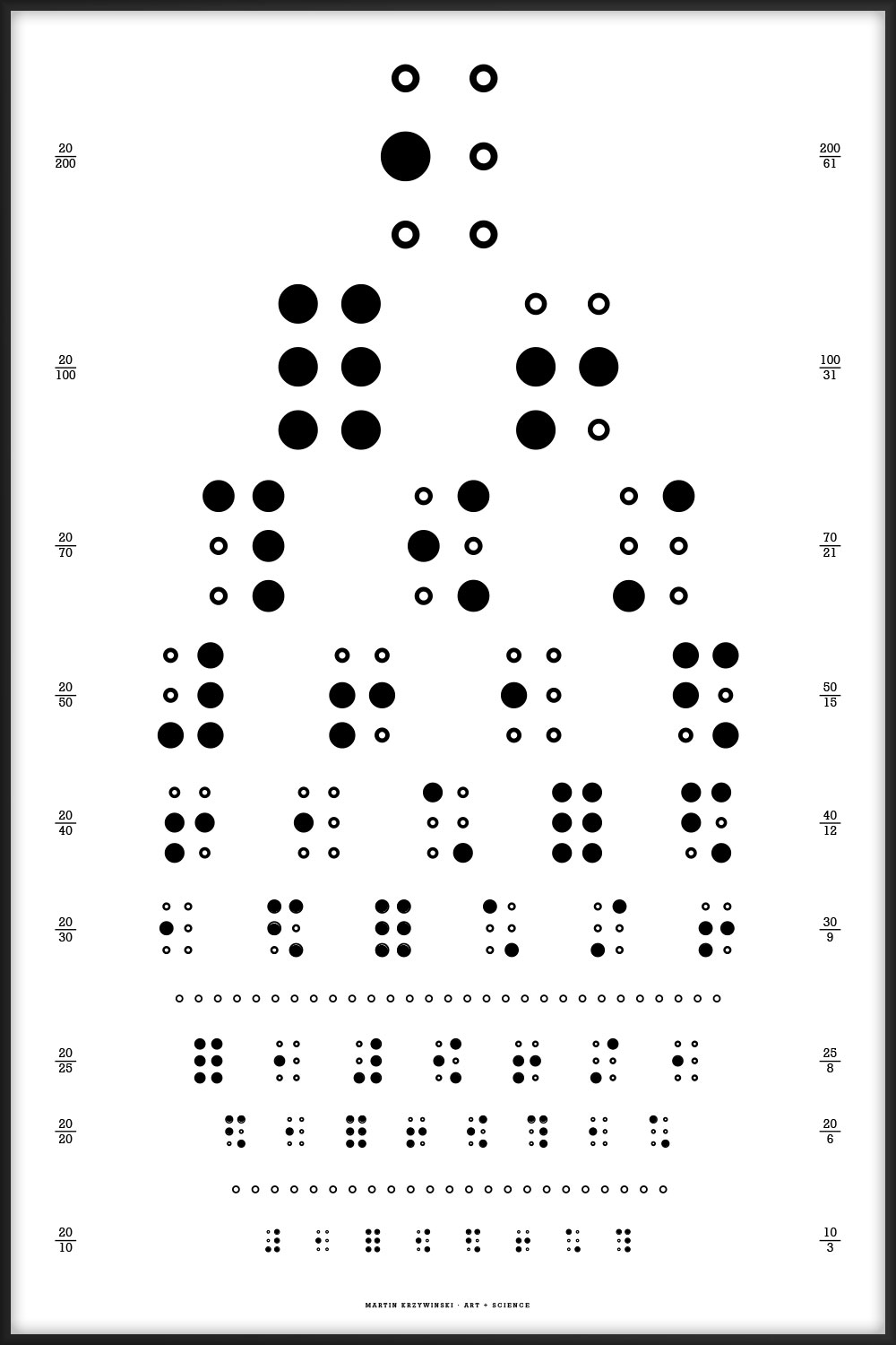
The charts don't necessarily use the latest version of my Snellen font design, which fluctuates as my mood about some of the letters changes.
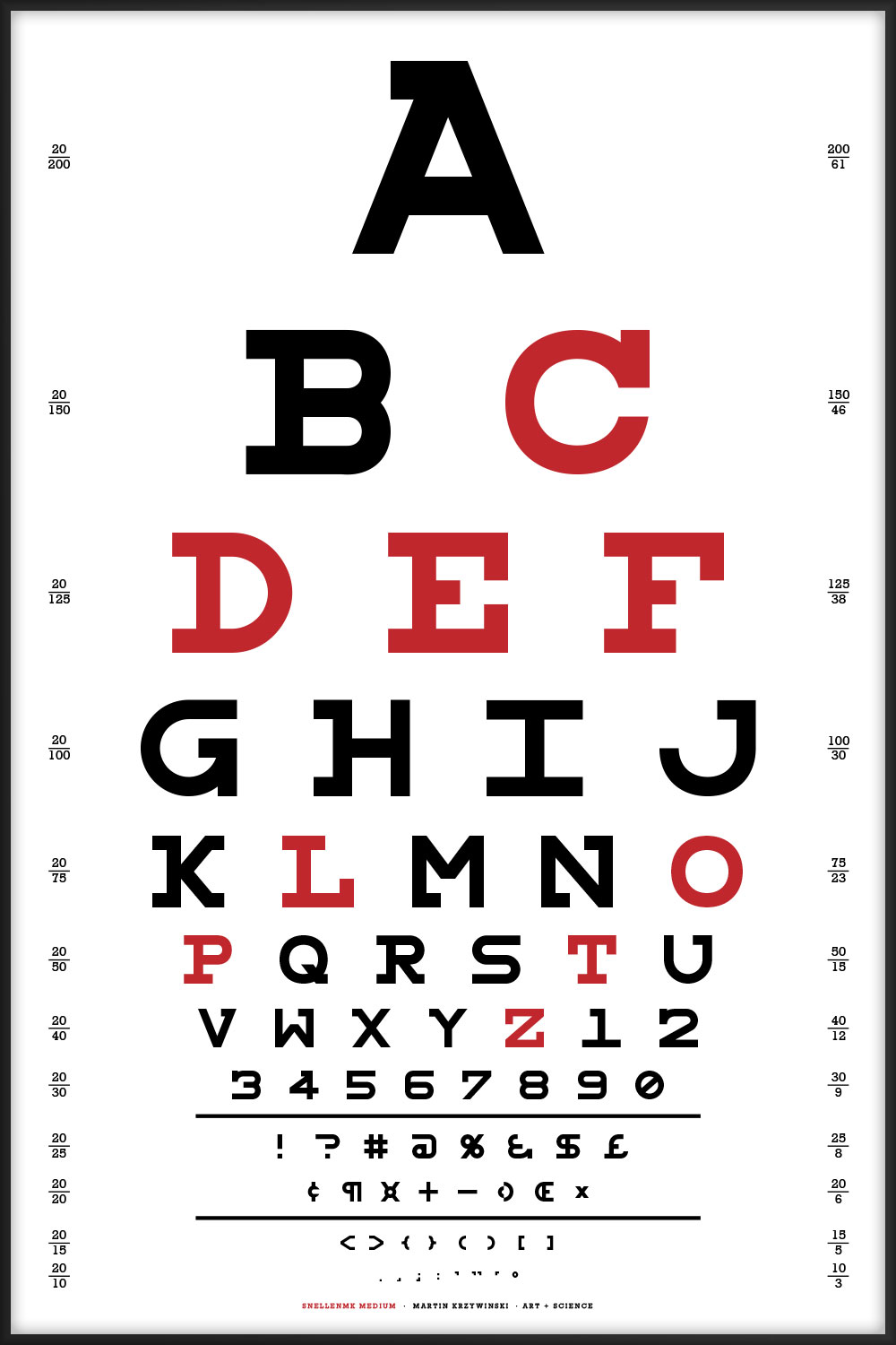
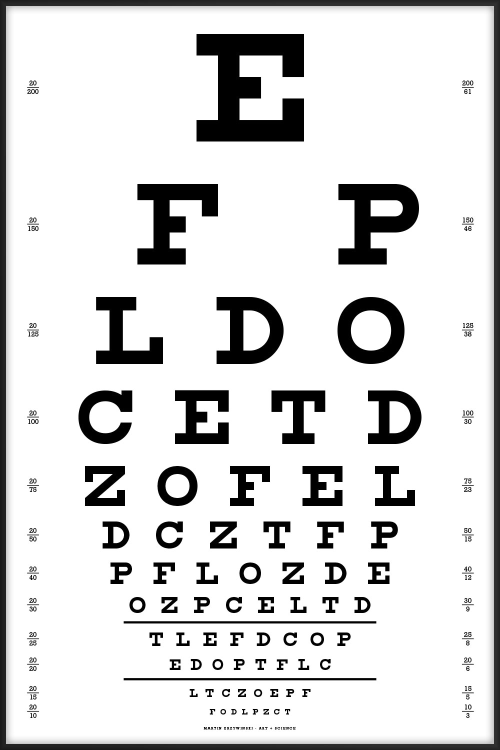
The optotype requirement is that letters be designed on a 5 × 5 grid, and have constant stroke width. This means that both lower and upper case letters need to share the grid and stroke. To stay compatible with the eyechart paradigm, letters should be as obvious as possible.
Lorrie Frear's article What are Optotypes? Eye Charts in Focus is a great read about optotypes and eye charts.
The uppercase letter design uses Herman Snellen's original chart as inspiration.
I have modified the design by Andrew Howlett (see below) for some letters. All the changes are relatively minor: more serifs and consistent stroke width for bars on R and K.
The lowercase characters should be considered experimental.
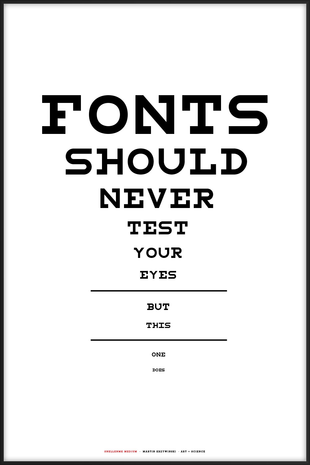
The progress of my redesign is shown below. I would greatly appreciate feedback and suggestions!
The distribution contains both Andrew's version and my redesign.
v7.002 11-Jul-2019 — Download SnellenMK optotype font
If I ever get back to this project, the next changes will be the suggestions from Tomasz.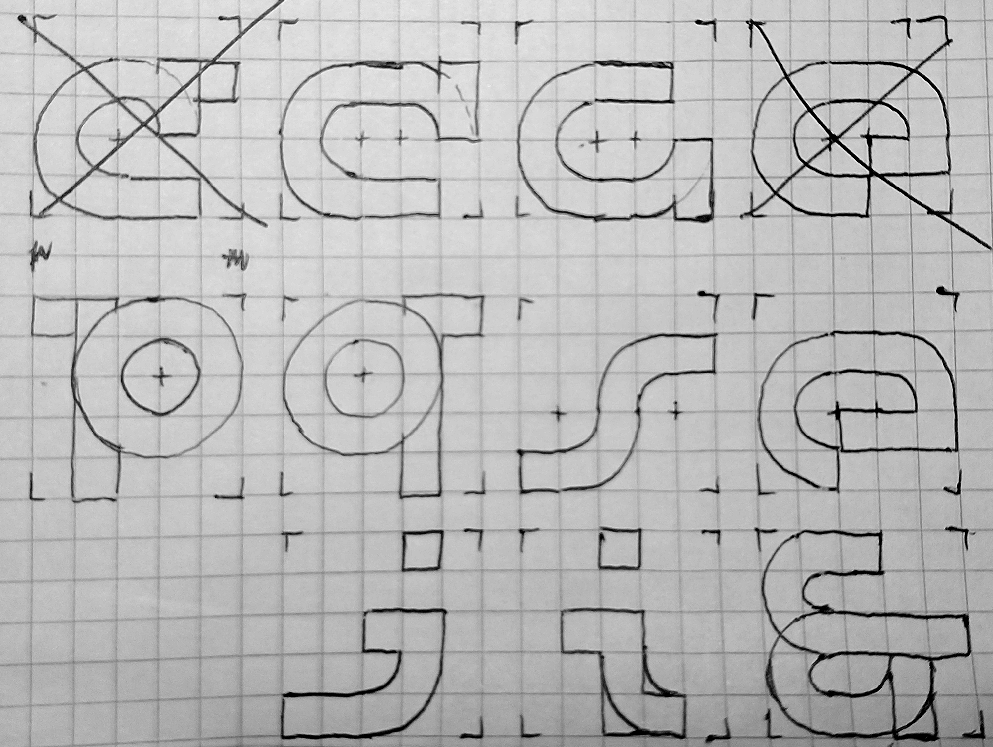
Tidied all letter forms with Fontlab 6.
Fixed g and e. Thanks to Makeesha Fisher for suggestions.

Adjusted serifs on f, j, l, o, t to extend the full width of the grid. Added a lot more symbols.
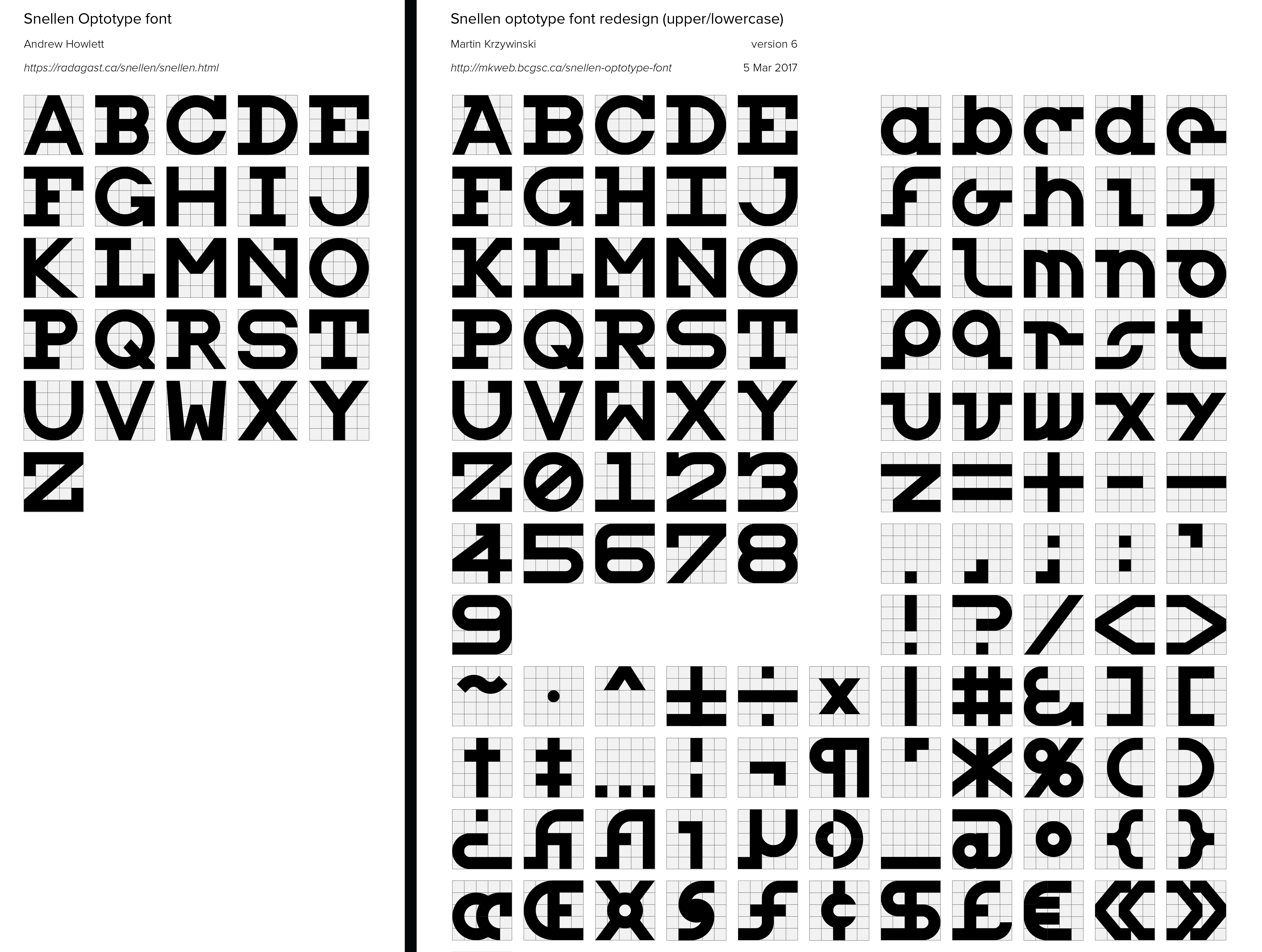
Added lowercase, digits and symbols.
Adding digits.
I'm exploring the lowercase characters. I don't know what I want to do with them. Make this into a more standard font in which lowercase letters are smaller, so that letters can fit their roles clearly when text is set in sentence case, or fill out the full optotype grid.
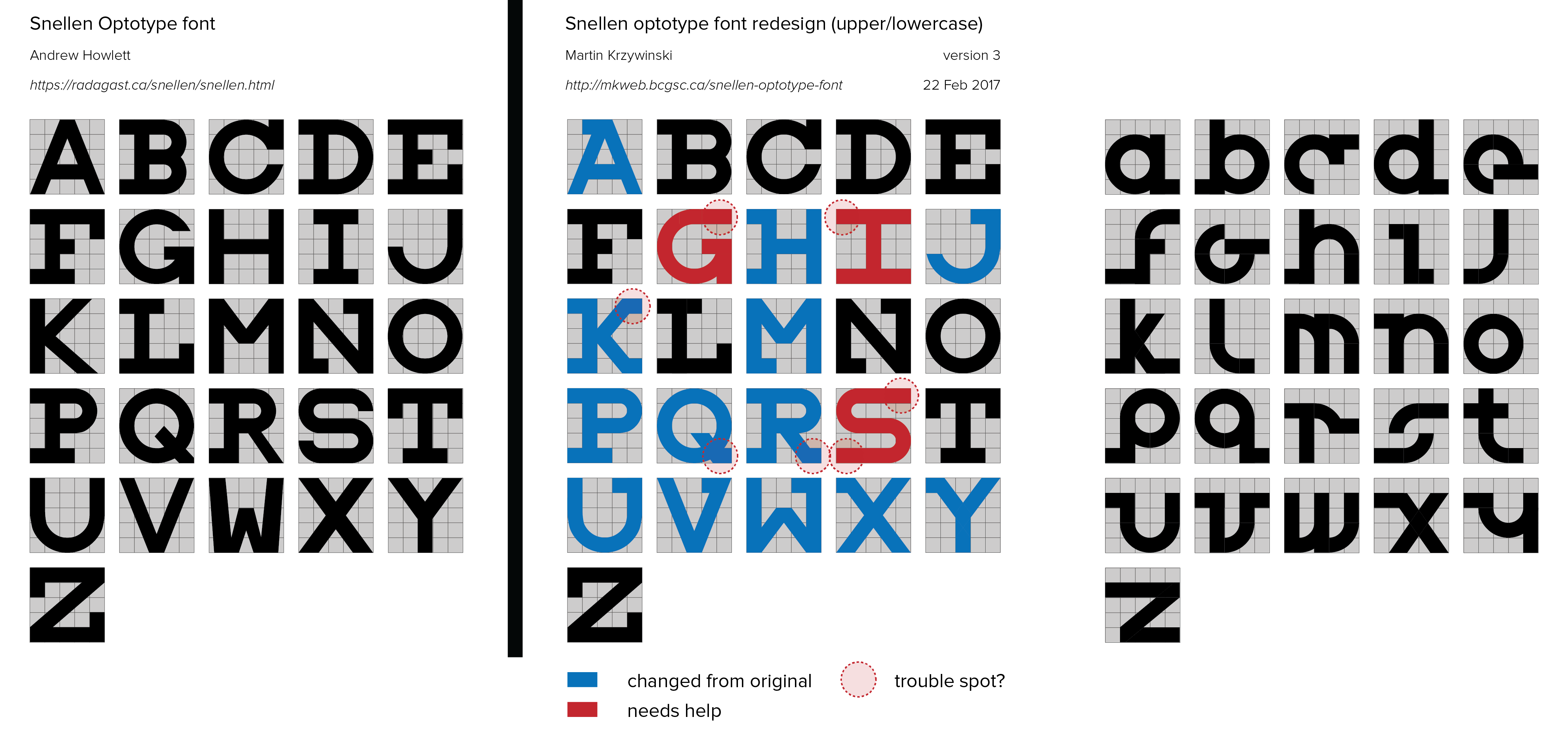
Flushed out some inconsistencies in the uppercase characters. Added serifs to more letters.
Now all the letters occuppy the full 5 × 5 grid, including the I, whose serifs were widened to allow this. While this new uppercase I isn't as pretty as the old one, it makes the entire typeface more consistent to its optotype roots.
Still struggling with the G. In the original version, the descending stroke was cut off in the middle of a grid, which I didn't like.
The S has been fixed—thanks to Elanor Lutz for feedback.
I've color coded the characters slightly differently, drawing attention to ones that I feel need more thought.
The lowercase characters aren't color coded (yet) because ... most of them need help. Primarily, I'm vacillating between making them fill the full size of the 5 × 5 square, just like the uppercase characters, and keeping them confined to a 4 × 4 square, which incurs loss of legibility. If I make the letters the same size, it will be impossible to distinguish lowercase and uppercase characters some cases (e.g. c, i). Perhaps this is desired?
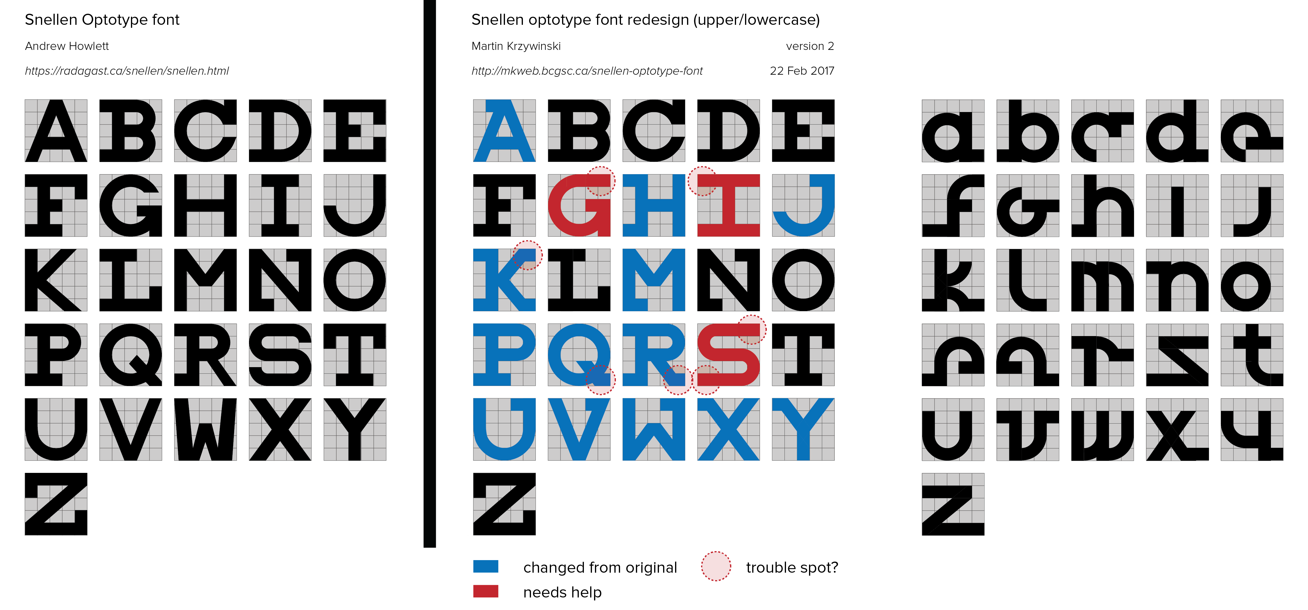
First attempt at lowercase characters.
Propensity score weighting
It is not certain that everything is uncertain. —Blaise Pascal
We have already explored how we can mitigate bias caused by confounding variables in observational studies using propensity score (PS) matching (PSM) and propensity score weighting (PSW). However, any statistical model is only as good as its assumptions and, if it is specified incorrectly, it can itself produce biased estimates of the treatment effect.
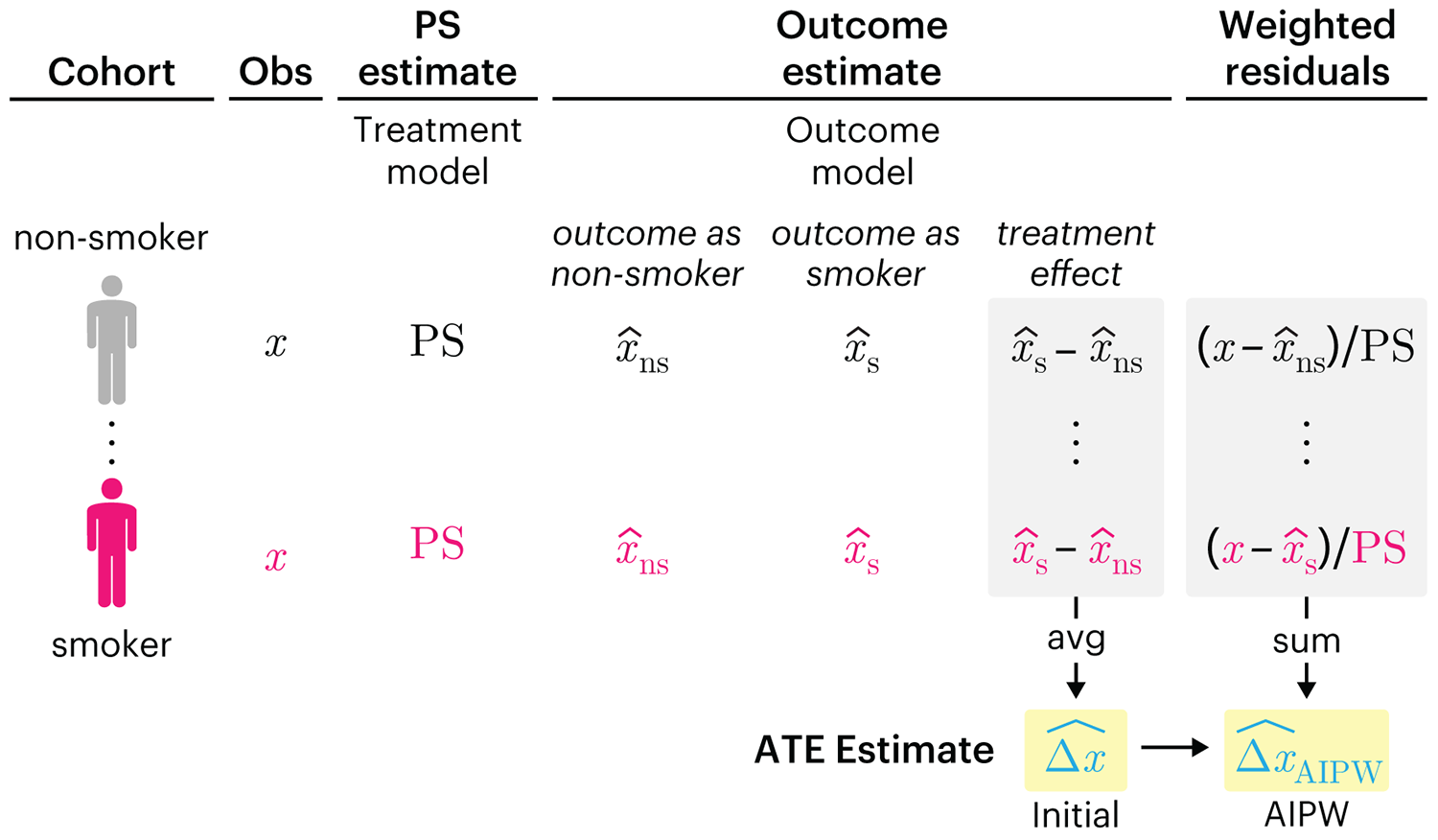
This month, we explore double robustness, a powerful statistical concept that provides a valuable “safety net” against the risk of an incorrect model. It offers two opportunities, instead of just one, to obtain a valid estimate of the treatment effect — making it possible to draw credible causal inferences from observational data without having to depend on a single set of modeling assumptions.
Kurz, C.F., Krzywinski, M. & Altman, N. (2026) Points of significance: Double Robustness. Nat. Methods 23:868–869.
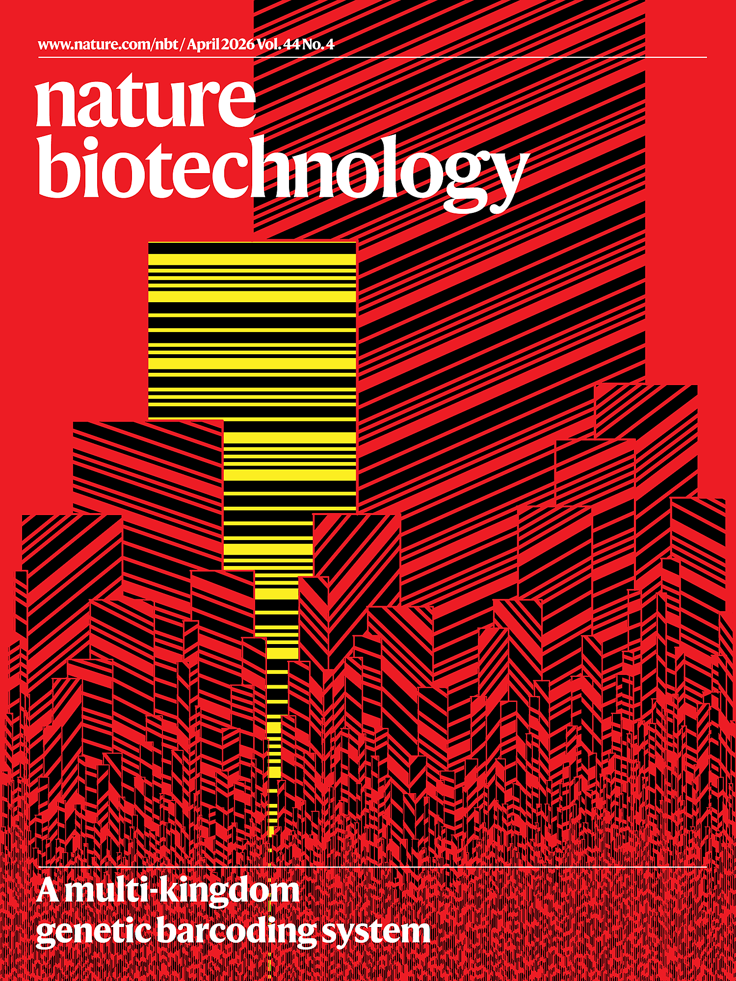
Nature Biotechnology cover
My cover design on the 7 April 2026 Nature Biotechnology issue shows the dendrogram that represents a cluster of uniquely expressed (or downregulated) genes in human naive stem cells induced from such cells. Within each dendrogram block, the genomic barcode sequence (sampled from Supplementary Table 1) is depicted with a Code 39 barcode. The highlighted barcode is one of those used for cell isolation.
Ishiguro S. et al. A multi-kingdom genetic barcoding system for precise clone isolation (2026) Nature Biotechnology 44:616–629.
Browse my gallery of cover designs.
Happy 2026 π Day—
Art for the 5%
Celebrate π Day (March 14th) and enjoy the art — but only if you're part of the 5%.
Go ahead, see what you can't see.

Ishihara's Tests for Colour Deficiency
Authentic and accurate images of Ishihara's test plates photographed (and lovingly color-corrected) from the 38-plate Ishihara's Tests for Colour Deficiency.
I also provide the position, size, and color of each circle on each test plate.


Symmetric alternatives to the ordinary least squares regression
What immortal hand or eye, could frame thy fearful symmetry? — William Blake, "The Tyger"
This month, we look at symmetric regression, which, unlike simple linear regression, it is reversible — remaining unaltered when the variables are swapped.
Simple linear regression can summarize the linear relationship between two variables `X` and `Y` — for example, when `Y` is considered the response (dependent) and `X` the predictor (independent) variable.
However, there are times when we are not interested (or able) to distinguish between dependent and independent variables — either because they have the same importance or the same role. This is where symmetric regression can help.

Luca Greco, George Luta, Martin Krzywinski & Naomi Altman (2025) Points of significance: Symmetric alternatives to the ordinary least squares regression. Nat. Methods 22:1610–1612.
Beyond Belief Campaign BRCA Art
Fuelled by philanthropy, findings into the workings of BRCA1 and BRCA2 genes have led to groundbreaking research and lifesaving innovations to care for families facing cancer.
This set of 100 one-of-a-kind prints explore the structure of these genes. Each artwork is unique — if you put them all together, you get the full sequence of the BRCA1 and BRCA2 proteins.
