



EMBO Journal 2011 Cover Contest
contents
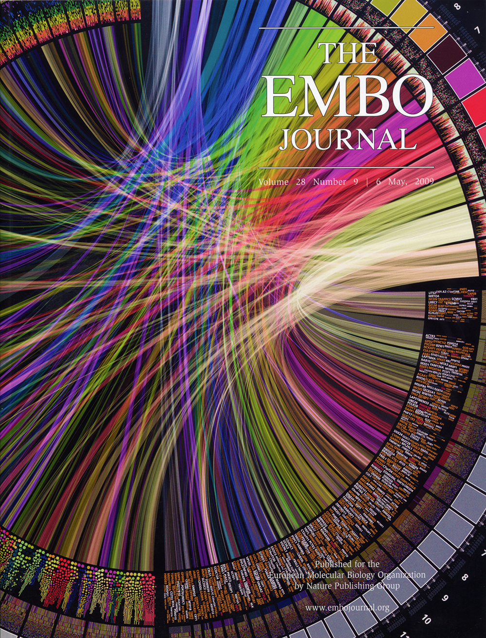
For its 6 May 2009 issue, the EMBO Journal selected my submission of a large Circos figure for its cover. At the time, front page exposure of this sort has made Circos a very popular tool for visualization in genomics, and in particular, in cancer research where there is a need to illustrate differences between genomes.
Below I describe a couple of subsequent submissions for the EMBO Journal 2011 Cover Contest — a scientific entry and a non-scientific entry.
For the EMBO Journal 2011 Cover Contest, I prepared two entries, one for the scientific category and one for the non-scientific category.
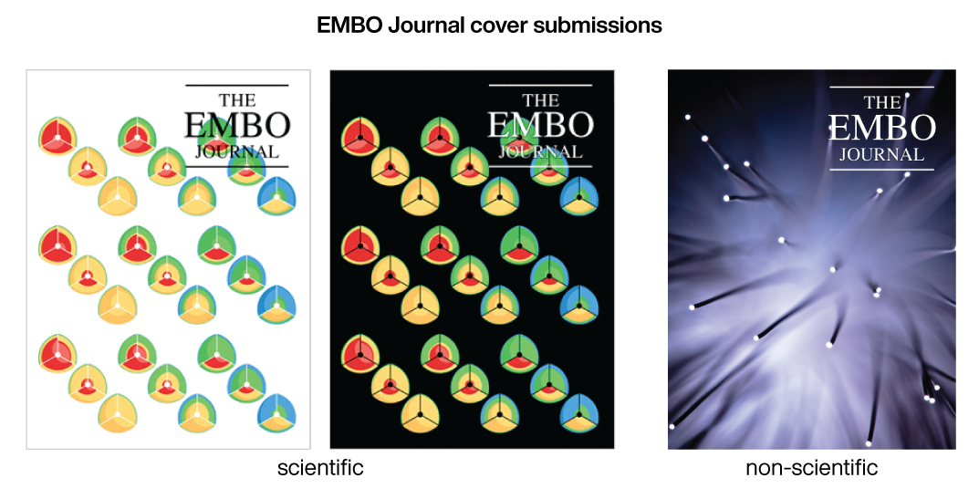
The EMBO Journal non-scientific cover prize is awarded for the most interesting and beautiful image made outside the lab. Contestants may submit, for example, photos or artistic impressions of wildlife animals, plants or landscapes. Particularly welcome will also be hand or computer-generated paintings or drawings (or photographs of other works of art) related to a biological or molecular biological topic.
The EMBO Journal scientific cover prize is awarded for the most captivating and thought-provoking contribution depicting a piece of molecular biology research. Entries can include light or electron micrographs, 3D reconstructions or models of biological specimen or molecules, spectacular artefacts collected in the lab, original new views of lab equipment (but not of colleagues!), or other research-based images to be of interest to molecular biologists.

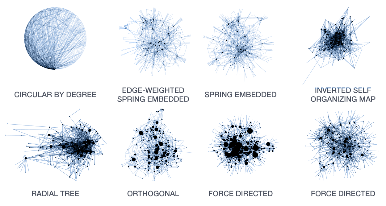
A large number of layout algorithms already exist to attempt to visualize networks. In an attempt to create attractive layouts, node and edge positions are optimized to minimize some fitness function, such as overlap or force (if edges are treated as springs). Unfortunately, as a result it is impossible to relate the position of a node (or the distance between any two nodes in the layout) to their connected neighbourhood in the network. This particularly holds for large networks, where nodes and edge overlap in the layout is unavoidable.
The hive plot is a rational approach to visualizing networks. It is designed to complement (at times, replace) the network hairball.
In a hive plot, network nodes are assigned to and placed on axes using rational rules. These rules typically are a function of local network structure around the node (connectivity, density, centrality, etc). The resulting plot is interpretable.
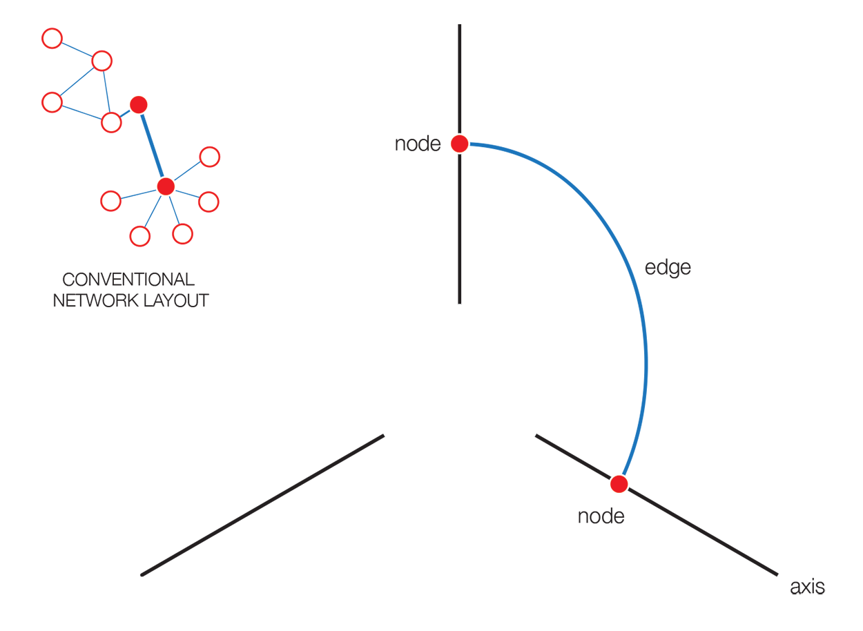
The hive plot can be applied to visualize a large number of ratios between three or more scales.
Instead of network edges, the lines in a hive plot now correspond to an (x,y) data pair, which can be interpreted as a ratio (x/y). This approach is particularly effective when lines are drawn as ribbons, which are then stacked. This is shown in the figure below.
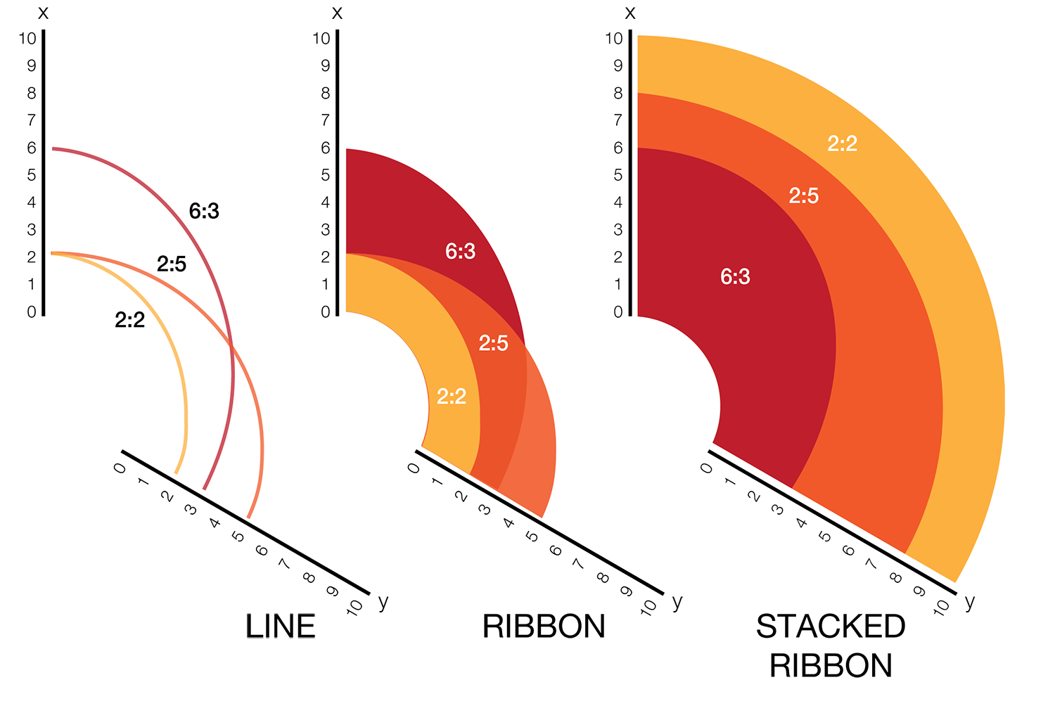
The resulting visualization bears resemblance to a stacked bar plot. The circular layout grants the advantage of being able to instantly compare all pair-wise comparisons between the axes (when three axes are used). This layout also gives the image a compare compact feel and is particularly suitable for tiling.
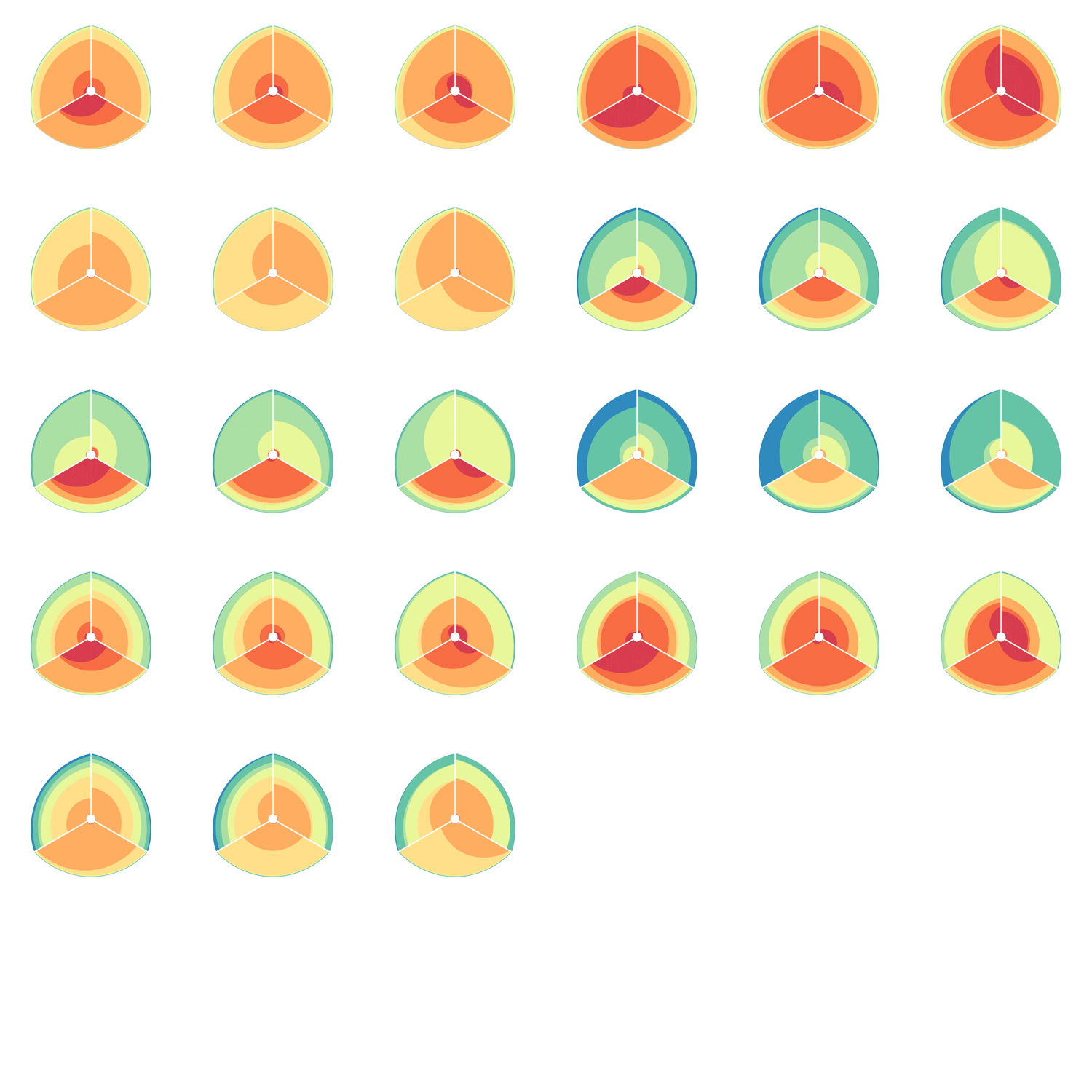
In the examples below, a 3-axis hive plot is shown with 8 ratios between each axis. The ratios are independent, in the sense that corresponding ribbons (e.g. blue) may have different thickness on either side of an axis. For example, if x:z = 2:3 and x:y = 1:3 then the ribbon on the left of the x axis will be twice as thick as on the right (see black arrow in figure below).
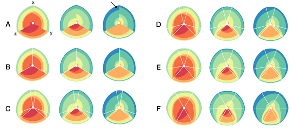
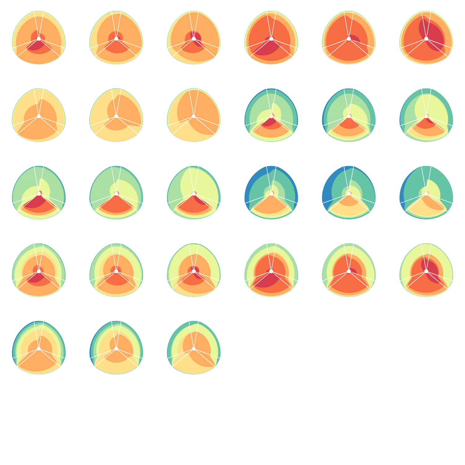
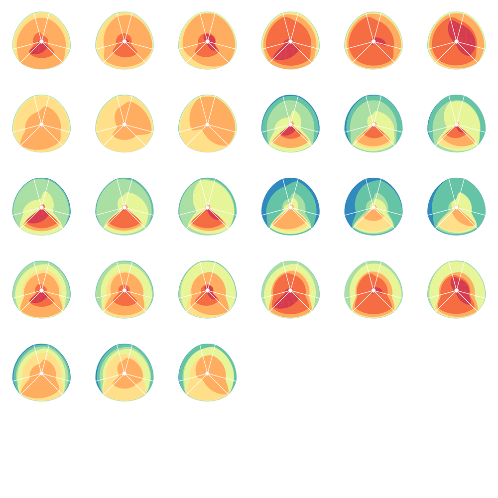
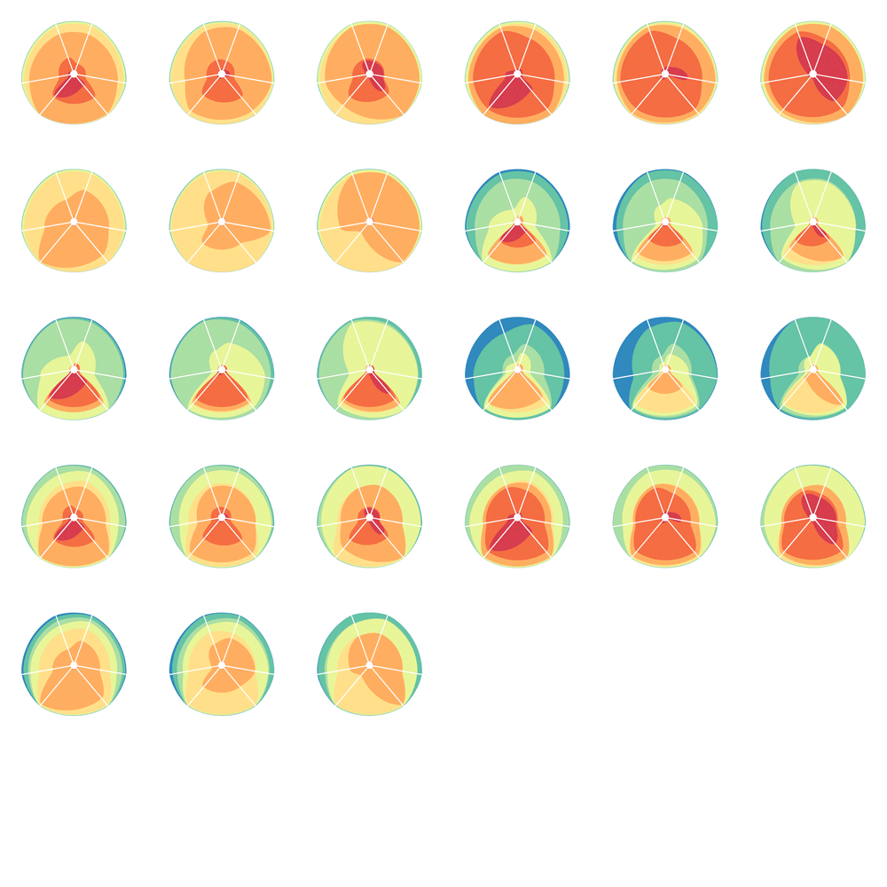
The axes in a hive plot can be arranged arbitrarily. In the figure above panels A and B show 24 ratios — 8 each between x/y, x/z, and y/x axes. In panels C-F each axis is split to create a single 6-axis plot from a dual 3-axis plot. The split axes reveal the transition between ribbons from the left and right sides.
The dual 3-axis plot appears more stylized and mathematical, whereas the single 6-axis plot is softer and organic. As the axis split distance is increased, the plots begin to look like surface density maps, which to some degree occludes the relationships between the ratio ribbons.
For each of human (hg18), mouse (mm8) and dog (canfam2) genome assemblies, UCSC annotations, available for each genome from the table browser, were used to hierarchically organize each base in the assembly using the following criteria: gene, repeat and gene+repeat. For each of these, bases were further categorized as conserved or not.
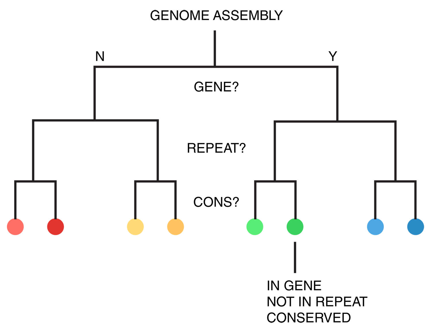
By exhaustively intersecting each of the annotation regions, the assembly was divided into disjoint segments, each with its annotation states. For example, below are a few adjacent regions from hg18 chr1 (a assembly, r repeat, c-cf conserved with dog, c-mm conserved with mouse).
...
hg 1 120,942,663 120,945,658 2,996 a r
hg 1 120,945,659 120,945,665     7 a
hg 1 120,945,666 120,947,239 1,574 a c-cf c-mm
hg 1 120,947,240 120,947,243     4 a c-cf c-mm r
hg 1 120,947,244 120,947,268    25 a c-mm r
hg 1 120,947,269 120,950,367 3,099 a r
hg 1 120,950,368 120,950,386    19 a
...
Next, the total size of regions for each combination of annotation was calculated for each pairwise combination of genomes. The second genome in the pair dictates which conservation is used. For example, for the human-mouse pair, the relative fractions of the human genome that fall into each of the categories are
hg mm a        1,839,255,050 0.643542044483869
hg mm a,c-mm     757,027,260 0.264878365091574
hg mm a,r        206,719,589 0.0723296896425132
hg mm a,c-mm,r    42,358,464 0.0148209203088807
hg mm a,g          8,139,587 0.00284798264342638
hg mm a,c-mm,g     4,435,658 0.0015520046651231
hg mm a,g,r           48,994 1.71426463814481e-05
hg mm a,c-mm,g,r      33,869 1.18505182327074e-05
thus categorizing all the 2.86 Gb of the assembled human genome. The corresponding ratios for the mouse genome are
mm hg a          1,388,193,028 0.544355712823795
mm hg a,c-hg       892,892,218 0.350132128602082
mm hg a,r          196,173,508 0.0769260237089193
mm hg a,c-hg,r      62,305,053 0.0244318411447455
mm hg a,g            6,377,904 0.00250098394691097
mm hg a,c-hg,g       4,076,727 0.00159861747416369
mm hg a,g,r             81,889 3.21113447973805e-05
mm hg a,c-hg,g,r        57,585 2.2580954586784e-05
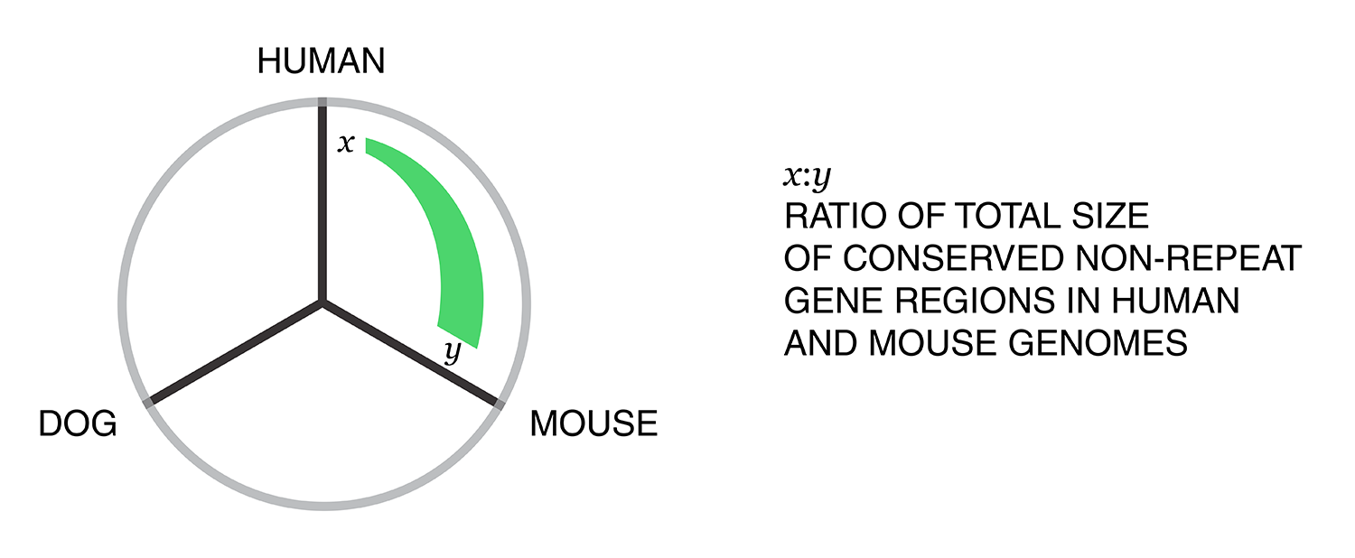
Using these two lists, all the ratios between the human and mouse axes can be determined. For example, for the conserved/gene/non-repeat regions the ratio of human:mouse is 0.00155:0.00160 (lines are bolded above). The corresponding ribbon for this ratio is shown below.
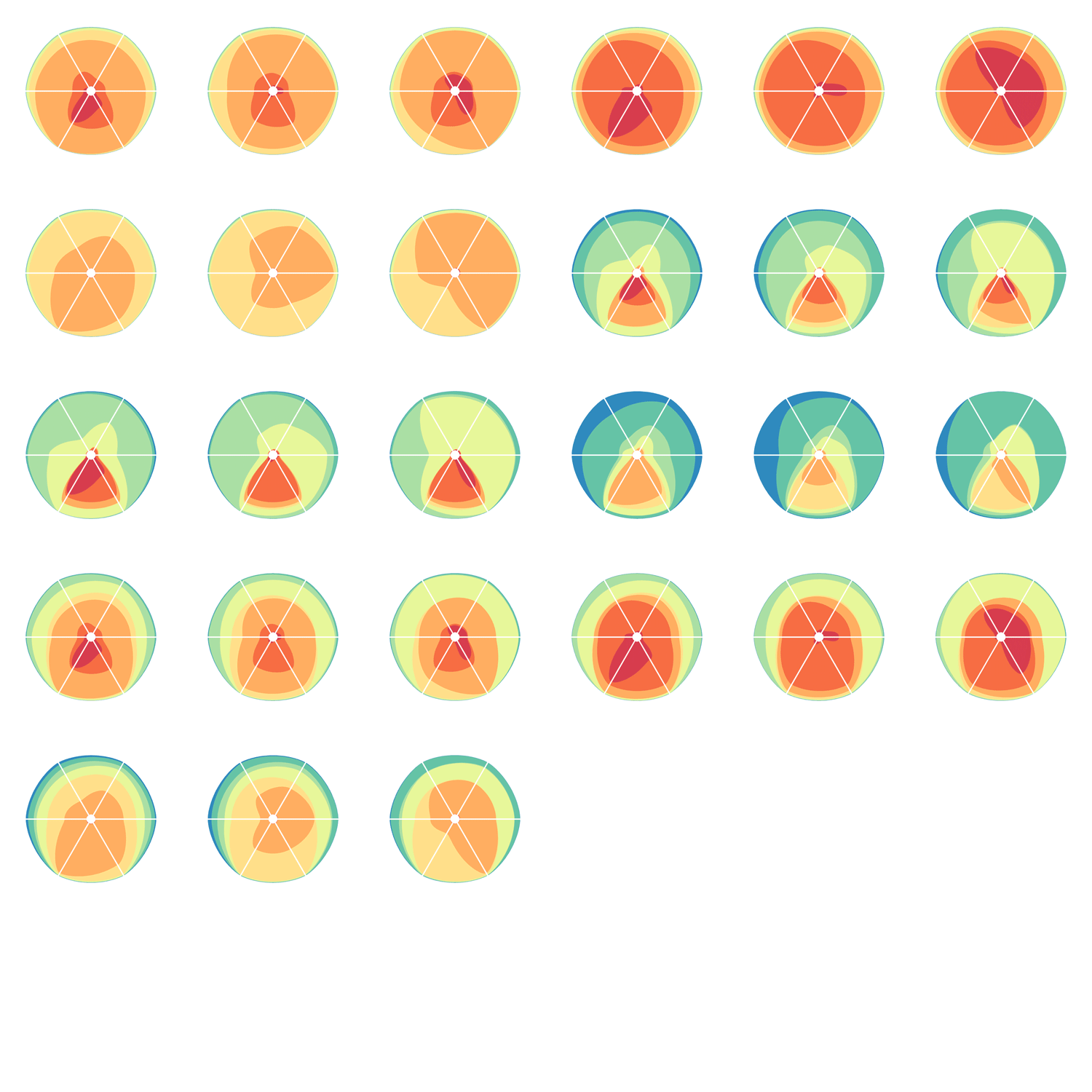
Category assignment into repeat, gene and conserved region was parametrized into three ranges for each criteria. These values were selected heuristically, to obtain a reasonable sample for each combination.
- gene g1 <4kb, g2 4kb-22kb, g3 >22kb
- repeat r1 simple, r2 LTR, r3 LINE/SINE
- conservation c1 <45%, c2 45%-58%, c3 >58%
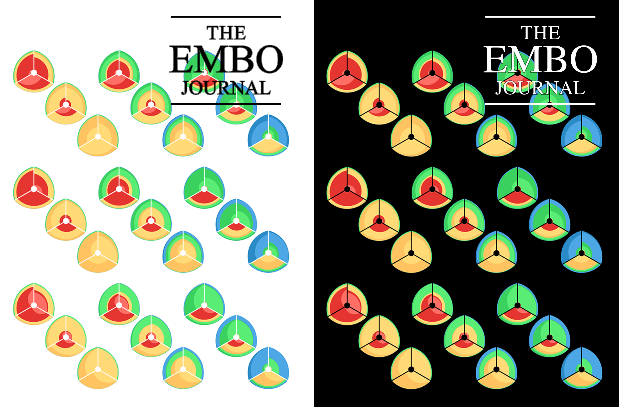
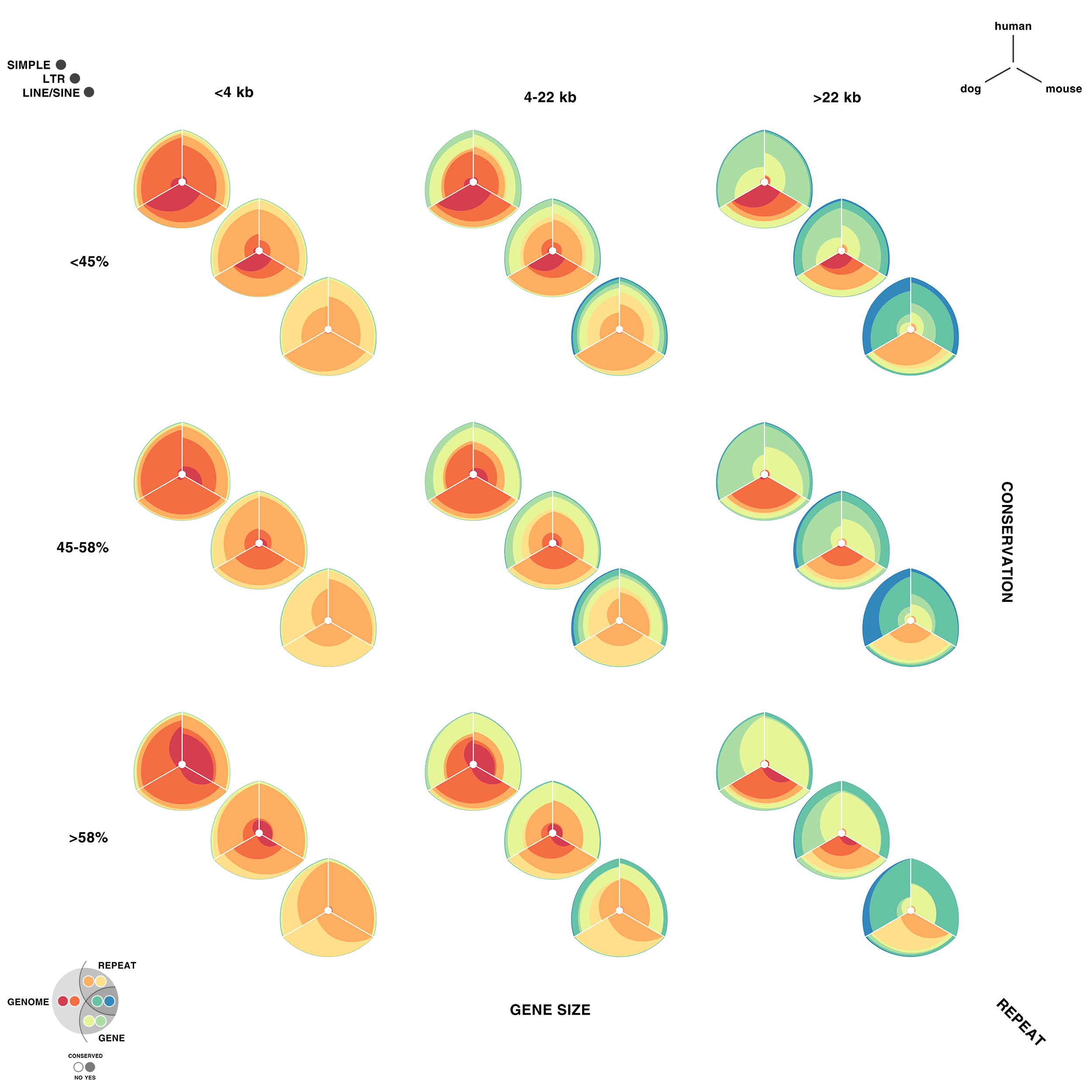
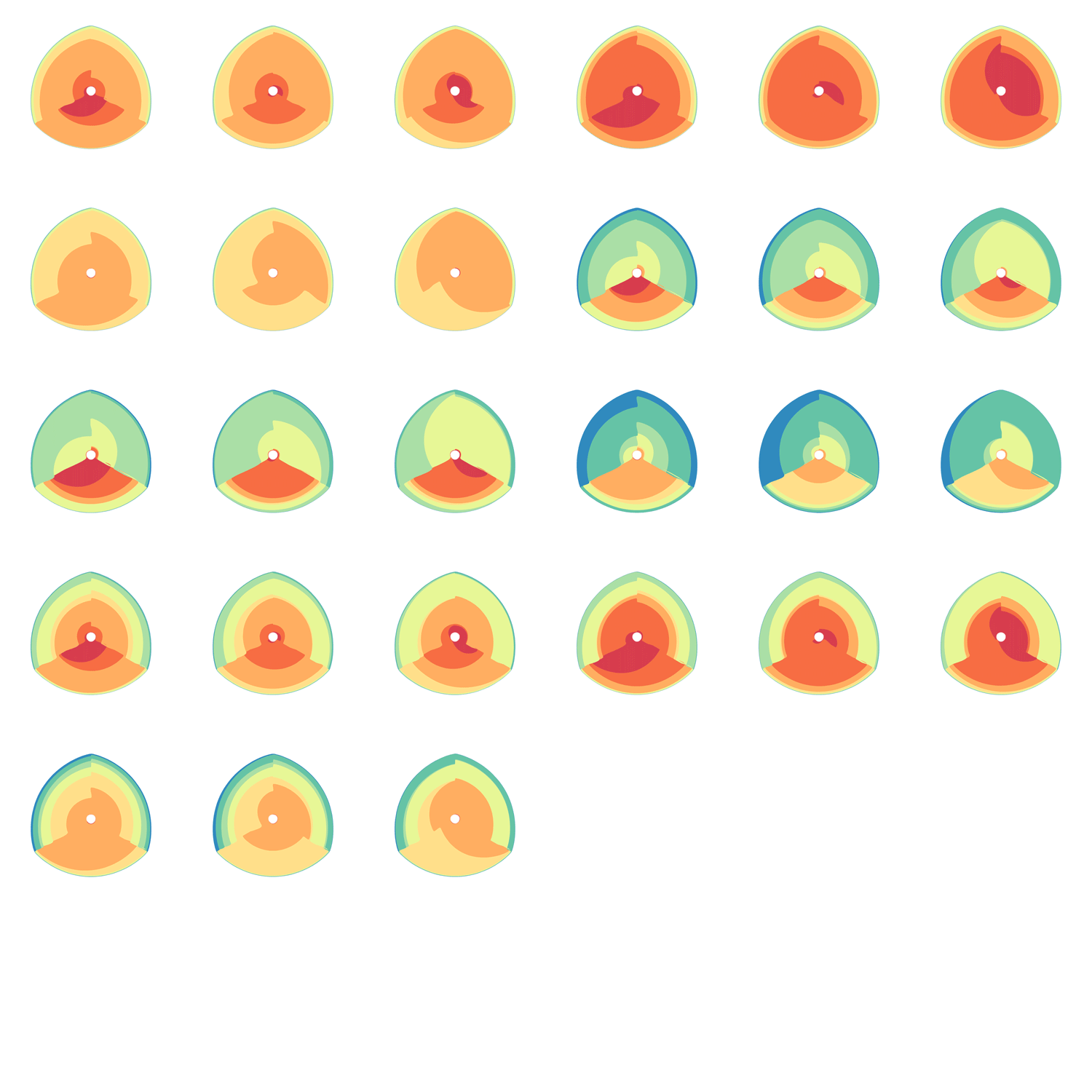
Given 3 parameters for each of the categories, the full comparison is represented by 27 hive plots. These plots are arranged on the cover as follows
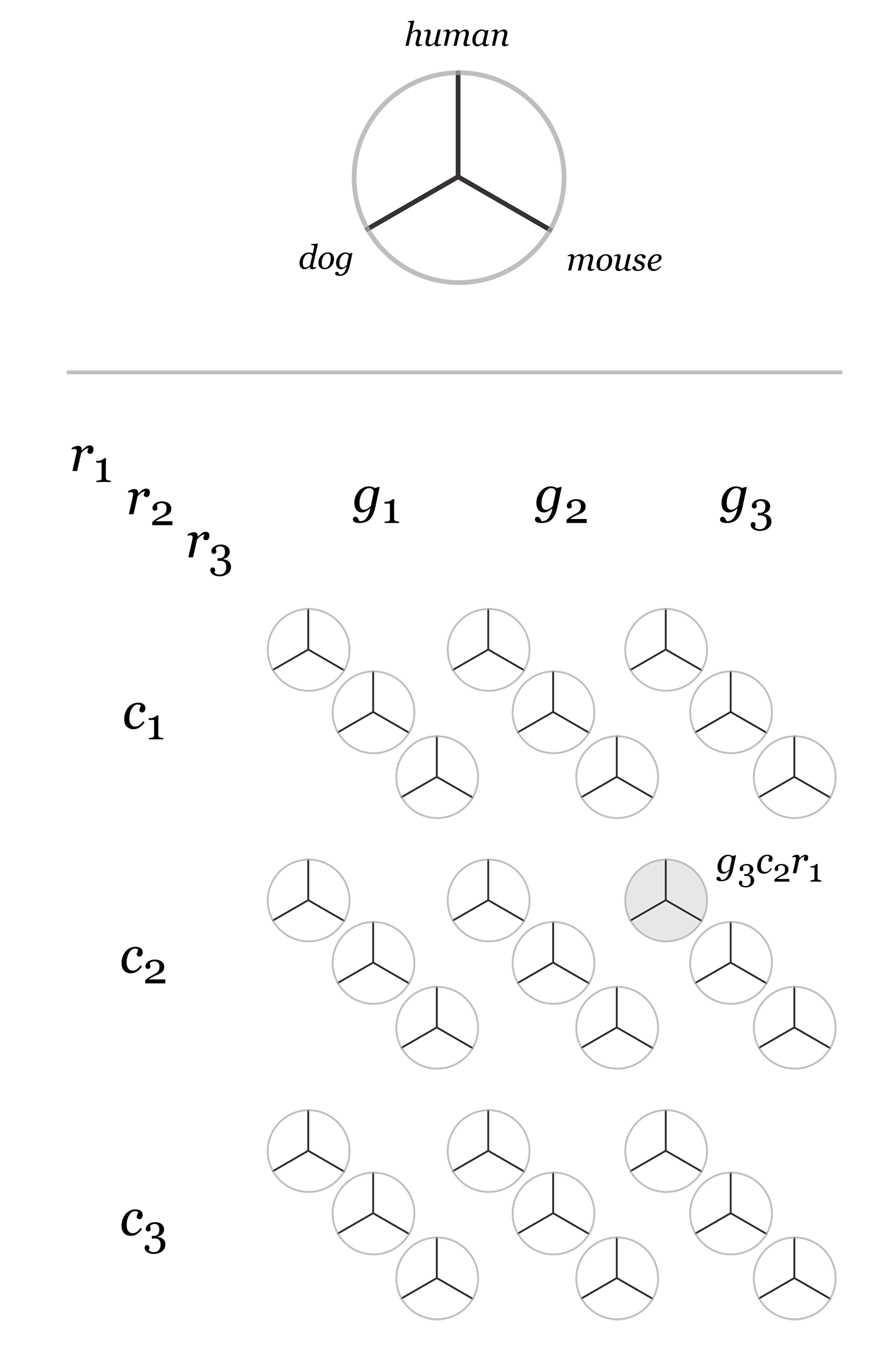
The scale of the axes was logarithmic to maintain visibility of all categories.
My 2011 non-scientific fiber optic entry received an honorouable mention. Oh well, we can't always have nice things.


Some time ago, I photographed fiber optic strands. These worked out well. I had not done anything with these images, and thought they would make a competitive entry into the cover contest.
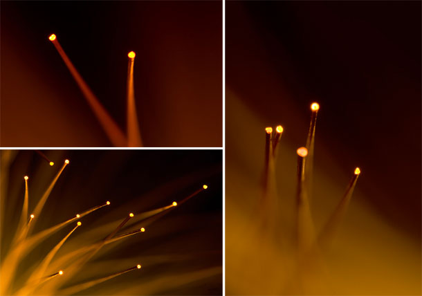
I revisited the fiber optic lamp with a higher resolution camera (Canon 5D — original images were from a Canon 20D) and a dedicated macro lens (Sigma 150mm f2.8 EX APO DG HSM Macro) (original images were shot with the Canon EF 24-70L).
From these new images, shown below, I created five EMBO Journal cover submissions.

The submissions would render on the cover as shown below.





Consequences of missing data
Either I've been missing something or nothing has been going on. —Karen Elizabeth Gordon
Missing data are everywhere. Subjects may decline to participate in a survey or fail to answer sensitive questions. A cell culture might fail due to contamination. Instrument failures or mishandling of a sample may lead to missing observations. But why are missing data a problem?
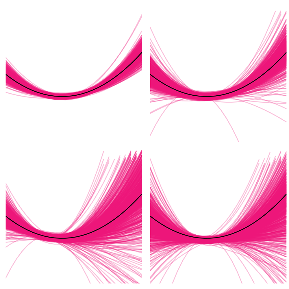
This month, we begin a series of articles about practical and statistical aspects of missing data. We'll see that missing data can increase variability and introduce bias and we will ask whether anything can be done to mitigate these consequences. It turns out that, in the case where we know nothing about the missing subjects, no mitigation is possible. We must accept higher variability and, if we have a suspicion that the missing subjects aren’t completely random, possible bias as well.
Tanujit Dey, T., Lipsitz, S.R., Fitzmaurice, G., Krzywinski, M. & Altman, N. (2026) Points of significance: Consequences of missing data. Nat. Methods 23:1661–1663.
Double Robustness
It is not certain that everything is uncertain. —Blaise Pascal
We have already explored how we can mitigate bias caused by confounding variables in observational studies using propensity score (PS) matching (PSM) and propensity score weighting (PSW). However, any statistical model is only as good as its assumptions and, if it is specified incorrectly, it can itself produce biased estimates of the treatment effect.
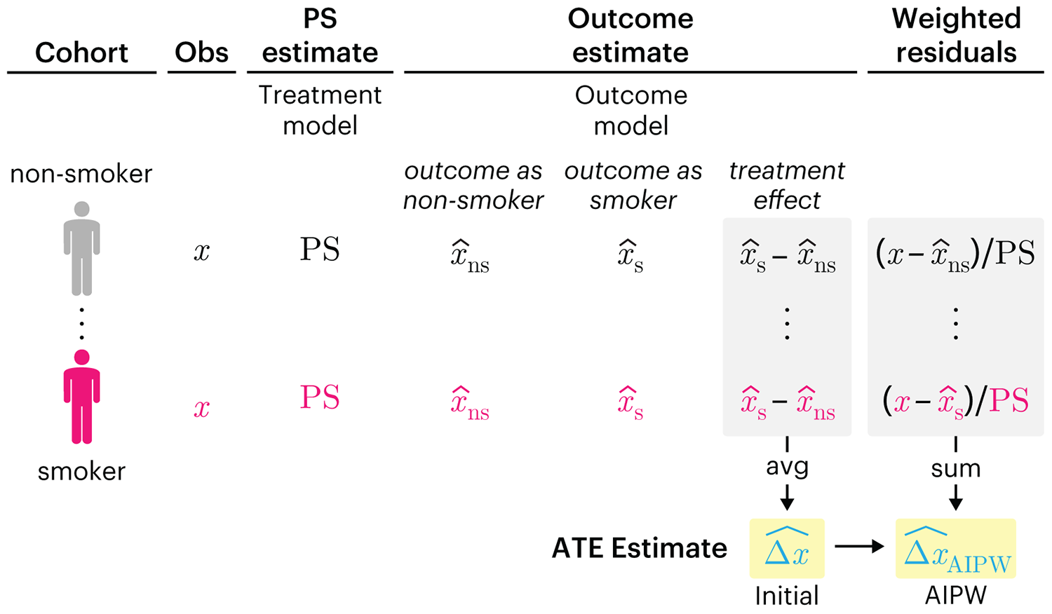
This month, we explore double robustness, a powerful statistical concept that provides a valuable “safety net” against the risk of an incorrect model. It offers two opportunities, instead of just one, to obtain a valid estimate of the treatment effect — making it possible to draw credible causal inferences from observational data without having to depend on a single set of modeling assumptions.
Kurz, C.F., Krzywinski, M. & Altman, N. (2026) Points of significance: Double Robustness. Nat. Methods 23:868–869.
Nature Biotechnology cover
My cover design on the 7 April 2026 Nature Biotechnology issue shows the dendrogram that represents a cluster of uniquely expressed (or downregulated) genes in human naive stem cells induced from such cells. Within each dendrogram block, the genomic barcode sequence (sampled from Supplementary Table 1) is depicted with a Code 39 barcode. The highlighted barcode is one of those used for cell isolation.
Ishiguro S. et al. A multi-kingdom genetic barcoding system for precise clone isolation (2026) Nature Biotechnology 44:616–629.

Browse my gallery of cover designs.

Happy 2026 π Day—
Art for the 5%
Celebrate π Day (March 14th) and enjoy the art — but only if you're part of the 5%.
Go ahead, see what you can't see.

Ishihara's Tests for Colour Deficiency
Authentic and accurate images of Ishihara's test plates photographed (and lovingly color-corrected) from the 38-plate Ishihara's Tests for Colour Deficiency.
I also provide the position, size, and color of each circle on each test plate.


Symmetric alternatives to the ordinary least squares regression
What immortal hand or eye, could frame thy fearful symmetry? — William Blake, "The Tyger"
This month, we look at symmetric regression, which, unlike simple linear regression, it is reversible — remaining unaltered when the variables are swapped.
Simple linear regression can summarize the linear relationship between two variables `X` and `Y` — for example, when `Y` is considered the response (dependent) and `X` the predictor (independent) variable.
However, there are times when we are not interested (or able) to distinguish between dependent and independent variables — either because they have the same importance or the same role. This is where symmetric regression can help.

Luca Greco, George Luta, Martin Krzywinski & Naomi Altman (2025) Points of significance: Symmetric alternatives to the ordinary least squares regression. Nat. Methods 22:1610–1612.