


Nature Methods: Points of View
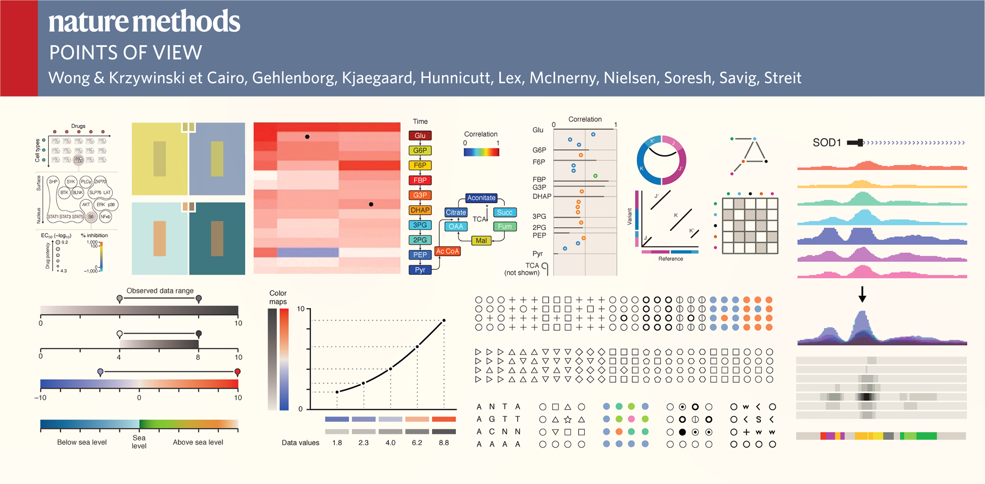
Guidelines for Effective Figures
Practical and concise advise on the visual presentation of data for researchers. One topic and one page at a time.
Common Challenges in Figure Design
Andreas Dahlin runs a figure making course at Uppsala University. He was kind to share with me common questions and concerns that his students have when creating figures (emphasis is mine).
I face problems for using the tools in power point to make nice illustration figures, and in addition how one can enhance the resolution of the figures to print it in a high quality mode.
In my opinion, the most difficult thing is how to draw the good-looking pictures and design the structure of slide to make it simple and substantial in content.
I find it difficult to find the right software to draw pictures.
The most difficult thing for me, when I make a figure, is to arrange the parts of the figure in a way they look nice and understandable.
I think the most difficult part is creating the concept, how to make a figure easy and fast to understand but not lacking all essential parts.
Stepping outside of my own knowledge of what the picture presents and viewing it as someone who sees it for the first time. It's easy to assume that some things are self evident and not making them clear enough in the pictures.
Figures that not are plots can also be tricky to get to look nice.
Anytime you have to draw something in paint, gimp, or other image program it requires a lot of work to make it look even slightly better than crap.
The most difficult thing (in general) is to include as much information as possible and display it in a way that is easy to understand. Figures should be intuitive for the reader, which is sometimes difficult to achieve. There might also be technical difficulties in achieving what you've visualized.
I think the most difficult part for me is to highlight the main idea I would like to express.
For me the most difficult part is making 3-D figures. Also while making figures its hard to decide on the good colors to choose for the figure.
In my opinion, the most difficult part when making a figure is don't know which software we can use and how to use.
The most difficult part for me is to start it! Because I am so meticulous and I am a painter, then it is not so easy to make decision about my figures and which one is better and so on, then finally I give up and put just one figure which of course I don't like...
I think it is difficult to put together my ideas to something that is connected and makes it easier for the viewer to understand.
It is so easy to just get an image from internet. I don’t know what is ok to do. There seems to be different rules in different communities.
To come up with a figure that does not simplify the concept too much at the same time as it does not overwhelm the viewer. To get some ideas for this is the reason why I take the course. ;-)
To me, how to make it easy to understand is the difficult part.
I think it is to save it in the correct format: Raster or vector, png or jpg or pdf... especially if I want to make some changes in the future to the figure.
I think is to choose the most appropriate figure that really help to transmit the information we want. Then, how many words can be good enough for been part of the message. At the beginning I used to use too many.
Apart from the difficulty of making the figure clear and easy to understand, the biggest problem I'm having is the captions. How long and detailed description is appropriate, so it neither steals attention from the figure nor leaves out too much important information.
I think the most difficult part is to have high resolution image once we want to save it. My experience is when finish with drawing, the file size sometimes to large for high quality image and if we downgrade it, the image becomes bad.
The most difficult part when i making a figure is the software using part, I'm not good at computer so that part is annoying for me all the time.
I think the most difficult is to find out how to condensate many ideas in one picture without making it difficult to understand.
The most difficult part is the get the image to not look too amateurish that people focus on that instead of the message.
The most difficult part when doing a figure is to let it speak for itself, i.e. to not have long caption text.
To be able to depict all the desirable results on a single figure is sometimes not that easy. It becomes more critical when a figure is to be fitted within a certain size frame. An exact placing of a figure in some text editors often comes along with difficulties.
The most difficult part when making a figure is to make it simple and still be informative.
Depends a lot on the kind of figure, but generally it is to get clarity in the design, such that the idea is conceived easily. This requires some good outline (usually an iterative process).
The most difficult part to make a figure is the need to express abstract concepts into drawings.
The compromise between include detailed information and at the same time be readable (figures in articles)
To compress all information and ideas you have in your head into short and clear message.
I feel the difficulty in choosing a right resolution of the picture and the angle that could visualize all the details. And also choosing right test/label colour, size, font. Another difficulty for me is continuation from one slide to another.
I believe that my biggest problem would be making nice flux charts. Generally the ones I draw look too crude, it does not look beautiful. I have no concern about making an image that can represent an idea, but making a beautiful image makes it more pleasing to the eyes of the people who will read my work.
It is very difficult to make the figure delicate. I am still not get used to put all the small components together to integrate the figure by the vector software, instead of drawing it out directly.
I think the most difficult part is to make the image simple but yet informative.
I find it very difficult to make an original clarity picture in a particular format after dimensioning it according to the requirement.
Some times it is difficult to limit the size (Bytes) of the picture when going for high clarity remake.
Making the figure as informative as you want while keeping it simple enough to grasp quickly.
For me, the more difficult part is to create a figure that contains or tells all the information that I want to transmit, but keeping the figure simple, clean and not overloaded.
The most difficult for me is make it easily to be understood meanwhile containing the essential information.
The most difficult thing when developing a figure is ... to remove the bloat but keep the message. (Besides the very most difficult: finding out what I want to tell.)
For me the most difficult part is to choose colors with right contrast and to make it more attractive and catchy.
Propensity score weighting
It is not certain that everything is uncertain. —Blaise Pascal
We have already explored how we can mitigate bias caused by confounding variables in observational studies using propensity score (PS) matching (PSM) and propensity score weighting (PSW). However, any statistical model is only as good as its assumptions and, if it is specified incorrectly, it can itself produce biased estimates of the treatment effect.
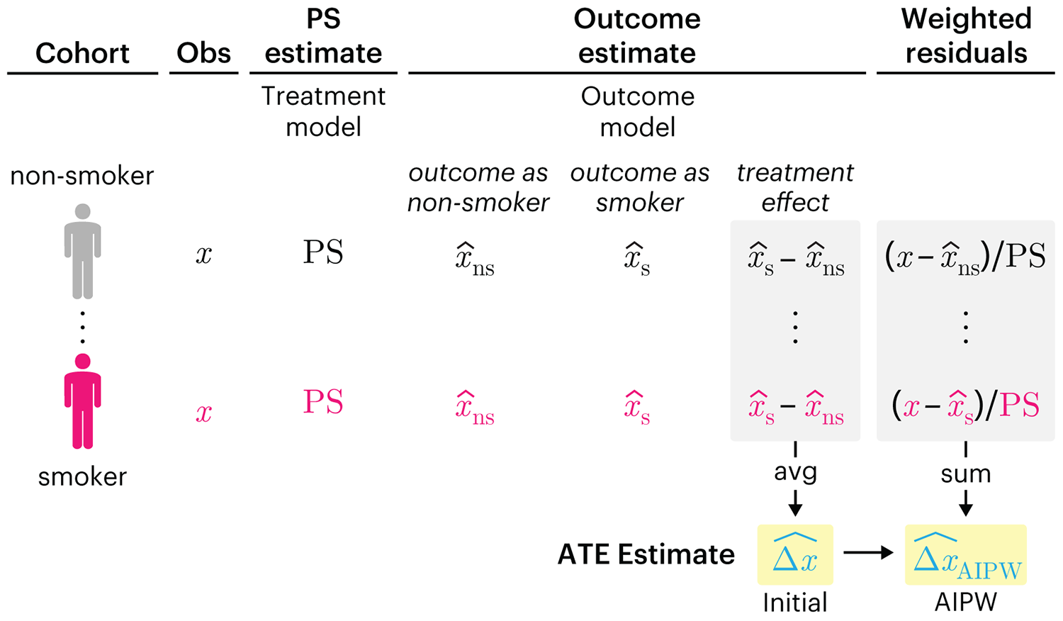
This month, we explore double robustness, a powerful statistical concept that provides a valuable “safety net” against the risk of an incorrect model. It offers two opportunities, instead of just one, to obtain a valid estimate of the treatment effect — making it possible to draw credible causal inferences from observational data without having to depend on a single set of modeling assumptions.
Kurz, C.F., Krzywinski, M. & Altman, N. (2026) Points of significance: Double Robustness. Nat. Methods 23:868–869.
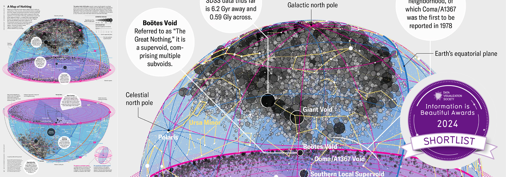
Nature Biotechnology cover
My cover design on the 7 April 2026 Nature Biotechnology issue shows the dendrogram that represents a cluster of uniquely expressed (or downregulated) genes in human naive stem cells induced from such cells. Within each dendrogram block, the genomic barcode sequence (sampled from Supplementary Table 1) is depicted with a Code 39 barcode. The highlighted barcode is one of those used for cell isolation.
Ishiguro S. et al. A multi-kingdom genetic barcoding system for precise clone isolation (2026) Nature Biotechnology 44:616–629.

Browse my gallery of cover designs.
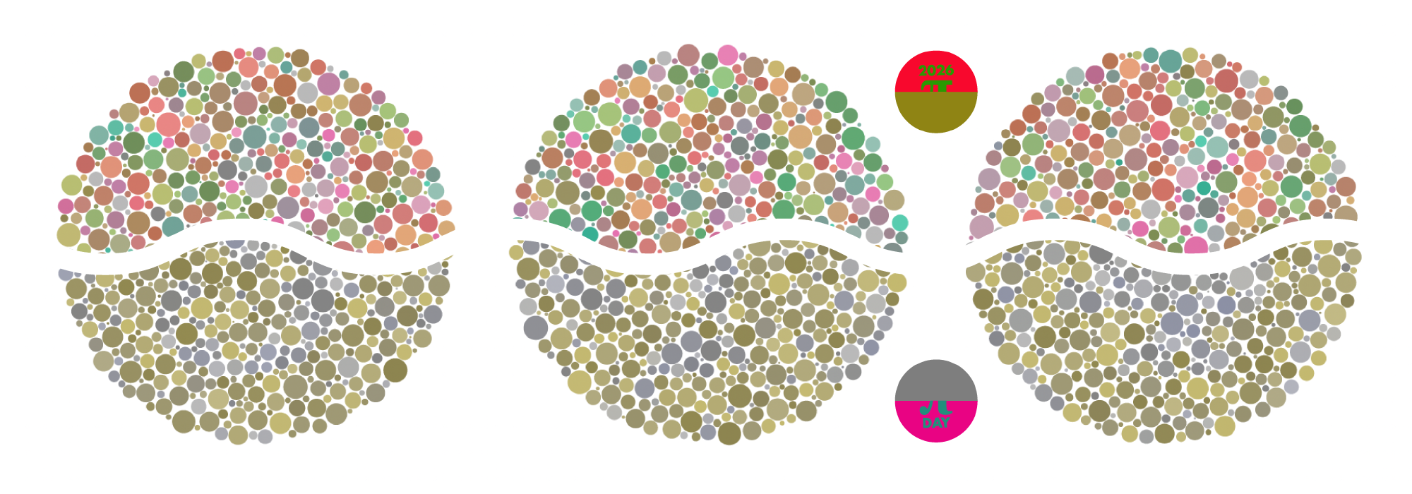
Happy 2026 π Day—
Art for the 5%
Celebrate π Day (March 14th) and enjoy the art — but only if you're part of the 5%.
Go ahead, see what you can't see.

Ishihara's Tests for Colour Deficiency
Authentic and accurate images of Ishihara's test plates photographed (and lovingly color-corrected) from the 38-plate Ishihara's Tests for Colour Deficiency.
I also provide the position, size, and color of each circle on each test plate.

