

Art of the Personalized Oncogenomics Program
Nature uses only the longest threads to weave her patterns, so that each small piece of her fabric reveals the organization of the entire tapestry.
— Richard Feynman
contents
The legend can be printed at 4" × 6". The bitmap resolution is 600 dpi.
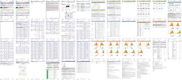
For every case, we sequence the DNA to study the genome structure and the RNA to discover which genes are expressed and to what extent. The analysis is quite complex and brings together many steps: sequence alignment, structural variation detection, expression profiling, pathway analysis and so on. Every case is "summarized" by a lengthy report, such as the one below, which can run to over 40 pages.
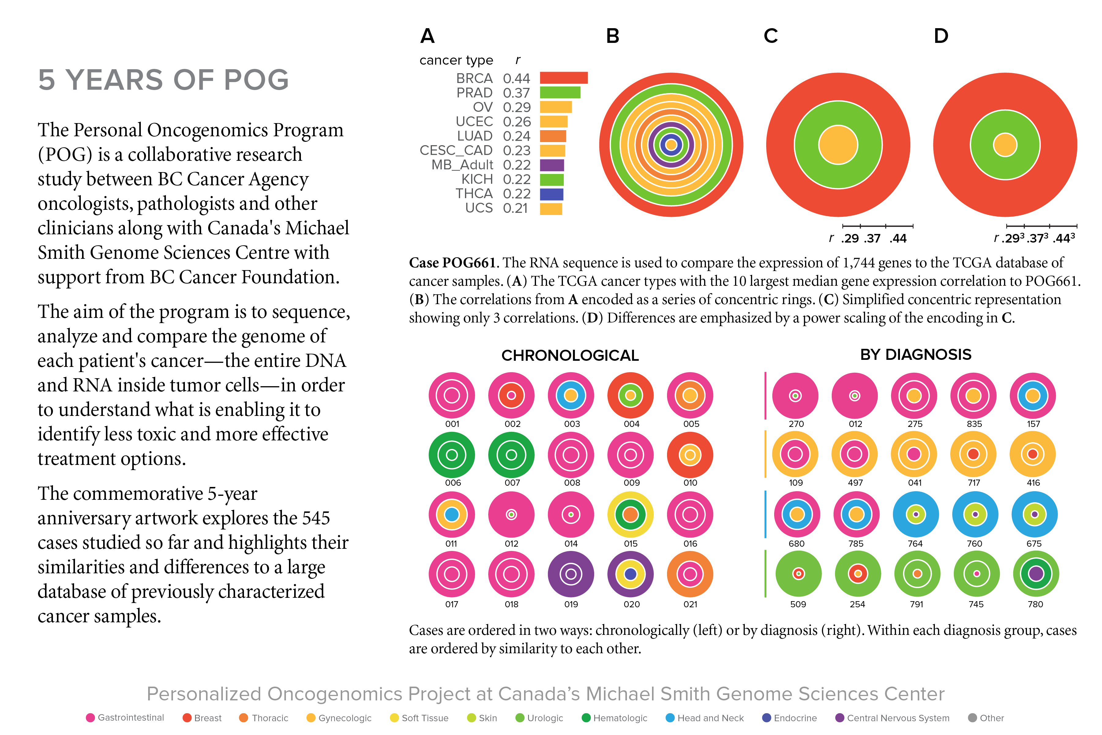
One of the goals of the 5-year anniversary art was to represent the cases in a way to clearly show their number, classification as well as diversity. There are many metrics that can be used and I decided to choose the case's correlation to other cancer types.
correlation to TCGA cancer database
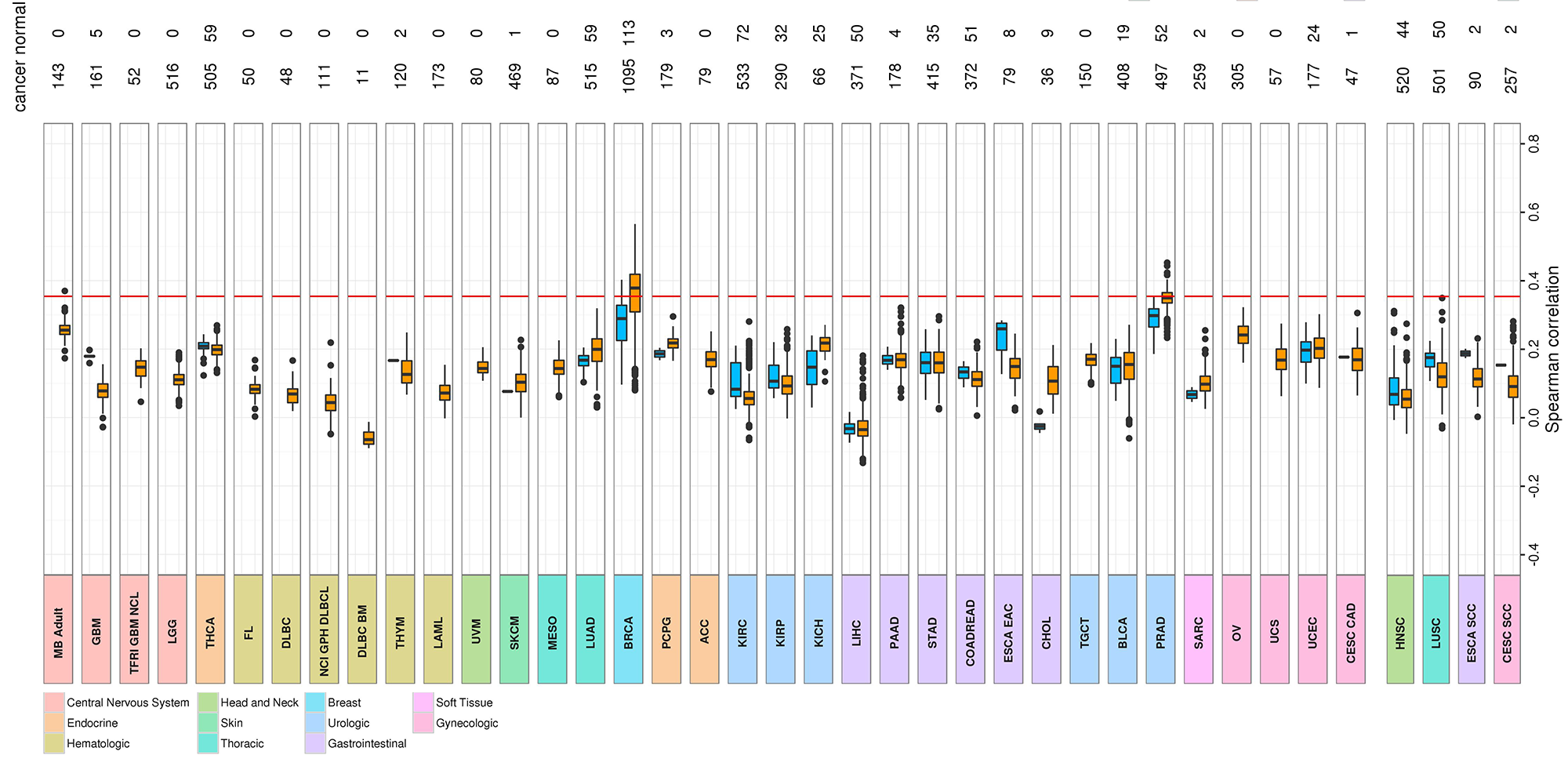
For every POG case, the gene expression of 1,744 key genes is compared to that of 1,000's of cases in the TCGA database of cancer samples. For a given cancer type in the TCGA database (e.g. BRCA), we visualize the correlations using box plots. The box plot is ideal for showing the distribution of values in a sample.
The 10 largest Spearman correlation coefficients for the case shown above are
case    corr    type     tissue
-----------------------------------------------
POG661	0.436	BRCA	 Breast
POG661	0.371	PRAD	 Urologic
POG661	0.295	OV	 Gynecologic
POG661	0.257	UCEC	 Gynecologic
POG661	0.244	LUAD	 Thoracic
POG661	0.235	CESC_CAD Gynecologic
POG661	0.225	MB_Adult Central Nervous System
POG661	0.222	KICH	 Urologic
POG661	0.219	THCA	 Endocrine
POG661	0.208	UCS	 Gynecologic
In the figure below I show how the final encoding of the correlations is done. First, the top three correlations are taken—using more generates a busy look and diminishes visual impact. The correlations are encoded as concentric rings.
Because in most cases the differences in the top 3 correlations are relatively small, differences are emphasized by non-linearly scaling the encoding (the correlations are first scaled `r^3`).
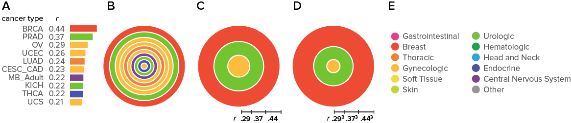
The type face is Proxima Nova. The colors for each tissue source are
         Gastrointestinal ● 234,62,144
                   Breast ● 237,75,51
                 Thoracic ● 242,130,56
              Gynecologic ● 253,188,61
              Soft tissue ● 244,217,59
                     Skin ● 193,216,51
                 Urologic ● 114,197,49
              Hematologic ● 29,166,68
            Head and neck ● 43,168,224
                Endocrine ● 71,82,178
   Central nervous system ● 127,65,146
                    Other ● 150,150,150
Beyond Belief Campaign BRCA Art
Fuelled by philanthropy, findings into the workings of BRCA1 and BRCA2 genes have led to groundbreaking research and lifesaving innovations to care for families facing cancer.
This set of 100 one-of-a-kind prints explore the structure of these genes. Each artwork is unique — if you put them all together, you get the full sequence of the BRCA1 and BRCA2 proteins.

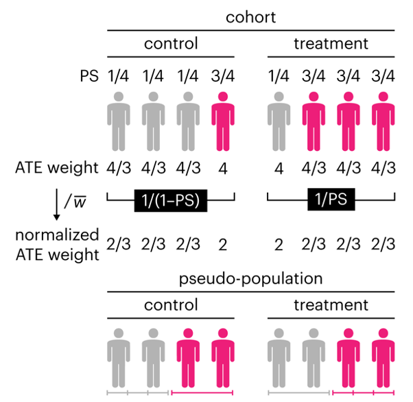
Propensity score weighting
The needs of the many outweigh the needs of the few. —Mr. Spock (Star Trek II)
This month, we explore a related and powerful technique to address bias: propensity score weighting (PSW), which applies weights to each subject instead of matching (or discarding) them.
Kurz, C.F., Krzywinski, M. & Altman, N. (2025) Points of significance: Propensity score weighting. Nat. Methods 22:1–3.
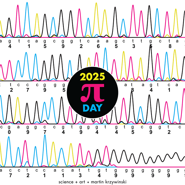
Happy 2025 π Day—
TTCAGT: a sequence of digits
Celebrate π Day (March 14th) and sequence digits like its 1999. Let's call some peaks.
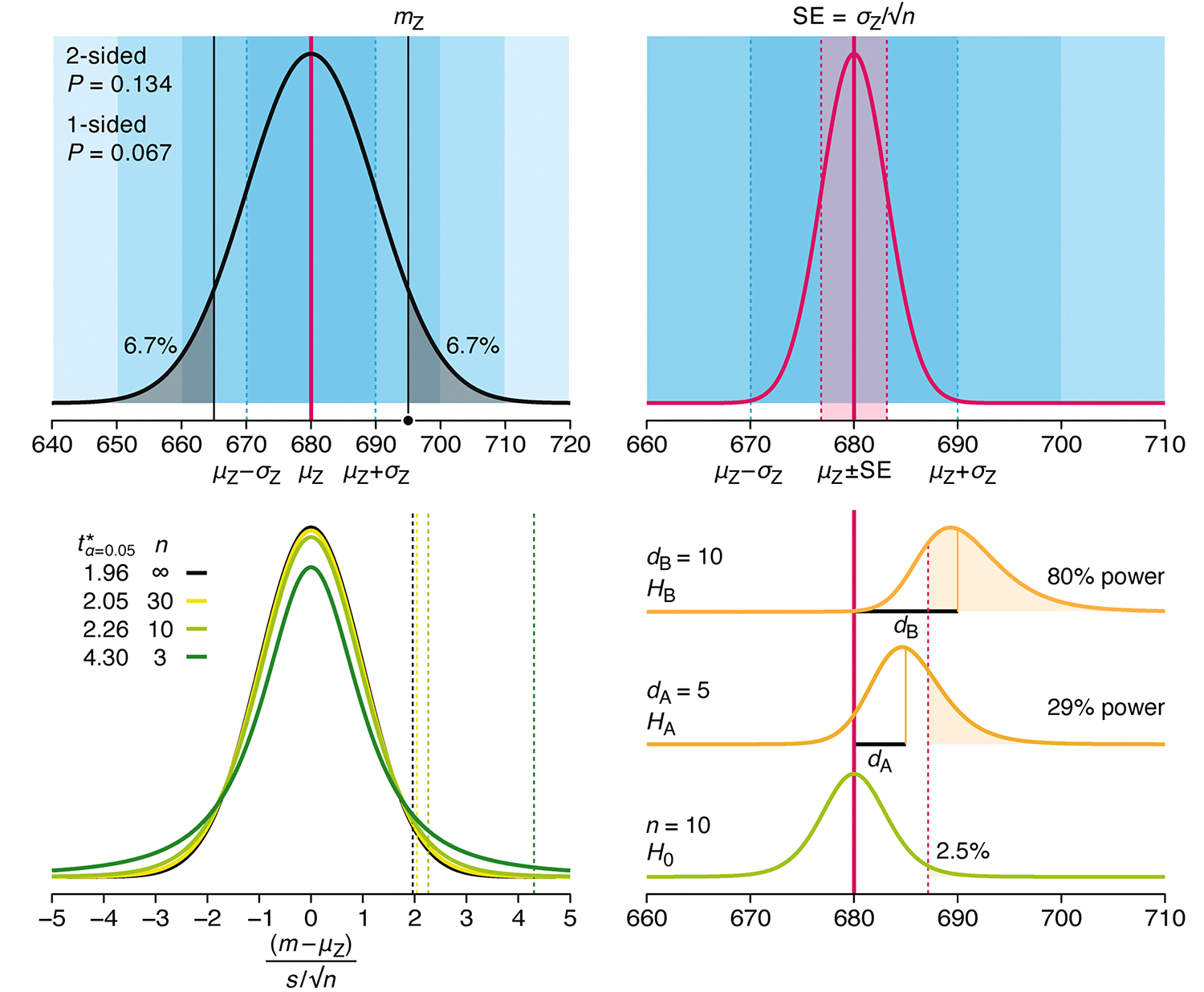
Crafting 10 Years of Statistics Explanations: Points of Significance
I don’t have good luck in the match points. —Rafael Nadal, Spanish tennis player
Points of Significance is an ongoing series of short articles about statistics in Nature Methods that started in 2013. Its aim is to provide clear explanations of essential concepts in statistics for a nonspecialist audience. The articles favor heuristic explanations and make extensive use of simulated examples and graphical explanations, while maintaining mathematical rigor.
Topics range from basic, but often misunderstood, such as uncertainty and P-values, to relatively advanced, but often neglected, such as the error-in-variables problem and the curse of dimensionality. More recent articles have focused on timely topics such as modeling of epidemics, machine learning, and neural networks.
In this article, we discuss the evolution of topics and details behind some of the story arcs, our approach to crafting statistical explanations and narratives, and our use of figures and numerical simulations as props for building understanding.
Altman, N. & Krzywinski, M. (2025) Crafting 10 Years of Statistics Explanations: Points of Significance. Annual Review of Statistics and Its Application 12:69–87.
Propensity score matching
I don’t have good luck in the match points. —Rafael Nadal, Spanish tennis player
In many experimental designs, we need to keep in mind the possibility of confounding variables, which may give rise to bias in the estimate of the treatment effect.
If the control and experimental groups aren't matched (or, roughly, similar enough), this bias can arise.
Sometimes this can be dealt with by randomizing, which on average can balance this effect out. When randomization is not possible, propensity score matching is an excellent strategy to match control and experimental groups.
Kurz, C.F., Krzywinski, M. & Altman, N. (2024) Points of significance: Propensity score matching. Nat. Methods 21:1770–1772.
Understanding p-values and significance
P-values combined with estimates of effect size are used to assess the importance of experimental results. However, their interpretation can be invalidated by selection bias when testing multiple hypotheses, fitting multiple models or even informally selecting results that seem interesting after observing the data.
We offer an introduction to principled uses of p-values (targeted at the non-specialist) and identify questionable practices to be avoided.
Altman, N. & Krzywinski, M. (2024) Understanding p-values and significance. Laboratory Animals 58:443–446.