
PNAS cover — Earth BioGenome Project
An enlightened perspective on our planet
contents
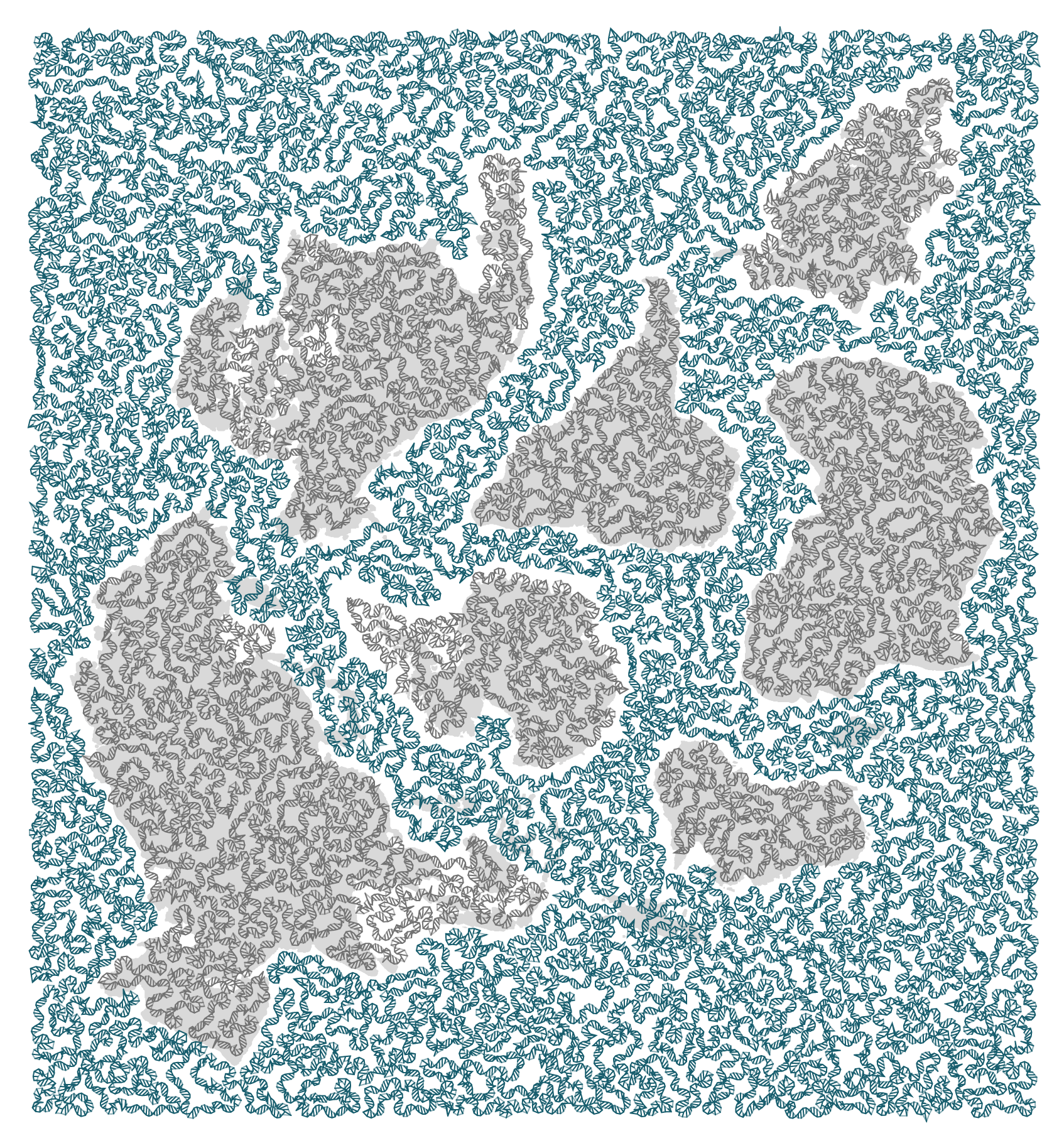
The design represents a genomics perspective on the biodiversity of the Earth.
The basis of the design are the shape of continents. These were taken from the award-winning Authagraph Map, which is a projection that strongly preserves shapes and areas. Wired calls it “not perfect, but close”.
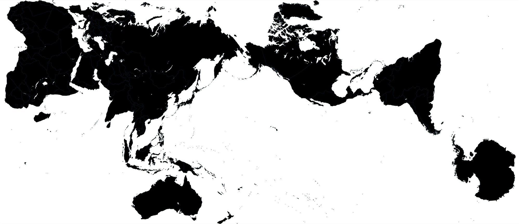
I rearranged the authagraph map to fit the aspect ratio of the cover image (nearly 1:1) and allow for enough room for text on the cover. To make things interesting, I put Antarctica in the center — north is everywhere. Given how the image is constructed (read below), I had to remove some islands. Sorry, Madagascar — you're a star.
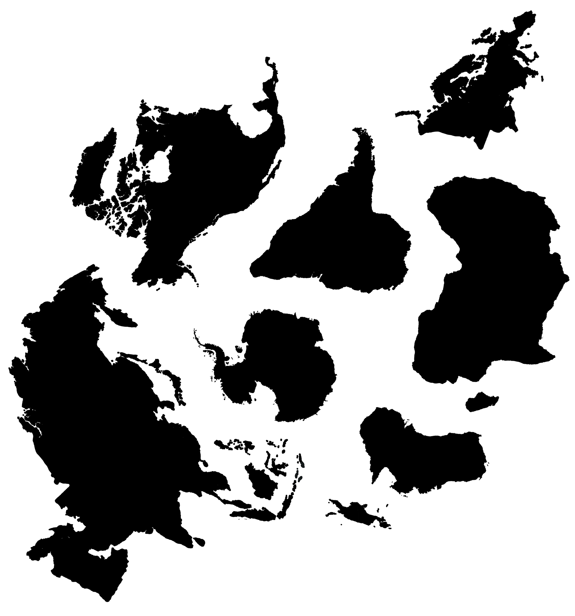
Australia has the job of representing all of Oceania, such as Inaccessible Island.
For each continent and ocean, a travelling salesman problem (TSP) was solved to find the shortest (or close to it) path that covers the area. The path joins points that were sampled at a level of detail that I thought would strike a good balance between detail and legibility.
Some continents do not have full coverage by the path &mdsah; some small islands and peninsulas were excluded (or extended). This needed to be done to give room for the ocean path between continents and to avoid situations where the ocean path crossed a landmass. The shortest solution isn't always the most appropriate.
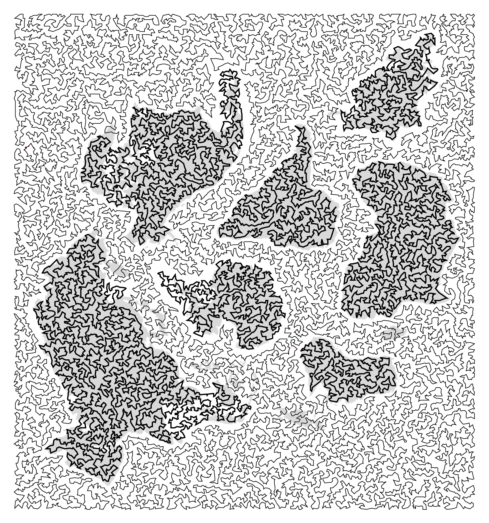
The number of points visited for each landmass were
  1,575 africa
    848 antarctica
  2,818 asia
    475 australia
    713 europe
  1,674 namerica
 17,354 ocean
    872 samerica
 26,329 ALL
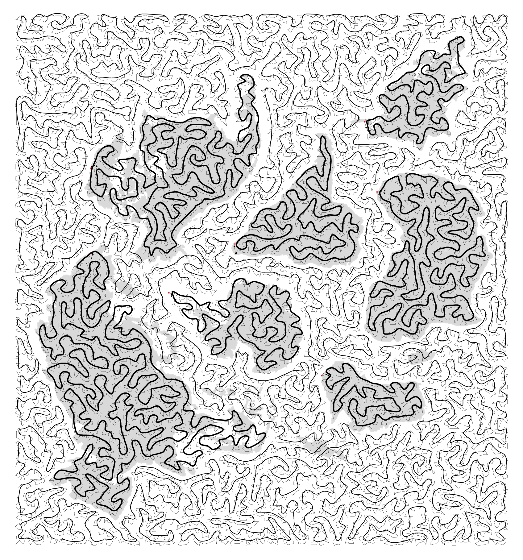
I then smoothed the path using a J-spline curve.
The DNA double helix is a trope — let's embrace it.
And before you start pixel peeping: the helix doesn't have handedness. It's composed of three independent stacked layers: one layer per strand strands and one layer with bonds.
Once the helix was drawn, I added bases as circles and resized to increase visibility while avoiding overlap.
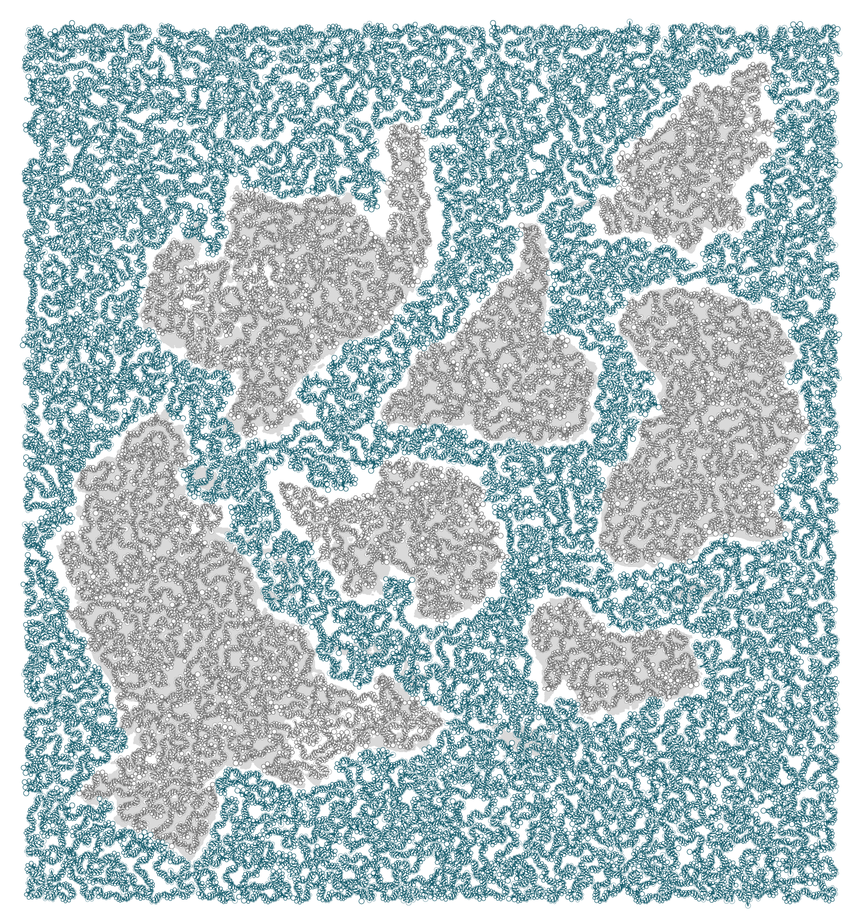
The number of base pairs per area is
              nbp
 australia    596
    europe    872
antarctica  1,024
  samerica  1,064
    africa  1,911
  namerica  2,033
      asia  3,403
     ocean 21,208
           ------
           32,111
I mapped species sequenced as part of the Earth BioGenome Project to the path that corresponded to their habitat location. This was done using a combination of automated searches through the Global Biodiversity Information Facility (GBIF) and manual corrections.
For a given path, the length of the sequence of each species was fixed and depended on the length of the area's double helix and number of species assigned to it.
For example, in Africa we have 1,911 bases to distribute across 87 species, giving us `1911/87-1=20` bases per species. The value is rounded down to the nearest integer and the `-1` term allows for a gap between each sequence.
The ocean area is very large and has relatively few species, so we can have long sequences — 396 bases per species.
              nbp   species  bp_per_species
 australia    596        71               7
    europe    872       113               6
antarctica  1,024         2             511
  samerica  1,064        93              10
    africa  1,911        87              20
  namerica  2,033       182              10
      asia  3,403       206              15
     ocean 21,208        52             396
           ------       ---
           32,111       806
Any bases left over on the helix were assigned to gaps. Initially, I thought of concatenating the sequences without any gaps. While this would allow me to represent (neglibibly) longer sequences, I was persuaded against this idea (thank you Emma!).
First, the Earth Biogenome sequencing isn't complete (nor will it ever be), so gaps in the sequence are a nice metaphor for this. Second, the gaps offer some hope of actually reading the sequences off for each species. Below is a view of one of the strands with the backbone and base pair locations within gaps shown in magenta.
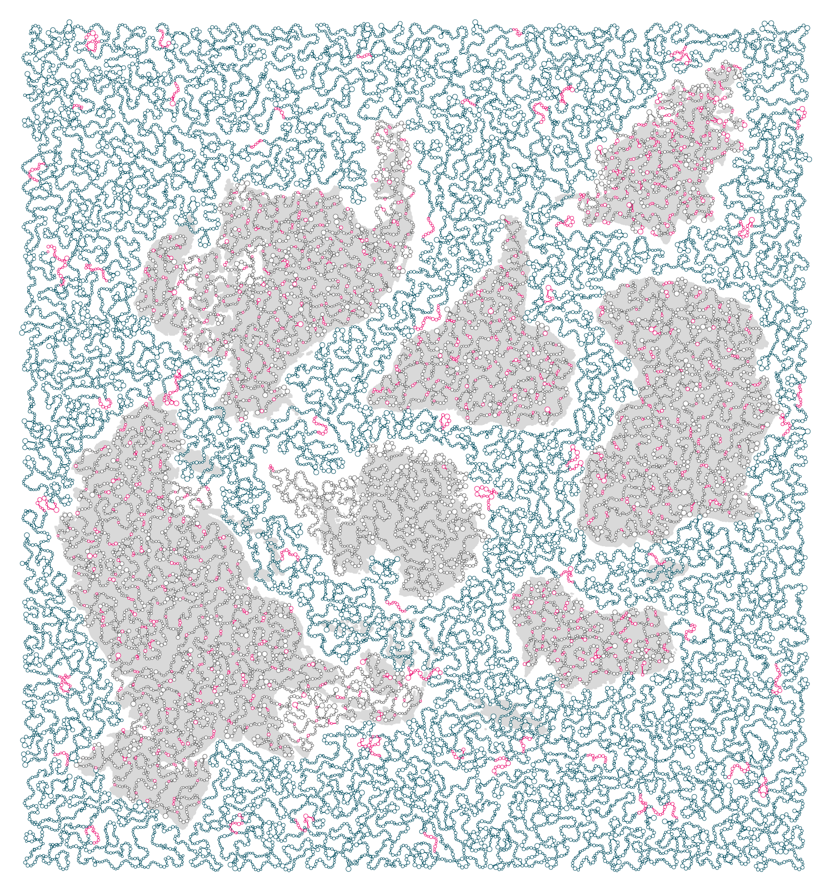
In the final figure, the helix backbone in gaps is faded.
In the final figure, bases are colored by nucleotide (A, T, C, G) and region (land vs ocean).

You can download each species's sequence and its location.
Sequences were sampled from the Genbank records starting at the first non-repeated base. This was a quick way to avoid spamming the design with polytails.
For example, the sequence for the Hanuman langur
>PVII010000001.1:1-1000 Semnopithecus entellus isolate BS30 SemEnt_scaffold_0, WGS
AAAAA AAAAA AAAAA AAAAA AAAAA AAATT ATTTT GCTAA GGTCT GAGAA CTCCA GAAGG TGGTG TCGTG
----- ----- ----- ----- ----- ---++ +++++ +++++ +++++ +++++ +++++ +++++ +++++ +++++
                                 ** ***** ***** ***
was sampled by skipping the first 28 bases (A's) and uses the sequence indicated by * above.
The position and sequence for each species is shown below. The first base of the sequence is capitalized and remaining are lowercase. The numeric code below the species name is the taxon, a unique taxonomy ID used by Genbank.
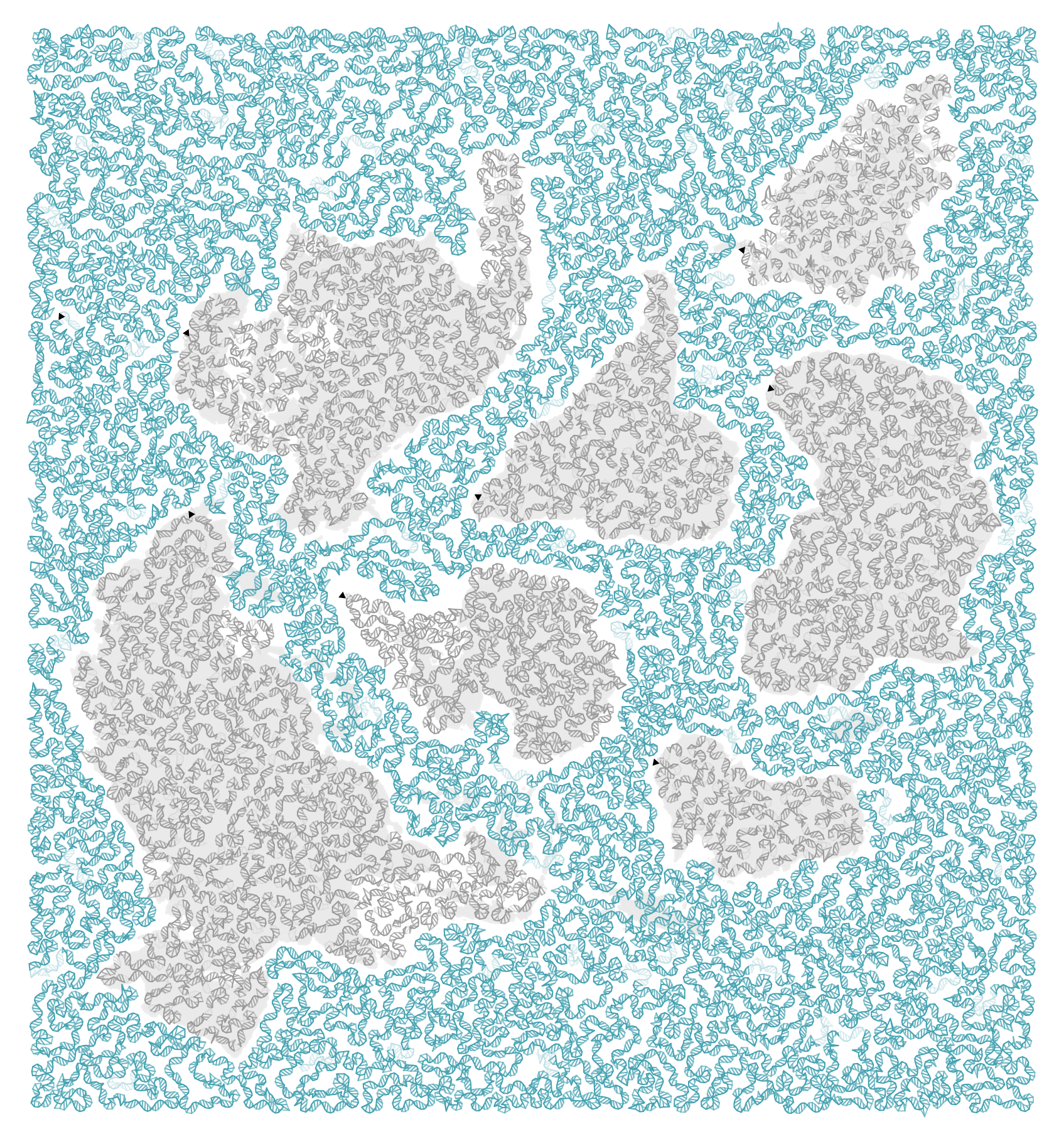
A version of the above without the sequence is shown below.
Propensity score matching
I don’t have good luck in the match points. —Rafael Nadal, Spanish tennis player
In many experimental designs, we need to keep in mind the possibility of confounding variables, which may give rise to bias in the estimate of the treatment effect.
If the control and experimental groups aren't matched (or, roughly, similar enough), this bias can arise.
Sometimes this can be dealt with by randomizing, which on average can balance this effect out. When randomization is not possible, propensity score matching is an excellent strategy to match control and experimental groups.
Kurz, C.F., Krzywinski, M. & Altman, N. (2024) Points of significance: Propensity score matching. Nat. Methods 21:1770–1772.
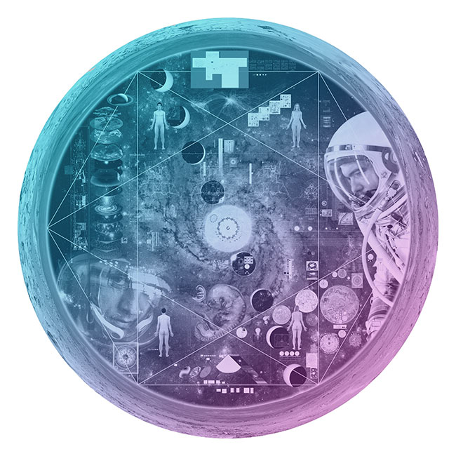
Nasa to send our human genome discs to the Moon
We'd like to say a ‘cosmic hello’: mathematics, culture, palaeontology, art and science, and ... human genomes.


Comparing classifier performance with baselines
All animals are equal, but some animals are more equal than others. —George Orwell
This month, we will illustrate the importance of establishing a baseline performance level.
Baselines are typically generated independently for each dataset using very simple models. Their role is to set the minimum level of acceptable performance and help with comparing relative improvements in performance of other models.
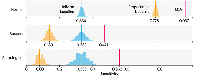
Unfortunately, baselines are often overlooked and, in the presence of a class imbalance, must be established with care.
Megahed, F.M, Chen, Y-J., Jones-Farmer, A., Rigdon, S.E., Krzywinski, M. & Altman, N. (2024) Points of significance: Comparing classifier performance with baselines. Nat. Methods 21:546–548.
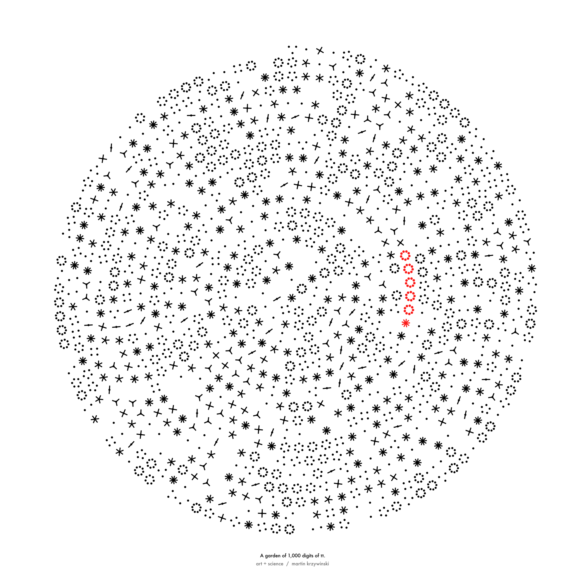
Happy 2024 π Day—
sunflowers ho!
Celebrate π Day (March 14th) and dig into the digit garden. Let's grow something.
How Analyzing Cosmic Nothing Might Explain Everything
Huge empty areas of the universe called voids could help solve the greatest mysteries in the cosmos.
My graphic accompanying How Analyzing Cosmic Nothing Might Explain Everything in the January 2024 issue of Scientific American depicts the entire Universe in a two-page spread — full of nothing.
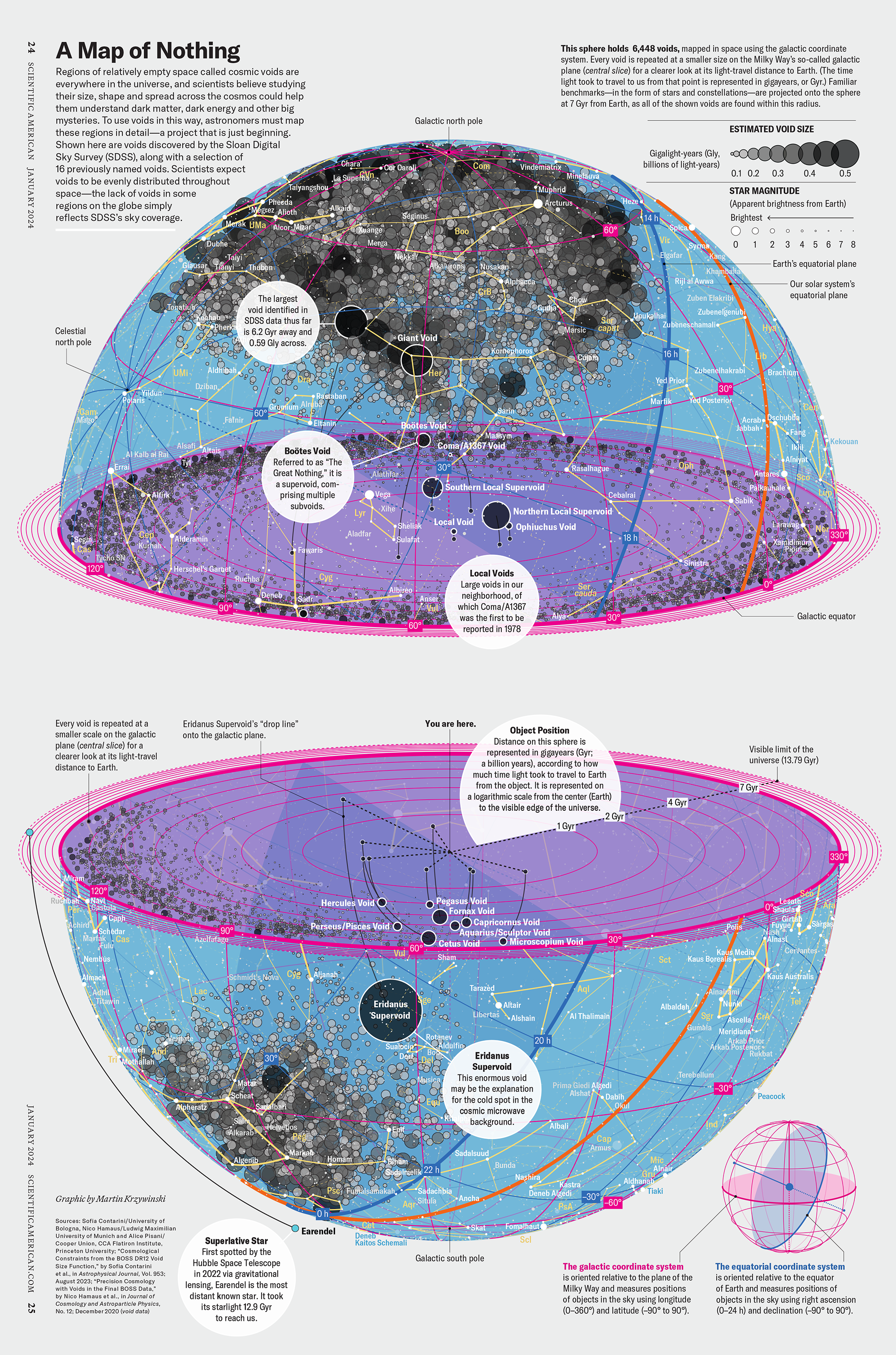
The graphic uses the latest data from SDSS 12 and is an update to my Superclusters and Voids poster.
Michael Lemonick (editor) explains on the graphic:
“Regions of relatively empty space called cosmic voids are everywhere in the universe, and scientists believe studying their size, shape and spread across the cosmos could help them understand dark matter, dark energy and other big mysteries.
To use voids in this way, astronomers must map these regions in detail—a project that is just beginning.
Shown here are voids discovered by the Sloan Digital Sky Survey (SDSS), along with a selection of 16 previously named voids. Scientists expect voids to be evenly distributed throughout space—the lack of voids in some regions on the globe simply reflects SDSS’s sky coverage.”
voids
Sofia Contarini, Alice Pisani, Nico Hamaus, Federico Marulli Lauro Moscardini & Marco Baldi (2023) Cosmological Constraints from the BOSS DR12 Void Size Function Astrophysical Journal 953:46.
Nico Hamaus, Alice Pisani, Jin-Ah Choi, Guilhem Lavaux, Benjamin D. Wandelt & Jochen Weller (2020) Journal of Cosmology and Astroparticle Physics 2020:023.
Sloan Digital Sky Survey Data Release 12
Alan MacRobert (Sky & Telescope), Paulina Rowicka/Martin Krzywinski (revisions & Microscopium)
Hoffleit & Warren Jr. (1991) The Bright Star Catalog, 5th Revised Edition (Preliminary Version).
H0 = 67.4 km/(Mpc·s), Ωm = 0.315, Ωv = 0.685. Planck collaboration Planck 2018 results. VI. Cosmological parameters (2018).
constellation figures
stars
cosmology