

The trees along this city street,
Save for the traffic and the trains,
Would make a sound as thin and sweet
As trees in country lanes.
And people standing in their shade
Out of a shower, undoubtedly
Would hear such music as is made
Upon a country tree.
Oh, little leaves that are so dumb
Against the shrieking city air,
I watch you when the wind has come,—
I know what sound is there.
— Edna St. Vincent Millay
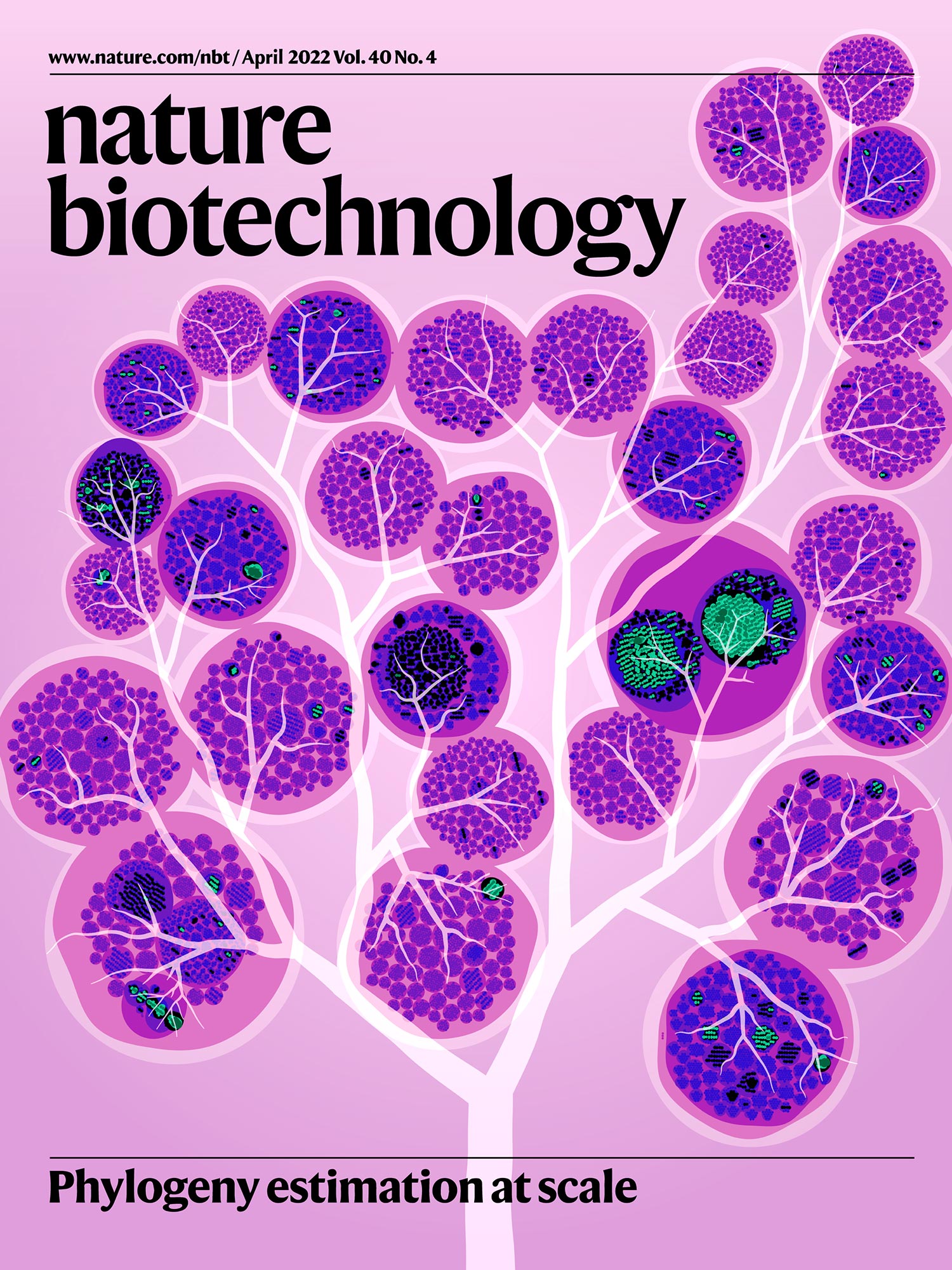
Nature Biotechnology Cover
11 April 2022, Issue 40, Volume 4
contents
During the design process, there's usually an early sketch phase — you try out various ideas and see which one sticks. For this design, I was lucky to skip this step entirely — I knew exactly what I wanted to do. It was just a matter of translating the vague vision in my head onto the page.
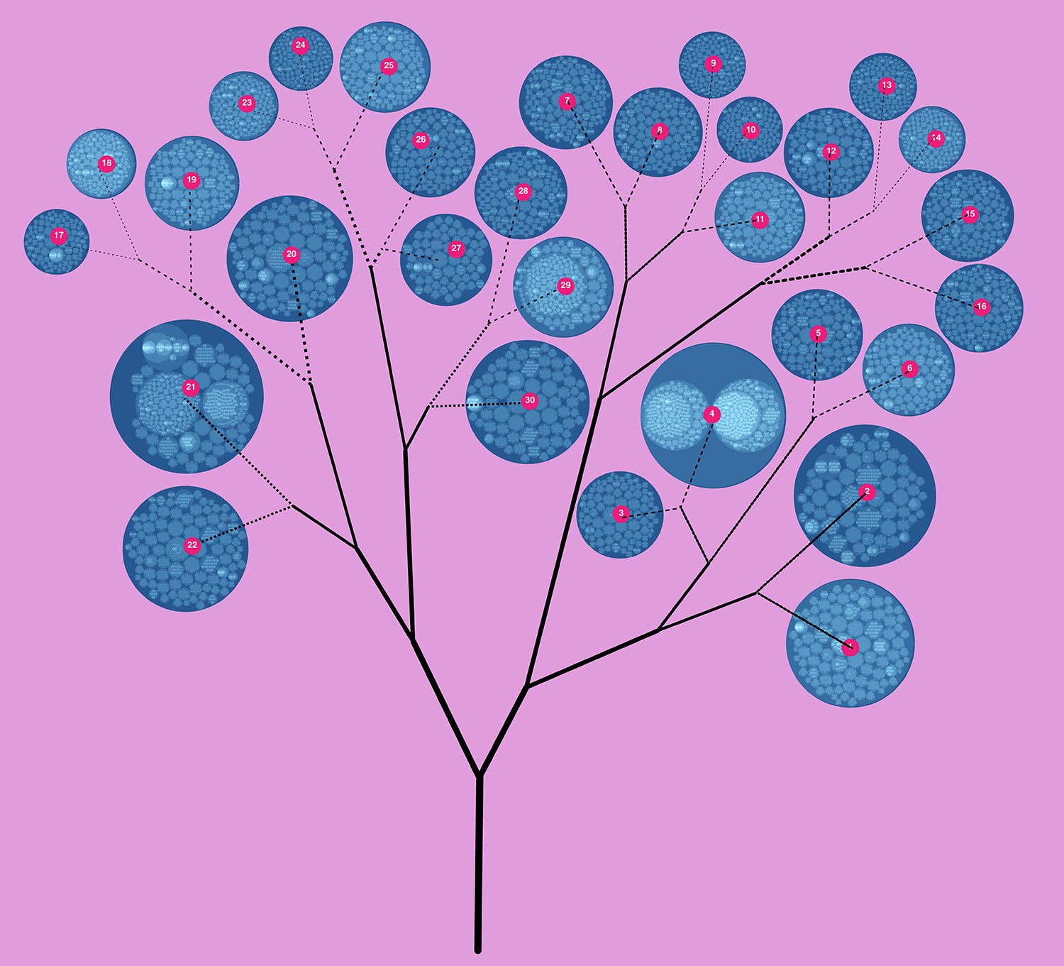
First thing I did was to assign each top-level cluster a number. I knew that eventually I wanted to be able to know what went where.
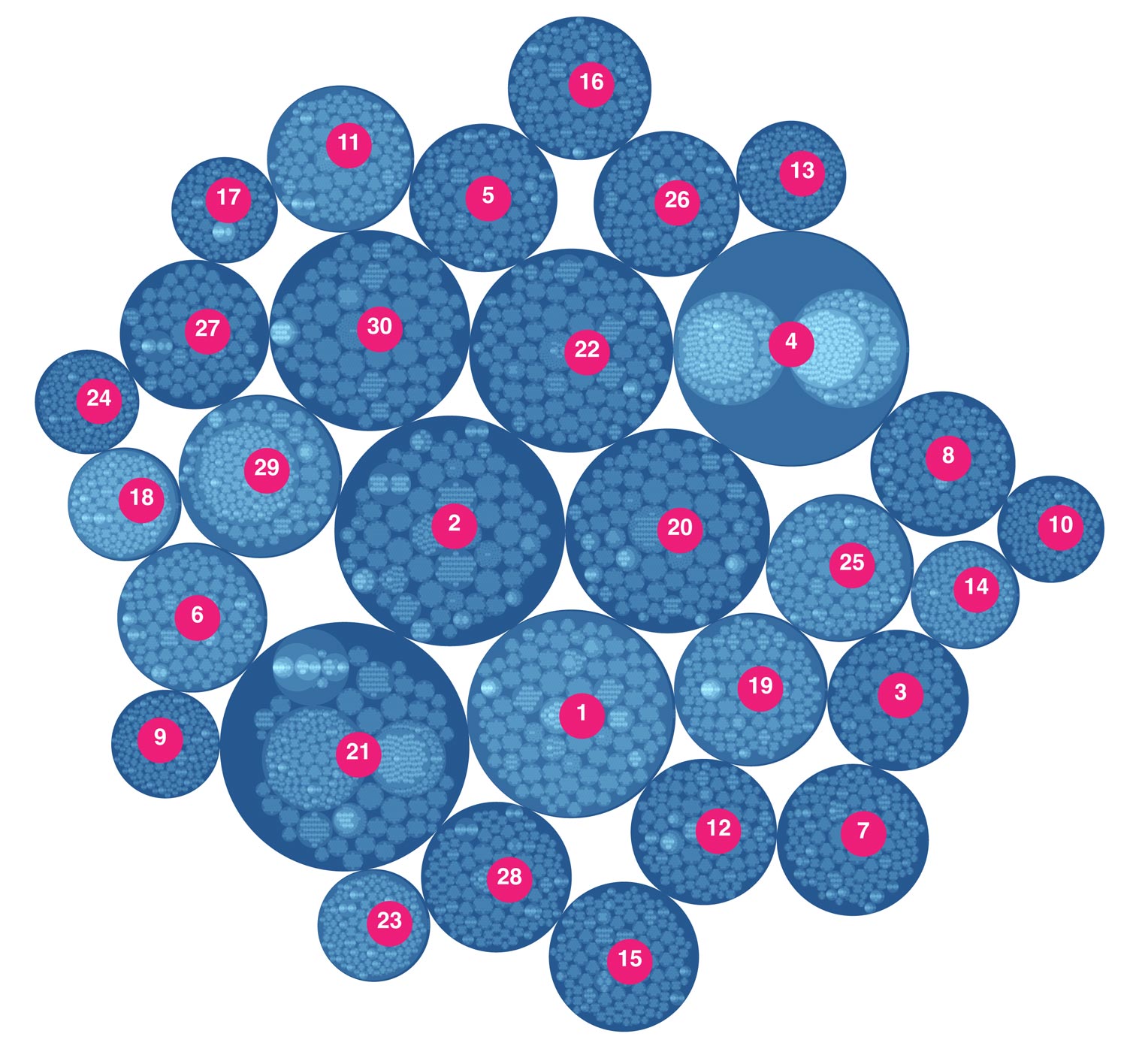
Next, I had to figure out a way to arrange the clusters on the branches of a tree in a way that would (a) fill the page, (b) have smaller clusters at tips of branches, and (c) minimize or eliminate overlap.
But I had to draw the tree first. Below are a couple of sketches. Branches are positioned to have the tree wrap around the title of the journal.
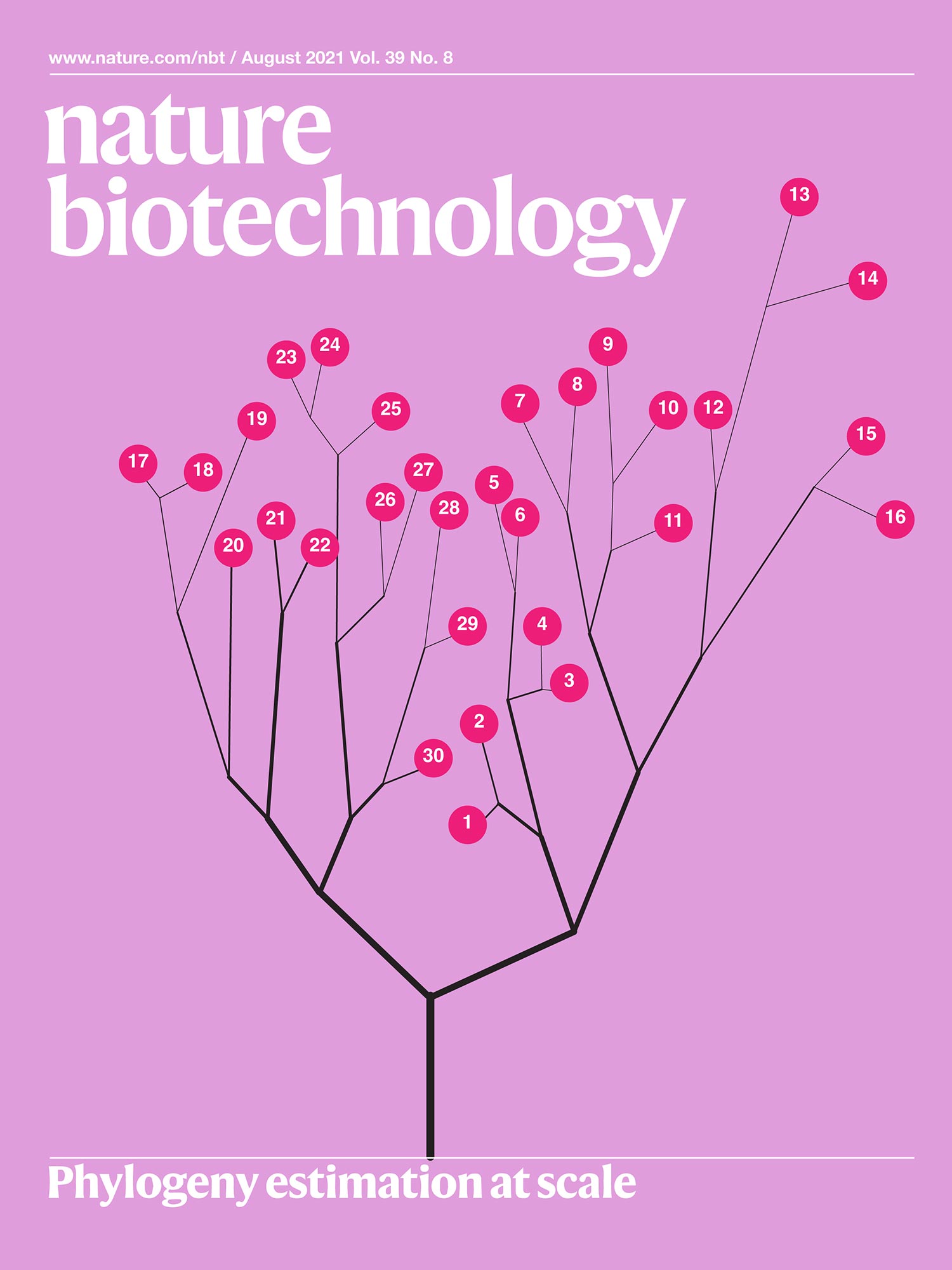
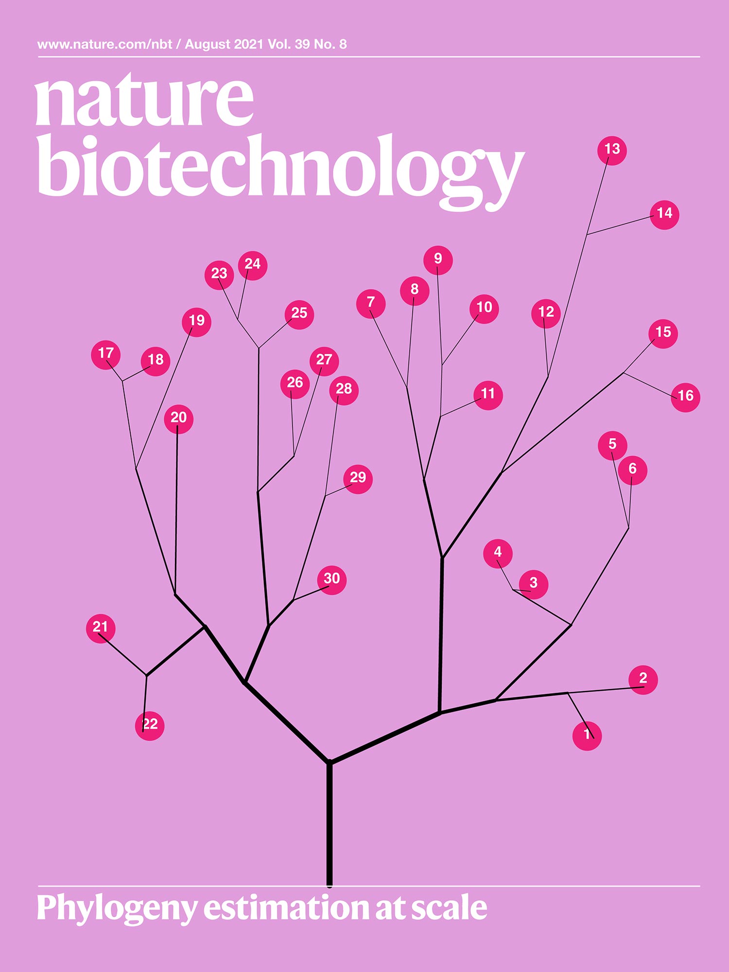
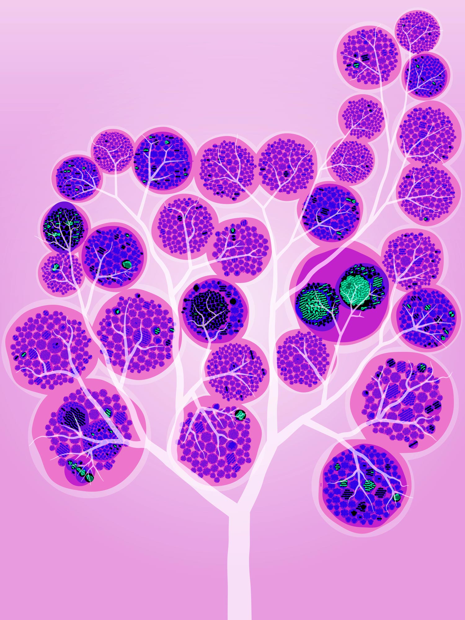
Once the clusters were placed in the tree, more adjustments needed to be made. Moving the clusters around so that everything looked “just so” took quite a bit of time.
The week of nudge.
I probably spent half a week 3 days moving the clusters around on the page.
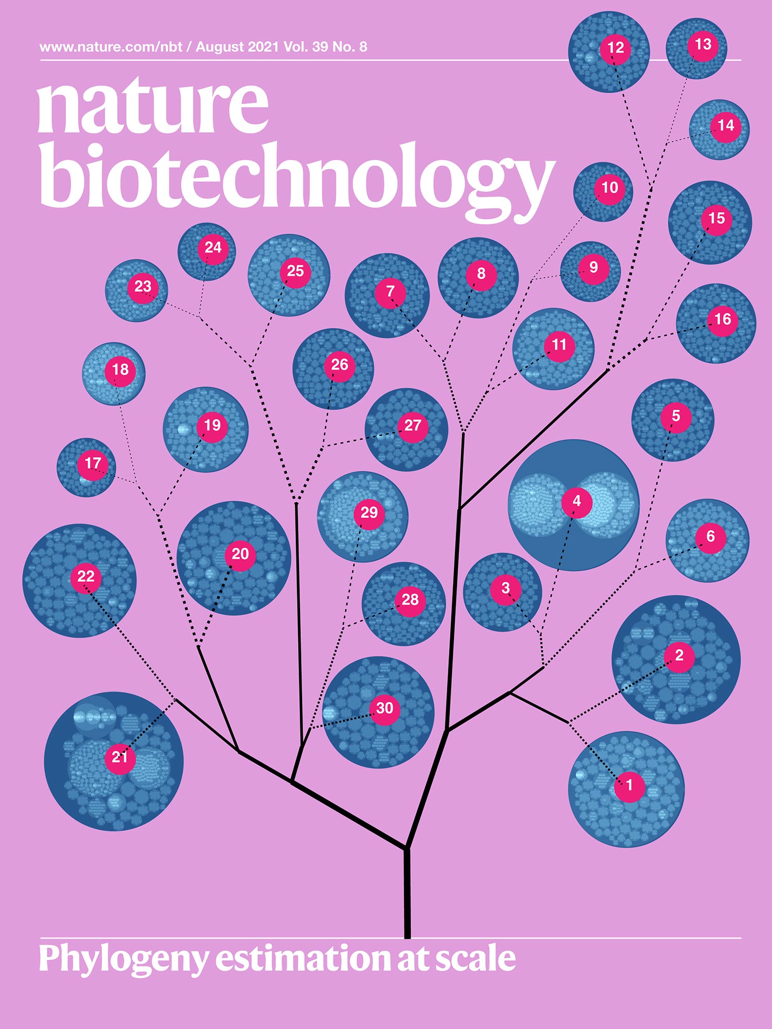
By this point, I was pretty happy with the layout, but the branches seemed a bit sparse and much much too straight.
So, I had to get quite friendly with Illustrator's width tool, adding bends to the branches and variation to their width.
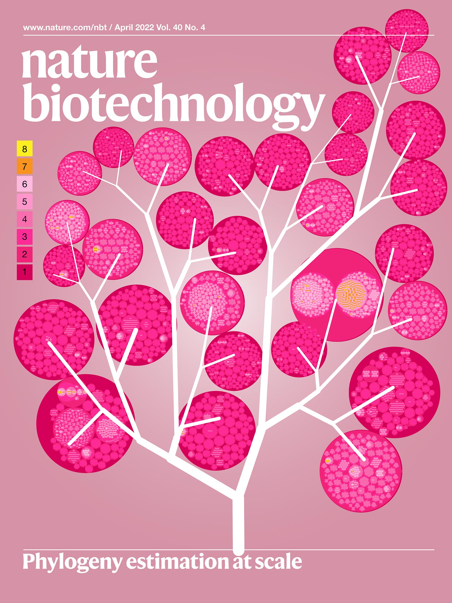
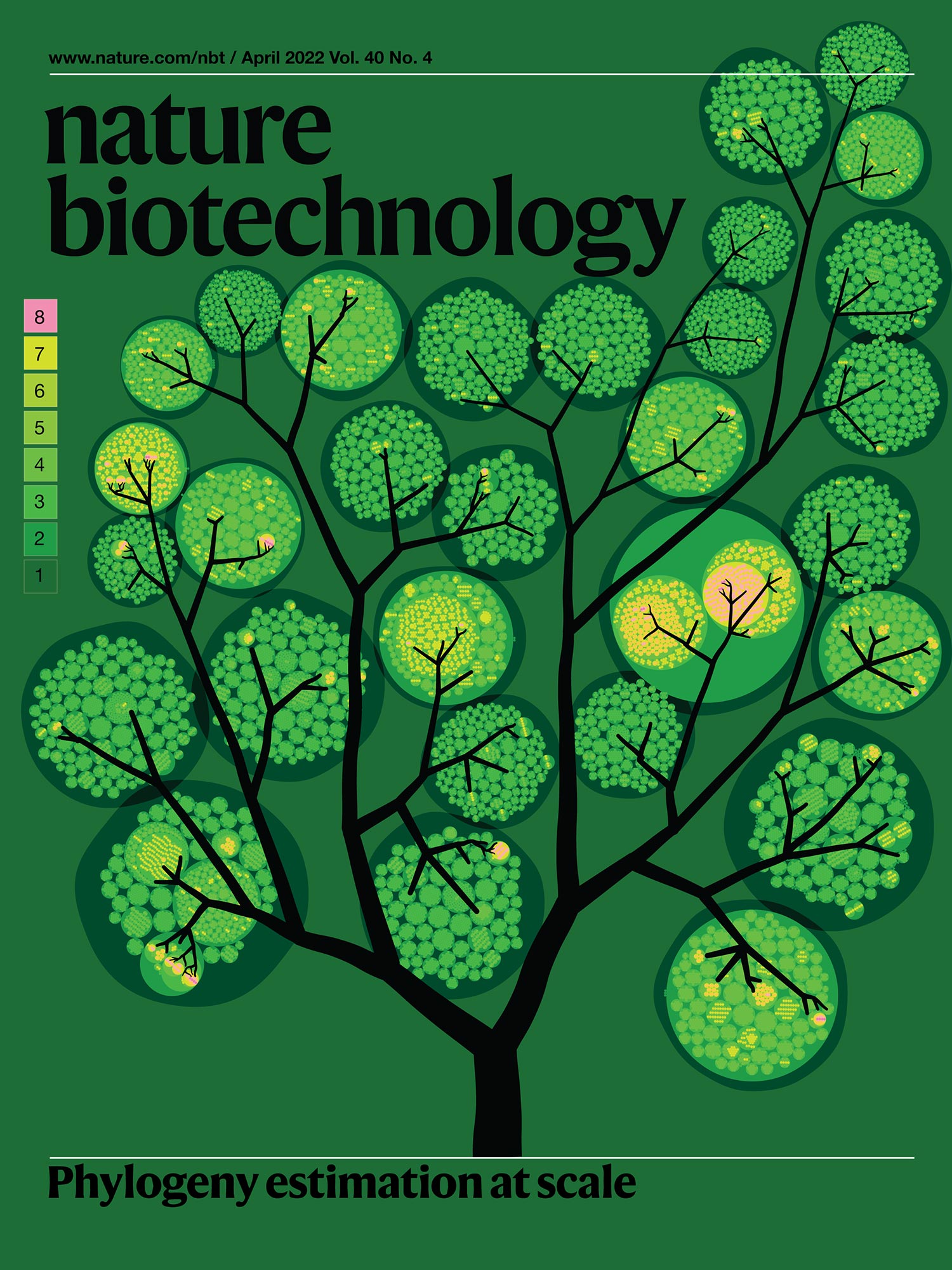
I also experimented with another color scheme that felt more summery.
You'll also notice that the boundaries of the clusters are no longer round — a littee smooth roughening grows a long way.
I created to sets of images. One had a black branch and wound up having a nighttime feeling — the clusters looking like lanterns.
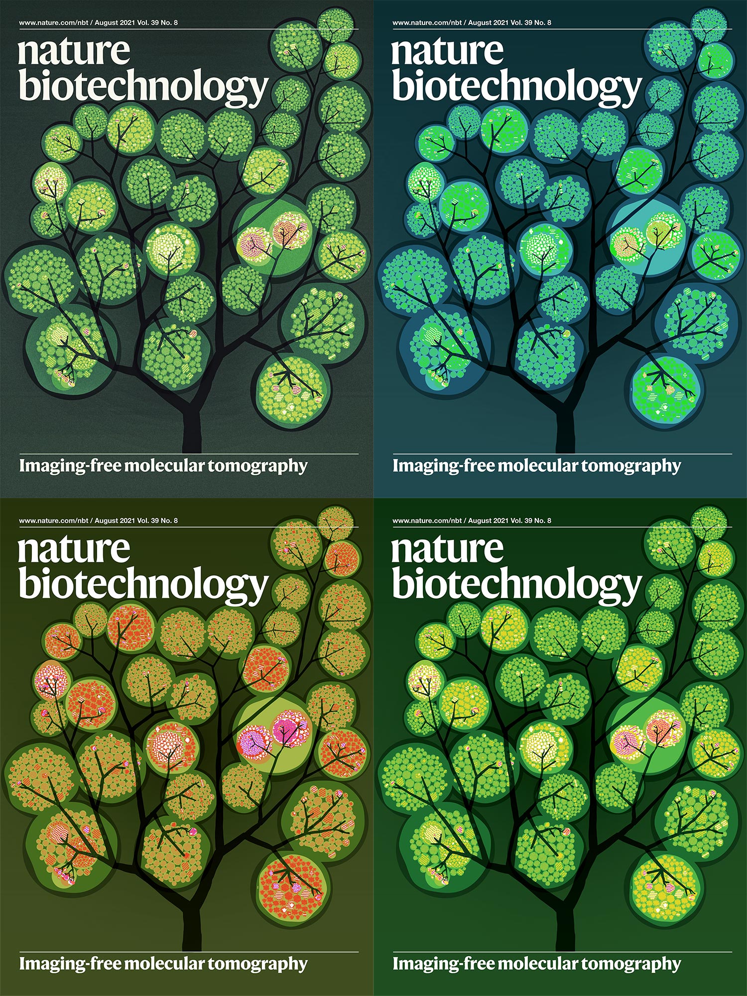
And the other set having a light and airy (and almost underwater) feeling with white branches. I particularly like the light outlines around the clusters
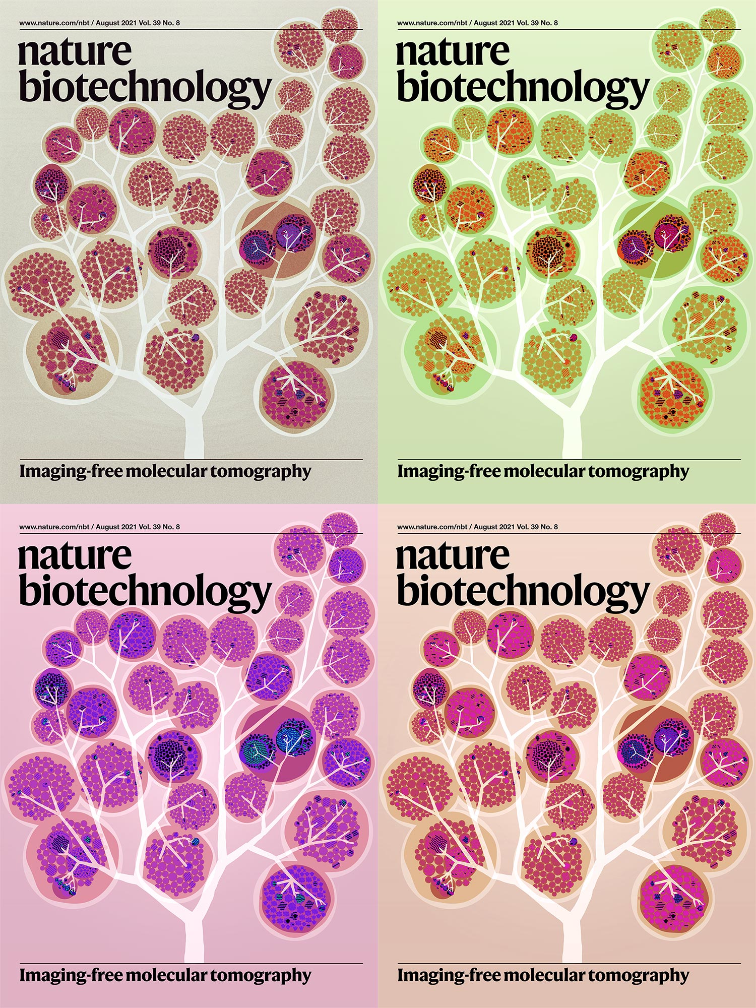
These 8 candidates were submitted to the journal.
The editor selected the bottom left option from the light series.
A few final tweaks to the editor's selection saw a little more branch detail and contrast.
Below, I walk you through all the elements of the final cover image.


Beyond Belief Campaign BRCA Art
Fuelled by philanthropy, findings into the workings of BRCA1 and BRCA2 genes have led to groundbreaking research and lifesaving innovations to care for families facing cancer.
This set of 100 one-of-a-kind prints explore the structure of these genes. Each artwork is unique — if you put them all together, you get the full sequence of the BRCA1 and BRCA2 proteins.

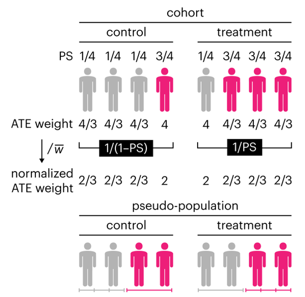
Propensity score weighting
The needs of the many outweigh the needs of the few. —Mr. Spock (Star Trek II)
This month, we explore a related and powerful technique to address bias: propensity score weighting (PSW), which applies weights to each subject instead of matching (or discarding) them.
Kurz, C.F., Krzywinski, M. & Altman, N. (2025) Points of significance: Propensity score weighting. Nat. Methods 22:1–3.
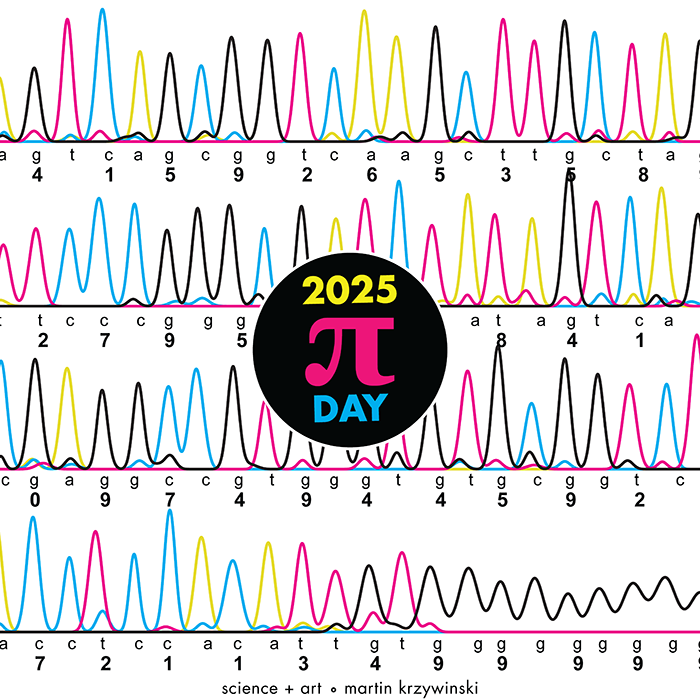
Happy 2025 π Day—
TTCAGT: a sequence of digits
Celebrate π Day (March 14th) and sequence digits like its 1999. Let's call some peaks.
Crafting 10 Years of Statistics Explanations: Points of Significance
I don’t have good luck in the match points. —Rafael Nadal, Spanish tennis player
Points of Significance is an ongoing series of short articles about statistics in Nature Methods that started in 2013. Its aim is to provide clear explanations of essential concepts in statistics for a nonspecialist audience. The articles favor heuristic explanations and make extensive use of simulated examples and graphical explanations, while maintaining mathematical rigor.
Topics range from basic, but often misunderstood, such as uncertainty and P-values, to relatively advanced, but often neglected, such as the error-in-variables problem and the curse of dimensionality. More recent articles have focused on timely topics such as modeling of epidemics, machine learning, and neural networks.
In this article, we discuss the evolution of topics and details behind some of the story arcs, our approach to crafting statistical explanations and narratives, and our use of figures and numerical simulations as props for building understanding.
Altman, N. & Krzywinski, M. (2025) Crafting 10 Years of Statistics Explanations: Points of Significance. Annual Review of Statistics and Its Application 12:69–87.
Propensity score matching
I don’t have good luck in the match points. —Rafael Nadal, Spanish tennis player
In many experimental designs, we need to keep in mind the possibility of confounding variables, which may give rise to bias in the estimate of the treatment effect.
If the control and experimental groups aren't matched (or, roughly, similar enough), this bias can arise.
Sometimes this can be dealt with by randomizing, which on average can balance this effect out. When randomization is not possible, propensity score matching is an excellent strategy to match control and experimental groups.
Kurz, C.F., Krzywinski, M. & Altman, N. (2024) Points of significance: Propensity score matching. Nat. Methods 21:1770–1772.