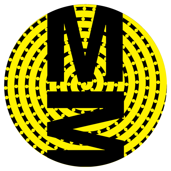
DNA on 10th — Science this way
There are some new shapes on the streets of Vancouver.
“DNA on 10th” wayfinding signs on the Health Care corridor are
based on sequence data from the Personal OncoGenomics program and
designed at Canada’s Michael Smith Genome Sciences Centre.
When the night comes on,
the signs take on a new personality.


North sign in day
North sign at night


South sign in day
South sign at night
Our signs help you navigate the Health Care Corridor on West 10th Avenue. And if you take a closer look at their design, you'll see the footprint of groundbreaking science happening right here in the city.
What do the sign show?
Your genes are coded in molecules of DNA using four bases—A, C, G and T. Errors in this code are called mutations, interfere with the complex biology of a cell and result in disease.
Each shape on the sign represents a base and each row represents a gene sequence. The shapes of complementary bases are vertical (A/T) or horizontal (C/G) reflections. Circles inside the shape indicate where a base repeats twice (small circle) or three times (large circle). These shapes are part of the DNA ON 10TH font designed for the sign.
Bright bases signal a gene mutation and form a double helix—the 3-dimensional shape of DNA. The sequence along the helix is part of the TP53 gene—an important tumour suppressor and regulator of cell division.
There are several puzzles and Easter eggs built into the sign.
How are the north and south designs different?
Sequence in rows that intersect with the 5' helix (the one that starts on the bottom row) are oriented in the direction of the sign.
The helix shape on the north sign is as the helix on the south sign would appear if you were to look at it from the back.
Are you sure the DNA helix is winding the right way?
Pretty sure.
Why are the signs changing color?
The signs are dimly backlit—they have different day and night personalities.
As the night comes on, the mysteries of the cell are revealed—the background sequence and the DNA double helix become distinguishable.
Where did the data for the signs come from?
The data represent DNA of cancer patients sequenced at Canada's Michael Smith Genome Sciences Centre at BC Cancer the to guide treatment decisions. Each unique row of shapes is a real gene sequence implicated in cancer.
Modern breakthroughs in cancer treatment have been made possible by genomics, the study of DNA and its role in heredity, health and disease. In our our Personalized OncoGenomics program (POG), we compare patients’ tumour and normal DNA to find the best targeted therapies.
Where are the signs?
On the east side of the intersection of 10th Avenue and Oak Street (view map).
designed at
BC Cancer Canada's Michael Smith Genome Sciences Center
in collaboration with
PUBLIC Architecture + Communication
concept + design
Martin Krzywinski
data wrangling
Greg Taylor
Josh Davies
Nikki Martin
Isaac Beckie
Darryl D'Souza
Caralyn Reisle
Erich Chuah
sequencing
Richard Moore
Inanc Birol
Steven Jones
Marco Marra
communication
Kevin Sauve
production
PUBLIC Architecture + Communication
Aaron Sportack
Susan Mavor


