

Color proportions in country flags
contents
Country flags are pretty colorful and some are even pretty.
Instead of drawing the flag in a traditional way (yawn...), I wanted to draw it purely based on the color proportions in the flag (yay!). There are lots of ways to do this, such as stacked bars, but I decided to go with concentric circles. A few examples are shown below.

Once flags are drawn this way, they can be grouped by similarity in the color proportions.
Check out the posters or read about the method below.
Or, download my country flag color catalog to run your own analysis.
To determine the proportions of colors in each flag, I started with the collection of all country flags in SVG from Wikipedia. The flags are conveniently named using the countries' ISO 3166-2 code. At the time of this project (21 Mar 2017), this repository contained 312 flags, of which I used 256.
I originally wanted to use the flag-icon-css collection, but ran into problems with it. It had flags in only either 1 × 1 or 4 × 3 aspect ratio, which distorted and clipped many flags. Many flags were also inaccurately drawn and had inconsistent use of colors. For example, in Turkey's flag the red inside the white crescent was slightly different than elsewhere in the flag.
 buy artwork
I converted the SVG files to high resolution PNG (2,560 pixels in width) and sampled the colors in each flag, keeping only those colors that occupied at least 0.01% of the flag. I apply this cutoff to avoid blends between colors due to anti-aliasing applied in the conversion. When drawing the flags as circles, I only use colors that occupy at least 1% of the flag—this impacts flags that have detailed emblems, such as Belize. I apply some rounding off of the proportions and colors with the same proportion are ordered so that lighter colors (by Lab luminance) are in the center of the circle.
There are various ways to represent the proportions of the flag colors as concentric rings—in other words, to use symbols of different size to encode area.
The accurate way is to have the area of the ring be proportional to the area of the color on the map. The inaccurate way is to encode the area by the the width of the ring. These two cases are the `k=0.5` and `k=1` columns in the figure below, where `k` is the power in `r = a^k` by which the radius of the ring, `r`, is scaled relative to the area, `a`. A perceptual mapping using `k=0.57` has been suggested by some.

My goal here is not to encode the proportions so that they can be read off quantitatively. To find a value of `k`, I drew some flags and looked at their concentric ring representation. For example, with `k=0.57` the Nigerian flag's white center is too large for my eye while for `k=1` it is definitely too small. I liked the proportions for `k=1/\sqrt{2}` but wasn't happy with the fact that flags like France's, which have colors in equal areas, didn't have equal width rings.
In the end I decided on a hybrid approach in which the out radius of color `i` whose area is `a_i` is `r_i = a_i^k + \sum_{j=0}^{i-1} a_j^k` where the colors are sorted so that `a_{i-1} \le a_i`. If I use `k=0.25`, I manage to have flags like France have equal width rings but flags like Nigeria in which the proportions are not equal are closer to the encoding with `k=1/\sqrt{2}`. In this hybrid approach smaller areas, such as the white in the map of Turkey, are exaggerated. Notice that here `k` plays a slightly different role—it's used as the power for each color individually, `\sum a^k`, rather than their sum, `\left({\sum a}\right)^k`.
For the purists this choice of encoding might appear as the crime of the worst sort, representing neither correct (`k=0.5`) nor the conventionally incorrect encoding associated with `k=1`. Think of it this way—I know what rule I'm breaking.
The similarity between two flags is calculated by forming an intersection between the radii positions of the concentric rings of the flags.

For each intersection, the similarity of colors is determined using `\Delta E`, which is the Euclidian distance of the colors in LCH space. I placed less emphasis on luminance and chroma in the similarity calculation by fist transforming the coordinates to `(\sqrt L,\sqrt C, H)`) before calculating color differences. The similarity score is $$ S = \sum \frac{\Delta r}{\sqrt{\Delta E}} $$
Color pairs with `\Delta E < \Delta E_{min} = 5` are considered the same and have an effective `\Delta E = 1`.

I explored different cutoffs and combinations of transforming the color coordinates. This process was informed based on how the order of the flags looked to me.

I decided to start the order with Tonga, since it had the highest average similarity score to all other flags in some of my trials. The flag that is most different from other flags, as measured by the average similarity score, is Israel.

 buy artwork
I couldn't find a list of colors in the flags of countries, so I provide my analysis here. Every country's SVG flag was converted into a 2,560 × 1,920 PNG file (4,915,200 pixels). Colors that occupied at least 0.01% of the pixels are listed in their HEX format, followed by the number of pixels they occupy. The fraction of the flag covered by sampled colors is also shown.
DOWNLOAD

#code img_pixels sampled_pixels fraction_sampled_pixels hex:pixels,hex:pixels,...
...
cm 4366506 4364514 0.999544 FCD116:1513103,007A5E:1456071,CE1126:1395340
cn 4369920 4364756 0.998818 DE2910:4260992,FFDE00:103764
co 4364800 4364800 1.000000 FCD116:2183680,003893:1090560,CE1126:1090560
...
DOWNLOAD

#code1 code2 similarity_score
ad ae 0.0108360578506763
ad af 0.0288161214840692
ad ag 0.0510922121861494
ad ai 0.42746294322472
...
zw ye 0.473278765746989
zw yt 0.238101673130705
zw za 0.810589244643825
zw zm 0.573265751850587
Propensity score weighting
It is not certain that everything is uncertain. —Blaise Pascal
We have already explored how we can mitigate bias caused by confounding variables in observational studies using propensity score (PS) matching (PSM) and propensity score weighting (PSW). However, any statistical model is only as good as its assumptions and, if it is specified incorrectly, it can itself produce biased estimates of the treatment effect.
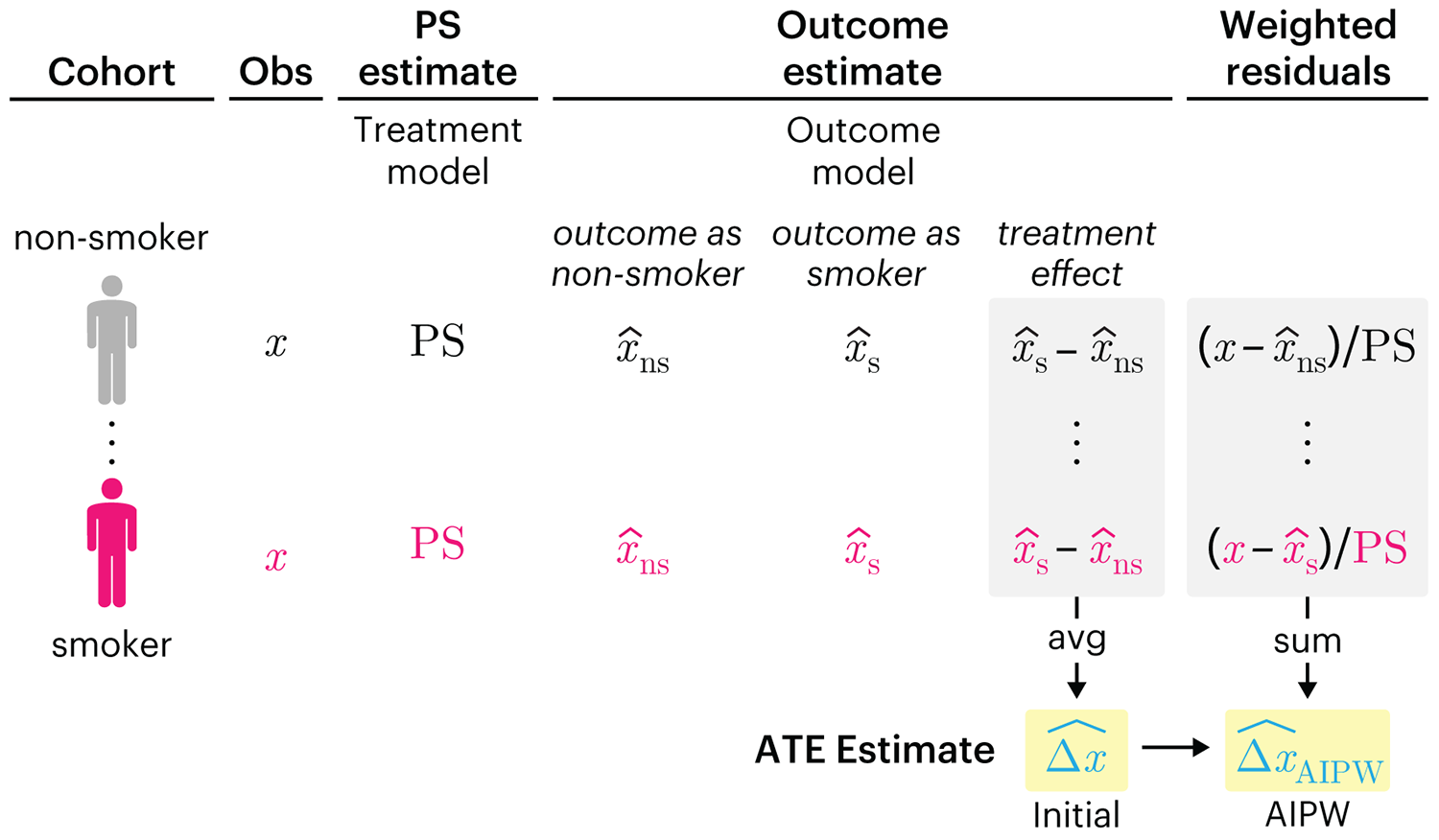
This month, we explore double robustness, a powerful statistical concept that provides a valuable “safety net” against the risk of an incorrect model. It offers two opportunities, instead of just one, to obtain a valid estimate of the treatment effect — making it possible to draw credible causal inferences from observational data without having to depend on a single set of modeling assumptions.
Kurz, C.F., Krzywinski, M. & Altman, N. (2026) Points of significance: Double Robustness. Nat. Methods 23:868–869.
Nature Biotechnology cover
My cover design on the 7 April 2026 Nature Biotechnology issue shows the dendrogram that represents a cluster of uniquely expressed (or downregulated) genes in human naive stem cells induced from such cells. Within each dendrogram block, the genomic barcode sequence (sampled from Supplementary Table 1) is depicted with a Code 39 barcode. The highlighted barcode is one of those used for cell isolation.
Ishiguro S. et al. A multi-kingdom genetic barcoding system for precise clone isolation (2026) Nature Biotechnology 44:616–629.

Browse my gallery of cover designs.
Happy 2026 π Day—
Art for the 5%
Celebrate π Day (March 14th) and enjoy the art — but only if you're part of the 5%.
Go ahead, see what you can't see.

Ishihara's Tests for Colour Deficiency
Authentic and accurate images of Ishihara's test plates photographed (and lovingly color-corrected) from the 38-plate Ishihara's Tests for Colour Deficiency.
I also provide the position, size, and color of each circle on each test plate.


Symmetric alternatives to the ordinary least squares regression
What immortal hand or eye, could frame thy fearful symmetry? — William Blake, "The Tyger"
This month, we look at symmetric regression, which, unlike simple linear regression, it is reversible — remaining unaltered when the variables are swapped.
Simple linear regression can summarize the linear relationship between two variables `X` and `Y` — for example, when `Y` is considered the response (dependent) and `X` the predictor (independent) variable.
However, there are times when we are not interested (or able) to distinguish between dependent and independent variables — either because they have the same importance or the same role. This is where symmetric regression can help.

Luca Greco, George Luta, Martin Krzywinski & Naomi Altman (2025) Points of significance: Symmetric alternatives to the ordinary least squares regression. Nat. Methods 22:1610–1612.
Beyond Belief Campaign BRCA Art
Fuelled by philanthropy, findings into the workings of BRCA1 and BRCA2 genes have led to groundbreaking research and lifesaving innovations to care for families facing cancer.
This set of 100 one-of-a-kind prints explore the structure of these genes. Each artwork is unique — if you put them all together, you get the full sequence of the BRCA1 and BRCA2 proteins.
