
VIZBI 2012
Visualization Principles Tutorial
This tutorial took place on Monday Mar 5th 2012 at VIZBI 2012 in Heidelberg Germany.
Introduction
Jessie Kennedy · We will present fundamental principles of graphic design and visual communication that will help you create more effective interactive and print visualizations. You will learn how the purposeful use of salience, color, consistency and layout can help communicate large data sets and complex ideas with greater immediacy and clarity.
Cydney Nielsen · We will illustrate how these principles were implemented in ABySS-Explorer to visualize genome assemblies, an example to show you ways to apply design ideas to your own project.
Martin Krzywinski · At the end of the tutorial, you will apply what you have learned in an interactive group session in which you will design a figure illustrating a biological process.
Agenda
Download agenda + participant list
| 9:30 – 10:15 | 45 min | Jessie Kennedy Principles |
| 10:15 – 10:25 | 10 min | break |
| 10:25 – 11:10 | 45 min | Cydney Nielsen Design Process |
| 11:10 – 11:20 | 10 min | form teams + select figure to critique |
| 11:20 – 11:30 | 10 min | break |
| 11:30 – 12:00 | 30 min | Martin Krzywinski Practical — Breakout session download papers |
| 12:00 – 13:00 | 60 min | team presentations Interactive suggested solutions |
It is not necessary to read the paper from which your figure was selected. I have included the papers only if you are interested in learning about the figure's context.
Visualization and Design Resources
Effect of resolution on sequence visualization
Principles of effective color selection
Designing effective visualizations in the biological sciences (PSA Genomics Workshop, Seattle, 12 July 2011)
Circos and Hive Plots: Challenging visualization paradigms in genomics and network analysis (PSA Genomics Workshop, Seattle, 12 July 2011)
Designing effective visualizations in the biological sciences (Genome Sciences Center bioinformatics seminar, 26 August 2011)
Drawing Data: Creaing information-rich, informative and appealing figures for publication and presentation (BCCA workshop, 8 Jun 2011)
Behind a great figure is a design principle (BCB Spring Seminar, Iowa State, 27 Feb 2012)
Visualizing Quantitative Information (Genome Sciences Center bioinformatics seminar)
Blast from the past
Propensity score weighting
It is not certain that everything is uncertain. —Blaise Pascal
We have already explored how we can mitigate bias caused by confounding variables in observational studies using propensity score (PS) matching (PSM) and propensity score weighting (PSW). However, any statistical model is only as good as its assumptions and, if it is specified incorrectly, it can itself produce biased estimates of the treatment effect.
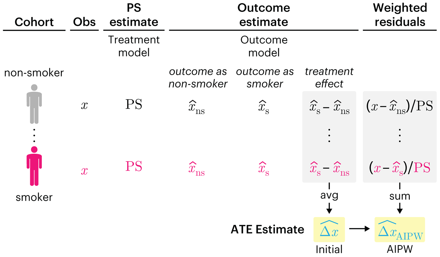
This month, we explore double robustness, a powerful statistical concept that provides a valuable “safety net” against the risk of an incorrect model. It offers two opportunities, instead of just one, to obtain a valid estimate of the treatment effect — making it possible to draw credible causal inferences from observational data without having to depend on a single set of modeling assumptions.
Kurz, C.F., Krzywinski, M. & Altman, N. (2026) Points of significance: Double Robustness. Nat. Methods 23:868–869.
Nature Biotechnology cover
My cover design on the 7 April 2026 Nature Biotechnology issue shows the dendrogram that represents a cluster of uniquely expressed (or downregulated) genes in human naive stem cells induced from such cells. Within each dendrogram block, the genomic barcode sequence (sampled from Supplementary Table 1) is depicted with a Code 39 barcode. The highlighted barcode is one of those used for cell isolation.
Ishiguro S. et al. A multi-kingdom genetic barcoding system for precise clone isolation (2026) Nature Biotechnology 44:616–629.

Browse my gallery of cover designs.
Happy 2026 π Day—
Art for the 5%
Celebrate π Day (March 14th) and enjoy the art — but only if you're part of the 5%.
Go ahead, see what you can't see.

Ishihara's Tests for Colour Deficiency
Authentic and accurate images of Ishihara's test plates photographed (and lovingly color-corrected) from the 38-plate Ishihara's Tests for Colour Deficiency.
I also provide the position, size, and color of each circle on each test plate.

