


data visualization + art
Genes that make us sick
It is said that for money you can have everything, but you cannot. You can buy food, but not appetite; medicine, but not health; knowledge, but not wisdom; glitter, but not beauty; fun, but not joy; acquaintances, but not friends; servants, but not faithfulness; leisure, but not peace. You can have the husk of everything for money, but not the kernel.
— Arne Garborg
I have recently had the opportunity to contribute to The Objects that Power the Global Economy, a book by Quartz.
The book is about objects that have impact on our world and our lives. "Each chapter of this book examines an object that is driving radical change in the global economy: how we communicate, what we eat, the way we spend our money. The stories are told through global reporting, original photography and illustration by award-winning artists, contributions from business visionaries, data visualization, and interactive features." (Quartz).
the posters
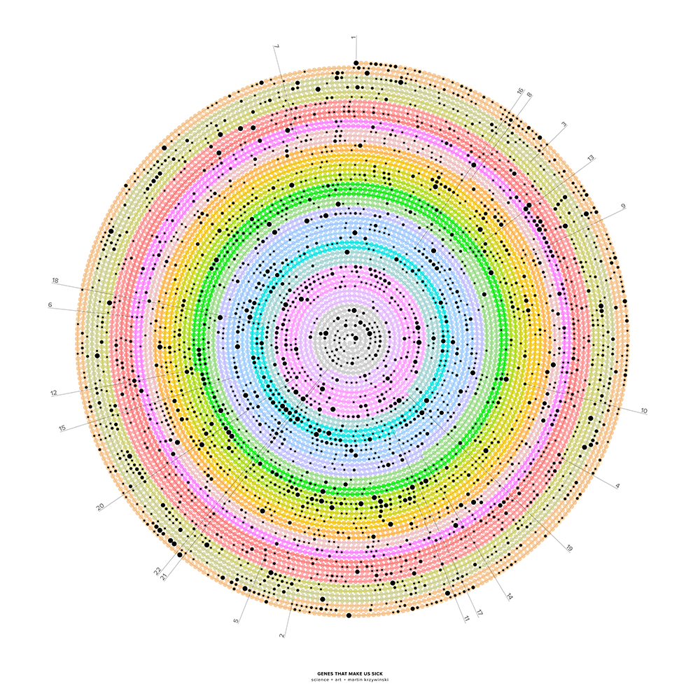
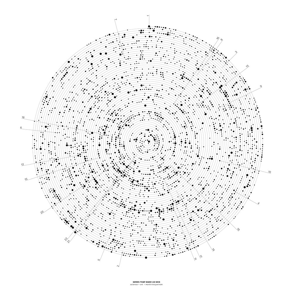
The human genome is shown as a spiral, starting at the top with chromosome 1 and proceeding clockwise. The spiral is formed by 10,087 segments that correspond to 286,000 bases each. Segments that contain genes implicated in disease are indicated by dots, sized by the number of genes. Chromosomes X and Y are not shown.


where disease hides in the genome
My illustration is of the human genome with a focus on the genes that have been implicated in disease.
We have about 30,000 genes and about half of these play some role in disease.
You can peruse what we know about the connection between genetics and illness at the Online Mendelean Inheritance of Man database. For example, a cursory search for "cancer" results in over 3,500 entries.
It's important to realize that these aren't genes that cause disease—its misregulation and mutations in them that are associated with disease (causality is complicated).
the visualization
The illustration shows the genome as a single line, wound in an Archimedean spiral. Chromosomes 1–22 are shown binned into about 10,000 regions along the spiral. Regions that have genes associated with disease are marked with dots—the size of the dot shows how many such genes are found. Each region corresponds to about 286,000 bases.
In about 73% of the 286 kb regions, there are no genes. In about 18%, there is a single gene and in roughly 11% two genes or more.
  regions  genes
    7,321  0
    1,812  1
      556  2
      221  3
       85  4
       93  5+
Winding the genome up in a spiral creates a compact representation. Squishing a line onto a page can be tricky.
Luckily, space filling curves like the Hilbert curve are very efficient at doing this. I've previously shown the genome along a Hilbert curve for a Scientific American Graphic Science page.
the artwork
In the book, the image is printed on a black background.
Beyond Belief Campaign BRCA Art
Fuelled by philanthropy, findings into the workings of BRCA1 and BRCA2 genes have led to groundbreaking research and lifesaving innovations to care for families facing cancer.
This set of 100 one-of-a-kind prints explore the structure of these genes. Each artwork is unique — if you put them all together, you get the full sequence of the BRCA1 and BRCA2 proteins.

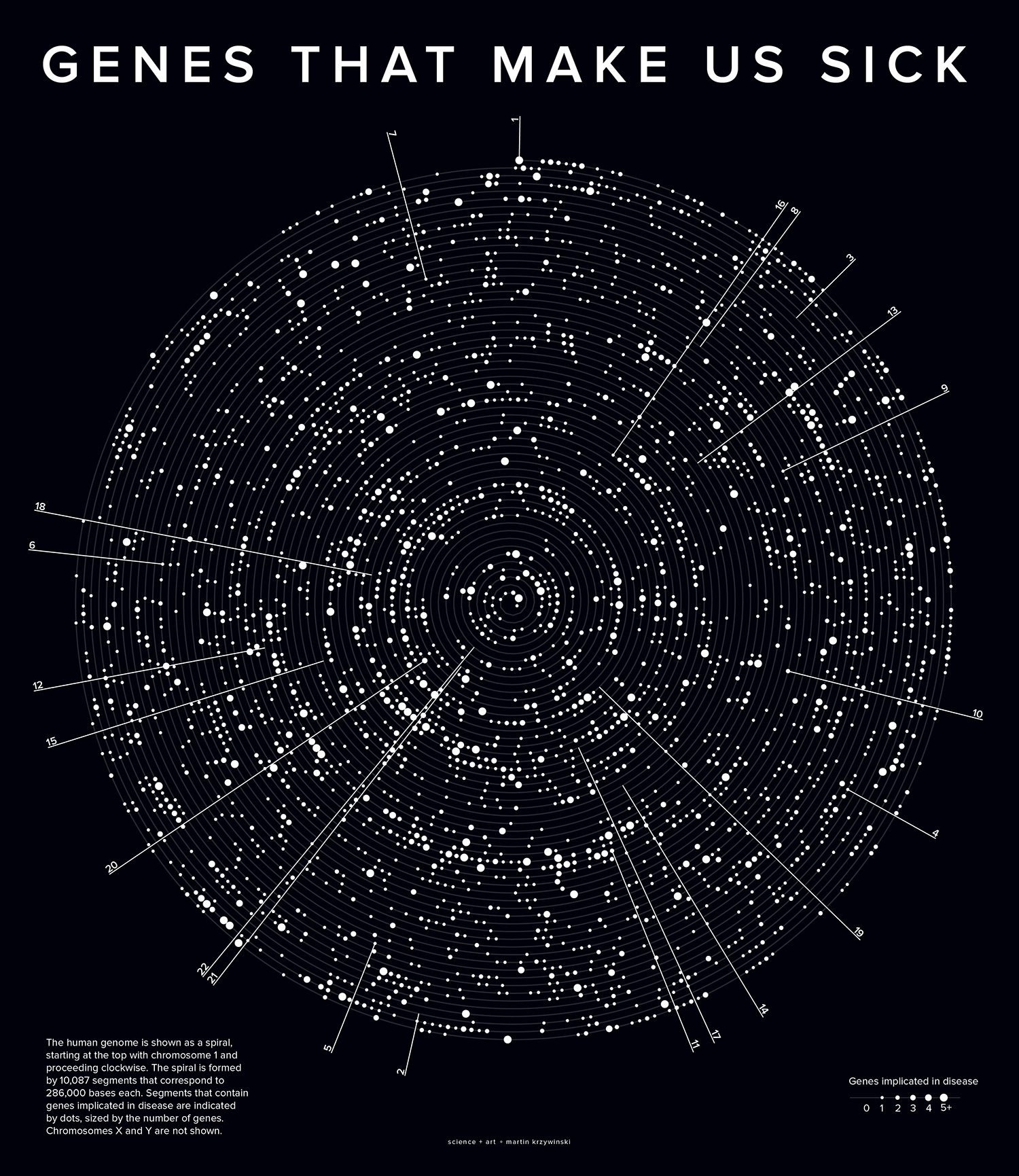
Propensity score weighting
The needs of the many outweigh the needs of the few. —Mr. Spock (Star Trek II)
This month, we explore a related and powerful technique to address bias: propensity score weighting (PSW), which applies weights to each subject instead of matching (or discarding) them.
Kurz, C.F., Krzywinski, M. & Altman, N. (2025) Points of significance: Propensity score weighting. Nat. Methods 22:1–3.
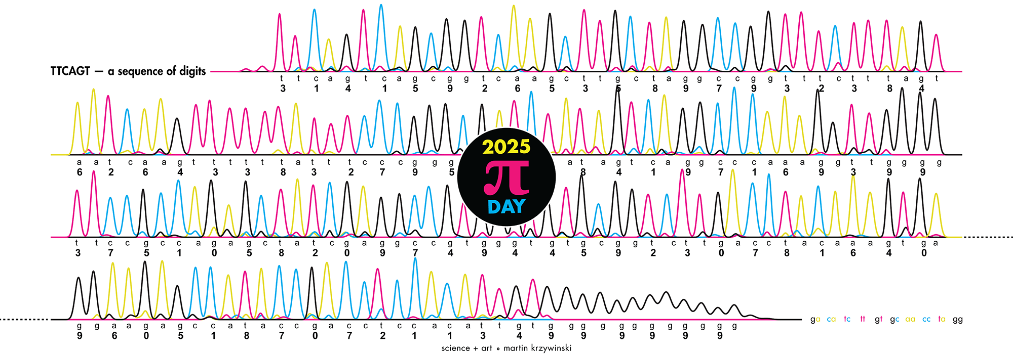
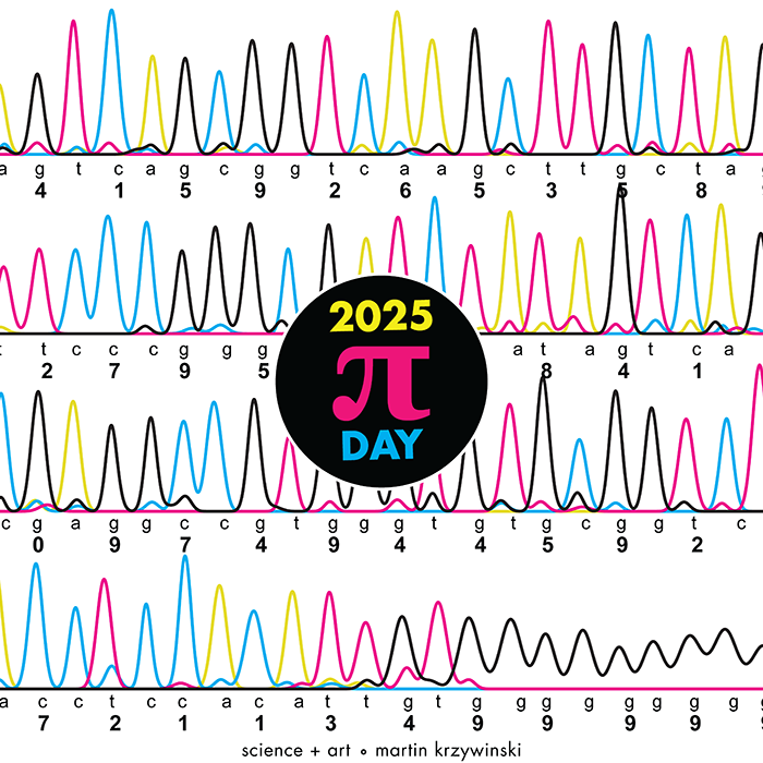
Happy 2025 π Day—
TTCAGT: a sequence of digits
Celebrate π Day (March 14th) and sequence digits like its 1999. Let's call some peaks.
Crafting 10 Years of Statistics Explanations: Points of Significance
I don’t have good luck in the match points. —Rafael Nadal, Spanish tennis player
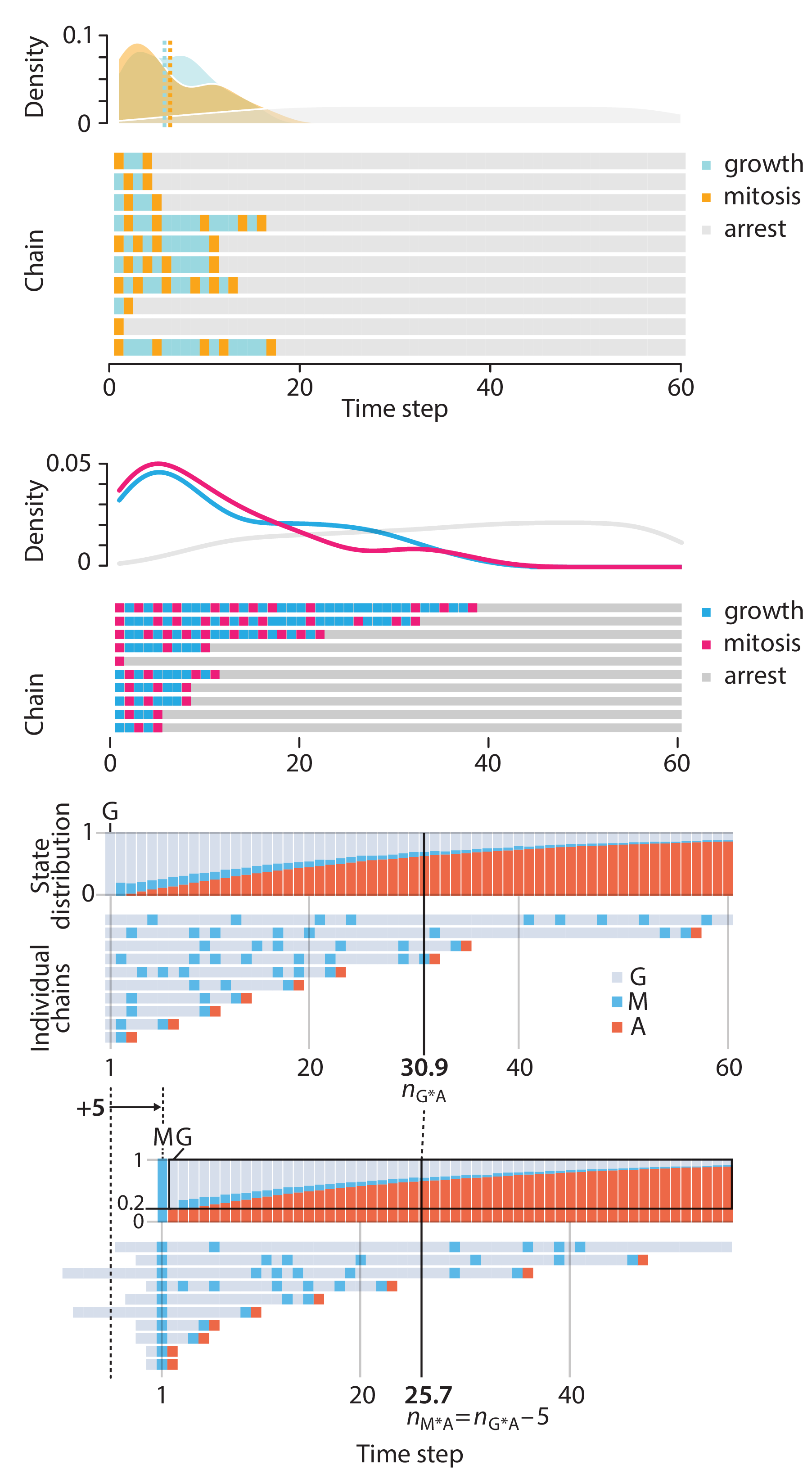
Points of Significance is an ongoing series of short articles about statistics in Nature Methods that started in 2013. Its aim is to provide clear explanations of essential concepts in statistics for a nonspecialist audience. The articles favor heuristic explanations and make extensive use of simulated examples and graphical explanations, while maintaining mathematical rigor.
Topics range from basic, but often misunderstood, such as uncertainty and P-values, to relatively advanced, but often neglected, such as the error-in-variables problem and the curse of dimensionality. More recent articles have focused on timely topics such as modeling of epidemics, machine learning, and neural networks.
In this article, we discuss the evolution of topics and details behind some of the story arcs, our approach to crafting statistical explanations and narratives, and our use of figures and numerical simulations as props for building understanding.
Altman, N. & Krzywinski, M. (2025) Crafting 10 Years of Statistics Explanations: Points of Significance. Annual Review of Statistics and Its Application 12:69–87.
Propensity score matching
I don’t have good luck in the match points. —Rafael Nadal, Spanish tennis player
In many experimental designs, we need to keep in mind the possibility of confounding variables, which may give rise to bias in the estimate of the treatment effect.
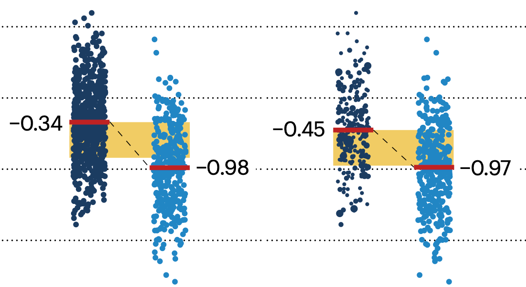
If the control and experimental groups aren't matched (or, roughly, similar enough), this bias can arise.
Sometimes this can be dealt with by randomizing, which on average can balance this effect out. When randomization is not possible, propensity score matching is an excellent strategy to match control and experimental groups.
Kurz, C.F., Krzywinski, M. & Altman, N. (2024) Points of significance: Propensity score matching. Nat. Methods 21:1770–1772.
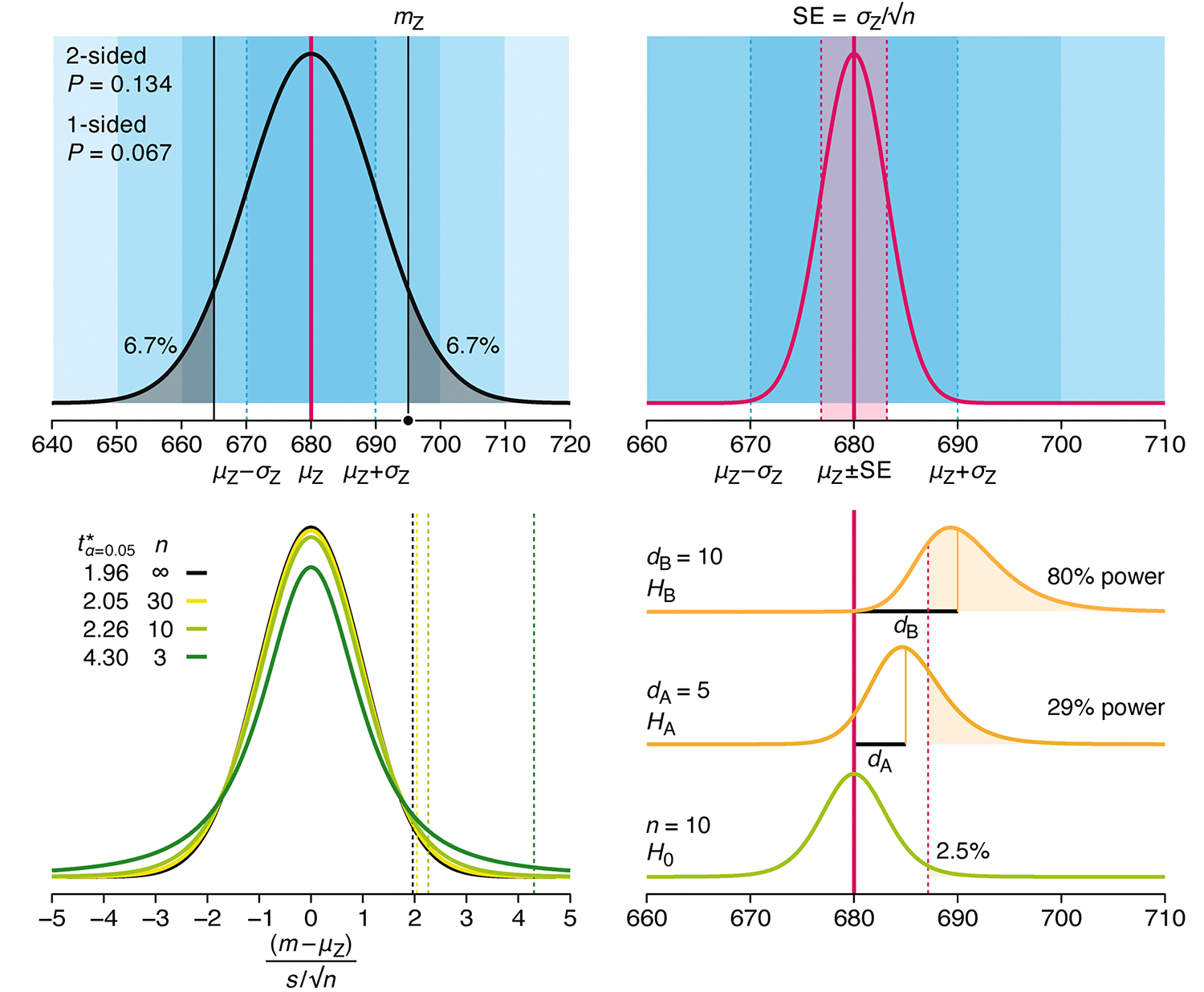
Understanding p-values and significance
P-values combined with estimates of effect size are used to assess the importance of experimental results. However, their interpretation can be invalidated by selection bias when testing multiple hypotheses, fitting multiple models or even informally selecting results that seem interesting after observing the data.
We offer an introduction to principled uses of p-values (targeted at the non-specialist) and identify questionable practices to be avoided.
Altman, N. & Krzywinski, M. (2024) Understanding p-values and significance. Laboratory Animals 58:443–446.