







visualization + design
Getting into Visualization of Large Biological Data Sets
The 20 imperatives of information design
Martin Krzywinski, Inanc Birol, Steven Jones, Marco Marra
Presented at Biovis 2012 (Visweek 2012). Content is drawn from my book chapter Visualization Principles for Scientific Communication (Martin Krzywinski & Jonathan Corum) in the upcoming open access Cambridge Press book Visualizing biological data - a practical guide (Seán I. O'Donoghue, James B. Procter, Kate Patterson, eds.), a survey of best practices and unsolved problems in biological visualization. This book project was conceptualized and initiated at the Vizbi 2011 conference.
If you are interested in guidelines for data encoding and visualization in biology, see our Visualization Principles Vizbi 2012 Tutorial and Nature Methods Points of View column by Bang Wong.
ENSURE LEGIBILITY AND FOCUS ON THE MESSAGE
Create legible visualizations with a strong message. Make elements large enough to be resolved comfortably. Bin dense data to avoid sacrificing clarity.
Distinguish between exploration and communication.
Use exploratory tools (e.g. genome browsers) to discover patterns and validate hypotheses. Avoid using screenshots from these applications for communication – they are typically too complex and cluttered with navigational elements to be an effective static figure.
Do not exceed resolution of visual acuity.
Our acuity is ~50 cycles/degree or about 1/200 (0.3 pt) at 10 inches. Ensure the reader can comfortably see detail by limiting resolution to no more than 50% of acuity. Where possible, elements that require visual separation should be at least 1 pt part.
Use no more than ~500 scale intervals.
Ensure data elements are at least 1 pt on a two-column Nature figure (6.22 in), 4 pixels on a 1920 horizontal resolution display, or 2 pixels on a typical LCD projector. These restrictions become challenges for large genomes.
Show variation with statistics.
Data on large genomes must be downsampled. Depict variation with min/max plots and consider hiding it when it is within noise levels. Help the reader notice significant outliers.
Do not draw small elements to scale.
Map size of elements onto clearly legible symbols. Legibility and clarity are more important than precise positioning and sizing. Discretize sizes and positions to facilitate making meaningful comparisons.
Aggregate data for focused theme.
A strong visual message has no uncertainty in its interpretation. Focus on a single theme by aggregating unnecessary detail.
Show density maps and outliers.
Establishing context is helpful when emergent patterns in the data provide a useful perspective on the message. When data sets are large, it is difficult to maintain detail in the context layer because the density of points can visually overwhelm the area of interest. In this case, consider showing only the outliers in the data set.
Consider whether showing the full data set is useful.
The reader’s attention can be focused by increasing the salience of interesting patterns. Other complex data sets, such as networks, are shown more effectively when context is carefully edited or even removed.
USE EFFECTIVE VISUAL ENCODINGS TO ORGANIZE INFORMATION.
Match the visual encoding to the hypothesis. Use encodings specific and sensitive to important patterns. Dense annotations should be independent of the core data in distinct visual layers.
Use the simplest encoding.
Choose concise encodings over elaborate ones.
Help the reader judge accurately.
Accuracy and speed in detecting differences in visual forms depends on how information is presented. We judge relative lengths more accurately than areas, particularly when elements are aligned and adjacent. Our judgment of area is poor because we use length as a proxy, which causes us to systematically underestimate.
Use encodings that are robust and comparable.
In addition to being transparent and predictable, visualizations must be robust with respect to the data. Changes in the data set should be reflected by proportionate changes in the visualization. Be wary of force-directed network layouts, which have low spatial autocorrelation. In general, these are neither sensitive nor specific to patterns of interest.
Crop scale to reveal fine structure in data.
Biological data sets are typically high-resolution (changes at base pair level can meaningful), sparse (distances between changes are orders of magnitude greater than the affected areas) and connect distant regions by adjacency relationships (gene fusions and other rearrangements). It is difficult to take these properties into account on a fixed linear scale, the kind used by traditional genome browsers. To mitigate this, crop and order axis segments arbitrarily and apply a scale adjustment to a segment or portion thereof.Use perceptual palettes.
Selecting perceptually favorable colors is difficult because most software does not support the required color spaces. Brewer palettes exist for the full range of colors to help us make useful choices. Qualitative palettes have no perceived order of importance. Sequential palettes are suitable for heat maps because they have a natural order and the perceived difference between adjacent colors is constant. Twin hue diverging palettes, are useful for two-sided quantitative encodings, such as immunofluorescence and copy number.Never use hue to encode magnitude.
Hue does not communicate relative change in values because we perceive hue categorically (blue, green, yellow, etc). Changes within one category have less perceptual impact than transitions between categories. For example, variations across the green/yellow boundary are perceived to be larger than variations across the same sized hue interval in other parts of the spectrum.USE EFFECTIVE DESIGN PRINCIPLES TO EMPHASIZE AND COMMUNICATE PATTERNS.
Well-designed figures illustrate complex concepts and patterns that may be difficult to express concisely in words. Figures that are clear, concise and attractive are effective – they form a strong connection with the reader and communicate with immediacy. These qualities can be achieved with methods of graphic design, which are based on theories of how we perceive, interpret and organize visual information.
Reduce unnecessary variation.
The reader does not know what is important in a figure and will assume that any spatial or color variation is meaningful. The figure’s variation should come solely from data or act to organize information.
Encapsulate details.
Including details not relevant to the core message of the figure can create confusion. Encapsulation should be done to the same level of detail and to the simplest visual form. Duplication in labels should be avoided.
Use consistent alignment. Center on theme.
Establish equivalence using consistent alignment. Awkward callouts can be avoided if elements are logically placed.Respect natural hierarchies.
When the data set embodies a natural hierarchy, use an encoding that emphasizes it clearly and memorably. The use hierarchy in layout (e.g. tabular form) and encoding can significantly improve a muddled figure.
Be aware of the luminance effect.
Color is a useful encoding – the eye can distinguish about 450 levels of gray, 150 hues, and 10-60 levels of saturation, depending on the color – but our ability to perceive differences varies with context. Adjacent tones with different luminance values can interfere with discrimination, in interaction known as the luminance effect.
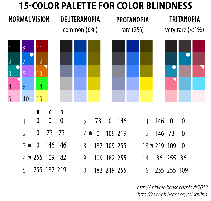
Be aware of color blindness.
In an audience of 8 men and 8 women, chances are 50% that at least one has some degree of color blindness. Use a palette that is color-blind safe. In the palette below the 15 colors appear as 5-color tone progressions to those with color blindness. Additional encodings can be achieved with symbols or line thickness.
I have designed 15-color palettes for color blindess for each of the three common types of color blindness.
Propensity score weighting
It is not certain that everything is uncertain. —Blaise Pascal
We have already explored how we can mitigate bias caused by confounding variables in observational studies using propensity score (PS) matching (PSM) and propensity score weighting (PSW). However, any statistical model is only as good as its assumptions and, if it is specified incorrectly, it can itself produce biased estimates of the treatment effect.
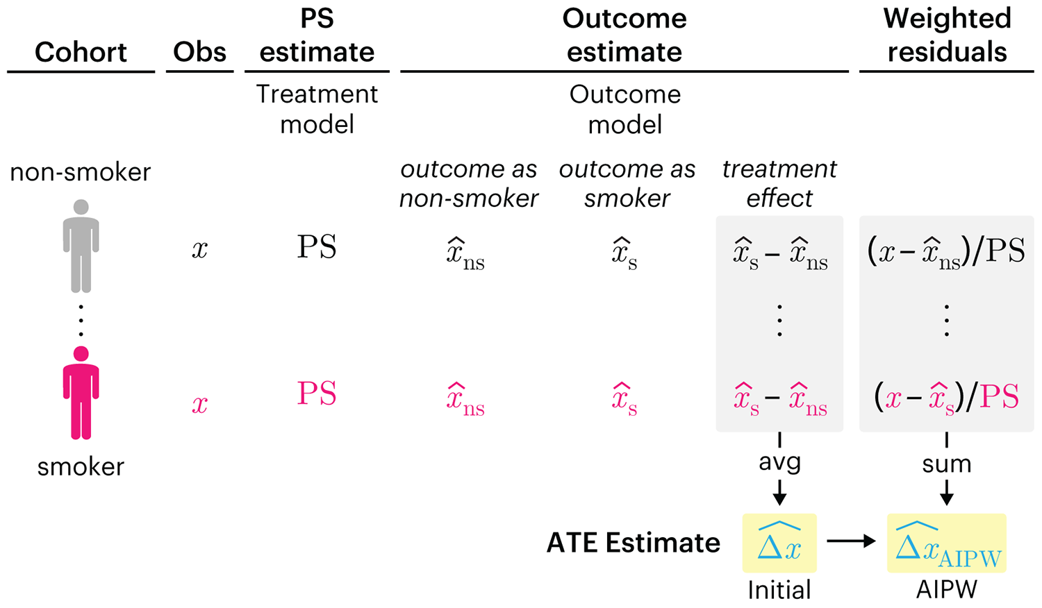
This month, we explore double robustness, a powerful statistical concept that provides a valuable “safety net” against the risk of an incorrect model. It offers two opportunities, instead of just one, to obtain a valid estimate of the treatment effect — making it possible to draw credible causal inferences from observational data without having to depend on a single set of modeling assumptions.
Kurz, C.F., Krzywinski, M. & Altman, N. (2026) Points of significance: Double Robustness. Nat. Methods 23:868–869.
Nature Biotechnology cover
My cover design on the 7 April 2026 Nature Biotechnology issue shows the dendrogram that represents a cluster of uniquely expressed (or downregulated) genes in human naive stem cells induced from such cells. Within each dendrogram block, the genomic barcode sequence (sampled from Supplementary Table 1) is depicted with a Code 39 barcode. The highlighted barcode is one of those used for cell isolation.
Ishiguro S. et al. A multi-kingdom genetic barcoding system for precise clone isolation (2026) Nature Biotechnology 44:616–629.

Browse my gallery of cover designs.
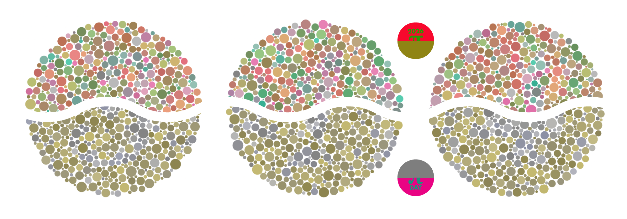
Happy 2026 π Day—
Art for the 5%
Celebrate π Day (March 14th) and enjoy the art — but only if you're part of the 5%.
Go ahead, see what you can't see.

Ishihara's Tests for Colour Deficiency
Authentic and accurate images of Ishihara's test plates photographed (and lovingly color-corrected) from the 38-plate Ishihara's Tests for Colour Deficiency.
I also provide the position, size, and color of each circle on each test plate.


Symmetric alternatives to the ordinary least squares regression
What immortal hand or eye, could frame thy fearful symmetry? — William Blake, "The Tyger"
This month, we look at symmetric regression, which, unlike simple linear regression, it is reversible — remaining unaltered when the variables are swapped.
Simple linear regression can summarize the linear relationship between two variables `X` and `Y` — for example, when `Y` is considered the response (dependent) and `X` the predictor (independent) variable.
However, there are times when we are not interested (or able) to distinguish between dependent and independent variables — either because they have the same importance or the same role. This is where symmetric regression can help.

Luca Greco, George Luta, Martin Krzywinski & Naomi Altman (2025) Points of significance: Symmetric alternatives to the ordinary least squares regression. Nat. Methods 22:1610–1612.