

Obesity — a Data Story
Rescuing nuanced pattterns from the clutches of a bad graphic
“This figure may give you a migrane”
Sometimes, I get emails that look like this
   Sent: Monday, July 29, 2019 at 07:59
   From: Jasleen Grewal
Subject: This figure may give you a migrane

As you can see, 100% of the graphs are ineffective.

Here, I wanted to take you through my reaction to the figure, which was quick, and the redesign, which wasn't quick.
text labels — it's a hard life
I'm always on the lookout for abused text. So here I cried. A lot.

strangely structured legend
Do we really need a footnote inside the legend? The globe? The hyphenated "Body-Mass-Index". By this point, I really could feel that migrane.

here's the graphic — now what?
What question's does this figure answer? Here's my list, with answers.
1. How many countries are there in the world? A lot.
2. What is the range of BMI ≥ 25 prevalence? 18—89.
3. Who has the lowest and highest prevalence? Vietnam and Nauru.
4. What is the median prevalence? Probably 55 and answering this is only made easy by the fact that the book's spine splits the plot into largely two equal halves
5. What is the prevalence where I live (e.g. Canada)? I gave up trying to find "Kanada".
Essentially, the two-page figure of ring charts is equivalent to the summary

critique by redesign
It's obvious what's wrong with the figure. How do you fix it?
Using the list of countries by body mass index, I created a poster that tells interesting stories about how high BMI and obesity vary across countries and genders.
I describe the design and stories in the poster in the design section.

Propensity score weighting
It is not certain that everything is uncertain. —Blaise Pascal
We have already explored how we can mitigate bias caused by confounding variables in observational studies using propensity score (PS) matching (PSM) and propensity score weighting (PSW). However, any statistical model is only as good as its assumptions and, if it is specified incorrectly, it can itself produce biased estimates of the treatment effect.
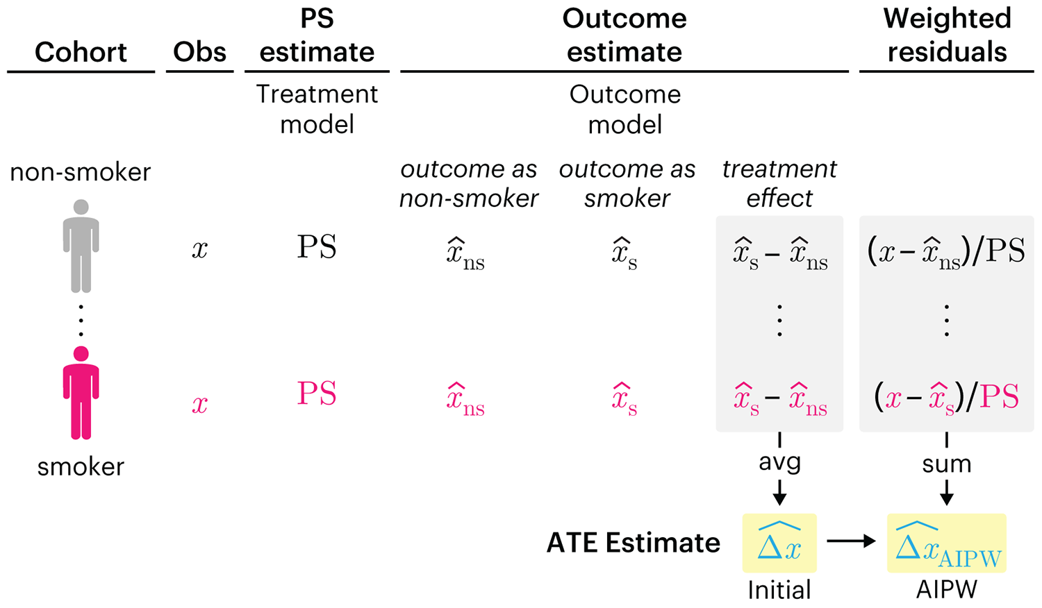
This month, we explore double robustness, a powerful statistical concept that provides a valuable “safety net” against the risk of an incorrect model. It offers two opportunities, instead of just one, to obtain a valid estimate of the treatment effect — making it possible to draw credible causal inferences from observational data without having to depend on a single set of modeling assumptions.
Kurz, C.F., Krzywinski, M. & Altman, N. (2026) Points of significance: Double Robustness. Nat. Methods 23:868–869.
Nature Biotechnology cover
My cover design on the 7 April 2026 Nature Biotechnology issue shows the dendrogram that represents a cluster of uniquely expressed (or downregulated) genes in human naive stem cells induced from such cells. Within each dendrogram block, the genomic barcode sequence (sampled from Supplementary Table 1) is depicted with a Code 39 barcode. The highlighted barcode is one of those used for cell isolation.
Ishiguro S. et al. A multi-kingdom genetic barcoding system for precise clone isolation (2026) Nature Biotechnology 44:616–629.

Browse my gallery of cover designs.

Happy 2026 π Day—
Art for the 5%
Celebrate π Day (March 14th) and enjoy the art — but only if you're part of the 5%.
Go ahead, see what you can't see.

Ishihara's Tests for Colour Deficiency
Authentic and accurate images of Ishihara's test plates photographed (and lovingly color-corrected) from the 38-plate Ishihara's Tests for Colour Deficiency.
I also provide the position, size, and color of each circle on each test plate.


Symmetric alternatives to the ordinary least squares regression
What immortal hand or eye, could frame thy fearful symmetry? — William Blake, "The Tyger"
This month, we look at symmetric regression, which, unlike simple linear regression, it is reversible — remaining unaltered when the variables are swapped.
Simple linear regression can summarize the linear relationship between two variables `X` and `Y` — for example, when `Y` is considered the response (dependent) and `X` the predictor (independent) variable.
However, there are times when we are not interested (or able) to distinguish between dependent and independent variables — either because they have the same importance or the same role. This is where symmetric regression can help.

Luca Greco, George Luta, Martin Krzywinski & Naomi Altman (2025) Points of significance: Symmetric alternatives to the ordinary least squares regression. Nat. Methods 22:1610–1612.