

design + visualization
VIZBI 2013 Keynote
Visual Design Principles—Communicating Effectively
This talk happened on Thursday, Mar 21st 2013 at VIZBI 2013 at the Broad Institute in Boston.
How often people speak of art and science as though they were two entirely different things, with no interconnection. An artist is emotional, they think, and uses only his intuition; he sees all at once and has no need of reason. A scientist is cold, they think, and uses only his reason; he argues carefully step by step, and needs no imagination. That is all wrong. The true artist is quite rational as well as imaginative and knows what he is doing; if he does not, his art suffers. The true scientist is quite imaginative as well as rational, and sometimes leaps to solutions where reason can follow only slowly; if he does not, his science suffers. —Isaac Asimov (The Roving Mind)
For more visualization and design resources, see my VIZBI 2012 tutorials, Nature Methods Points of View column, and rant about colors.

presentation video
The video will be posted at vizbi.org.
presentation slides
Slides are available as PDF and keynote (zipped).


A poet is, after all, a sort of scientist, but engaged in a qualitative science in which nothing is measurable. He lives with data that cannot be numbered, and his experiments can be done only once. The information in a poem is, by definition, not reproducible. He becomes an equivalent of scientist, in the act of examining and sorting the things popping in [to his head], finding the marks of remote similarity, points of distant relationship, tiny irregularities that indicate that this one is really the same as that one over there only more important. Gauging the fit, he can meticulously place pieces of the universe together, in geometric configurations that are as beautiful and balanced as crystals. —Lewis Thomas (The Medusa and the Snail: More Notes of a Biology Watcher)
breakout session—making good figures

small, medium and big data visualization
If you're asking how to visualize big data, first make sure you're doing a good job on small and medium data. Each scale requires good design.
to tell many stories
Also consider that there is a very large number of combinations of data sets, hypotheses and possible patterns. Because of this, you cannot expect to use one way to tell many stories. There is no Holy Grail of big data visualization. But there are many good questions to ask and practices to follow that make up a process which can help you get there.


Propensity score weighting
It is not certain that everything is uncertain. —Blaise Pascal
We have already explored how we can mitigate bias caused by confounding variables in observational studies using propensity score (PS) matching (PSM) and propensity score weighting (PSW). However, any statistical model is only as good as its assumptions and, if it is specified incorrectly, it can itself produce biased estimates of the treatment effect.
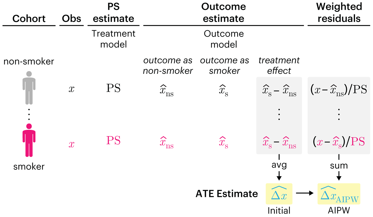
This month, we explore double robustness, a powerful statistical concept that provides a valuable “safety net” against the risk of an incorrect model. It offers two opportunities, instead of just one, to obtain a valid estimate of the treatment effect — making it possible to draw credible causal inferences from observational data without having to depend on a single set of modeling assumptions.
Kurz, C.F., Krzywinski, M. & Altman, N. (2026) Points of significance: Double Robustness. Nat. Methods 23:868–869.
Nature Biotechnology cover
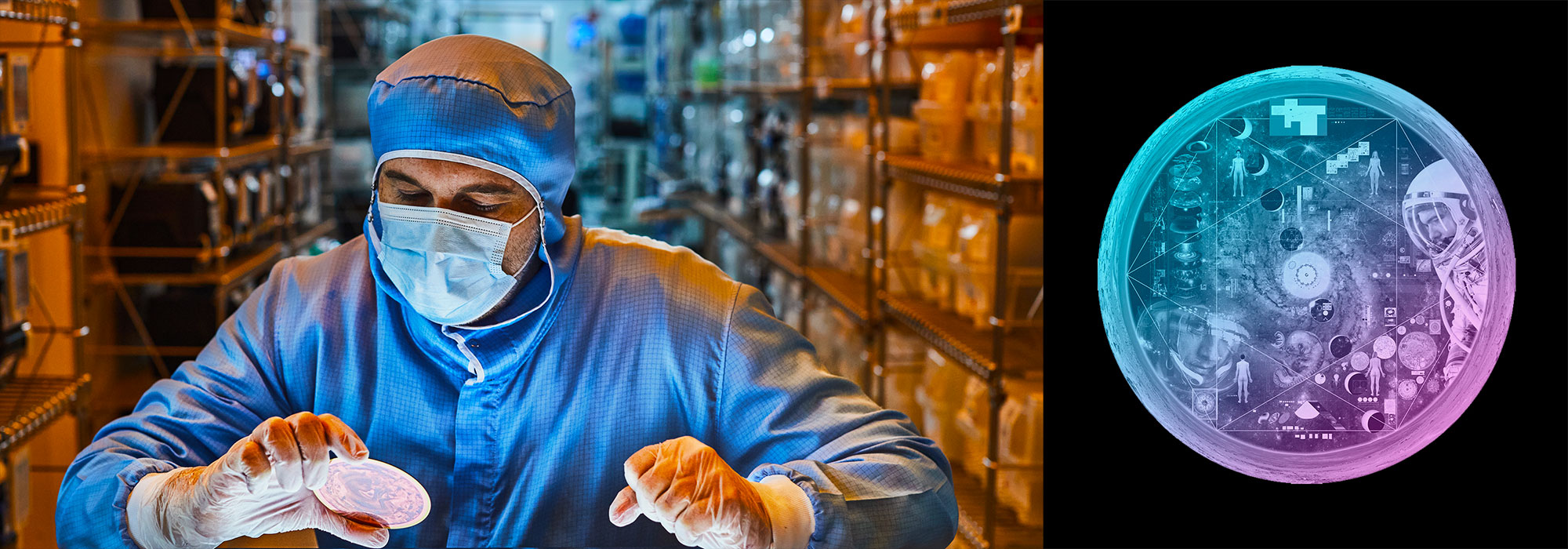
My cover design on the 7 April 2026 Nature Biotechnology issue shows the dendrogram that represents a cluster of uniquely expressed (or downregulated) genes in human naive stem cells induced from such cells. Within each dendrogram block, the genomic barcode sequence (sampled from Supplementary Table 1) is depicted with a Code 39 barcode. The highlighted barcode is one of those used for cell isolation.
Ishiguro S. et al. A multi-kingdom genetic barcoding system for precise clone isolation (2026) Nature Biotechnology 44:616–629.

Browse my gallery of cover designs.
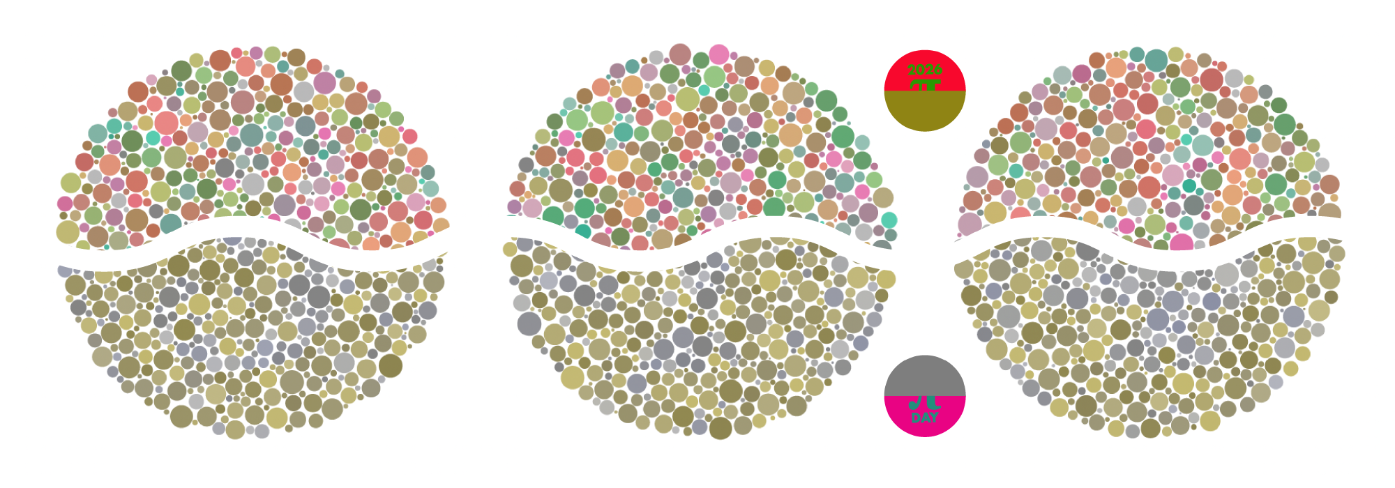
Happy 2026 π Day—
Art for the 5%
Celebrate π Day (March 14th) and enjoy the art — but only if you're part of the 5%.
Go ahead, see what you can't see.

Ishihara's Tests for Colour Deficiency
Authentic and accurate images of Ishihara's test plates photographed (and lovingly color-corrected) from the 38-plate Ishihara's Tests for Colour Deficiency.
I also provide the position, size, and color of each circle on each test plate.

