Effective graphical abstract design for science communication
Guidelines to get you started and keep you going

GRAPHICAL ABSTRACT DESIGN GUIDELINES
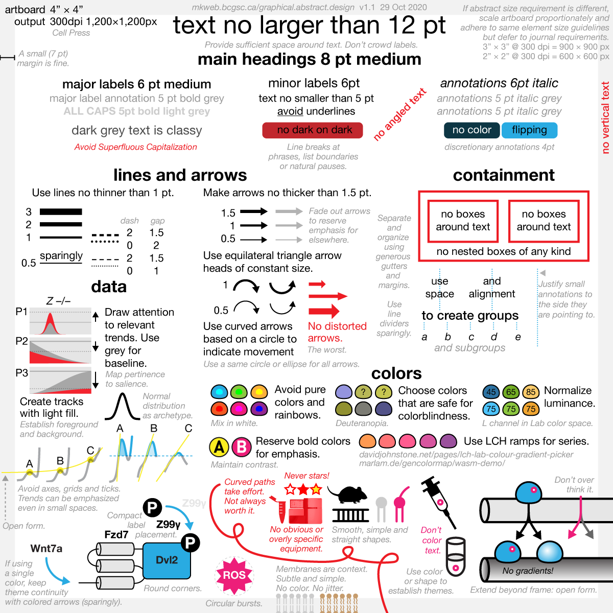
The graphical abstract guidelines build on my design guidelines for posters. Because their focus is on telling the essence of a story in a small space, I see them as much less negotiable than guidelines for posters, where the large canvas allows for more options.
See how the guidelines can be applied to graphical abstracts in the wild by visiting the graphical abstract hospital.
The Graphical abstract mindset
The purpose of the graphical abstract is to quickly present the key findings of a paper in a way that closely matches the narrative of the paper. The graphical abstract should place all central terms in context and emphasize key relationships.
A graphical abstract is Figure 0.
Everything you learn about the design of graphical abstracts applies to the design of figures.
Everything you learn about the design of figures applies to the design of posters.
Identifying what to put in the graphical abstract cannot be answered by design alone. Design can help place and shape what you have chosen, but it cannot tell you what to chose — that's up to the science.
Graphical abstracts are typically small square bitmaps. Though individual journal requirements vary, this constraint on the size of the canvas places tremendous limits on the design and imposes more strict requirements than when designing for a larger space.
The graphical abstract is a tiny space that offers no quarter. A bad design decision cannot be mitigated by a good design decision downstream. There is no room for "style".
The graphical abstract is a visual elevator pitch. There is no room for visual garnish or embelishment of any kind.
The function of a graphical abstract comes from its form, which cues the nature of relationships in its story.
Many abstracts struggle to fit the path of the story into a small space. Individual scenes meander down the image, often snaking, as elements struggle for space and attention. Make it easy for the eye and guide it along simple paths.
The graphical abstract should never be designed with attracting the eye as the first priority. Rather, it's your first opportunity for engaging the reader's pre-attentive processing and to lay out a map of the story. Every part of the abstract should correspond to the beginning of important story arcs in the paper.
Strict control of color.
No gradients. There, I said it.
No elaborate three-dimensional representations. While well-drawn ones can be attractive, many distract the eye with too much detail and draw attention away from the story path.
Your paper is a mansion and the graphical abstract is a studio apartment — you cannot bring all the furniture. Too often, "style" is that credenza you've been lugging around everywhere. It's time to let it go.
Most graphical abstracts have poor top-level organization. In many, the wrong things are grouped and categories, such as experimental conditions, are not clearly demarcated. Opportunities for maintaining continuity between scenes of the story are often missed.
Understand and practise good Gestalt grouping principles. In a small space, color will group more powerfully than position and much more powerfully than shape.
Organize content in a way that reflects spatial or semantic hierarchy by making use of Gestalt figure-ground principles. These are very helpful in reinforcing inside vs. outside (e.g. cytosol vs. nucleus).
Tables are dead. Long live the table.
Typical graphical tropes, such as those used in figures and presentations, have no place in graphical abstracts. Everything must be distilled down to its core essence — this part is hard and requires that you pay attention to how graphical elements relate in shape and position and whether these relationships are unambiguous and speak to your story with specificity.
Many abstracts do not balance visual weight: they have too much detail in shapes and symbols and have too much variation in text size and line thickness.
In most abstracts, key aspects of the story are lost among too much variation due to loose design.
For every pair of things on the abstract, ask yourself: (1) can their graphical relationship be improved to better match their actual relationship? (2) does their graphical relationship imply something that isn't important or true? (3) am I repeating myself?
Are things of equal importance drawn with equal emphasis? How many different sizes of type are being used?
The abstract's grid layout should present a strong tabular feel. Can you draw a horizontal or vertical line across the abstract to divide its elements along thematic or categorical boundaries?
Stick to straight paths for the eye: left-to-right, top-to-bottom, or top-left to bottom-right. Avoid requiring the reader to backtrack or turn sharply.
Align ruthlessly. In a small space even tiny misalignments become obvious and a barrier to assessing relationship between elements.
Encapsulate your story in a strong and obvious grid layout (1×2, 2×2, ...) and maintain symmetry in margins, padding and spacing between elements.
Use open form (elements extending beyond the image) to imply that the scene is a vignette of a larger scene or more complex process.
Color
The success of a graphical abstrat rests on how well it is organized and how well it represents important relationships. Color can be used to maintain a theme (e.g. health vs disease) but this effect is diluted by other colors.
Do not create too many color groups. Instead, group using space and shape.
Avoid strongly coloring elements that are drawn for context or are of secondary importance.
Avoid background color, which generally reduces contrast. If you cannot overcome your desire for a background gradient, make it as subtle as possible.
Typography
Well-chosen type placement and size goes a long way in alleviating tightness of a small space.
Have a modest type size ladder with no more than 3 sizes — for example, 4, 6, 8 pt.
Generally, do not apply color to text unless you're cuing the continuation of a theme. But do so carefully.
Use light and dark grey for text to indicate a hiearchy of importance.
On a large canvas, there is room for a fully type hierarchy (bold, small caps, italics, etc). In a small space, there isn't. Always evaluate the legibility of text on the final bitmap.
Do not outline or add styling to text, such as drop shadows or glow.
Apply bold and italics gently and do not combine them — too much variation in type will overwhelm the space.
Small italic labels make for great annotations.
Technical Considerations
Although the graphical abstract itself may never be printed, it's extremely helpful to design it to a specific physical size. You'll be able to standardize your design process for graphical abstracts, figures and posters.
Design on a 4" × 4" artboard and export at 300 dpi. Scale artboard size, not output resolution, to match journal requirements.
Use point units for sizing text in the range 6–10 pt. Limit yourself to Arial or one of the Helveticas. Avoid angled or vertical text.
Draw lines no thinner than 0.5 pt. Standardize line and arrow length and angle.
Nature Biotechnology cover
My cover design on the 7 April 2026 Nature Biotechnology issue shows the dendrogram that represents a cluster of uniquely expressed (or downregulated) genes in human naive stem cells induced from such cells. Within each dendrogram block, the genomic barcode sequence (sampled from Supplementary Table 1) is depicted with a Code 39 barcode. The highlighted barcode is one of those used for cell isolation.
Ishiguro S. et al. A multi-kingdom genetic barcoding system for precise clone isolation (2026) Nature Biotechnology 44:616–629.

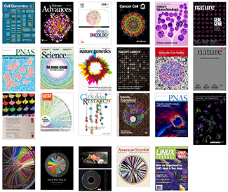
Browse my gallery of cover designs.

Happy 2026 π Day—
Art for the 5%
Celebrate π Day (March 14th) and enjoy the art — but only if you're part of the 5%.
Go ahead, see what you can't see.

Ishihara's Tests for Colour Deficiency
Authentic and accurate images of Ishihara's test plates photographed (and lovingly color-corrected) from the 38-plate Ishihara's Tests for Colour Deficiency.
I also provide the position, size, and color of each circle on each test plate.


Symmetric alternatives to the ordinary least squares regression
What immortal hand or eye, could frame thy fearful symmetry? — William Blake, "The Tyger"
This month, we look at symmetric regression, which, unlike simple linear regression, it is reversible — remaining unaltered when the variables are swapped.
Simple linear regression can summarize the linear relationship between two variables `X` and `Y` — for example, when `Y` is considered the response (dependent) and `X` the predictor (independent) variable.
However, there are times when we are not interested (or able) to distinguish between dependent and independent variables — either because they have the same importance or the same role. This is where symmetric regression can help.

Luca Greco, George Luta, Martin Krzywinski & Naomi Altman (2025) Points of significance: Symmetric alternatives to the ordinary least squares regression. Nat. Methods 22:1610–1612.
Beyond Belief Campaign BRCA Art
Fuelled by philanthropy, findings into the workings of BRCA1 and BRCA2 genes have led to groundbreaking research and lifesaving innovations to care for families facing cancer.
This set of 100 one-of-a-kind prints explore the structure of these genes. Each artwork is unique — if you put them all together, you get the full sequence of the BRCA1 and BRCA2 proteins.


